Oftentimes when browsing the DataIsBeautiful subreddit I look at the content and think to myself, "this would be pretty easy to make in Wolfram Language," at which point I promptly forget I had that thought and move on to the next post (where I likely have the same thought).
Today I stumbled upon a post by user with a beautiful graphic visualizing the hourly temperature in Brooklyn from 1973 through 2017. This time I decided to act upon my "this would be pretty easy to make in Wolfram Language" thoughts, and went at it.
Wolfram Language's WeatherData functionality made gathering the temperatures a breeze (weather puns), and I was able to bring all the data into Mathematica with a single line of code:
WeatherData[Entity["City", {"Champaign", "Illinois", "UnitedStates"}],
"Temperature", {{1970, 1, 1}, Today, "Day"}]
After that it was just a matter of converting the degrees to Fahrenheit, getting the colors right (I really liked the colors in the original graphic, so I tried to mimic them), and then creating and formatting the rows (click to zoom).
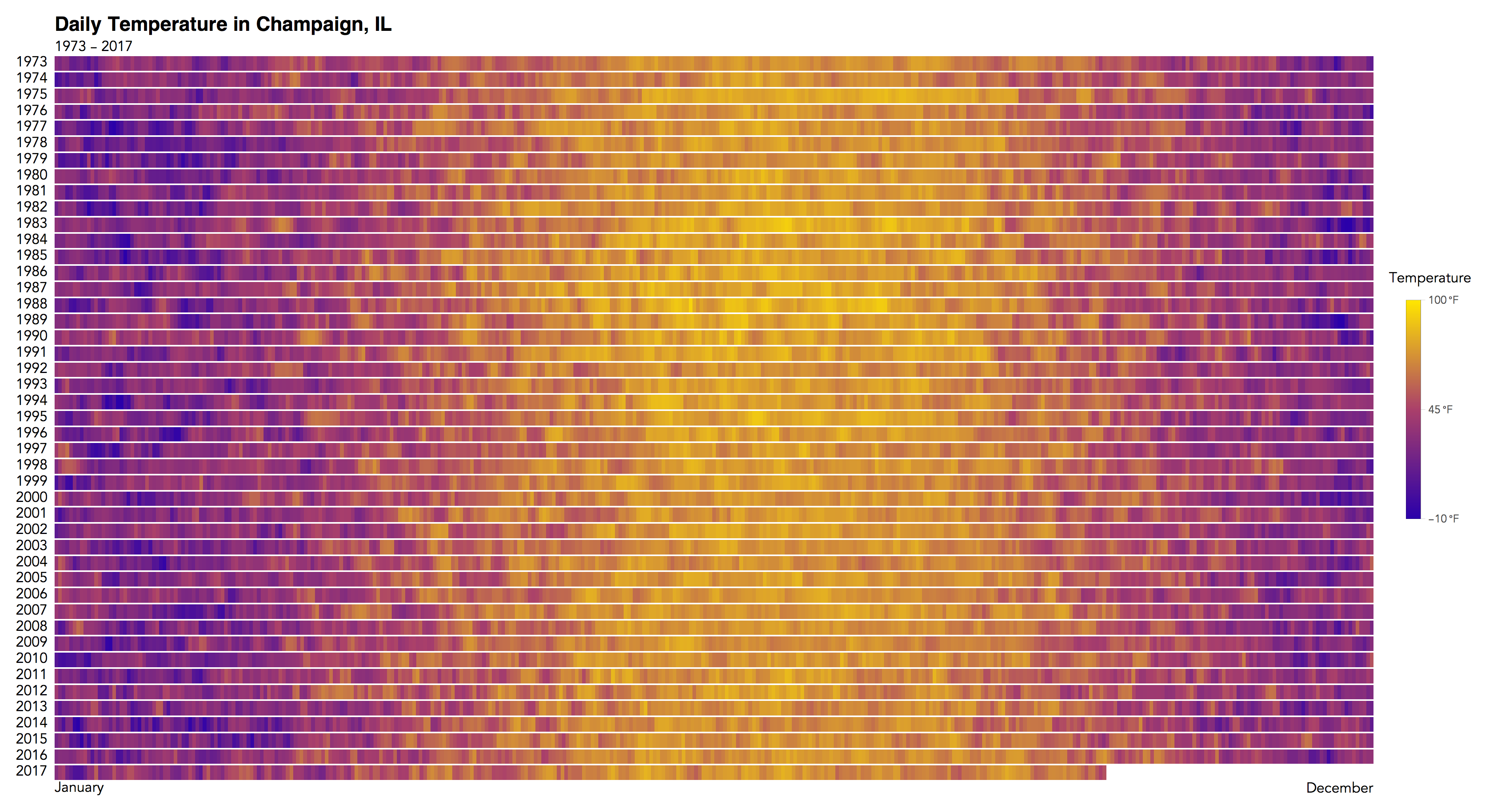
I really don't want to take anything away from the original creator (here is a GitHub link with his R source code), as his was much more carefully done (he took care of leap years so his hours actually line up, etc...), I just wanted to demonstrate how easy it was to accomplish something similar in the Wolfram Language.
Here is the notebook (also attached) I used to create this (in the Cloud some things don't line up quite the same as they do on my Desktop, but the end result is the same). All that would be required to make this same chart for another city would be to edit the city entity in the first line of code, and perhaps edit the scaling to better accommodate the maximum and minimum temperature for that region.
CODE
champaignTemp=WeatherData[
    Entity["City",{"Champaign","Illinois","UnitedStates"}],"Temperature",{{1970,1,1},Today,"Day"}];
datePath=champaignTemp["DatePath"]/.{x_,y_Quantity}:>{x,UnitConvert[y,"DegreesFahrenheit"]};
{min,max}=MinMax[datePath[[All,2]]]
mean=Mean@datePath[[All,2]]

$blendingColors={RGBColor[1/6,0,2/3],RGBColor[2/3,1/4,5/12],RGBColor[1,9/10,0]};
Graphics[Table[{Blend[$blendingColors,x],Disk[{8x,0}]},{x,0,1,1/8}]]
(*quick pic for looking at how the bleding will turn out*)

cf[x_]:=Blend[$blendingColors,x]
$legend=BarLegend[{cf[#]&,{0,1}},"Ticks"->{0,.5,1},"TickLabels"->(Style[#,FontFamily->"Avenir"]&/@
{Quantity[-10,"DegreesFahrenheit"],Quantity[45,"DegreesFahrenheit"],Quantity[100,"DegreesFahrenheit"]}),
LegendLabel->Style["Temperature",FontFamily->"Avenir"]];

scaledDatePath=datePath/.{x_,y_}:>
{x,Rescale[y,{Quantity[-10,"DegreesFahrenheit"],Quantity[100,"DegreesFahrenheit"]}]};

sortedScaledByYear=GroupBy[scaledDatePath,#[[1,1,1]]&];

Table[imgData[i]=Table[#,4]&/@(Blend[$blendingColors,#]&/@sortedScaledByYear[i][[All,2]])
//Transpose,{i,sortedScaledByYear//Keys}];

imgData[2017]=Transpose[Join[imgData[2017]//Transpose,
Table[{White,White,White,White},365-Length@Last@sortedScaledByYear]]];

grid=Grid[
Join[
{{Null,Column[{Style["Daily Temperature in Champaign, IL",FontFamily->"Helvetica",
18,Bold],Style["1973 - 2017",FontFamily->"Avenir",13]}],SpanFromLeft}
},
Table[{Style[i,FontFamily->"Avenir"],Image[imgData[i],ImageSize->1200],SpanFromLeft},
{i,sortedScaledByYear//Keys}],
{{Null,Style["January",FontFamily->"Avenir",13],Style["December",FontFamily->"Avenir",13]}}
]
,
Spacings->{.5,0.1},
Alignment->{{Left,Left,Right},Top}
];
final=Framed[Labeled[grid,$legend,Right],ImageMargins->10,FrameStyle->None]

SetDirectory[NotebookDirectory[]];
finalImg=Rasterize[final,ImageResolution->200]

Export["ChampaignWeather.png",finalImg]
 Attachments:


