Message Boards Message Boards

Palette user interface

Posted 6 years ago

Hi all, I am using Wolfram Mathematica about 10 years, but the user interface did not improve substantially. I really upset that such innovative company as Wolfram Research did not provide any useful alternative of palettes and docked cells for packages developers. From my own point of view the palettes have several shortcomings.

  1. they overlay each other and notebooks. Users have to waste more time for allocate the palettes than use them. Typically users open several notebooks and the next one notebook opens on its own place of screen without any correlation with the palettes. Finally users decide to close the palettes.
  2. the functional of the palettes is scarce. Some package developers prefer to create a small notebook with buttons rather than the palette.
  3. the palettes look archaic in comparison with other programs.

For example, a ribbon interface has proved effective. Take a look at MS Word, Matlab, Foxit Reader and so on. Or maybe one can use a tabbed document interface for notebooks.

14 Replies

I think if Matematica claim to be a tool for information exchange (in CDF format), then it has to have a standard convenient way for design the view of the CDF documents. For example, a fast way for a modification PlotRange and other options can be available from new standard palettes (or it alternative).

Some of my thoughts on palettes: The principle maxim is: Maximize the functionality; minimize the space.

Since screen real estate is valuable there are a few things to be wary of. Don't use a lot of nonfunctional decoration on the palette, or expansive spacing. Don't use a huge billboard of symbols if you can avoid it. Don't use permanent space for something that is infrequently used. Minimize any changes to a user's Mathematica Palettes menu.

Over the years I have evolved a palette design that I feel is useful for moderate size applications with packages, or for convenient use of some related subset of Mathematica commands. It is not useful for Mathematica as a whole because there are just too many commands.

For these palettes I have chosen as the most useful information: 1) An overview of the routines available; 2) Links to the documentation for the application and individual routines; 3) Paste buttons providing labeled templates for each of the commands.

As an aside, palettes can be added to the Mathematica Palettes menu. If you follow the prescription for writing applications they can be put in the FrontEnd/Palettes folder of the application. If you have multiple palettes it is useful to add an extra folder with your application name and then put all the palettes in that folder. Then all your palettes will appear on the Mathematica menu under one entry, won't be scattered all over the user's Palettes menu and won't clutter it.

I have attached two palettes. One is a UnitsHelper Advanced Palette for a UnitsHelper application that I have to provide more convenient usage of Mathematica Units. There are also additional application routines and documentation which I am not providing here, but there is plenty enough to see how the palette works. And it does have access to all the Mathematica routines and documentation as well as relevant NIST pages on units. The second palette is for the Mathematica Geometry routines and should be fully functional. You could open these to explore with a Mathematica notebook.

There are three space-saving devices that I find most useful. 1) Openers to group various functionalities; 2) Dropdown ActionMenus containing groupings of functions and routines or containing a list of Help links for the routines; 3) Tooltips on the dropdown menus that give a compact list of the routines in the menu or ancillary information. Also, the palettes have the standard Size button on the frame so a user could make the palette smaller, according to how good his eyesight is, or only enlarge it when using it.

Most of these elements are present in the Basic Math Assistant palette although it is directed more to beginner or basic use of Mathematica. It does use a fair number of 'billboard displays' (Do we really need to punch in digits from the palette when they are already available at two places on most keyboards?) and only has direct help links to overall tutorials and not individual function pages. The palettes I'm showing are more appropriate for a set of several hundred commands from an application or as a related subset of Mathematica.

The following describes the UnitsHelper Advanced Palette.

The top button is a dropdown menu to directly load the application or paste the load statement (much the better choice). The second, Documentation, button gives access to the UnitsHelper documentation (not available here) and the WRI guide and tutorial pages. It also gives links to various NIST pages.

The Units and Prefixes section gives the various System, Prefixes and units organized into groups. The SIPrefixes for example gives a list of the standard prefixes annotated with their numerical values. For each of the dimensional unit groupings two dropdown menus are provided, the first ordering the units by magnitude and the second alphabetically. The items, of course, paste the unit into the notebook.

The Physical Constants sections just gives the constants alphabetically.

Skipping to the Wolfram Units Routines we see the method used for displaying routines. The "?" dropdown gives links to the Help pages for each of the routines. The group heading has a tooltip giving a compact list of the routines in that group, When the dropdown menu is opened paste buttons are provided for each of the routines. A button is generally provided for each overloaded version of the routine.

The second palette, Geometry Palette, for the Mathematica Geometry routines, can be explored for yourself.

Attachments:

Thank you for your palettes! They contain a huge commands and have a small size. Your palettes are convenient and helpful as opposed to standard Mathematica palettes.

I agree with you. The ribbons don't suitable to a small screen laptop. But several palettes that showed simultaneously don't suitable too. I haven't ready-made solution, but I think the user interface have to develop.

Posted 6 years ago

A way to escape the notebook paradigm is to use attached cells. For instance you can make a cute little input-field display interface like so:

bottomWrappedBox[boxExpr_, bottomLayer_] :=
 DynamicModule[
  {myBox, myCell},
  DynamicWrapper[
   boxExpr,
   If[MatchQ[NotebookRead[myCell], Except[_Cell]],
    myBox = EvaluationBox[];
    myCell =
     FrontEndExecute@
      FrontEnd`AttachCell[myBox,
       Cell[BoxData@ToBoxes@bottomLayer],
       {Offset[{2, 0}, -2], {Left, Bottom}
        },
       {Left, Top},
       "ClosingActions" -> {"ParentChanged", "EvauatorQuit"}
       ]
    ]
   ],
  UnsavedVariables :> {myBox, myCell}
  ]

bottomWrappedBox[
 Panel[
  InputField[
   Dynamic["", (a = #) &],
   String,
   ImageSize -> 100
   ],
  Appearance ->
   {
    "Default" ->
     Lookup[
      FrontEndResource["FEExpressions", 
       "TooltipOptionsBarNinePatchAppearance"],
      "Hover"
      ]
    },
  FrameMargins -> {{10, 10}, {5, 5}}
  ],
 Framed[
  Dynamic[Pane[a, ImageSize -> 102]],
  FrameMargins -> {{10, 10}, {3, 3}},
  FrameStyle -> GrayLevel[.8]
  ]
 ]

ugh

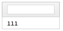
The display cell is properly attached to the box of the input-field. This isn't a prettied-up Column-type interface.

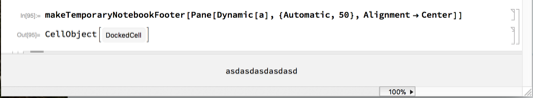
The gets more powerful once you realize you can attach the same to a notebook. Here's a way to make a temporary notebook footer:

makeTemporaryNotebookFooter[nb_: Automatic, footer_] :=

  FrontEndExecute@
   FrontEnd`AttachCell[
    Replace[nb, Automatic :> EvaluationNotebook[]],
    Cell[BoxData@ToBoxes@footer, "DockedCell",
     CellFrame -> {{0, 0}, {0, 1}},
     Background -> GrayLevel[.95],
     CellSize -> {Scaled[1], 50},
     CellFrameMargins -> None,
     TextAlignment -> Center
     ],
    {Offset[{0, 0}, 0], {Left, Bottom}
     },
    {Left, Bottom},
    "ClosingActions" -> {"EvauatorQuit", "OutsideMouseClick"}
    ];

makeTemporaryNotebookFooter[
 Pane[Dynamic[a], {Automatic, 50}, Alignment -> Center]]

You can add whatever interface you like in there. And you can make it permanent or stick to the left / right hand sides of the notebook, too.

ugh2

POSTED BY: b3m2a1 ​ 

The code shows great promise. Thanks, I am going to try this!

I don't like the ribbon itself, but I thought that the developers can place the packages menu in its own tab in one ribbon, so that will be convenience.

You can create ribbon toolbar based on DockedCells and TabView and other ui elements.

Then you can move Default.nb to appropriate place in $UserBaseDirectory and make this DockedCell a default one. See General approach to modifying built in stylesheets to get an idea.


If you want to add new items in menu bar / Edit or anywhere, copy MenuSetup.tr to analogous dir in $UserBaseDirectory and edit it accordingly. See this topic https://mathematica.stackexchange.com/a/109396/5478 where I created an additional menu to quickly open important directories.


I'm not 100% this answers your question so sorry if I missed the point.

p.s. about stagnation in GUI updates, yes, we are victims of a need to keep things consistent across Mac/Win/Linux and now also web FrontEnd as well as iOS.

POSTED BY: Kuba Podkalicki

That's great! Definitely, I am going to do the experiment based on your instruction. I used DockedCells option, but you give a more general way for all notebooks. Thank a lot! I hope Wolfram Research will provide an easy way to build helpful menu, that will consistent across all support operation systems.

So, you would prefer that (for example) the edit bar (formatting option for the top of notebooks) be expanded to cover the options currently in the Writing assistant palette? I think this is a useful idea. Right now, the option is a very simple form of the ribbons, etc., available in most word processors, although the ones in Word are way too complicated for the more modest needs of a notebook.

I have the same issues with palettes obscuring notebooks, etc. especially when I use my laptop. The UI is functional, but dated, as you say. The classroom assistant, and other palettes derived from them seem to be unchanged from 2008 when they were introduces, and the widgets in them are not really aesthetically pleasing. No criticism of the developer -- the functionality of the palettes is excellent -- but the UI elements are, in general, not very pretty. This may be due to the fact that their metrics, if not appearance has to work across Linux, Windows, and macOS. The equivalent format pane in the On-line version of Mathematica may be a step in the right direction.

Generally, I agree with that the usability depends on way of working. For somebody the ribbon interface is utterly absurd. Yes I would prefer the edit bar be expanded to cover more options. Also I would like to have a possability to program "new edit bar". My first message arised from that I often use several palettes (from quantum package, not only Writing assistant palette) and I have to switch beetween different notebooks with different window size. For that reason palettes overlay the notebooks. Certainly, If somebody does not use several palettes, they do not cause inconvenience.

To the contrary, I utterly hate and detest the ribbon toolbars in MS apps.

Palettes in Mathematica can stay where you put them. I love the decoupling between the separate palettes and the main work areas, namely, the notebook windows. to say that positioning them takes more time than using them is utterly absurd.

The "interface", contrary to what you claim, is much more friendly with practically each new release. For example, the pop-ups for possible autocompletion, with quick links to help or templates to paste, are very helpful, for beginners and experienced users alike.

POSTED BY: Murray Eisenberg

Thanks for reminding me why I stopped using MS apps. My comments are in response to the Apple apps and some of the word processing apps I use on macs. Not everything that they do is applicable to what is needed in Mathematica, but, for example, moving some of the functionality present in the Writing Assistant palette to the Formatting (Edit) bar that can be optional shown at the top of a notebook window would be useful.

The UI in general in Mathematica is improved with each release. The palettes seem to be stuck in version 7, though. It may be a case of "if it's not broken, don't fix it", but there are some refinements that can be made.

The main problem I have with palettes is on my small laptop, where it can be difficult to manage the screen real estate, especially if I need to make the notebook window wide to accommodate some nifty graphics, or a multi-column table. It is in these cases where I may have to constantly move a palette or even close it to see that I need to see in the notebook. This is not an issue on my iMac, of course.

Oh hush. o_~

I think what Mr. Cherkasskii is suggesting is that notebook toolbars and menus should be upgraded with the latest functional features not an updated rigid interface style that you cannot get out of. If you have ever used Microsoft Office you will find that the ribbons are very flexible, loaded with functions based on the current context that can easily be customized.

Other applications are even more flexible. For example I work in engineering and there most design and analysis tools like CATIA, SolidWorks, AutoCAD, NX, etc. allow you to select an interface style (ribbons, classic, retro, floating palette, etc) in which you can choose which functions you want in your menus and even the menu themes with custom backgrounds making it easy for those long 12 hour work days which are common. Of course you an even create your own toolbars with simple click options forms. These applications even have very elaborate mouse context menus that are very intelligent and customizable.

Bottom line: Mathematica is the best science and engineering computational tool in the world. But it is a bit behind its competitors in UI design and flexibility. But I have to give it props for its Palettes. I think they are well designed although I rarely use them (when I need a special character). I might use them more if I didn't have to dig through a regular drop down menu to find them.

POSTED BY: Jules Manson
Reply to this discussion
Community posts can be styled and formatted using the Markdown syntax.
Reply Preview
Attachments
Remove
or Discard

Group Abstract Group Abstract