Introduction
On Tuesday, 14 August 2018, a large suspension bridge collapsed in Genoa, Italy, during a violent storm.
GeoGraphics[GeoMarker@Entity["City", {"Genoa", "Liguria", "Italy"}]["Coordinates"], GeoRange -> "Country"]
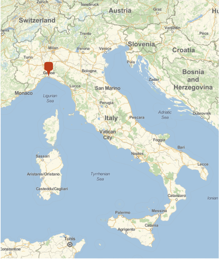
At least 39 people died. The disaster was extensively covered in the international press, see here and here. In the latter article by the BBC a graph is shown that indicates that Italy's infrastructure spending in roads has degrease from about 14 billion Euros in 2007 to slightly above 5 billion Euros in 2015. Is there a lack of investment into the road infrastructure? What is the state of our national bridges? Can a computational approach help citizens to better understand what the situation is and help them to make political decisions?
In this post I will explore some very simple representations to visualise some datasets; I will use the example of Germany for the most part. Many representations are inspired by an article in "Die Welt". At the bottom of the article they also offer a link to a google spreadsheet with data that we will use later. We will start with the data from the "Bundesstaat fuer Strassenwesen (BASt)", which is available here.
Data import and preparation
The data files we will look at contain the locations of all bridges in Germany with a quality grade and some additional information. We will start by importing the data
data = Import["/Users/thiel/Desktop/Zustandsnoten-excel.xlsx"];
The content of that table looks like so:

It has 51592 rows. The important column for us are the last three. The last two contain location data of the bridge (in the UTM32N system). The third column to the end contains a grade indicating the quality of the bridge. We will store the quality rules in the variable states:
states = {{1., 1.4, "very good"}, {1.5, 1.9, "good"}, {2.0, 2.4, "safe & sound"}, {2.5, 2.9, "suffient"}, {3.0, 3.4, "poor"}, {3.5,4.0, "very poor"}};
The first two elements of every entry indicate the range of values in which a certain descriptor (third entry) is achieved. The translations to English are a bit subjective. The last two categories (poor and very poor) are considered to be problematic.
We start with a graphic of the locations of all bridges in Germany - in fact we have to filter out some for which the location data is not available.
styling = {GeoBackground -> GeoStyling["StreetMapNoLabels", GeoStylingImageFunction -> (ImageAdjust@ColorNegate@ColorConvert[#1, "Grayscale"] &)], GeoScaleBar -> Placed[{"Metric", "Imperial"}, {Right, Bottom}], GeoRangePadding -> Full, ImageSize -> Large};

GeoGraphics[{GeoStyling[RGBColor[1, 0.85, 0], Opacity[1]], GeoDisk[#, Quantity[3, "Kilometers"]]} &
/@ (GeoPosition[GeoGridPosition[#, GeoProjectionData["UTMZone32"]]] & /@ (Cases[ToExpression
/@ data[[1, 2 ;;, -2 ;;]], {_Real, _Real}])), styling]
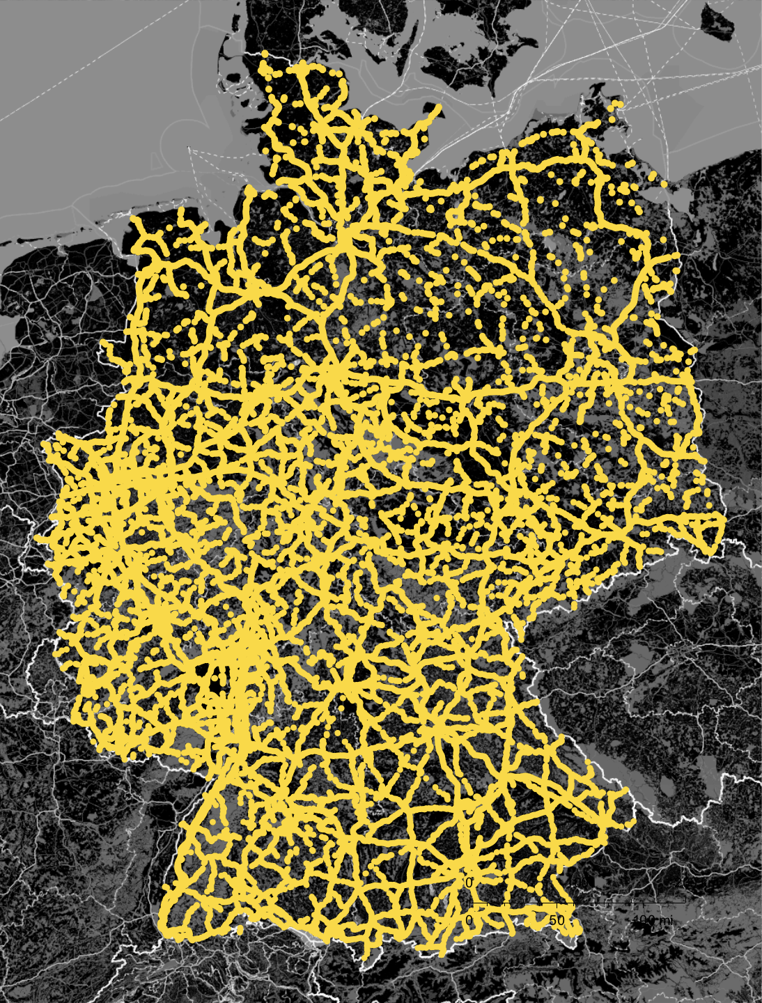
Note, that we convert the UTM32 data to standard GeoPosition entries within the command. Also, it might be quite unexpected that I use GeoGraphics with GeoDisk to visualise the data - GeoListPlot appears to be the more natural choice. Using the latter, I did have problems to plot all points and to properly size the dots. So I went for GeoGraphics and GeoDisk.
Cleaning the data some more
In order to visualise the positions of the bridges that are in a poor or very poor state. For that we define a little helper function:
fquality = (Which @@ Flatten[{#[[1]] <= dummy <= #[[2]], #[[3]]} & /@ states] /. dummy -> #) &
Not elegant, but it does the job. With that we adjust the dataset
cleanDataset = {GeoPosition[GeoGridPosition[#[[2 ;; 3]],
 GeoProjectionData["UTMZone32"]]], #[[1]], fquality[#[[1]]]} & /@
 Cases[ToExpression /@   data[[1, 2 ;; ;; 1, -3 ;;]], {_, _Real, _Real}];
The entries look like this now:
cleanDataset[[1]]

We also want to compute in which province (Bundesland) the bridge is located. So first we get the list of provinces:
provinces = Entity["Country", "Germany"][EntityProperty["Country", "AdministrativeDivisions"]];
The idea was to use GeoWithinQ or so to compute this. This for example
whereQ = Which[GeoWithinQ[Entity["AdministrativeDivision", {"BadenWurttemberg", "Germany"}], #1],
Entity["AdministrativeDivision", {"BadenWurttemberg", "Germany"}],  GeoWithinQ[Entity["AdministrativeDivision", {"Bavaria", "Germany"}], #1],  Entity["AdministrativeDivision", {"Bavaria", "Germany"}], GeoWithinQ[Entity["AdministrativeDivision", {"Berlin", "Germany"}], #1], Entity["AdministrativeDivision", {"Berlin", "Germany"}], GeoWithinQ[Entity["AdministrativeDivision", {"Brandenburg", "Germany"}], #1],Entity["AdministrativeDivision", {"Brandenburg", "Germany"}],   GeoWithinQ[Entity["AdministrativeDivision", {"Bremen", "Germany"}], #1], Entity["AdministrativeDivision", {"Bremen", "Germany"}], GeoWithinQ[Entity["AdministrativeDivision", {"Hamburg", "Germany"}], #1], Entity["AdministrativeDivision", {"Hamburg", "Germany"}],  GeoWithinQ[Entity["AdministrativeDivision", {"Hesse", "Germany"}], #1], Entity["AdministrativeDivision", {"Hesse", "Germany"}], GeoWithinQ[Entity["AdministrativeDivision", {"LowerSaxony", "Germany"}], #1], Entity["AdministrativeDivision", {"LowerSaxony", "Germany"}], GeoWithinQ[Entity["AdministrativeDivision", {"MecklenburgWesternPomerania", "Germany"}], #1], Entity["AdministrativeDivision", {"MecklenburgWesternPomerania", "Germany"}], GeoWithinQ[
Entity["AdministrativeDivision", {"NorthRhineWestphalia", "Germany"}], #1], Entity["AdministrativeDivision", {"NorthRhineWestphalia", "Germany"}], GeoWithinQ[Entity["AdministrativeDivision", {"RheinlandPalatinate", "Germany"}], #1], Entity["AdministrativeDivision", {"RheinlandPalatinate", "Germany"}], GeoWithinQ[Entity["AdministrativeDivision", {"Saarland", "Germany"}], #1], Entity["AdministrativeDivision", {"Saarland", "Germany"}], GeoWithinQ[Entity["AdministrativeDivision", {"Saxony", "Germany"}], #1], Entity["AdministrativeDivision", {"Saxony", "Germany"}], GeoWithinQ[
Entity["AdministrativeDivision", {"SaxonyAnhalt", "Germany"}], #1], Entity["AdministrativeDivision", {"SaxonyAnhalt", "Germany"}], GeoWithinQ[Entity["AdministrativeDivision", {"SchleswigHolstein",
"Germany"}], #1], Entity["AdministrativeDivision", {"SchleswigHolstein", "Germany"}],GeoWithinQ[
Entity["AdministrativeDivision", {"Thuringia", "Germany"}], #1], Entity["AdministrativeDivision", {"Thuringia", "Germany"}]] &
does the trick:
whereQ[cleanDataset[[3, 1]]]
(*Entity["AdministrativeDivision", {"SchleswigHolstein", "Germany"}]*)
but is far too slow. So we will use the polygons of the provinces:
polygons = (#["Polygon"] /. GeoPosition -> Identity) & /@ provinces;
It turns out that this is not sufficient. Some provinces "have a hole", i.e. a city inside that is not part of the province but rather an administrative unit in its own right. This leads to two provinces having the head FilledCurve rather than Polygon. We can fix this like so:
polygonsfixed = If[Head[#] === FilledCurve, Polygon[#[[1, 1, 1, 1]] /. Line -> Polygon], #] & /@ polygons;
This basically ignores the hole. What we will do later is make sure that we first check whether a bridge is in the city (the hole inside) - if not we use the larger province surrounding it. The next command takes a while to run:
Monitor[bridgeprovince = (provinces[[#]] & /@
Flatten /@ Table[Position[RegionMember[#, cleanDataset[[k, 1, 1]]] & /@ polygonsfixed,
True], {k, 1, Length[cleanDataset]}]) /. {} -> {Missing}, k]
It turns out that some bridges are not properly localised. The following code fixes that (it relies on the fact that the list is ordered by province anyway!).
bridgeprovinceclean = bridgeprovince[[All, 1]] //. {a___, x_, Missing, b___} -> {a, x, x, b};
Let's build one list of lists containing all that data:
totalData = Flatten /@ Transpose[{cleanDataset, bridgeprovinceclean /. Missing ->
Entity["AdministrativeDivision", {"SchleswigHolstein", "Germany"}]}];
The data looks like this now:
totalData[[1 ;; 5]] // TableForm
Some statistics and visualisations of the data
We can now count how many bridges in Germany are in a certain state:
tallyData = Tally[totalData[[All, -2]]][[Ordering[Flatten[Position[states, #] & /@ Tally[totalData[[All, -2]]][[All, 1]], 1][[All, 1]]]]]
which gives

Let's make a bar chart of that:
BarChart[tallyData[[All, 2]], ChartLabels -> Evaluate[Rotate[#, Pi/2] & /@ tallyData[[All, 1]]],
LabelStyle -> Directive[Bold, 15], PlotTheme -> "Marketing"]
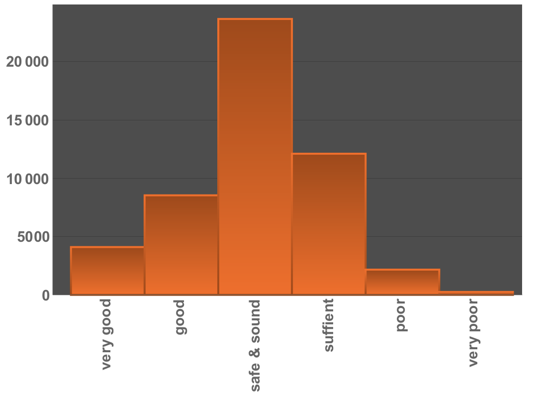
Most bridges are in the "safe & sound" state; a non-negligible number is in the states "poor" or "very poor". Let's first select the bridges in the last two categories:
badBridges = Select[totalData, (#[[3]] == "poor" || #[[3]] == "very poor") &];
There are 2413 bridges in that category now, and there are their locations:
GeoGraphics[{GeoStyling[RGBColor[1, 0.0, 0], Opacity[1]], GeoDisk[#, Quantity[3, "Kilometers"]]} & /@ badBridges[[All, 1]], styling]
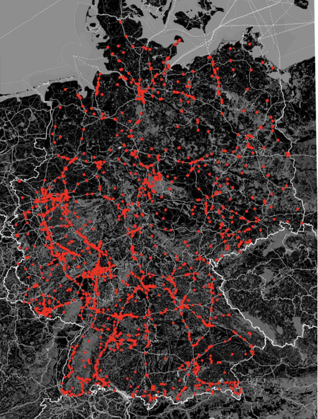
So, if you live in Germany, there is probably one of those bad bridges close to you. A GeoSmoothHistogram helps us to visualise the distribution of those bridges:
GeoSmoothHistogram[badBridges[[All, 1]], GeoRange -> Entity["Country", "Germany"],
ColorFunction -> "TemperatureMap", styling]
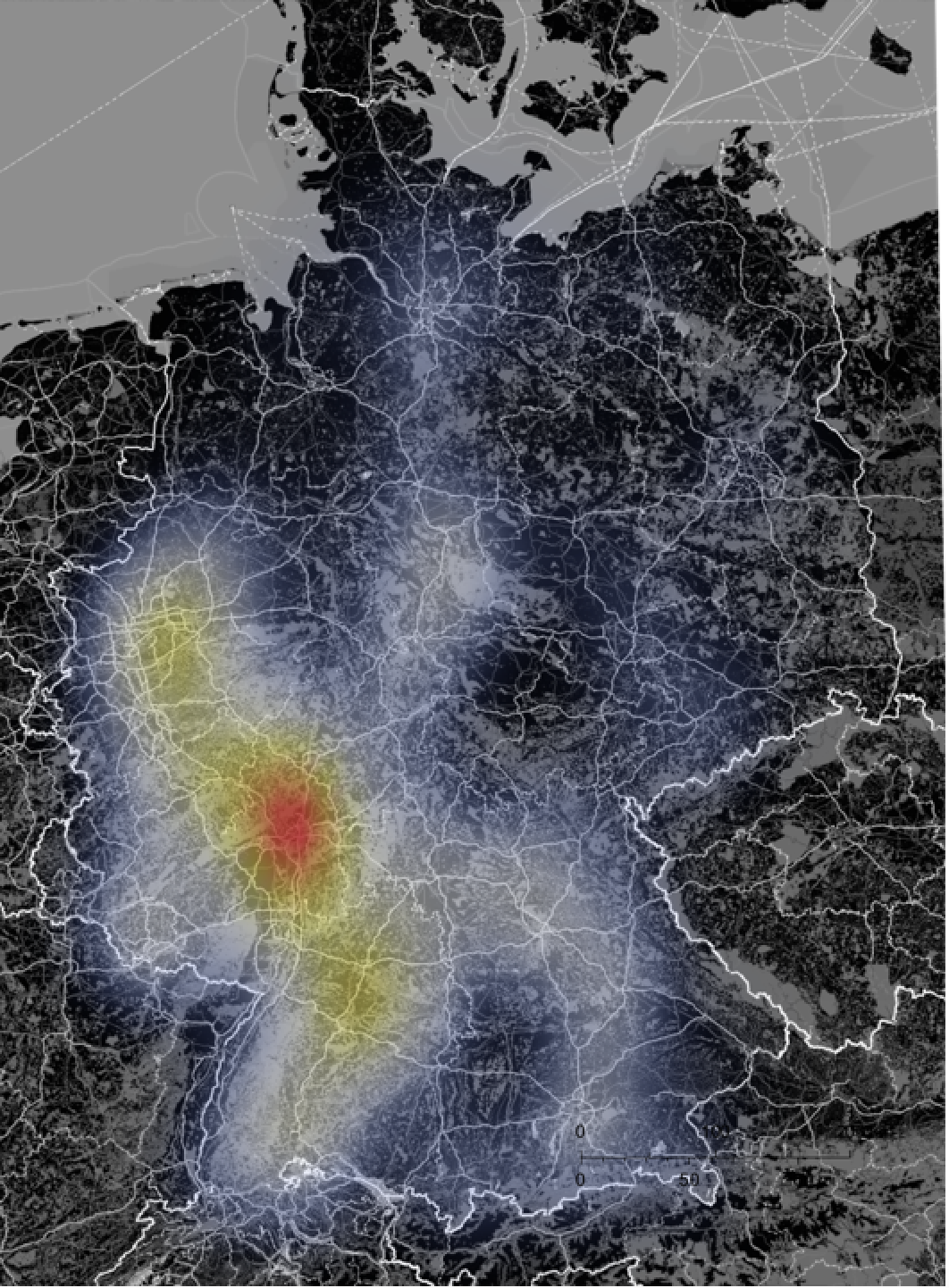
It is obvious that there are some areas where the problems are more acute than in other regions. We can represent good vs not-so-good bridges in Germany like so:
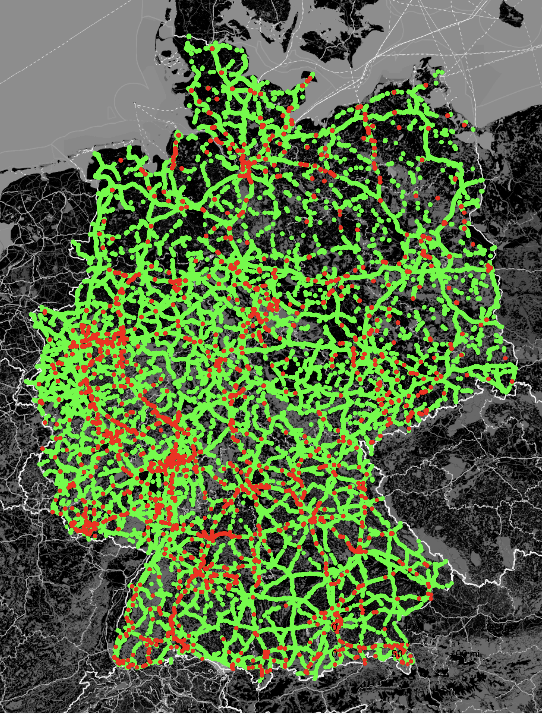
nonbadBridges = Select[totalData, ! (#[[3]] == "poor" || #[[3]] == "very poor") &];
GeoGraphics[Join[{GeoStyling[RGBColor[0, 1., 0], Opacity[1]], GeoDisk[#, Quantity[3, "Kilometers"]]} & /@ nonbadBridges[[All, 1]], {GeoStyling[RGBColor[1, 0.0, 0], Opacity[1]], GeoDisk[#, Quantity[3, "Kilometers"]]} & /@ badBridges[[All, 1]]], styling]
Satellite images
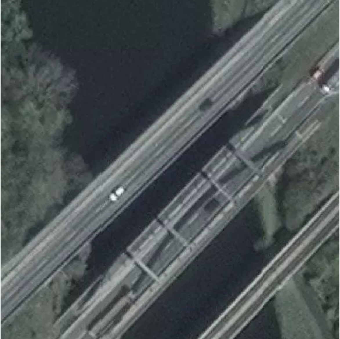
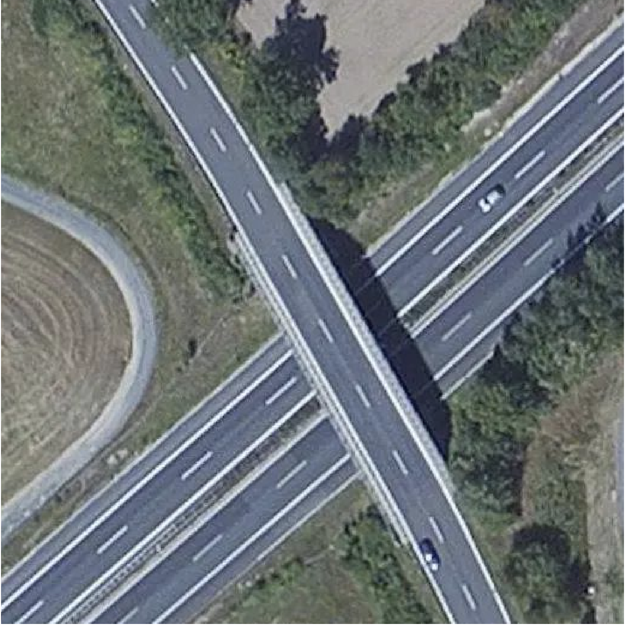
The Wolfram Language allows us to take a deeper look at the individual bridges by using satellite data. Let's first get some images of bridges in a poor state:
GeoImage[#, GeoRange -> Quantity[50, "Meters"]] & /@ RandomSample[badBridges][[1 ;; 25, 1]]
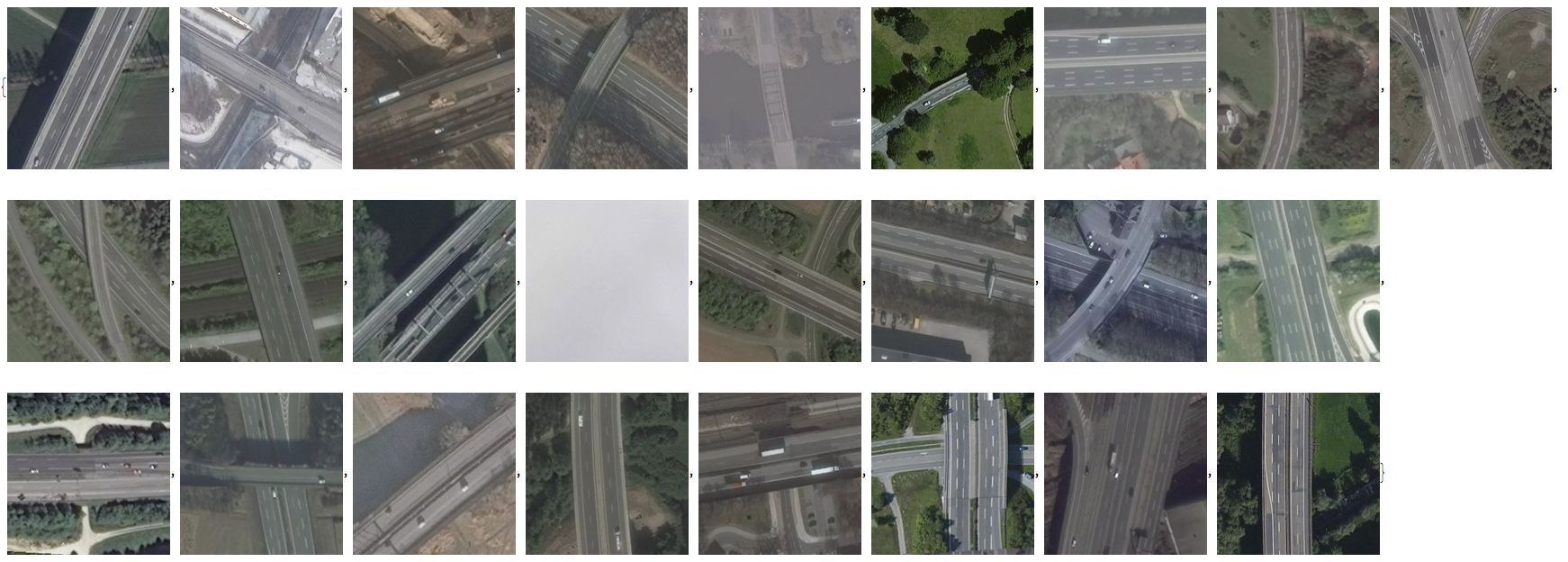
These images have an excellent resolution and allow us to study the bridges in greater detail:
Likewise we can look at the good bridges:
goodBridges = Select[totalData, ! (#[[3]] == "good" || #[[3]] == "very good") &];
GeoImage[#, GeoRange -> Quantity[50, "Meters"]] & /@ RandomSample[goodBridges][[1 ;; 25, 1]]
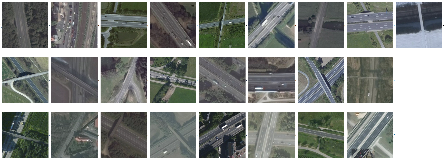
Again the resolution is very good for individual images:
I was first thinking about developing a machine learning approach to try and estimate the state of a bridge from images, but that seems impossible at this level.
How good are different administrative divisions addressing infrastructure
Next, we look for regional variations. We gather the data by province:
byprovince = GatherBy[totalData, Last];
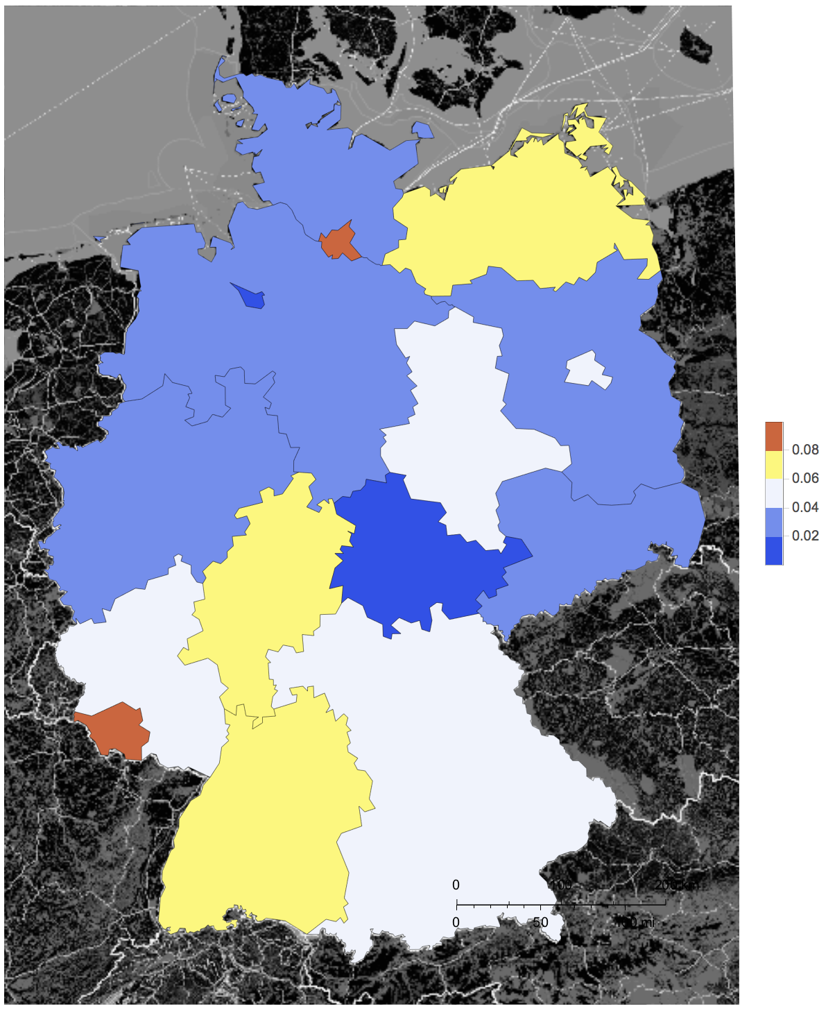
and plot the ratio of poor bridges vs all bridges
GeoRegionValuePlot[Rule @@@ SortBy[Table[{byprovince[[k, 1, -1]],
N@Length[Select[byprovince[[k, All, 3]], (# == "poor" || # == "very poor") &]]/
Length[byprovince[[k]]]}, {k, 1, Length[byprovince]}], Last], GeoRange -> Entity["Country", "Germany"], styling, ColorFunction -> "TemperatureMap"]
Relationship between age and state of the bridge
"Die Welt" offers consolidated data in an additional link (which also contains the name of the province, so we could have saved the effort above). We import the data
weltData = Import["/Users/thiel/Desktop/DIE WELT_ Zustand der Fernstraßenbrücken - Daten.tsv"];
It also contains the grades of the bridges for several consecutive test periods and for some bridges (in two of the provinces) the year it was built. Let's clean that
weltDatawDates = Select[weltData[[2 ;;]], #[[-1]] =!= "" &]
and collect the built year vs rating:
builtdatevsmark = {#[[1]], ToExpression[StringReplace[ToString[#[[2]]], "," -> "."]]} & /@ weltDatawDates[[All, {-1, 4}]]
A simple ListPlot of that looks rather boring:
ListPlot[builtdatevsmark]
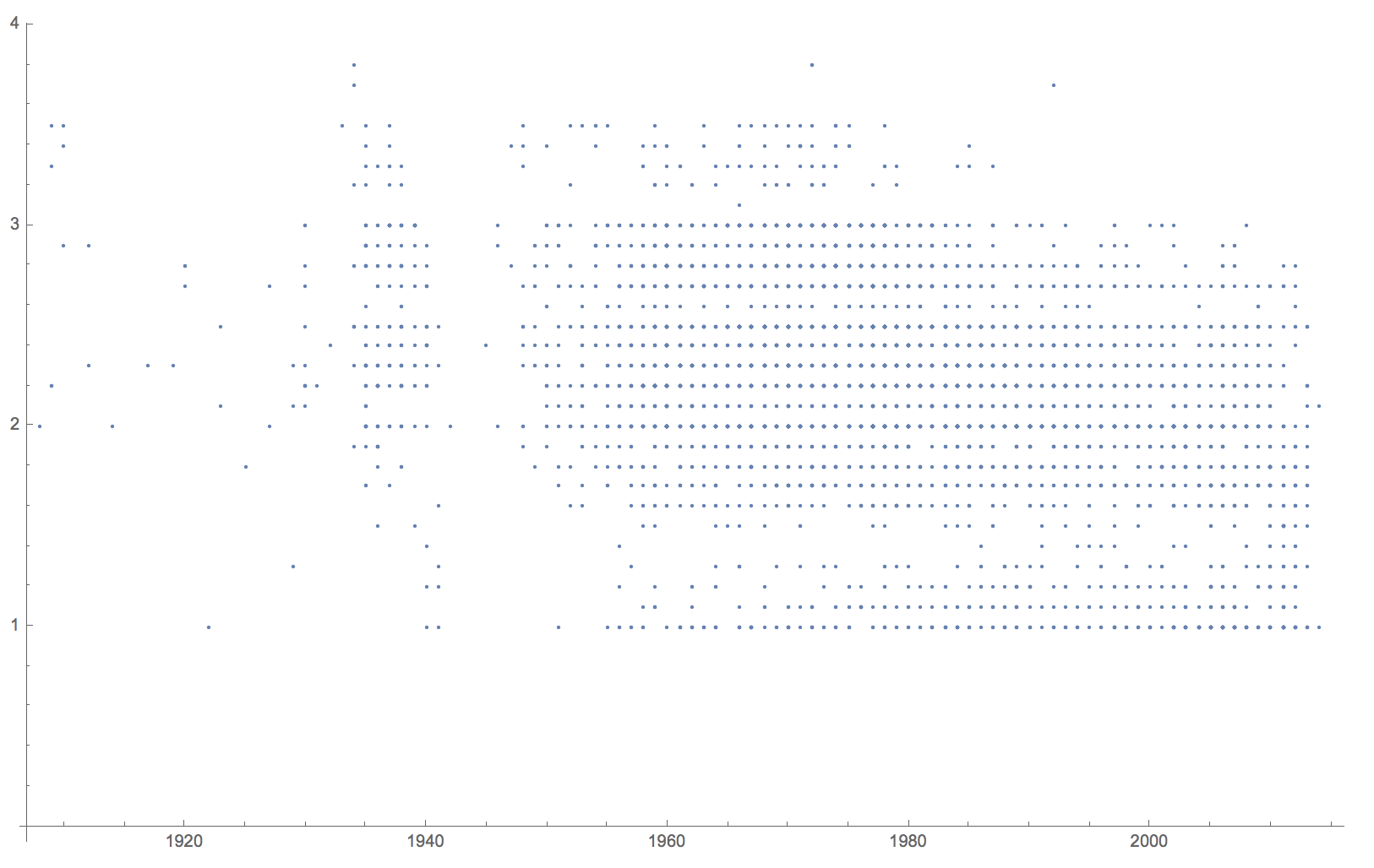
and is difficult to interpret. But with a little bit of work we can make it much more useful
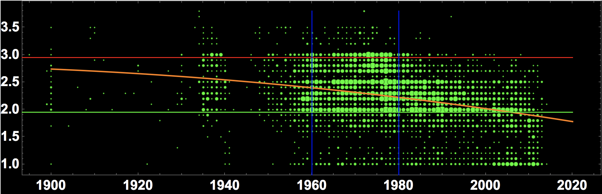
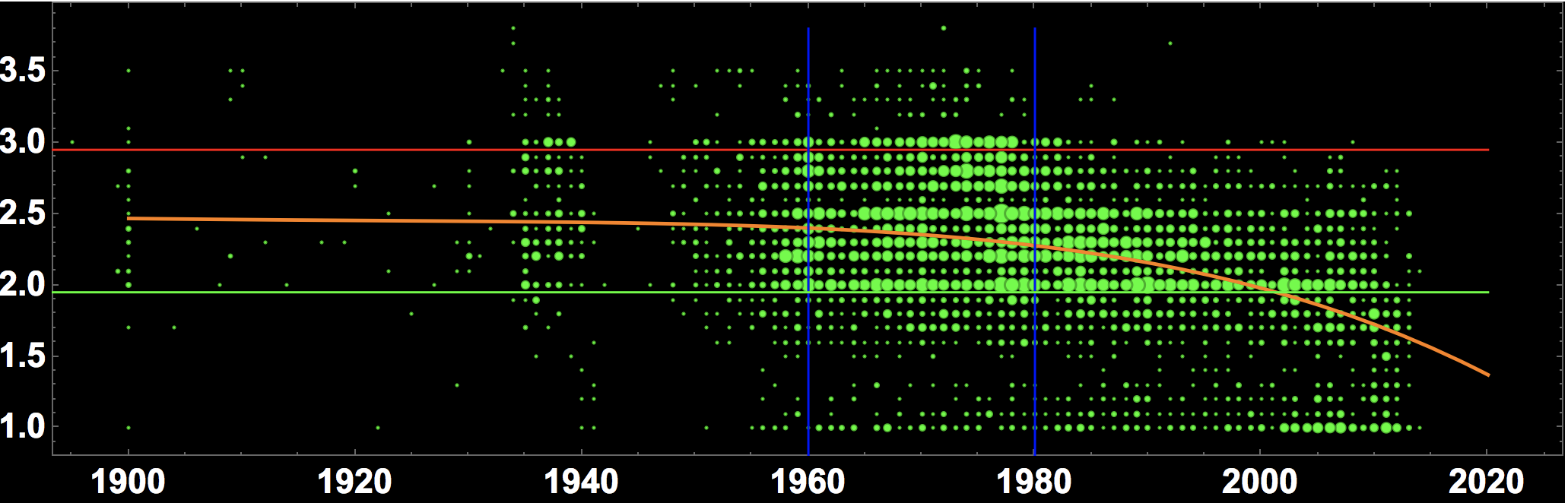
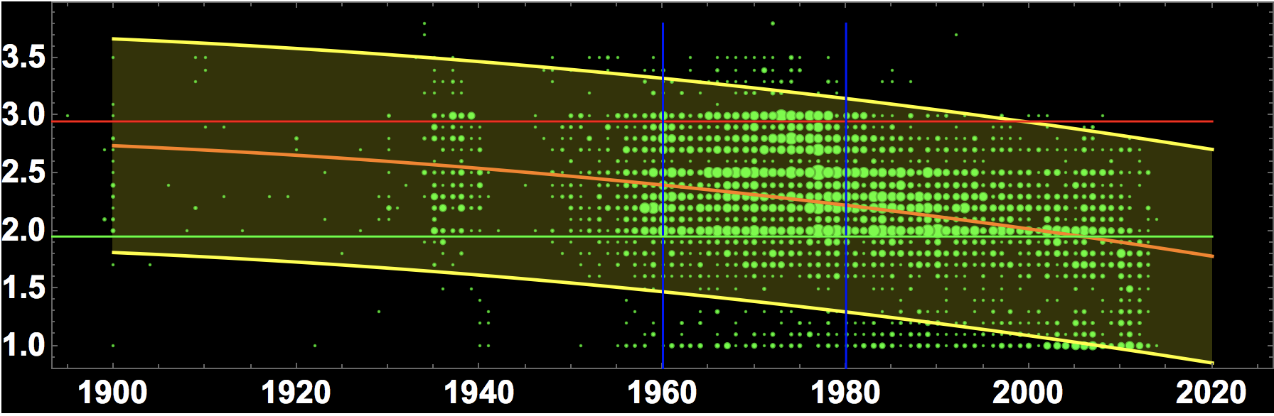
BubbleChart[Flatten /@ Tally[builtdatevsmark], PlotRange -> {{1900, 2020}, All},
ColorFunction -> Function[{x, y, r}, Lighter[Green, r/41.]], AspectRatio -> 0.3, BubbleSizes -> {0.01, 0.05}, Background -> Black,LabelStyle -> Directive[Bold, 15, White], Epilog -> {Red, Line[{{1890, 2.95}, {2020, 2.95}}], Blue, Line[{{1960, 0.8}, {1960, 3.8}}], Line[{{1980, 0.8}, {1980, 3.8}}],
Green, Line[{{1890, 1.95}, {2020, 1.95}}]}]
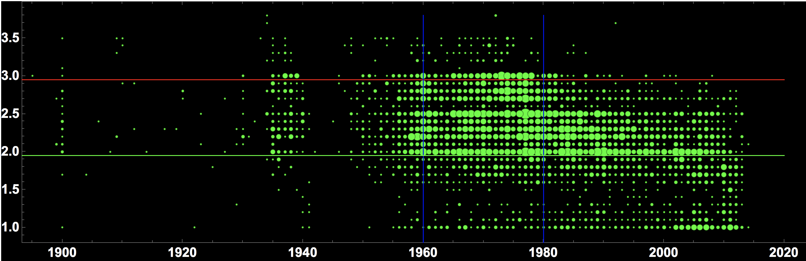
The x-axis shows the year the bridge was built. The y-axis the quality of the bridge - small numbers are better marks. The size of the bubbles roughly indicates the number of bridges at that coordinate. The red line indicates the quality threshold. Everything above is rather problematic. The green line separates the bridges in excellent states (below it) from the ok-ish bridges (above). The blue lines indicate a period from 1960-1980, which has a high proportion of bridges with issues. Bridges build after 1980 appear to be in a much better state in general. Bridges built after 2000 are usually in quite good states. This broadly suggests that bridges that are up to 20 years old are usually quite good. Bridges that are between 20-40 years old get slowly worse, and from 40-60 years old they start needing more maintenance. Another historically interesting fact is that this suggests that there were many bridges built during the Third Reich, from say 1935 to about 1941 or so. In the 10 years after the war notably fewer bridges seem to have been built.
To help illustrate that point one could also plot the regression line (orange below). We will use a linear and a quadratic model:
nlm = LinearModelFit[builtdatevsmark, {1, x}, x] nlm2 = LinearModelFit[builtdatevsmark, {1, x, x^2}, x]
and then plot it:
Show[BubbleChart[Flatten /@ Tally[builtdatevsmark],
  PlotRange -> {{1900, 2020}, All},
  ColorFunction -> Function[{x, y, r}, Lighter[Green, r/41.]],
  AspectRatio -> 0.3, BubbleSizes -> {0.01, 0.05},
  Background -> Black, LabelStyle -> Directive[Bold, 15, White],
  Epilog -> {Red, Line[{{1890, 2.95}, {2020, 2.95}}], Blue,
    Line[{{1960, 0.8}, {1960, 3.8}}],
    Line[{{1980, 0.8}, {1980, 3.8}}], Green,
    Line[{{1890, 1.95}, {2020, 1.95}}]}],
 Plot[nlm[x], {x, 1900, 2020}, PlotStyle -> Orange]]

or for the quadratic model (same code as above but nlm2 instead of nlm):
Fitting a 5th order polynomial gives this:
We can also plot bands for the single prediction error.
nlm2["SinglePredictionBands"]
For nlm2 that looks like so:
Show[BubbleChart[Flatten /@ Tally[builtdatevsmark],
  PlotRange -> {{1900, 2020}, All},
  ColorFunction -> Function[{x, y, r}, Lighter[Green, r/41.]],
  AspectRatio -> 0.3, BubbleSizes -> {0.01, 0.05},
  Background -> Black, LabelStyle -> Directive[Bold, 15, White],
  Epilog -> {Red, Line[{{1890, 2.95}, {2020, 2.95}}], Blue,
    Line[{{1960, 0.8}, {1960, 3.8}}],
    Line[{{1980, 0.8}, {1980, 3.8}}], Green,
    Line[{{1890, 1.95}, {2020, 1.95}}]}],
 Plot[{-129.53690036856392` + 0.14262757468838871` x -
    0.00003842565681513884` x^2 -
    1.9603506747760122` \[Sqrt](99.64290933950231` -
        0.20387038807958635` x + 0.00015683763427764343` x^2 -
        5.3645803097817624`*^-8 x^3 +
        6.883592653276127`*^-12 x^4), -129.53690036856392` +
    0.14262757468838871` x - 0.00003842565681513884` x^2 +
    1.9603506747760122` \[Sqrt](99.64290933950231` -
        0.20387038807958635` x + 0.00015683763427764343` x^2 -
        5.3645803097817624`*^-8 x^3 + 6.883592653276127`*^-12 x^4),
   nlm2[x]}, {x, 1900, 2020}, PlotStyle -> {Yellow, Yellow, Orange},
  Filling -> {{1 -> {3}, 2 -> {3}}}]]
Infrastructure spending
The OECD offers great data on the infrastructure spending of different countries here. We import that data:
spending = Import["/Users/thiel/Desktop/DPLIVE15082018232318196.csv"];
and select the infrastructure spending for roads for different countries over the years:
germanySpending =
  Select[spending, #[[3]] == "ROAD" && #[[1]] == "DEU" &];
spainSpending =
  Select[spending, #[[3]] == "ROAD" && #[[1]] == "ESP" &];
italySpending =
  Select[spending, #[[3]] == "ROAD" && #[[1]] == "ITA" &];
franceSpending =
 Select[spending, #[[3]] == "ROAD" && #[[1]] ==
     "FRA" &]; usaSpending =
 Select[spending, #[[3]] == "ROAD" && #[[1]] == "USA" &];
greeceSpending =
  Select[spending, #[[3]] == "ROAD" && #[[1]] == "GRC" &];
ukSpending =
 Select[spending, #[[3]] == "ROAD" && #[[1]] ==
     "GBR" &]; russiaSpending =
 Select[spending, #[[3]] == "ROAD" && #[[1]] == "RUS" &];
luxemburgSpending =
 Select[spending, #[[3]] == "ROAD" && #[[1]] ==
     "LUX" &]; russiaSpending =
 Select[spending, #[[3]] == "ROAD" && #[[1]] == "RUS" &];
If we plot this, we reproduce the plot of CNN, and get a better range than the BBC:
DateListPlot[{{DateObject[ToString[#[[1]]]], #[[2]]} & /@
   germanySpending[[All, -3 ;; -2]], {DateObject[
      ToString[#[[1]]]], #[[2]]} & /@
   spainSpending[[All, -3 ;; -2]], {DateObject[
      ToString[#[[1]]]], #[[2]]} & /@ italySpending[[All, -3 ;; -2]],
  {DateObject[ToString[#[[1]]]], #[[2]]} & /@
   ukSpending[[All, -3 ;; -2]], {DateObject[
      ToString[#[[1]]]], #[[2]]} & /@
   russiaSpending[[All, -3 ;; -2]]}, PlotTheme -> "Marketing",
 LabelStyle -> Directive[Bold, 15],
 PlotLegends -> {"Germany", "Spain", "Italy", "United Kingdom",
   "Russia"}, ImageSize -> Large, FrameLabel -> {"year", "spending"}]
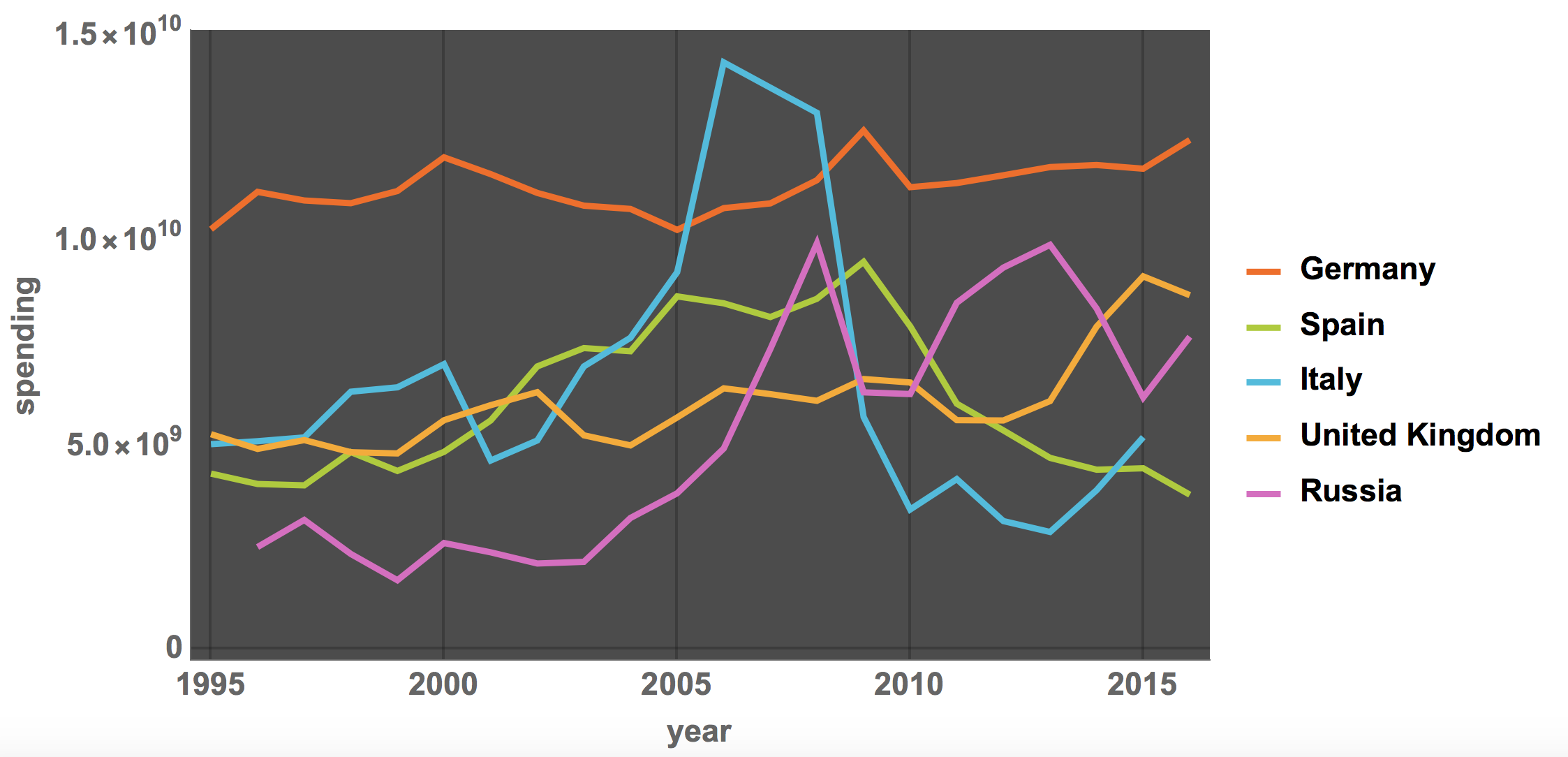
The BBC article only shows the range from 2007 to 2016, a phase in which the infrastructure spending in Italy (and Spain) has fallen substantially. This could be used to make the case that a lack of infrastructure spending by Italy might have contributed to the disaster. The full period from 1995, however, shows that Italy went through a phase of higher investments from 2004-2008 and then returned to values slightly lower than before 2004. Note also that this is the total spending and not normalised by population size, GDP or size of the road network. If for example we also plot the graph for the United States the diagram looks like this:
DateListPlot[{{DateObject[ToString[#[[1]]]], #[[2]]} & /@
   germanySpending[[All, -3 ;; -2]], {DateObject[
      ToString[#[[1]]]], #[[2]]} & /@
   spainSpending[[All, -3 ;; -2]], {DateObject[
      ToString[#[[1]]]], #[[2]]} & /@ italySpending[[All, -3 ;; -2]],
  {DateObject[ToString[#[[1]]]], #[[2]]} & /@
   ukSpending[[All, -3 ;; -2]], {DateObject[
      ToString[#[[1]]]], #[[2]]} & /@
   russiaSpending[[All, -3 ;; -2]], {DateObject[
      ToString[#[[1]]]], #[[2]]} & /@ usaSpending[[All, -3 ;; -2]]},
 PlotTheme -> "Marketing", LabelStyle -> Directive[Bold, 15],
 PlotLegends -> {"Germany", "Spain", "Italy", "United Kingdom",
   "Russia", "USA"}, ImageSize -> Large,
 FrameLabel -> {"year", "spending"}, PlotRange -> All]
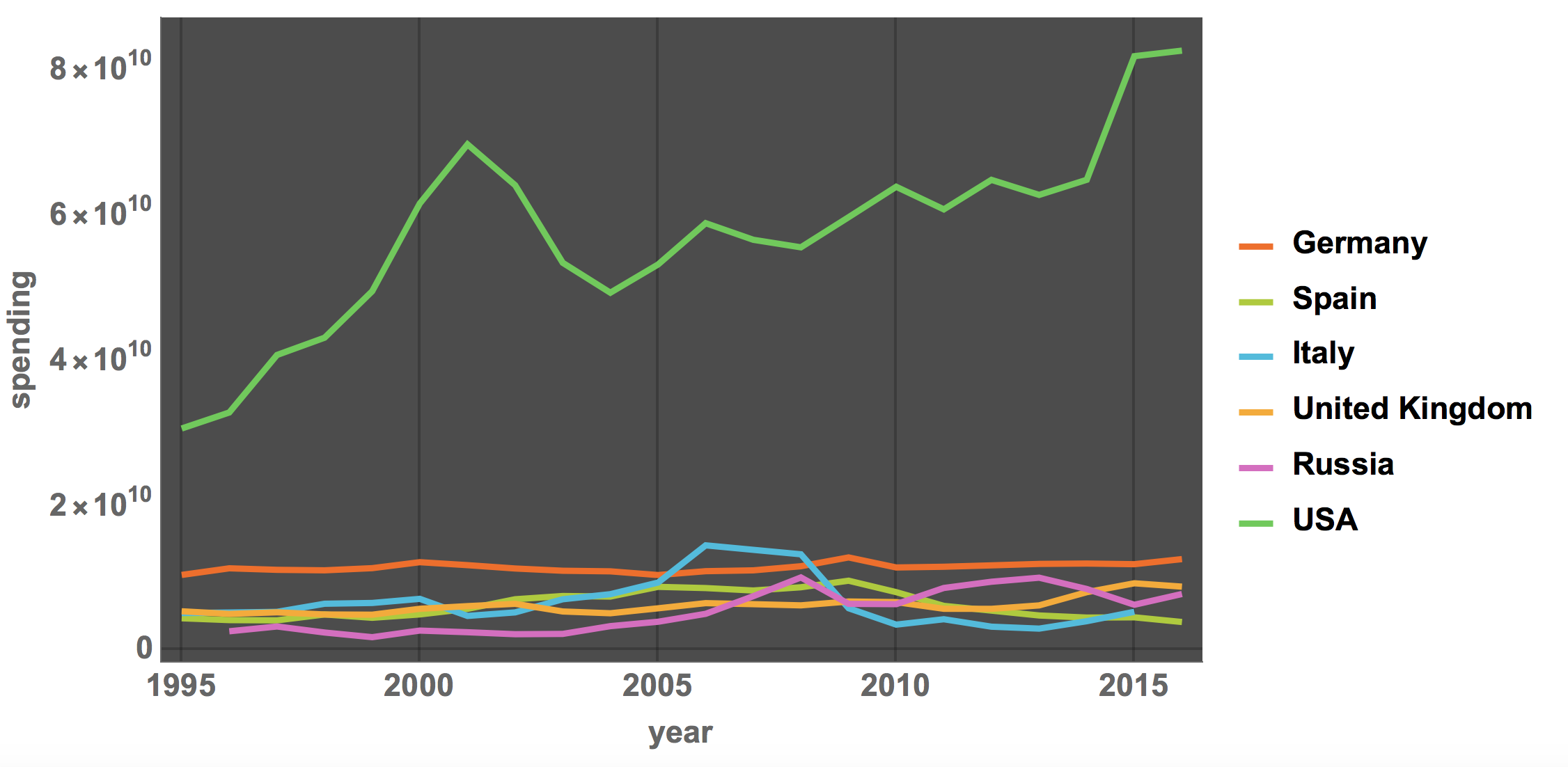
where the United States dwarf the spending by the (much smaller) European countries. There does, however, appear to be a trend of increasing infrastructure spending in the United States.
(Preliminary) Conclusion
We have developed a couple of graphs visualising some data about the state of bridges and produced some graphs that would appear in news coverage of the Genoa disaster. We have pulled in satellite date to inspect the bridges and seen how easy it is in the Wolfram Language to asks your own questions and get meaningful representations. This is, of course, only a shot computational essay, and by no means a comprehensive analysis. In fact, many questions can be asked next. Do different types of bridges age better (or worse)? Could additional data such as accelerometer data from mobile phones in cars that drive over bridges help to "measure" the state of the bridge? Could we use dash cam footage? There is data on cars using individual roads; could we build a model to suggest which bridges to fix first in order to minimise risk to people? It is should be easy to use TravelDirectionsData to get a warning about problematic bridges on the way.
If citizens perform this or similar types of analysis it might help to prompt politicians or the administration to act when there is a hazard. The Wolfram Language is a great tool to enable us to do so.
PS: By the way, if you want to do the same analysis for the United States, this dataset might be useful.


