There are a number of so-called Styled notebooks available for writing journal papers, preprints, but they all have their own styles and limitations. Since I am usually writing my papers with LaTeX, I think it would be useful to have a Styled notebook which has the looks as a LateX output. Of course you might ask why do not use LaTeX directly instead, but the answer is that at the same time I want to keep all other functionality of Mathematica.
More generally, such a notebook would be useful for two reasons. One, if the emphasis is on the calculations, then of course a default notebook will do, but it will only be readable for the author. To make it useful also for others, then, with the notebook I am seeking, one can comment the formulae in an aesthetically pleasing form in between the input formulae/calculations. This is very useful if two or more people collaborate on a subject (I try to establish this with my PhD students). Two, if one collects all the calculations at the end of the file like an Appendix and makes a rich description in the first part of the notebook of what the calculations are about, then one will have in the end a nearly ready draft of a paper which can very easily be converted into LaTeX for journal submission. So until the last step, one would work within one file for calculations, plotting, and paper writing, and producing a paper/preprint etc. from the material would be significantly reduced.
The main message of this note is that I got to somewhere in such an effort which I would be glad to share with the Community, as well as to get some feedback and help with some open questions, described below. There is at least one puzzle for the real hackers, if anyone is interested in such. I am also aware that in some cases I am knocking on open doors, and what I am looking for is already solved, probably more elegantly. I appreciate any such info.
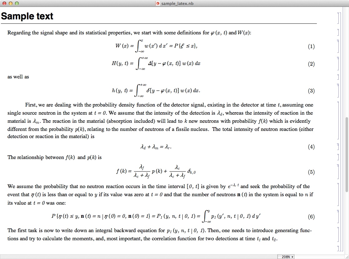
Here is a snapshot of part of a sample notebook that I created, which shows the text generated and illustrates the problems.

One nice feature which the above illustrates, and which is far from trivial, that the expressions in the display equations are italic, but the equation numbers are plain. This was achieved by editing the corresponding style definition by kind help of Martin Hadley of Wolfram Research. This is the definition of the style of EquationNumbered:
Cell[StyleData["EquationNumbered"],
CellMargins->{{60, Inherited}, {Inherited, Inherited}},
CellFrameLabels->{{None,
Cell[
TextData[{
StyleBox["(", FontSlant -> "Plain"],
CounterBox["EquationNumbered"],
StyleBox[")", FontSlant -> "Plain"]}], "EquationNumberedEquationNumber", FontSlant ->
Plain]}, {None, None}},
DefaultFormatType->TraditionalForm,
TextAlignment->Center,
CounterIncrements->"EquationNumbered",
MenuSortingValue->1450,
MenuCommandKey->"6",
FontFamily->"Euclid",
FontSlant->"Italic"]
The problems that remain, also illustrated in the sample text above, are that
- numbers should be plain and not slanted (i.e. not italic)
- the Greek symbols are already slanted in Euclid by default, and putting the slant to italic of the Euclid makes the slanting of the Greek symbols
twice that of the latin ones.
Martin had an interesting suggestion, to use the command
LanguageCategory->"Formula"
in the style definition. Here comes the real thriller

. This definition indeed keeps numbers straight, and other symbols slanted. However, the slanted property will be valid only to
single characters. So one would have correctly forms like (1 +
a), with "a" in italic, but it would turn to (1 + ab) with "ab" in plain, if instead of the single "a" the symbol is "ab". This is a mystery which would be interesting to understand.
I uploaded the full sample notebook from which a graphical excerpt is shown above, to
https://www.dropbox.com/s/zvx7a3fc4lu00ba/sample_latex.nbIt contains also the description of the goals and problems which are described in this discussion
It would be great to get comments on the usefulness of the idea, on the solution of the remaining problems, and possibly about already existing solutions which I am not aware of.
Best regards
Imre