Message Boards Message Boards

Analytics of Republican Debate and network percolation

Alan Joyce sent me some neat code of analysis of Republican Debate Sep. 16, 2015. Please do see his analytics below. Transcripts of debate can be found online. Alan mined most popular words used by the candidates filtered and re-weighted by different criteria. Properly weighted WordClouds are a good way to grasp key topics.

I just wanted to point to graph & networks take on the data. I thought that some candidates may share some top words they use. So if the candidates are nodes, then a weighted edge between them reflects upon how many top words they share. If you consider 1 top word per candidate then the graph will be completely disconnected as each candidate has own unique single top word. As you increase top words' pool some of them will be common and shared between some candidates and links between nodes will appear.

Percolation is the moment when, driven by top-words pool-size, all candidates become connected. In the opposite limit of large pool-size all candidates are connected and we get a complete graph. So below is the percolation moment that happens at 5 top words per candidate. It is indicative of which candidates speak about top common subjects.

CommunityGraphPlot[HighlightGraph[SetProperty[g, EdgeLabels -> None], Table[Style[e, Opacity[.7], 
    Thickness[.005 PropertyValue[{g, e}, EdgeWeight]]], {e, EdgeList[g]}]], 
 CommunityBoundaryStyle -> Directive[Red, Dashed, Thick], 
 CommunityRegionStyle -> {Directive[Opacity[.1], Red], 
   Directive[Opacity[.1], Yellow], Directive[Opacity[.1], Blue]}]

enter image description here

The edge thickness is reflective of number of common words. Grouping shows clustering of candidates around common words. And vertex size come from DegreeCentrality. DegreeCentrality will give high centralities to vertices that have high vertex degrees. So candidates with top words similar to more other candidates will have larger vertices. Clustered CommunityGraphPlot was derived from the top words:

topWords = Sort[Normal[highFrequencyForCloud[#]], #1[[2]] > #2[[2]] &][[;; 5]][[All, 1]] & /@ candidates;
TableForm[topWords, TableHeadings -> {candidates, None}]

enter image description here

( refining text filters would narrow top words more precisely ) and WeightedAdjacencyGraph:

mocw = Outer[Length[Intersection[#1, #2]] &, topWords, topWords, 1] (1 - IdentityMatrix[10]) /. 0 -> Infinity;
mocw // MatrixForm

g = WeightedAdjacencyGraph[candidates, mocw, VertexLabels -> "Name", 
  EdgeLabels -> "EdgeWeight",EdgeLabelStyle -> 15, VertexLabelStyle -> 14, 
  VertexSize -> "DegreeCentrality", GraphStyle -> "ThickEdge", 
  GraphLayout -> "CircularEmbedding", VertexStyle -> Directive[Opacity[.8], Orange]]

enter image description here

enter image description here

For top words extraction and better refinement see Alan's analysis right below. The notebook is attached to his post.

POSTED BY: Vitaliy Kaurov
15 Replies

enter image description here - another post of yours has been selected for the Staff Picks group, congratulations !

We are happy to see you at the tops of the "Featured Contributor" board. Thank you for your wonderful contributions, and please keep them coming!

POSTED BY: Moderation Team

Hi,

there are two more little things to add. Vitaliy has this fantastic post on measuring interest in the conflicts in Syria and Ukraine. We can of course use the same technique to study people's interest in the presidential candidates:

fullnames = {{"Donald", "TRUMP"}, {"Jeb", "BUSH"}, {"Scott", "WALKER"}, {"Marco", "RUBIO"}, {"Chris", "CHRISTIE"}, {"Ben", 
    "CARSON"}, {"Rand", "PAUL"}, {"Ted", "CRUZ"}, {"Mike", "HUCKABEE"}, {"John", "KASICH"}, {"Carly", "FIORINA"}};
data = WolframAlpha[#[[1]] <> " " <> #[[2]], {{"PopularityPod:WikipediaStatsData", 1}, "ComputableData"}] & /@ full names;

DateListPlot[data, PlotRange -> All, PlotTheme -> "Detailed", AspectRatio -> 1/4, ImageSize -> 800, PlotLegends -> fullnames[[All, 2]]]

enter image description here

It would now be interesting to identify what the peaks mean. Some are more obvious than others, but I have not got a neat and automated way to identify the events that cause these peaks. Vitaliy, I think that in your post you identified the peaks "manually". There are websites like Wikipedia, that list important events for most days. But the data does not appear to suffice to identify peaks at this level of detail automatically. Do you have any idea as to how to automise that?

Another thing is that we could draw an angle path from the sentiment list. This looks like so:

candidates = {"TRUMP", "BUSH", "WALKER", "RUBIO", "CHRISTIE", "CARSON", "PAUL", "CRUZ", "HUCKABEE", "KASICH", "FIORINA"};
sentimentlist = Table[-"Negative" + "Positive" /. ((Classify["Sentiment", #, "Probabilities"] & /@ #) &@TextSentences@Part[debateBySpeaker[#] & /@ candidates, k]), {k, 1, Length[candidates]}];
ListLinePlot[AnglePath[#] & /@ sentimentlist, PlotLegends -> candidates, ImageSize -> Large]

enter image description here

This plot is (relatively) easy to interpret: if the sentences are positive the curve bends left, otherwise right.

Cheers,

Marco

POSTED BY: Marco Thiel

Very interesting, Marco! The Wiki data can actually be used to reflect on what candidates people view as related. Again your data:

fullnames = {{"Donald", "TRUMP"}, {"Jeb", "BUSH"}, {"Scott", "WALKER"}, {"Marco", "RUBIO"}, 
                     {"Chris", "CHRISTIE"}, {"Ben", "CARSON"}, {"Rand", "PAUL"}, {"Ted", "CRUZ"}, 
                     {"Mike", "HUCKABEE"}, {"John", "KASICH"}, {"Carly", "FIORINA"}};

data = ParallelMap[WolframAlpha[#[[1]] <> " " <> #[[2]], 
{{"PopularityPod:WikipediaStatsData", 1}, "ComputableData"}] &, fullnames];

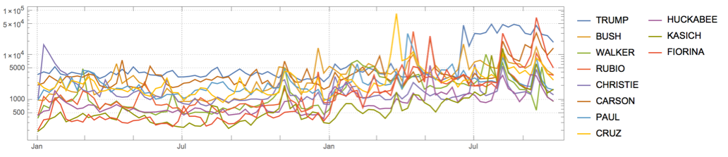
But I'll get the last year to be fair to the recent campaign and use log plot to see better the details:

recent = TimeSeriesWindow[#, {{2014, 1, 1}, Now}] &@ TemporalData[data];
DateListLogPlot[recent, PlotRange -> All, PlotTheme -> "Detailed", AspectRatio -> 1/4, 
 ImageSize -> 800, PlotLegends -> fullnames[[All, 2]]]

enter image description here

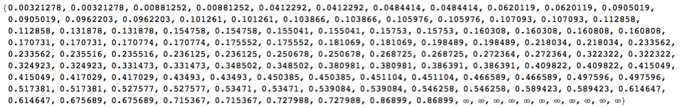
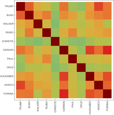
Let's get mutual correlation matrix - note the diagonal INfinity trick - for the self-edge removal in WeightedAdjacencyGraph.

m = Outer[Correlation, #, #, 1] &@ 
QuantityMagnitude[Normal[recent][[All, All, 2]]] (1 - IdentityMatrix[Length[fullnames]]) /. 0. -> Infinity;

Significant negative correlations are hard to get in such data, but positive values can be quite high:

m // Flatten // Sort

enter image description here

MatrixPlot[m, FrameTicks -> {Transpose[{Range[11], #}], Transpose[{Range[11], Rotate[#, Pi/2] & /@ #}]}, 
   ColorFunction -> "Rainbow"] &@fullnames[[All, 2]]

enter image description here

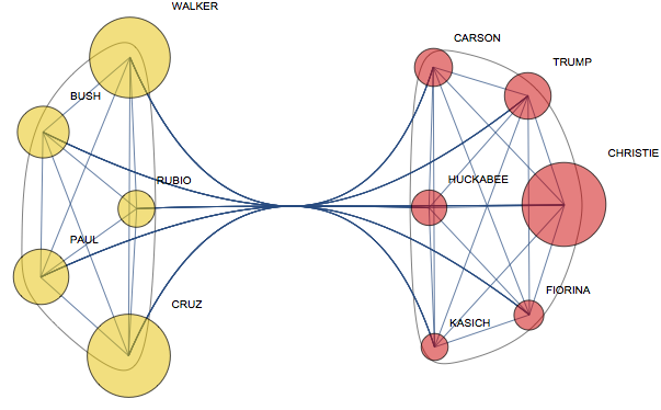
So we are getting a complete weighted graph:

g = WeightedAdjacencyGraph[m, VertexLabels -> Thread[Range[11] -> fullnames[[All, 2]]], 
   VertexSize -> "ClosenessCentrality", VertexStyle -> Opacity[.5]];

FindGraphCommunities still react on EdgeWeight:

comm = FindGraphCommunities[g]

{{1, 5, 6, 9, 10, 11}, {2, 3, 4, 7, 8}}

So I wonder if anyone with actual knowledge of politics can see in this clustering some truth:

CommunityGraphPlot[g, comm]

enter image description here

POSTED BY: Vitaliy Kaurov

Is the wiki data hits per page or what exactly is that data? I'm unsure what the "communities" are...wiki page queries?

POSTED BY: Jonathan Wallace

Communities just group those candidates whose pages viewed by public more synchronously. Wiki data are in hits per day based on weekly averages of daily hits to English-language page. That explanation can be seen on any W|A page under the wiki-data plot - for example: Donald Trump

enter image description here

POSTED BY: Vitaliy Kaurov

So it's essentially visually spikes of traffic to each candidates wiki page, connecting them by the times their daily hits overlap?

POSTED BY: Jonathan Wallace

connecting them by the times their daily hits overlap

Sort of, yes, but "overlap" is a too broad term. The measure of that is "Correlation" - and it is exactly the name of the function used in the main block of code:

m = Outer[Correlation, #, #, 1] &@ 
QuantityMagnitude[Normal[recent][[All, All, 2]]] (1 - IdentityMatrix[Length[fullnames]]) 
/. 0. -> Infinity;
POSTED BY: Vitaliy Kaurov
POSTED BY: Marco Thiel

What if instead of showing what the candidates said, we show what people heard? I wonder if there's a way to pull Twitter data by #demdebate or #gopdebate for a word cloud of reactions?

POSTED BY: Jonathan Wallace

Very interesting that “people” is prominent in 4/5 of the Democratic word clouds in this this post

http://blog.wolfram.com/2015/10/14/democratic-presidential-debate-word-clouds/

and none of the Republican ones in this post

http://blog.wolfram.com/2015/08/13/the-winner-of-the-gop-presidential-debate/

Not so interesting. Check the earlier notebooks — I made a point of removing "people" and a handful of other words that were exceptionally common (across all candidates) in the context of the debates. The democratic clouds would showcase more significant differences between the candidates if they did the same thing.

POSTED BY: Alan Joyce

Oh, darn. I thought I was on to something.

It's misleading, then, that the posts are not constructing the word clouds in the same way. The first thing people are going to do is compare the Democratic and Republican clouds, and draw wrong conclusions from the comparison.

Right, we should fix that. In the meantime, it's kind of interesting to look more closely at the words I threw out of the earlier clouds, and the context in which they appear. For example, "we need" is such a common phrase in these debates, but what is it that each candidate thinks "we" need?

enter image description here

POSTED BY: Alan Joyce

This is just so much fun and informative; a timely use of current analytics.

POSTED BY: Drew Lesso

This uses a preliminary transcript of the September 16 debate, with some manual editing to make it easier to process — the edited text is included in the attached notebook, assigned to the variable textRaw. Feel free to try out the simple public app, or do some additional experimentation on the text. It'll be interesting to start watching trends over time, as the campaign season progresses and more debates occur.

Manipulate[
 BarChart[ReplaceAll[<|# -> allCandidateCounts[#][ToLowerCase[word]] & /@ 
     Keys[allCandidateCounts]|>, _Missing -> 0], BarOrigin -> Left, 
  ChartLabels -> Automatic, 
  PlotLabel -> "Word frequency in the Sept. 16, 2015 Republican Debate"], {word, 
  "freedom", InputField[#, String] &}]

CloudDeploy[%, Permissions -> "Public"]

===> CloudObject"[https://www.wolframcloud.com/objects/d1b62bc5-f686-42b3-bab9-bb70436d7e02"]

enter image description here

Basic counts

debateBySpeaker = 
  StringJoin /@ GroupBy[StringSplit[#, ": ", 2] & /@ 
      StringTrim /@ StringSplit[StringDelete[
         StringReplace[StringReplace[StringDelete[textRaw, 
            "\n" | "(APPLAUSE)" | "(LAUGHTER)" | "(CROSSTALK)" | 
             "(COMMERCIAL BREAK)" | ("UNKNOWN") | "know" | "going" | 
             "think" | "people" | "say" | "said" | "country" | 
             "want" | "need"], "..." -> " "], 
          name : RegularExpression["[A-Z ]+:"] :> "\n" <> name], 
         RegularExpression["\[[a-z ]+\]"]], "\n"], First][[All, All, 2]];

candidates = {"TRUMP", "BUSH", "WALKER", "RUBIO", "CHRISTIE", 
   "CARSON", "PAUL", "CRUZ", "KASICH", "FIORINA"};

Multicolumn[Labeled[Framed@
     WordCloud[DeleteStopwords@debateBySpeaker[#], IgnoreCase -> True,
       ImageSize -> 300], Style[#, "Section"], Top] & /@ candidates, 3]

enter image description here

Only words with higher than overall mean frequency

allCandidateCounts = <|# -> 
      Sort[Counts[
        DeleteStopwords[
         TextWords[
          ToLowerCase@
           StringReplace[debateBySpeaker[#], "." -> " "]]]]] & /@ 
    candidates|>;

meanCounts = Merge[Values[allCandidateCounts], N[Mean[#]] &];

candidateVsMean = <|# -> 
      With[{cand = allCandidateCounts[#]}, <|# -> {cand[#], meanCounts[#]} & /@ 
         Keys[cand]|>] & /@ candidates|>;

highFrequencyPerCandidate = 
  Select[#, #[[1]] > #[[2]] &] & /@ candidateVsMean;

highFrequencyForCloud = <|# -> 
      highFrequencyPerCandidate[#][[All, 1]] & /@ candidates|>;

Multicolumn[
 Labeled[Framed@WordCloud[highFrequencyForCloud[#], IgnoreCase -> True, 
      ImageSize -> 300], Style[#, "Section"], Top] & /@ candidates, 3]

enter image description here

Individual frequency divided by overall mean frequency:

candidateOverMean = <|# -> 
      With[{cand = 
         allCandidateCounts[#]}, <|# -> cand[#]/meanCounts[#] & /@ 
         Keys[cand]|>] & /@ candidates|>;

Multicolumn[
 Labeled[Framed@WordCloud[candidateOverMean[#], IgnoreCase -> True, 
      ImageSize -> 300], Style[#, "Section"], Top] & /@ candidates, 3]

enter image description here

Unique words: Only show words that none of the other participants used

uniqueKeys = <|# -> 
      FoldList[Complement, Keys[allCandidateCounts[#]], 
        Keys[allCandidateCounts[#]] & /@ 
         Complement[Keys[allCandidateCounts], {#}]][[-1]] & /@ 
    Keys[allCandidateCounts]|>;

Multicolumn[
 Labeled[Framed@WordCloud[KeyTake[allCandidateCounts[#], uniqueKeys[#]], 
      IgnoreCase -> True, ImageSize -> 300], Style[#, "Section"], Top] & /@ candidates, 3]

enter image description here

Attachments:
POSTED BY: Alan Joyce
Reply to this discussion
Community posts can be styled and formatted using the Markdown syntax.
Reply Preview
Attachments
Remove
or Discard

Group Abstract Group Abstract