I'd like to produce a graph comparing South African gdp per capita with the ZAR/USD exchange rate on a single graph. Is this possible, and if so, how would I do it? Or do I have to go back to R?
I have tried variations of: south africa gdp, ZAR USD exchange rate
Thanks - I really need to get a full copy of Mathematica!
Though @Sean Clarke has a good point, I would like to add, that it is sometimes used in a legitimate way, just to align two datasets, not to compare them, or to compare trends. See the figure below, which I made and published. The difference between the blue data and the black lines is given as a percentage with the green dots, on a separate scale.
This time I did not make the right part of the frame green (they probably won't like that at the journal), but used an arrow to indicate that you should look at the right axis.
Hi Evan,
I just put custom FrameTicks on it:
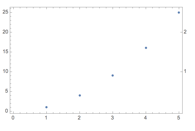
rticks=Table[{10i,i},{i,1,2}]
ListPlot[Range[5]^2,Frame->True,FrameTicks->{{Automatic,rticks},{Automatic,Automatic}}]
this is a minimal example:
Of course you have two tweak it to fit your needs.
Beautiful example! Thanks for sharing.
Cheers,
Marco