A friend of mine pointed to a very interesting article regarding "the golden cohort", a slice of the UK population that is living longer and healthier than the groups both above and below their age.
http://www.bbc.com/news/uk-15024436
He also wanted to know if they US population did have a similar generation.
So I tried if I could replicate the study with Mathematica.
Version 10.3 has released the function MortalityData. It does cover many properties and parameters on the population, but the availability of data is somewhat restricted on the time interval.
Instead we could download the tables from the source that WRI used as base for MortalityData (www.mortality.org)
Let's graph the percent changes in the three year moving average of death rates.
(*Set up our own color scaling*)
color[x_]:=Piecewise[{{Darker@Red,x>=5},{Orange,x>=4},{Pink,x>=3},
{Yellow,x>=2},{Darker@Green,x>=1},{Green,x>=0},{Lighter@Blue,x>=-2},
{Blue,x>=-4},{Purple,x<=-4}}]
(*Define the plot legend to be used in our charts*)
scale=ArrayPlot[{Range[-5,5]},ColorFunction->color,ColorFunctionScaling->False,FrameTicks->{None,{{1.5,-4},{3.5,-2},{5.5,0},{6.5,1},{7.5,2},{8.5,3},{9.5,4},{10.5,5}}}];
fname=FileNameJoin[{$UserDocumentsDirectory,"death_rates.zip"}];
interval=3;
If[FileNames[fname]=={},URLSave["http://www.mortality.org/hmd/zip/by_statistic/death_rates.zip",fname,"Username"->"johndoe@gmail.com","Password"->"1234567890"]];
files=Cases[Import[fname,"FileNames"],a_/;StringMatchQ[a,"Mx_1x1\\"~~__]];
data=Import[fname,{files[[#]],"Data"}]&/@Range@Length@files;
countries=data[[All,1,1]];
deathChart[deathRateData_,title_,key_,interval_]:=Module[{data,years,ratio,ds,values,ma,dif,pct,yearTicks,revPct,fields={"Year","Age","Female","Male","Total"}},
Quiet[data=Flatten[StringSplit[#]&/@deathRateData[[4;;]],1];
data [[All,3;; ]]=ToExpression[data[[All,3;;]]];
years=ToExpression@Union[data[[All,1]]];
ratio=100/(Length@years-interval);
ds=Dataset[AssociationThread[fields,#]&/@data];
values=ds[GroupBy["Age"],GroupBy["Year"],Identity,key]//Values//Normal;
values=Flatten[Values[values[[#]]]/.$Failed->0.]&/@Range@Length@values;
ma=MovingAverage[values[[#]],interval]&/@Range@Length@values;
dif=Differences[ma[[#]]]&/@Range@Length@ma;
pct=Table[100dif[[i,j]]/ma[[i,j]],{i,100},{j,Length@dif[[1]]}]/.Indeterminate->0.;
pct=MovingAverage[pct[[#]],interval]&/@Range@Length@pct;
yearTicks={#-2,#+years[[interval]]}&/@Range[Length@years-interval,1,-10];
revPct=With[{len=Length@pct},pct[[len-(#-1)]]&/@Range@len];
Rasterize@Column[{MatrixPlot[revPct,ColorFunction->color,ColorFunctionScaling->False,Mesh->All,FrameTicks->{{#,100-#}&/@Range[0,100,5],yearTicks},AspectRatio->ratio,ImageSize->Ceiling[6(Max[#]-Min[#])&@years],PlotLabel->Style[title,Bold,Medium],FrameLabel->(Style[#,Bold,Medium]&/@{"Age","Year"})],scale},Alignment->Center]]]
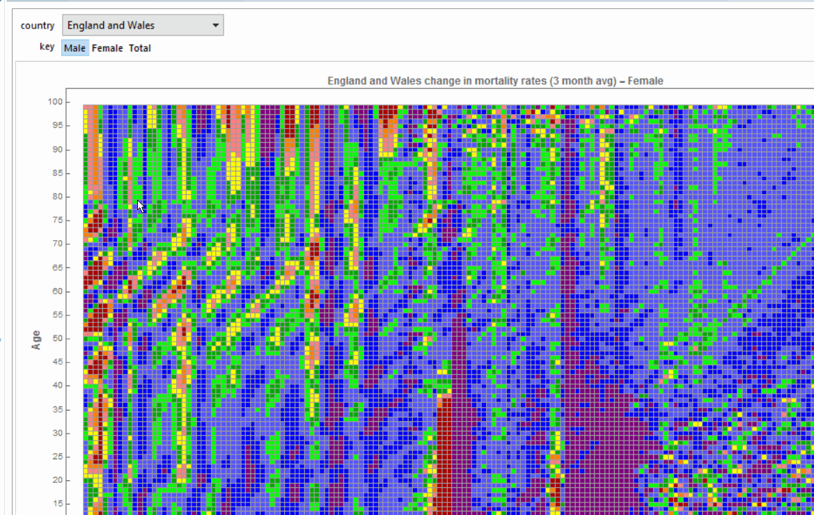
Manipulate[deathChart[Extract[data,First[Position[countries,country]]],country<> " change in mortality rates (3 month avg) - " <> key,key,3],{country,countries},{key,{"Male","Female","Total"}},SynchronousUpdating->False]
Now let's look at some of the results.
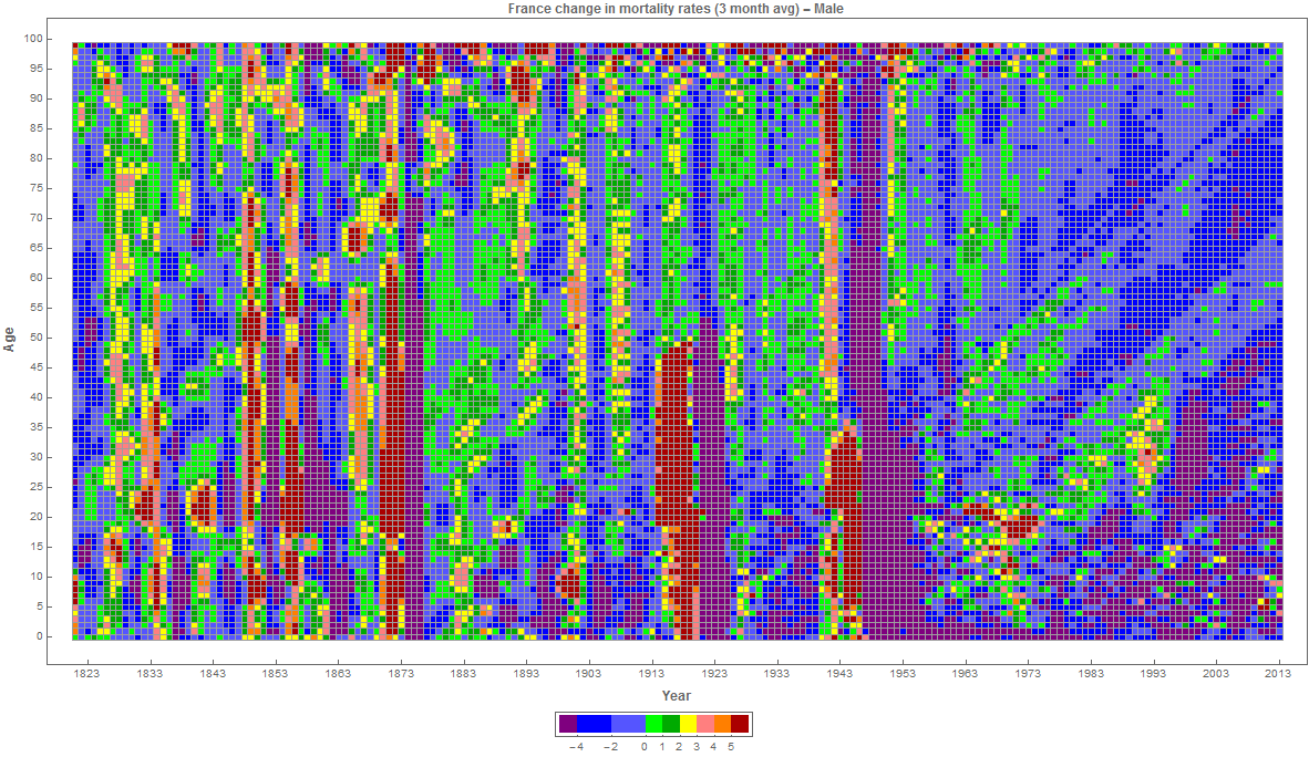
France first, male population..
We can see during the 19th century how different epidemics/pandemics/crop failures would affect death rates across all generations, and even cause revolutions. Example, the crops failures and cholera outbreaks between 1829 and 1832 that catalyzed the june revolution of 1832 described in Les Miserables,.
We can also see the effect of major conflicts such as the franco-prussian war of 1870, WWI and WWII. another interesting aspect is to see that generations that were born in a conflict, or disaster, have worse health than other generations. You can see the streaks of generation with higher death rates than younger and older cohorts and how this extends across time. Overall we can see that the advances in medicine, agriculture and public health has allowed humankind to escape from the periodic waves of increased mortalities. We don't see the same kind of pattern after the late 50's
https://en.wikipedia.org/wiki/Diseases_and_epidemics_of_the_19th_century https://en.wikipedia.org/wiki/List_of_epidemics
To the USA, male. 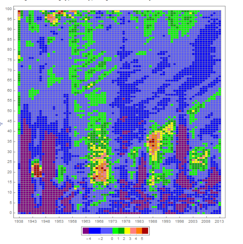 We can see the effect of WWII, Korea and Vietnam. Two oceans have isolated America of the ravages of war. It is interesting to see an increase in deaths around 1968 for all generations. Why is the same generation that had was affected in their young adulthood, affected again in the early 90s? Crack Epidemic? It is interesting to see that there is an uptick on the teenage group too during those years. Is the blob around 2001-2008 the Iraq/Iran war?
Finally Russia - Male and Female
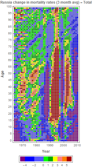
Is the substantial increase after 1990 due to the repercussions of the collapse of the Soviet Union? After a respite during the end of the 20th century, the numbers spiked again. What are the drivers?


