Ford Motor NYSE: F and General Electric NYSE: GE
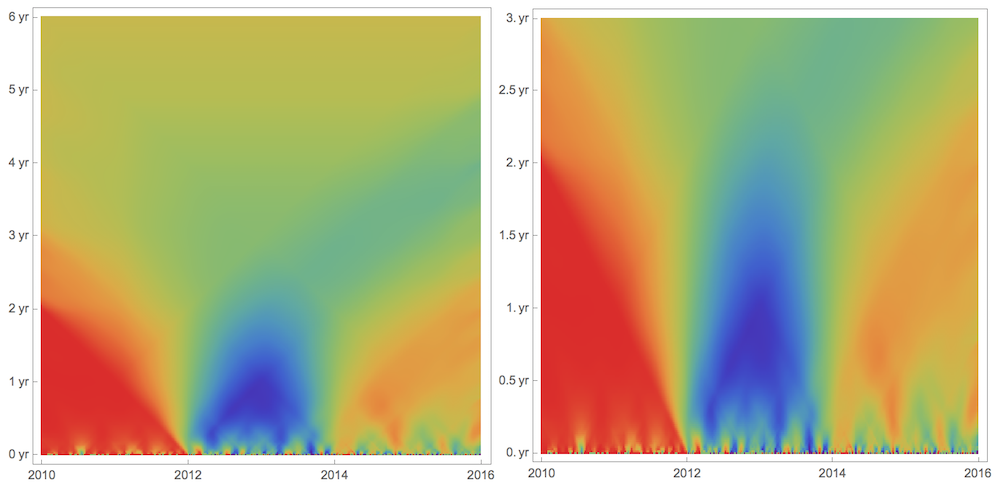
Vertical axis of top and bottom plots spans time-scales from 0 to 20 years.
Temperature in Different Hemispheres
Correlation function or Pearson's correlation coefficient is a useful tool to find relation between time series, but it gives just a single number. Imagine you have 2 time series correlated at the first half of their duration and anti-correlated a the other half. Correlation would return zero as a measure of their relation, which is due to the lack of correlation information for timescales smaller than full duration. Similarly Fourier analysis lacks same type of info relative to wavelets. I often wanted to have a visualization tool analogical to various types of scalograms that would show correlation on all time scales: from the minimal time scale of sampling rate to the maximum time scale of full time series length. I came up with a simple algorithm I called CorrelationScalogram, the WL code for which I give at the end and attached. The idea is quite simple. I pick a window size corresponding to a specific timescale and slide this window along time series computing a sequence of correlations. Because windows shift smoothly with a minimal step of sampling rate these windows overlap and are averaged in the overlap regions. This in essence gives time dependent correlation function for a specific time scale.
Temperature in different hemispheres
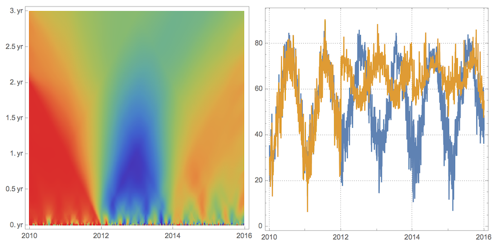
Here is how it works on a simple intuitive example. Imagine 2 brothers. One always lives in New York City. The other lived in Boston, Sydney, and Los Angeles for the last 6 years. What can we say about air temperature correlation between the places they lived at? For a start lets get data:
nyc=TimeSeriesResample[AirTemperatureData[
    Entity["City",{"NewYork","NewYork","UnitedStates"}],{{2010,1,1},{2016,1,1},"Day"}]]
bos=AirTemperatureData[
    Entity["City",{"Boston","Massachusetts","UnitedStates"}],{{2010,1,1},{2012,1,1},"Day"}];
syd=AirTemperatureData[
    Entity["City",{"Sydney","NewSouthWales","Australia"}],{{2012,1,1},{2014,1,1},"Day"}];
los=AirTemperatureData[
    Entity["City",{"LosAngeles","California","UnitedStates"}],{{2014,1,1},{2016,1,1},"Day"}];

travel=TimeSeriesResample[TimeSeriesInsert[TimeSeriesInsert[bos,syd],los]]
Due to TimeSeriesResample we have exactly same length of 2192 data points for both time series, which guarantees proper correlation computation. TimeSeriesInsert simply combines 3 different time series into a single one. Now the plot:
DateListPlot[{nyc,travel},
    PlotTheme->"Detailed",PlotLegends->Placed[{"NYC","Travel"},Top],
    AspectRatio->1/3,PlotStyle->Thickness[0]]
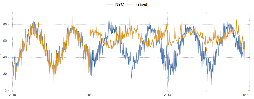
The usual correlation coefficient won't tell us much:
Correlation[nyc, travel]
Out[]= 0.378026
To apply CorrelationScalogram I will do a few tricks. First, I will resample my data at a lower frequency to reduce number of data points. Second, I will add to my data some weak noise SmallNoise a million times in magnitude smaller than the real data. This is a nasty hack to deal with the fact that Correlation will not compute for constant vectors, which we have plenty on smaller time scales. Some other method dealing with the issue must be found in future.
step = 5;

nycRES = SmallNoise@QuantityMagnitude[Values[nyc]][[1 ;; -1 ;; step]];
travelRES = SmallNoise@QuantityMagnitude[Values[travel]][[1 ;; -1 ;; step]];

mat = CorrelationScalogram[nycRES, travelRES]; // AbsoluteTiming

Out[]= {46.7814, Null}
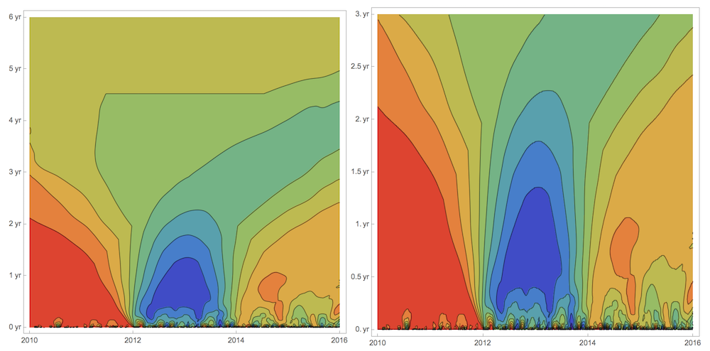
Now we can start visualizing the CorrelationScalogram. What images below tell us is on the time scales under 2 years (vertical axes) the data first are very correlated, then are very anti-correlated, and then correlated again but weaker than at the beginning. Which makes total sense if one brother stays in NYC and the other moves every 2 years from Boston to Sydney to Los Angeles. Beyond 2 years scale correlation flattens out. Anti-correlation comes from the fact that brothers lived in different Earth hemispheres from 2012 to 2014. First ArrayPlot shown twice, 2nd time at twice vertical resolution.
ArrayPlot[mat,ColorFunction->"Rainbow",
DataReversed->True,
FrameTicks->{
Thread[{Range[1,438,437/6],Quantity[#, "Years"]&/@Range[0,6,1]}],
Thread[{Range[1,439,438/3],Range[2010,2016,2]}]}]

ArrayPlot[Flatten[{#,#}&/@mat[[;;219]],1],ColorFunction->"Rainbow",
DataReversed->True,
FrameTicks->{
Thread[{Range[1,438,437/6],Quantity[#, "Years"]&/@Range[0,3,.5]}],
Thread[{Range[1,439,438/3],Range[2010,2016,2]}]}]
Same vertical axes scale-zoom is dome for ListContourPlot. By flow of contours to the right we realize correlation generally decreases as time progresses.
ListContourPlot[mat,ColorFunction->"Rainbow",
FrameTicks->{
{Thread[{Range[1,438,437/6],Quantity[#, "Years"]&/@Range[0,6,1]}],None},
{Thread[{Range[1,439,438/3],Range[2010,2016,2]}],None}}]

ListContourPlot[Flatten[{#,#}&/@mat[[;;219]],1],ColorFunction->"Rainbow",
FrameTicks->{
{Thread[{Range[1,438,437/6],Quantity[#, "Years"]&/@Range[0,3,.5]}],None},
{Thread[{Range[1,439,438/3],Range[2010,2016,2]}],None}}]
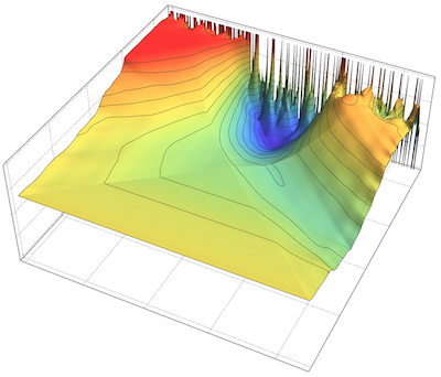
ListPlot3D[Reverse@mat, ColorFunction -> "Rainbow",
 MeshFunctions -> {#3 &}, Ticks -> None, PlotTheme -> "Detailed"]

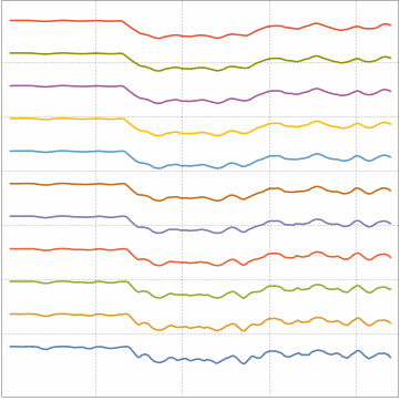
And here how we can move through time scales with an animation:
Manipulate[ListLinePlot[MapIndexed[3First[#2]+#1&,mat[[k;;k+10]]],
PlotTheme->"Detailed",FrameTicks->None,AspectRatio->1],{{k,1,"scale"},1,200,1}]
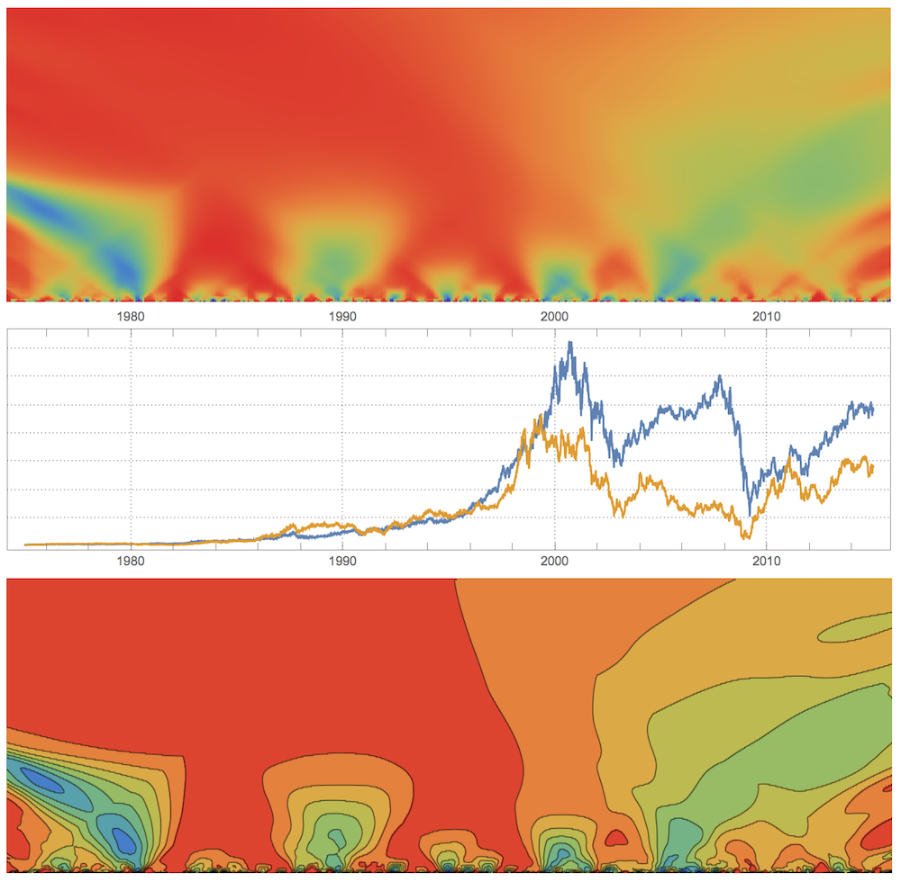
Stock: Ford Motor NYSE: F and General Electric NYSE: GE
Let's take a look now at more irregular data without seasonality: stock price of Ford Motor NYSE: F and General Electric NYSE: GE. Get the data:
GE = FinancialData["NYSE:GE", {{1975}, {2015}}];
F = FinancialData["NYSE:F", {{1975}, {2015}}];
Total correlation is quite high:
Correlation[SmallNoise[GS[[All, 2]]], SmallNoise[MS[[All, 2]]]]
Out[] = 0.834272
We will again resample:
step = 25;

mat = CorrelationScalogram[
    SmallNoise[GE[[All, 2]]][[1 ;; -1 ;; step]],
    SmallNoise[F[[All, 2]]][[1 ;; -1 ;; step]]
    ]; // AbsoluteTiming

Out[]= {23.2981, Null}
Total vertical time-scales runs 40 years from 1975 to 2015:
{ArrayPlot[mat, ColorFunction -> "Rainbow", DataReversed -> True, ],
 ListContourPlot[mat, FrameTicks -> None]}
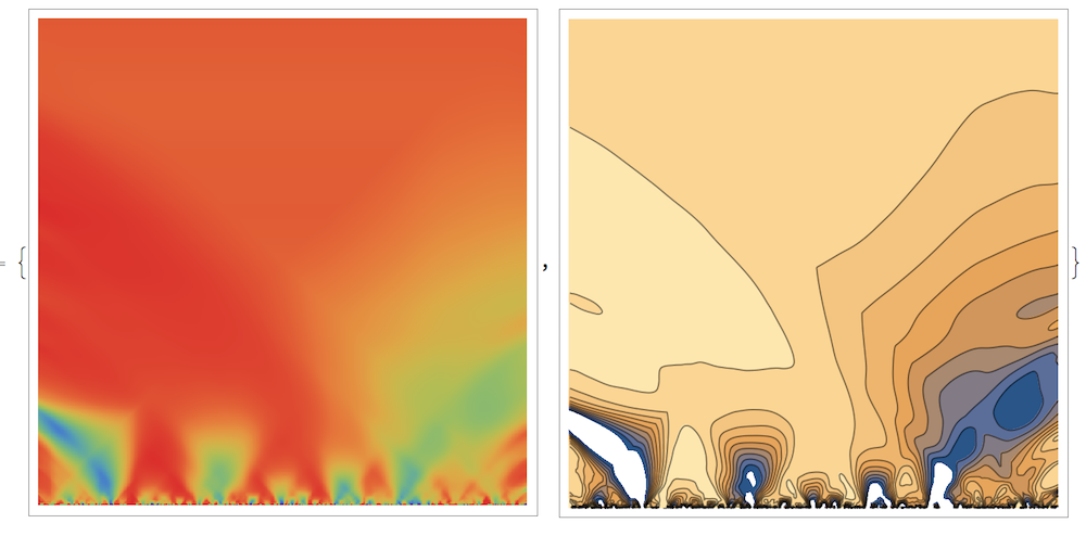
Lets zoom again to just a half vertical scale - 20 years:
{ArrayPlot[Flatten[{#, #} & /@ mat[[;; 200]], 1],
   ColorFunction -> "Rainbow",
   DataReversed -> True, AspectRatio -> 1/3, Frame -> False,
   PlotRangePadding -> None, ImageSize -> 700],
  DateListPlot[{GS, MS}, PlotTheme -> "Detailed", AspectRatio -> 1/4,
   ImageSize -> 700, FrameTicks -> {None, {True, True}}],
  ListContourPlot[Flatten[{#, #} & /@ mat[[;; 200]], 1],
   ColorFunction -> "Rainbow",
   AspectRatio -> 1/3, Frame -> False, PlotRangePadding -> None,
   ImageSize -> 700]} // Column
So what can we learn from the plot above? Up until the end of 1990s Ford's and GE's stocks were correlated on large time scales through the period of calm growth and only noisy small few-years time scales show anti- or no- correlations. But as we enter the turbulent era of 2000s loss of correlations propagates from small to larger timescales. Note interesting anti-correlation picked up around 1980s at less than 10 years time scales that propagates from larger to smaller time scales, meaning it is getting suppressed.
CODE:
The actual code is below and attached. The code is quite inefficient. Any suggestions or thoughts on the subject are welcome.
Clear@CorrelationScalogram;
CorrelationScalogram[a_,b_]:=
    Module[
       {
       lnth=Length[a],
       iniCorre,
       dummy
       },

       iniCorre=
       ParallelTable[

         Map[
          ConstantArray[#,k]&,
          MapThread[Correlation,{Partition[a,k,1],Partition[b,k,1]}]
         ]

         ,
       {k,2,lnth}];

       ParallelTable[
         Map[
          Mean[DeleteCases[#,dummy]]&,
          Transpose[
              Table[
                 ArrayPad[iniCorre[[m-1,k]],{k-1,lnth-m-(k-1)},dummy],
              {k,1,lnth+1-m}]]
          ],
       {m,2,lnth}]

    ]

SmallNoise[data_]:=With[
    {ln=Length[data],
    mn=Mean[data],
    sd=StandardDeviation[data]},
    data+RandomReal[mn+{-sd,sd},ln]/10^6
]
 Attachments:


