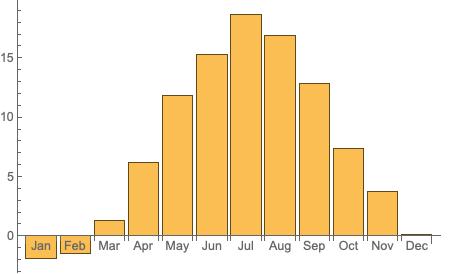
Make a histogram with aggregated monthly average seasonal weather data?

Hi
I have some twenty years of weather data with daily average temperature. I would like to make a histogram with aggregated monthly average for the whole period. I tried to do something like this Trends and Seasonalities: New in Wolfram Language 11
But it didn’t work since my weights in WeightedData can be both positive and negative. My data looks like this:

Any help would be much appreciated

Can you explain why you need to weight the data to compute monthly averages? Why can’t you use TimeSeriesAggregate?

My goal is to make a histogram of the average seasonal variation so i need the January in that diagram to be the average for all Januaries over the period. The same for Feb, Mar and so on.
First i used TimeSerieAggregate to make a monthly series. Then i tried (as you can see in the last part of my link) to make a DateHistogram. Then i realized that i can’t use the same method as the link because my weights (being temperature) could be both negative and positive, so I need another way of doing a histogram with the total average temperature for each month during the whole period.

Hi Nils,

I think I understand what you are trying to do, but I still don’t understand why weighting by temperature is needed. Does something like this satisfy your requirements?

Since your profile says you are in Sweden, get the daily mean temperature in Stockholm for 2008 to 2018

byDay = WeatherData["Stockholm", "MeanTemperature", {{2008, 1, 1}, {2018, 12, 31}, "Day"}]

Average over months (could have specified “Month” in WeatherData, but you have data by day)

byMonth = TimeSeriesAggregate[byDay, "Month", Mean]

Plot looks reasonable

DateListPlot[byMonth]

Group the data by month name

groupByMonth = GroupBy[byMonth["DatePath"], DateValue[First[#], "MonthNameShort"] &]

Compute average by month

meanByMonth = Mean[Map[Last, #]] & /@ groupByMonth

Plot BarChart

BarChart[meanByMonth, ChartLabels -> Automatic]

You could also compute min, max and mean

minMaxMean = {Min[Map[Last, #]], Max[Map[Last, #]], Mean[Map[Last, #]]} & /@ groupByMonth

and visualize as a BoxWhiskerChart

BoxWhiskerChart[minMaxMean, ChartLabels -> Automatic, PlotTheme -> "Detailed"]

Great! thats a really good answer, thanks alot