Dear Jack,
thank you very much for posting another data set with the global temperature anomalies.
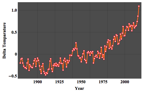
Please consider this graph of global temperatures from 1977 - 2016.
Does it seem more likely to you that the trend is exponential or
linear or something else? Data source:
http://data.giss.nasa.gov/gistemp/tabledata_v3/GLB.Ts+dSST.txt
Well, that is a very complicated question. Probably "something else" is the best answer here. There is a huge scientific machinery behind the numbers/measurements and the predictions resulting from them. In fact, there is a beautiful documentary on BBC 4 on Climate Change by Numbers where Dr Hannah Fry, Prof Norman Fenton and Prof David Spiegelhalter explain some of the numbers and methods behind the predictions. All three presenters are absolutely brilliant and it's certainly worth watching. There is of course a lot of scientific literature on all of that, but the presenters manage to at least hint at the complexities involved in all of this.
Something similar applies to your question. There is a range of models of climate change. Some are very sophisticated and certainly too complicated for a post on the community. They often have "mechanistically components" that condense knowledge about processes into equations and models. Not all models are equally suited of course and the following is certainly much to simplistic. Mathematica offered stochastic models that we can use to make predictions. These models allow us to check different assumptions we might want to make. Let's use features of Mathematica out of the box. Here's your data:
data = Import["http://data.giss.nasa.gov/gistemp/tabledata_v3/GLB.Ts+dSST.txt", "TSV"];
dataclean = (Select[StringSplit[#, WhitespaceCharacter ..] & /@
       Flatten[data[[8 ;;]], 1], Length[#] > 1 && #[[1]] != "Year" &][[1 ;; -5]] //. {a___, c_, b___} /; StringContainsQ[c, "*"] -> {a, "NA", b});
We can plot it - just as you did:
ListLinePlot[
 Transpose@{ToExpression /@ dataclean[[1 ;;, 1]], (1/100. Mean /@ (DeleteCases[#,
 NA] & /@ (ToExpression /@ (dataclean[[1 ;;, 2 ;; 13]]))))}, Mesh -> All, MeshStyle -> {Red, Thick}, ImageSize -> Large ,
 PlotTheme -> "Marketing", FrameLabel -> {{"Delta Temparature", None}, {"Year", None}},
 LabelStyle -> {FontFamily -> "Times New Roman", 18, GrayLevel[0], Bold}]
We can then make an "averaged time series (over years)".
averagedTimeSeries =
Transpose@{ToExpression /@ dataclean[[1 ;;, 1]], (1/100. Mean /@ (DeleteCases[#, NA] & /@ (ToExpression /@ (dataclean[[1 ;;, 2 ;; 13]]))))}
tsm = TimeSeriesModelFit[TimeSeries[averagedTimeSeries]]
The last line makes Mathematica look for a good model in some underlying range of stochastic models. These are not perfect for this type of prediction, but might illustrate how important a good model is for the predictions. These lines use the model to forecast. They also compute -based on the model- estimates of the errors of our prediction.
forecast = TimeSeriesForecast[tsm, {60}]
\[Alpha] = .95;
q = Quantile[NormalDistribution[], 1 - (1 - \[Alpha])/2];
err = forecast["MeanSquaredErrors"];
bands = TimeSeriesThread[{{1, -q}.#, {1, q}.#} &, {forecast,
   Sqrt[err]}]
This can now be plotted:
ListLinePlot[{averagedTimeSeries, forecast, bands["PathComponent", 1],
   bands["PathComponent", 2]}, Filling -> {3 -> {4}},
 AspectRatio -> 1/3, PlotStyle -> {Automatic, Automatic, Red, Red},
 Frame -> True, Mesh -> All, MeshStyle -> {Red, Thick},
 ImageSize -> Full , PlotTheme -> "Marketing",
 FrameLabel -> {{"Delta Temparature", None}, {"Year", None}},
 LabelStyle -> {FontFamily -> "Times New Roman", 18, GrayLevel[0],
   Bold}]
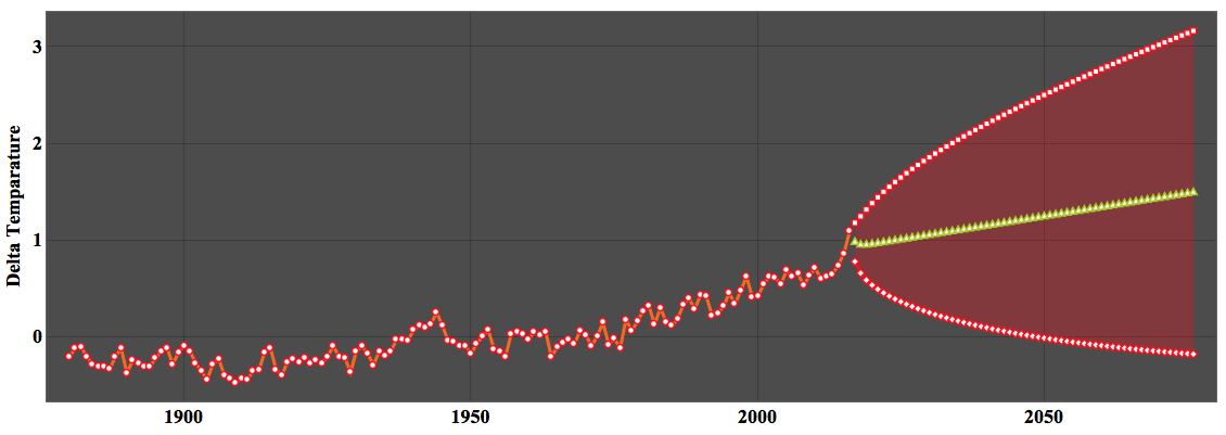
The green line shows the "prediction" and the red ones are the error bands. The thing is that the model restricts the possible types of behaviour to some extent. Take for example the following "models":
modelexp = NonlinearModelFit[TimeSeries[averagedTimeSeries], (a + c^(l t )), {a, c, l}, t]
modelconst = NonlinearModelFit[TimeSeries[averagedTimeSeries], a, {a}, t]
modellin = NonlinearModelFit[TimeSeries[averagedTimeSeries], a + b t, {a, b}, t]
modelsquare = NonlinearModelFit[TimeSeries[averagedTimeSeries], a + b t + c t^2, {a, b, c}, t]
modelcubic = NonlinearModelFit[TimeSeries[averagedTimeSeries], a + b t + c t^2 + d t^3, {a, b, c, d}, t]
modelsin = NonlinearModelFit[TimeSeries[averagedTimeSeries], amp Sin[o t] + (a + b t + c t^2), {a, b, c, d, o, amp}, t]
Here are the plots:
Grid[{{Show[ListPlot[averagedTimeSeries, PlotTheme -> "Scientific"],
    Plot[modelconst[t], {t, 1889, 2016}, PlotStyle -> Green,
     PlotTheme -> "Scientific"], PlotLabel -> "Constant"],
   Show[ListPlot[averagedTimeSeries, PlotTheme -> "Scientific"],
    Plot[modellin[t], {t, 1889, 2016}, PlotStyle -> Green,
     PlotTheme -> "Scientific"], PlotLabel -> "Linear"]}, {Show[
    ListPlot[averagedTimeSeries, PlotTheme -> "Scientific"],
    Plot[modelsquare[t], {t, 1889, 2016}, PlotStyle -> Green,
     PlotTheme -> "Scientific"], PlotLabel -> "Quadratic"],
   Show[ListPlot[averagedTimeSeries, PlotTheme -> "Scientific"],
    Plot[modelcubic[t], {t, 1889, 2016}, PlotStyle -> Green,
     PlotTheme -> "Scientific"], PlotLabel -> "Cubic"]}, {Show[
    ListPlot[averagedTimeSeries, PlotTheme -> "Scientific"],
    Plot[modelexp[t], {t, 1889, 2016}, PlotStyle -> Green,
     PlotTheme -> "Scientific"], PlotLabel -> "Exponential"],
   Show[ListPlot[averagedTimeSeries, PlotTheme -> "Scientific"],
    Plot[modelsin[t], {t, 1889, 2016}, PlotStyle -> Green,
     PlotTheme -> "Scientific"], PlotLabel -> "Sine-Quadratic"]}}]
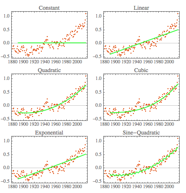
None of these models appear to be particularly meaningful and their predictions will be doubtful at best. I think that the data is only meaningful and interpretable if we use suitable model assumptions and the models that are meaningful here are rather complicated; thousands of scientists work on them for example in the IPCC. So there is no easy answer - it is hard work. Of course you might want to argue that whatever the functional form of the trend is, under relatively weak assumptions, you can probably use a low order polynomial to approximate the trend at least for short prediction horizons.
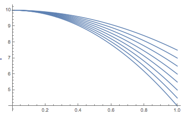
I would compare it to a situation were we have measurements of a falling stone. From basic physics we know that the model that dominates that situation is
$$m\ddot x=-m g.$$, with suitable initial conditions. We can solve this:
sol= DSolve[{x''[t] == -g, x[0] == x0, x'[0] == v0}, x[t], t]
which gives:
x[t] -> 1/2 (-g t^2 + 2 t v0 + 2 x0)
where g is the earths acceleration, v0 the initial speed of the stone, and x0 the initial hight. Let's suppose that we drop the stone form a height of 10 metres and with zero velocity:
sol /. {x0 -> 10, v0 -> 0}
which gives:
x[t] -> 1/2 (20 - g t^2)
Ok. So we have a quadratic function with the parameter g:
Plot[Table[x[t] /. sol[[1]] /. {x0 -> 10, v0 -> 0}, {g, 5, 12, 1}], {t, 0, 1}]
So if we had data,
measureddata =
  Table[{t, x[t] + RandomVariate[NormalDistribution[0, 1]] /. sol[[1]] /. {x0 -> 10, v0 -> 0, g -> 9.81}}, {t, 0, 1.5, 0.002}];
we could obviously fit our model to that to obtain:
FindFit[measureddata, 1/2 (20 - g t^2), g, t]
(*{g -> 9.78587}*)
Here is a plot:
Show[ListPlot[measureddata], Plot[Evaluate@Normal@NonlinearModelFit[measureddata, 1/2 (20 - g t^2), g, t], {t,0, 1.5}, PlotStyle -> Red]]
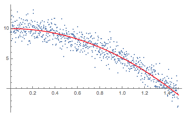
So we obtain an interpretable result within our model. If our model was inappropriate, we would still get a fit, but would not really be able to interpret it. If we had no idea of the model and would try to fit something very different:
Show[ListPlot[measureddata],
 Plot[Evaluate@Normal[NonlinearModelFit[measureddata, k (1 - Sin[g t + o]), {k, g, o}, t]], {t, 0, 1.5}, PlotStyle -> Red]]
the results might look good but might not be interpretable.
Show[ListPlot[measureddata],
Plot[Evaluate@Normal[NonlinearModelFit[measureddata, k (1 - Sin[g t + o]), {k, g, o}, t]], {t, 0, 1.5}, PlotStyle -> Red]]
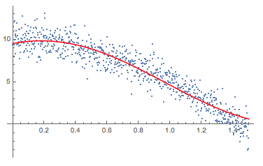
Note that the two models perform similarly:
mod1 = NonlinearModelFit[measureddata, k (1 - Sin[g t + o]), {k, g, o}, t];
mod2 = NonlinearModelFit[measureddata, 1/2 (20 - g t^2), g, t];
mod1["RSquared"]
mod2["RSquared"]
(*{0.975745,0.978336}*)
So goodness of fit is not the only point and the predictions might be (very) different for different model assumptions. In the IPCC reports they study different models and different emission scenarios come up with their predictions. When you ask whether the trend is exponential or otherwise, that is basically asking for a suitable model.
Mathematica has lots of tools to estimate model parameters if you have data. It can suggest plausible (often stochastic) models - but you will need some serious modelling and the answer to your question will be quite complicated, I guess.
Cheers,
M.


