After having creating a number of CNN (Convolution Neural Networks) with NetTrain, I have constantly found the Error Loss per Epoch to be small but useful in the training panel when it is training, but the "LossEvolutionPlot" provided as an output to be very confusing. I has struck me as always wrong in every case I have examined, now more than 30.
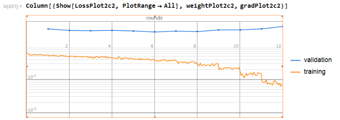
So for comparison, here is one these plots provide for a CNN I did last night:

This certainly makes my validation look very poor, which was not the case while training.
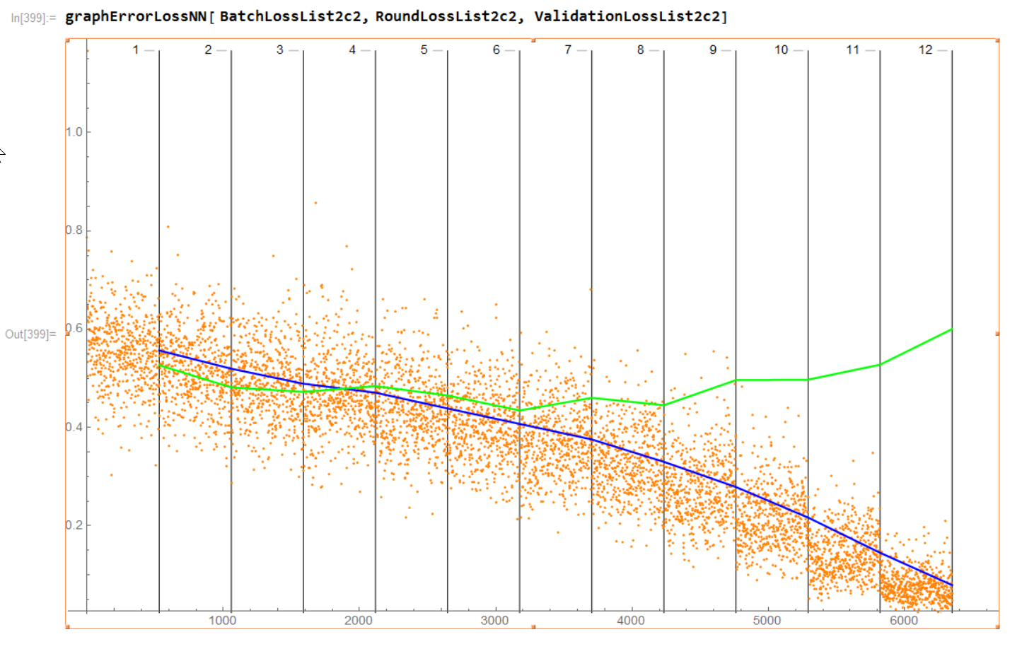
Pulling the raw Batch loss ("BatchLossList"), Round loss ("RoundLossList"), and Validation loss ("ValidationLossList") data and doing my own plot I see for this case:

These two graphs look very little a like.
The function I created for doing this Error Loss graph from the data mentioned is:
graphErrorLossNN[batchLoss1_, roundLoss1_, validationLoss1_] := Module[
  {
   i = 1,
   epochLinesGraphSet1 = {},
   batchLossGraph1 = Null,
   roundLossGraph1 = Null,
   validationLossGraph1 = Null,
   newRoundLossList1 = {},
   minY1 = 0,
   maxY1 = 0,
   caption1 = Null,
   xEpoch = 0,
   plot1 = Null
   },

  (* Initializations *)
  minY1 = Min[batchLoss1];
  maxY1 = Max[batchLoss1];

  (* Graph vertical lines for each Epoch *)
  For[i = 1, i <= (validationLoss1 // Length), i++,
   Caption1 = ToString[i];
   xEpoch = validationLoss1[[i, 1]];
   epochLinesGraphSet1 = Append[ epochLinesGraphSet1,
     ListPlot[{{xEpoch, minY1},
       Callout[{xEpoch, maxY1}, Caption1, Left]},
      PlotStyle -> {Thickness[0.00001], Black}, Joined -> True,
      PlotRange -> {minY1, maxY1}]
     ];
   ]; (* end For\[Rule]i *)

  (* Adjust top of graph to ensure Epoch labels showing *)
  maxY1 = 1.02*maxY1;

  (* Generate Batch Loss graph *)
  batchLossGraph1 =
   ListPlot[batchLoss1, PlotStyle -> {PointSize[Small], Orange},
    PlotRange -> {minY1, maxY1}];

  (* Generate Round Loss graph *)
  For[i = 1, i <= (roundLoss1 // Length), i++,
   newRoundLossList1 =
     Append[ newRoundLossList1, {validationLoss1[[i, 1]],
       roundLoss1[[i]] }];
   ]; (* end For\[Rule]i *)

  roundLossGraph1 =
   ListPlot[newRoundLossList1,
    PlotStyle -> {PointSize[Medium], Blue}, Joined -> True,
    PlotRange -> {minY1, maxY1}];

  (* Generate Validation Loss graph *)
  validationLossGraph1 =
   ListPlot[validationLoss1, PlotStyle -> {PointSize[Medium], Green},
    Joined -> True, PlotRange -> {minY1, maxY1}];

  (* Bring all graphs to one *)
  plot1 =
   Show[epochLinesGraphSet1, batchLossGraph1, roundLossGraph1,
    validationLossGraph1, PlotRange -> {minY1, maxY1}];

  Return[plot1]
  ]
I am happy to share this code as a notebook.
My questions:
Is my graph correct?
Anyone else having this same issue with the provided Error Loss graph?