We demonstrate the application of SARIMA model for the UK inflation forecasting. Using long-span historical data, we build robust and well-behaved model that captures structural variations in the UK inflation. Forecasts and predictions are reasonable and found within the models bands. Rich Mathematica functionality on time series modeling makes the entire effort much more compelling and faster.
Introduction
Inflation forecasting is one of the most demanding predictions central institutions do to devise their monetary policies. It is therefore not s uprising that this activity attracts a lot of public attention. Good inflation forecasts are not only desirable, but also important for correct policy formulation and future adjustments.
Inflation forecasting is based on models. Various approaches exist and model appropriateness is generally judged by predictive accuracy and evaluation of provided output.
We review the application of SARIMA (Seasonal autoregressive integrated moving average) model to the UK inflation using longer historical period of 25+ years. Using stationarity test, we establish that the UK inflation exhibits both deterministic and stochastic patterns, with later being a dominant factor of the inflation process. We demonstrate that SARIMA model fits the UK inflation well and, as such, can be well used to forecast future inflation based on the fitted model.
SARIMA model belongs to the to the family of ARIMA models that are known to be practical and useful when modelling economic time series. They generally tend to outperform more complex econometric modes in short-term forecasting. Although the modelling framework is agnostic and neglects the requirements for richer explanatory variables, this simplicity and dependence only on past values makes the model flexible, powerful and dynamic in nature that adapts well to the inflation process. Nowadays it is difficult to prove that other modelling choices will perform better when it comes to inflation prediction on a short or even longer-time basis.
Economic data collection
Our input data for the inflation model is the UK RPI statistics from 1998. Monthly index data will be used an our primary input:
ukrpi = {119.5, 120.2, 121.4, 125.1, 126.2, 126.7, 126.8, 128.1,
   129.3, 130.3, 130., 129.9, 130.2, 130.9, 131.4, 133.1, 133.5,
   134.1, 133.8, 134.1, 134.6, 135.1, 135.6, 135.7, 135.6, 136.3,
   136.7, 138.8, 139.3, 139.3, 138.8, 138.9, 139.4, 139.9, 139.7,
   139.2, 137.9, 138.8, 139.3, 140.6, 141.1, 141., 140.7, 141.3,
   141.9, 141.8, 141.6, 141.9, 141.3, 142.1, 142.5, 144.2, 144.7,
   144.7, 144., 144.7, 145., 145.2, 145.3, 146., 146., 146.9, 147.5,
   149., 149.6, 149.8, 149.1, 149.9, 150.6, 149.8, 149.8, 150.7,
   150.2, 150.9, 151.5, 152.6, 152.9, 153., 152.4, 153.1, 153.8,
   153.8, 153.9, 154.4, 154.4, 155., 155.4, 156.3, 156.9, 157.5,
   157.5, 158.5, 159.3, 159.5, 159.6, 160., 159.5, 160.3, 160.8,
   162.6, 163.5, 163.4, 163., 163.7, 164.4, 164.5, 164.4, 164.4,
   163.4, 163.7, 164.1, 165.2, 165.6, 165.6, 165.1, 165.5, 166.2,
   166.5, 166.7, 167.3, 166.6, 167.5, 168.4, 170.1, 170.7, 171.1,
   170.5, 170.5, 171.7, 171.6, 172.1, 172.2, 171.1, 172., 172.2,
   173.1, 174.2, 174.4, 173.3, 174., 174.6, 174.3, 173.6, 173.4,
   173.3, 173.8, 174.5, 175.7, 176.2, 176.2, 175.9, 176.4, 177.6,
   177.9, 178.2, 178.5, 178.4, 179.3, 179.9, 181.2, 181.5, 181.3,
   181.3, 181.6, 182.5, 182.6, 182.7, 183.5, 183.1, 183.8, 184.6,
   185.7, 186.5, 186.8, 186.8, 187.4, 188.1, 188.6, 189., 189.9,
   188.9, 189.6, 190.5, 191.6, 192., 192.2, 192.2, 192.6, 193.1,
   193.3, 193.6, 194.1, 193.4, 194.2, 195., 196.5, 197.7, 198.5,
   198.5, 199.2, 200.1, 200.4, 201.1, 202.7, 201.6, 203.1, 204.4,
   205.4, 206.2, 207.3, 206.1, 207.3, 208., 208.9, 209.7, 210.9,
   209.8, 211.4, 212.1, 214., 215.1, 216.8, 216.5, 217.2, 218.4,
   217.7, 216., 212.9, 210.1, 211.4, 211.3, 211.5, 212.8, 213.4,
   213.4, 214.4, 215.3, 216., 216.6, 218., 217.9, 219.2, 220.7, 222.8,
    223.6, 224.1, 223.6, 224.5, 225.3, 225.8, 226.8, 228.4, 229.,
   231.3, 232.5, 234.4, 235.2, 235.2, 234.7, 236.1, 237.9, 238.,
   238.5, 239.4, 238., 239.9, 240.8, 242.5, 242.4, 241.8, 242.1, 243.,
    244.2, 245.6, 245.6, 246.8, 245.8, 247.6, 248.7, 249.5, 250.,
   249.7, 249.7, 251., 251.9, 251.9, 252.1, 253.4, 252.6, 254.2,
   254.8, 255.7, 255.9, 256.3, 256., 257., 257.6, 257.7, 257.1, 257.5,
    255.4, 256.7, 257.1, 258., 258.5, 258.9, 258.6, 259.8, 259.6,
   259.5, 259.8, 260.6, 258.8, 260., 261.1, 261.4, 262.1, 263.1,
   263.4, 264.4, 264.9, 264.8, 265.5, 267.1, 265.5, 268.4, 269.3};
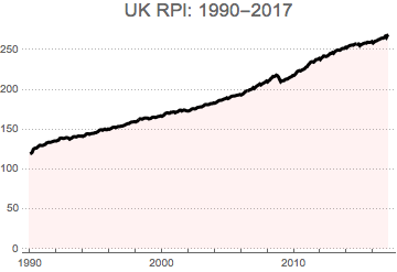
We build Time Series object from the above data
rpita = TimeSeries[ukrpi, {{1990, 1, 1}, {2017, 3, 1}, "Month"}];
DateListPlot[rpita, PlotTheme -> "Business", PlotStyle -> Black,
 Filling -> Axis, FillingStyle -> Directive[Opacity[0.1], Pink],
 PlotLabel -> Style["UK RPI: 1990-2017", 17]]
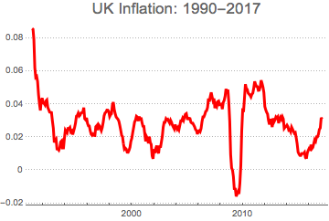
and obtain UK i inflation data by log-differencing of the RPI
tsdata = TimeSeries[rpita];
logdata = Log[tsdata];
dlogdata = Differences[logdata, 1, 12];
DateListPlot[dlogdata, PlotTheme -> "Business", PlotStyle -> Red,
 PlotLabel -> Style["UK Inflation: 1990-2017", 17]]
Data examination
We first want to examine the underlying data and perform the normality tests.
ftest = DistributionFitTest[dlogdata, Automatic, "HypothesisTestData"];
ftest["TestDataTable", All]
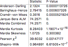
All above tests uniformly confirm the non-normal distribution of the UK inflation data. This is also obvious from the above chart where we observe some structural breaks that lead to skewed and peaked distribution. The non-normality is also confirmed at the histogram comparison to fitted normal distribution. Peaked and fatter tails point out at non-normal patterns.
Show[Histogram[dlogdata, Automatic, "ProbabilityDensity",
  ColorFunction -> Function[{height}, ColorData["Rainbow"][height]],
  PlotLabel -> Style["UK Inflation: Normality test", 17]],
 Plot[PDF[ftest["FittedDistribution"], x], {x, -0.01, 0.09},
  PlotStyle -> {Black, Thick}]]
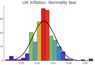
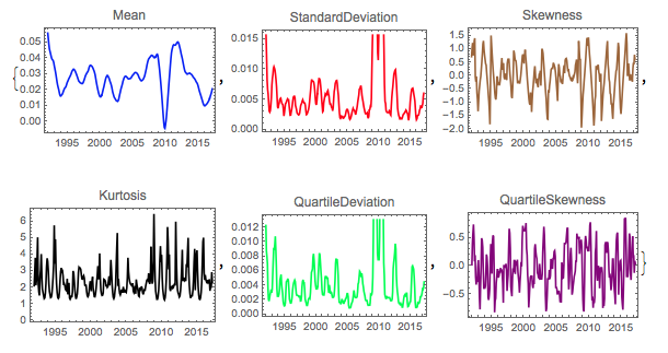
This is further proved by localising four distributional moments over time - we clearly observe oscillating mean, noisy volatility and non-stable skewness, kurtosis and other related measures.
The above analysis shows that the UK inflation evolution over the past 25+ years has primarily been stochastic with less prominent deterministic trends. This is not surprising as during that period the UK economy went through a number of economic cycles with high and low inflation.
f = {Mean, StandardDeviation, Skewness, Kurtosis, QuartileDeviation,
   QuartileSkewness};
c = {Blue, Red, Brown, Black, Green, Purple};
Table[DateListPlot[MovingMap[f[[i]], dlogdata, "Year"],
   PlotLabel -> f[[i]], PlotStyle -> c[[i]]], {i, Length[f]}] // Quiet
Stationarity and autocorrelation tests
Aside from normality, we may want to look at the additional data properties to determine if the UK inflation data are well-suited for SARIMA modelling.
Stationarity: we want to establish if stochastic properties of the data (distributional moments - such as mean, variance, skewness etc) are time-invariant, To achieve this, we apply a number of Unit Root Tests to the underlying data.
Let's recall that the unit root existence in the data will indicate non-stationarity and a small p-value returned by the tests will confirm that the unit root is not present.
urt = UnitRootTest[dlogdata, Automatic, "HypothesisTestData"];
urt["TestDataTable", All]

Low p-value in the above three tests confirms the absence of unit root and therefore confirmation that the series is stationary.
Autocorrelation: the purpose is to determine if there is autocorrelation (i.e.serial correlation) in the error terms of the underlying data. Similarly to the above, we refer to the p-static as an indicator of autocorrelation presence in the data. Low p-value will confirm that the time series data is autocorrelated.
act = AutocorrelationTest[dlogdata, Automatic, "HypothesisTestData"];
act["TestDataTable", All]

The autocorrelation test confirms that the inflation data is path-wise correlated. This is again non-surprising as the inflation data typically display serial correlation and linear co-dependency.
SARIMA model fitting
Having determined data properties and having completed data tests, we can now proceed with SARIMA model fitting to the UK inflation data. This can be easily done with time series model fit function.
inflsarima = TimeSeriesModelFit[dlogdata, {"SARIMA", 12}]

inflsarima["BestFit"]
SARIMAProcess[-0.000103279, {0.927709}, 0, {0.376708, 0.175456}, {12, {}, 1, {-0.484877, 0.0838243}}, 0.0000259715]
Mathematica fits SARIMA (p,d,q) (P,D,Q) model with single parameter non-seasonal integration order (p),two-parameter non-seasonal autoregressive order (q), single parameter seasonal integration order (D) and two-parameter seasonal moving average order (Q). There is notable absence of non-seasonal integration order (d) and seasonal autoregressive order P in the fitted model.
We can easily extract the information about the automated model fitting by requesting model selection statistics:
inflsarima["CandidateSelectionTable"]
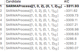
We can see that the AIC criterion has been used to select the most optimal model for our task. We can also visualise parameter statistics to see how each value has been determined and what are the errors in their estimates.
inflsarima["ParameterTable"]

Model diagnostics
We can now examine how well the model fits the data and how accurate it is w.r.t. predicted valued. We will run the correlogram examination of the residuals (difference between the actual data point and the estimates) to check if any significant patterns about the data have not be left out in our model. If all information has been captured, then the ACF and PACF plots should resemble white noise.
inflsarima["ACFPlot"]
inflsarima["PACFPlot"]
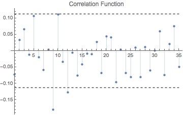
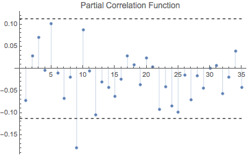
The visual examination of the model confirms well-behaved residuals on both graphs. All autocorrelations in the ACF and PACF plots are within the confidence band, and therefore not significantly different from zero. The only exception with marginal significance can be seen at lag 9 which can be smoothly ignored on grounds of minor substance. The plots do not reveal any other significant outliers or heteroskedasticity. This confirms that selected SARIMA model fits the inflation data well.
We can further enhance our diagnostics by running the autocorrelation test again - now on the model residuals. We can additionally performs the Box-Ljung test on the residuals, with null hypothesis that the residuals are not different from white noise. If a Box-Ljung test returns a large p-value, it suggests that the residuals have no remaining autocorrelations, i.e., they resemble white noise.
inflsarima["LjungBoxPlot"]
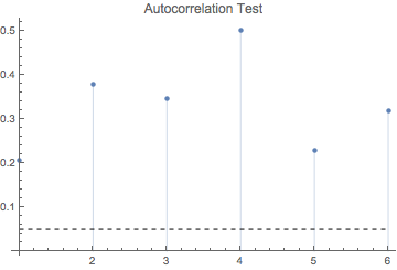
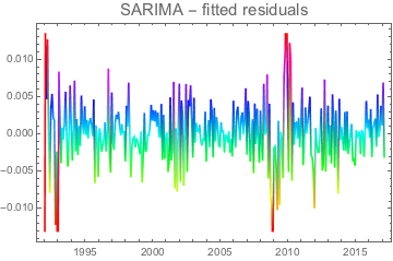
This is indeed the case, which merely confirms that residuals do not exhibit any correlation pattern. The same conclusion can be derived from the residual fit that should clearly display white noise-alike patterns
DateListPlot[inflsarima["FitResiduals"],
 ColorFunction -> Function[{x, y}, Hue[y]],
 PlotLabel -> Style["SARIMA - fitted residuals", 15]]
Forecasting inflation with SARIMA model
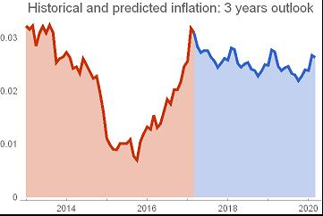
We are now in a position to use the SARIMA model to forecast future inflation evolution. We first use the TimeSeriesForecast function to predict the UK inflation for the next 3 years:
forecast = TimeSeriesForecast[inflsarima["Process"], dlogdata, {0, 3*12}];

DateListPlot[{TimeSeriesWindow[
   dlogdata, {{2013, 1, 1}, {2017, 3, 1}}], forecast}, Joined -> True,
  Filling -> Bottom, PlotTheme -> "Web",
 PlotLegends -> {"past inflation", "forecast"},
 PlotLabel ->
  Style["Historical and predicted inflation: 3 years outlook", 15]]
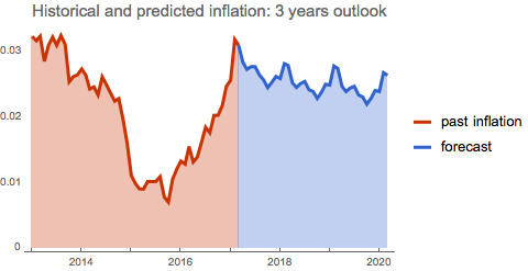
We use 'automatic' method for the forecast, which is the best choice to get the optimised response from the predicted outcome. As the chart above shows, the model predicts subdued inflation outcome with the levels below 3%.
How confident can we be with our prediction? We compute standard errors and review the entire model with the error bands.
moderror = Sqrt[forecast["MeanSquaredErrors"]];
uperr = TimeSeriesThread[{1, 1}.# &, {forecast, moderror}];
dnerr = TimeSeriesThread[{1, -1}.# &, {forecast, moderror}];

DateListPlot[{TimeSeriesWindow[dlogdata, {{2013, 1, 1}, {2017, 3, 1}}], forecast, uperr, dnerr},
 Joined -> True, PlotTheme -> "Web", Filling -> {3 -> {4}},
 PlotLegends -> {"past inflation", "forecast", "upp err band",
   "low err band"},
 PlotLabel -> Style["Inflation forecst with prediction errors", 15]]
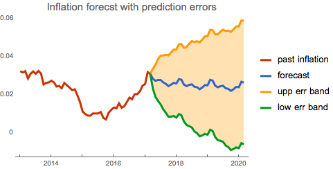
We can see where the predicted inflation value can go in the next three years. Whilst 6% inflation (or deflation) does not seem to be realistic at present, it is still the possibility that the model takes into consideration when deriving future paths.
We can certainly go beyond standard model analysis to derive further insight from the setting. Once useful approach is the examination of stochastic nature of the model. We will simulate future inflation paths, determine distributional quantiles and visualise them on the graph.
sim = RandomFunction[inflsarima, {0, 12*3}, 100];
stmean = TimeSeriesThread[Mean, sim];
stup = TimeSeriesThread[Quantile[#, 0.95] &, sim];
stdown = TimeSeriesThread[Quantile[#, 0.05] &, sim];
sim2 = DateListPlot[sim, PlotStyle -> Directive[Opacity[.30]],
   Joined -> True, PlotRange -> All];

Show[DateListPlot[{stmean, stup, stdown},
  PlotStyle -> {Blue, Green, Red},
  PlotLabel -> Style["Projected inflation with confidence bands", 15],
   PlotLegends -> {"Projection", "Upper band", "Lower band"}], sim2]
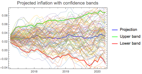
Simulation approach is handy tool to observe seasonality effect on the future inflation modelling. As this is present in all future predictions, we can detect where seasonality effect can influence inflation forecast. This can be seen as additional 'risk factor' in the outcome prediction.
From the above analysis we can easily locate the quantile values as 'worst outcomes' within prediction tolerance.
DateListPlot[{TimeSeriesWindow[
   dlogdata, {{2013, 1, 1}, {2017, 3, 1}}], stup, stdown},
 PlotStyle -> Thick,
 PlotLabel -> Style["Where are future inflation limits?", 16],
 PlotLegends -> {"Hist inflation", "Upper limit", "Lower limit"},
 PlotTheme -> "Web", Filling -> {2 -> {3}}]
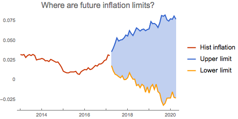
The chart above reveals interesting pattern: deflation scenario is now steeper and deeper. This may indicate higher downside risk as turn to deflation will be more abrupt with potentially higher severity.
Conclusion
We have demonstrated the ease of using Mathematica for inflation modelling tasks using rich library of built-in routines and functions for time series analysis. As many functions are built to operate in automatic mode, the task of inflation modelling can be reduced to data sourcing and outcome analysis. All hard work of data preparation, model fitting and diagnostics can be left to excellent Mathematica capabilities in this field.
 Attachments: