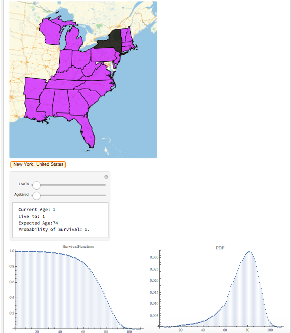
A branch of actuarial science is mortality probability and life expectancy. Distributions were created to model the probability of mortality based on previous data in the given population. This demonstration aims to portray the survival probability and proportion of ages of death per state. The Survival Function graph shows the probability of surviving each age. The probability density function plot shows the proportion of the population that die at each age. Further, the manipulate calculates the probability of surviving to age x given an individual has lived y years in a specified state.
With the help of my mentor John, we pulled about 90 million pieces of data from the Death Master File. The record contained the names, dates of birth, dates of death, and social security numbers of people who have died in the past 100 years. We calculated the age of death of each individual, and created a distribution of ages for each state. The PDF plot (Figure #1), is a probability density function plot shows the density of ages of people who have died in a given state. The Survival Function (Figure #1) plots the probability of surviving to each age. The Survival Function plotted the probability of survival at each age.
survivalFunction[location_entity] := DiscretePlot[SurvivalFunction[dist[location], x], {x, Range[110]}]
To calculate the probability a person aged y survives to age x and the life expectancy, I used a manipulate on the function below.
f[liveto_Integer, lived_Integer, dist_DataDistribution] := {"Current Age: " <> ToString@lived, "Live to: " <> ToString@liveto,"Probability of Survival: " <> ToString@Probability[x > liveto \[Conditioned] x > lived, x \[Distributed] dist]}
Figure #1: New York

This demonstration allows the user to compare survival probabilities in each state, and infer factors that contribute to life expectancy in different states in the United States.
References:
Social Security Death Master File courtesy of SSDMF.INFO
 Attachments: