Introduction
This project from the 2017 Wolfram High School Summer Camp maps the spread of Ebola during the 2014 outbreak over a map of Sierra Leone and Liberia. The map also displays key locations, such as airports, seaports, and populated cities. It uses colors on a map to symbolize the transmission of Ebola. Additionally, it provides a graph of how a future epidemic would spread, through travel over the air or water, or spread through neighboring areas. This map compares the probabilities of the disease spreading through that particular channel.
Data Acquisition
All data was acquired from the World Health Organization. This data provides in-depth Ebola statistics from January 2014 to April 2016 and provides the number of cases in each district in Sierra Leone and Liberia.
Once I imported the data, I converted each String into Entities so it could be plot onto a GeoListPlot. This is shown below, and I also did the same for Liberia.
sl = Import[ "/Users/YashSomaiya/Desktop/Wolfram Summer Camp/Project/Data/Smaller Sierra Leone.xlsx"];
SierraLeone = sl /. { "MOYAMBA" -> Entity["AdministrativeDivision", {"Moyamba", "Southern", "SierraLeone"}],  "BO" -> Entity["AdministrativeDivision", {"Bo", "Southern", "SierraLeone"}],  "KENEMA" -> Entity["AdministrativeDivision", {"Kenema", "Eastern", "SierraLeone"}], "WESTERN AREA RURAL" -Entity["AdministrativeDivision", {"Western", "SierraLeone"}], "WESTERN AREA URBAN" -> Entity["AdministrativeDivision", {"Western", "SierraLeone"}],
"KAILAHUN" ->  Entity["AdministrativeDivision", {"Kailahun", "Eastern", "SierraLeone"}], "KAMBIA" ->  Entity["AdministrativeDivision", {"Kambia", "Northern", "SierraLeone"}], "KOINADUGU" -> Entity["AdministrativeDivision", {"Koinadugu", "Northern",  "SierraLeone"}], "BOMBALI" -> Entity["AdministrativeDivision", {"Bombali", "Northern",  "SierraLeone"}],  "TONKOLILI" -> Entity["AdministrativeDivision", {"Tonkolili", "Northern", "SierraLeone"}],   "PUJEHUN" -> Entity["AdministrativeDivision", {"Pujehun", "Southern", "SierraLeone"}], "BONTHE" ->  Entity["AdministrativeDivision", {"Bonthe", "Southern",  "SierraLeone"}],  "PORT LOKO" -> Entity["AdministrativeDivision", {"PortLoko", "Northern", "SierraLeone"}], "KONO" -> Entity["AdministrativeDivision", {"Kono", "Eastern", "SierraLeone"}]};
Given this data, I used Count to find how many cases there were in each district and had lists of the number of cases a month in each district by month, which I put directly into my final notebook.
Creation of Map
Now that I had the data organized and counted, I began creating the maps used in the Manipulate. I made functions of the number of cases in each region each month so that on my map regions with more cases of Ebola were darker and had more red. These map functions are very long, but you can see them in the notebook attached. Here is a screenshot of what the maps looked like: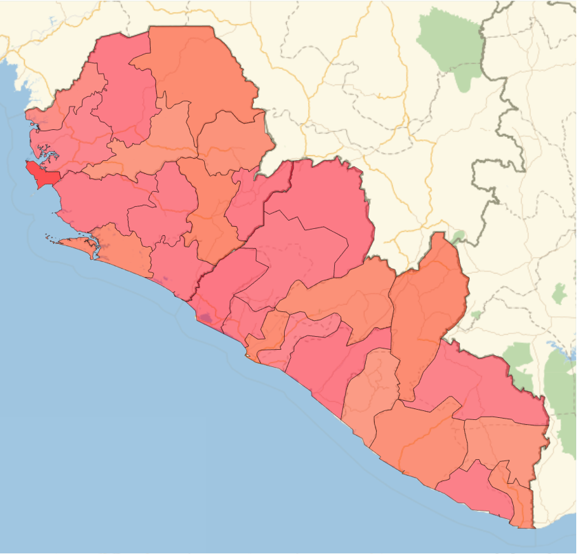
Additionally, a legend was created so the user can recognize what the colors actually mean:

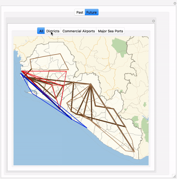
Predictive Paths
By looking at the data and trends in the spread of Ebola, I began looking at different channels disease transmits through, such as planes, boats, or spreads through normal contact. I first began to model this by making networks of points on the map, such as airports or sea ports.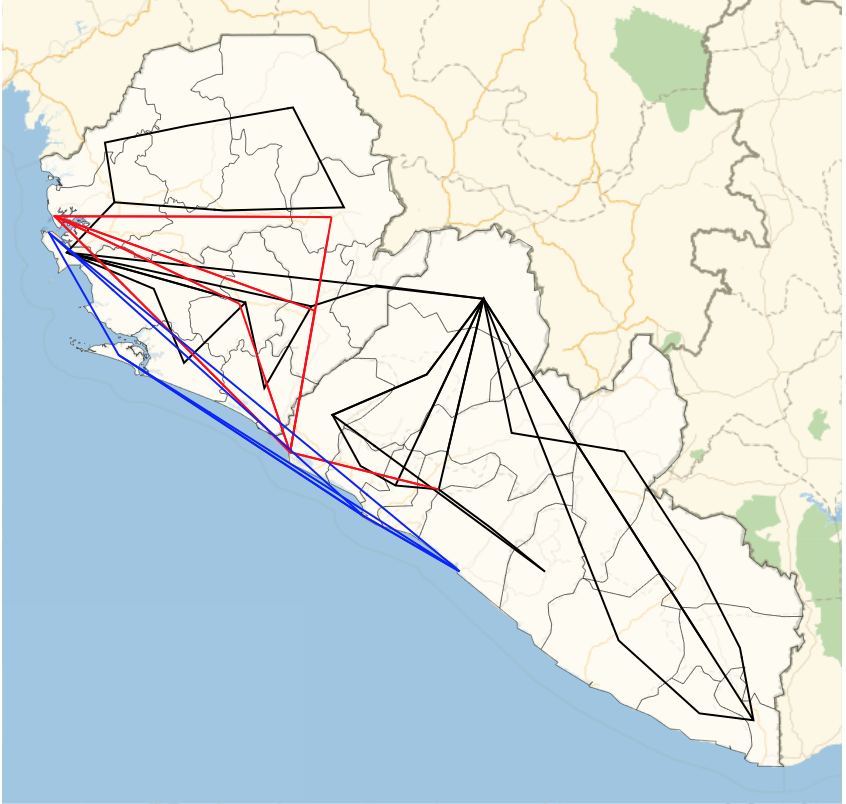
Then, by looking at data, such as airport, shipping port, and highway traffic, I was able to make a weighted network where thicker edges represent a greater chance of the disease spreading via that channel. This was the resulting graph: 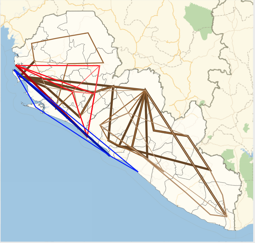
Final Demonstration
Now that I had the maps and predictive networks, I was ready to bring everything together into one manipulate. TabView was used for the buttons to choose whether the user wants to view the "Past Maps" or "Future Networks", as well as buttons to choose any information the user wants on the map. Finally, a slider is used to show the spread of Ebola.
n = 1;
 Manipulate[
 TabView[{
    "Past" -> Manipulate[
     TabView[{
        "None" -> Column[{

          Row[{Slider[Dynamic[n], {1, 28, 1}], " ",
            Dynamic[labels[[n]]]}],
          Dynamic[nonepastFunction[n], TrackedSymbols :> {n}]}],
       "Populated Cities" -> Column[{

          Row[{Slider[Dynamic[n], {1, 28, 1}], " ",
            Dynamic[labels[[n]]]}],
          Dynamic[citiespastFunction[n], TrackedSymbols :> {n}]}],
       "Commercial Airports" -> Column[{

          Row[{Slider[Dynamic[n], {1, 28, 1}], " ",
            Dynamic[labels[[n]]]}],
          Dynamic[airportpastFunction[n], TrackedSymbols :> {n}]}],
       "Major Sea Ports" -> Column[{

          Row[{Slider[Dynamic[n], {1, 28, 1}], " ",
            Dynamic[labels[[n]]]}],
          Dynamic[portspastFunction[n], TrackedSymbols :> {n}]}]
       }],
     {{n, 1}, 1, 28, 1, ControlType -> None}
     ],
    "Future" -> Manipulate[
     TabView[{
        "All" -> futureall,
       "Districts" -> futureregions,
       "Commercial Airports" -> futureairports,
       "Major Sea Ports" -> futureports
       }],
     {{n, 1}, 1, 28, 1, ControlType -> None}
     ]}],
 {{n, 1}, 1, 28, 1, ControlType -> None}, ContentSize -> {680, 670},
 SaveDefinitions -> True
 ]
The Manipulate results in the following:
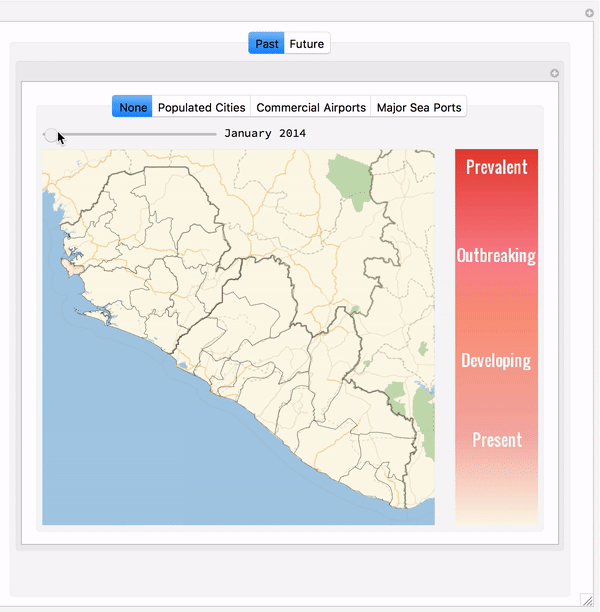
The first is a GIF of the spread of the 2014 Ebola Outbreak, while the second GIF is a weighted graph connecting points that are key to the spread of disease.
Conclusion
From this project, we can see that areas with international airports are a hub for the spread of disease. The Lungi Airport and Robertsport Airport are the two international airports in this region, and the districts that they are in happen to have the most cases of Ebola. Additionally, we can see that the disease originated in the Western Province, which contains the International Airport in Sierra Leone, has a major sea port, is the most populated region in Sierra Leone, AND has the most populated city (Freeman) in Sierra Leone, which makes sense as why it was a hub for Ebola. Because of the fact that disease can spread quickly through travel, it makes sense that regions along the coast had more confirmed cases of Ebola. This project allowed me to visualize how the Ebola disease spread and helped me create a network that models the various channels diseases can be transmitted through.
As an extension of this project, I would like to take my model one step further and plug in numerical values to show in exactly what quantity the disease will spread in. This project was a great way to make a visual model of the Ebola epidemic and can be applied to learn more about how diseases are transmitted.
 Attachments:


