Introduction
It is often said that a picture is worth a thousand words, and its true that a graphic can equal a thousand data points. Graphics can reveal to us trends that we wouldnt have seen otherwise and show us information in a new light. Yet, making the right representation can be a struggle, especially when given data without context.
Purpose
The goal of this project was to create a function that finds the best possible graphical representation for numerical data. The function analyzes whether the data should be either a bar chart, a line plot, a scatter plot, a pie chart, points on a map, a histogram, a bubble plot, or a waterfall chart.
Process
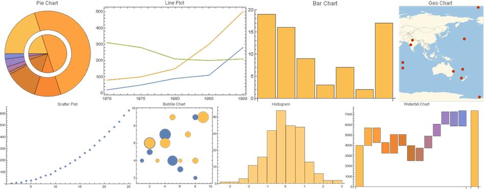
The first step was gathering sample data for each type of graphic. To accomplish this step, the most commonly used and easy to identify types of charts were determined. As mentioned before, these types of graphics were determined to be bar charts, waterfall charts, pie charts, scatter plots, line plots, bubble charts, histograms, and geo charts.
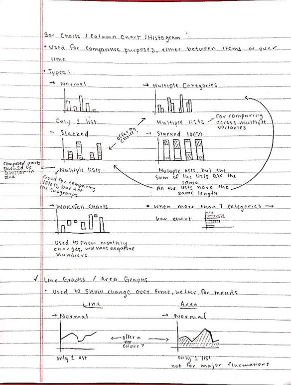
Bar charts are used for comparative purposes, and can encompass multiple variables. The input for this type of graphic can vary greatly, but must be contained either in a single list or in a series of nested lists.
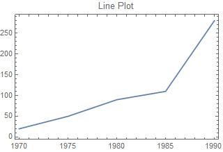
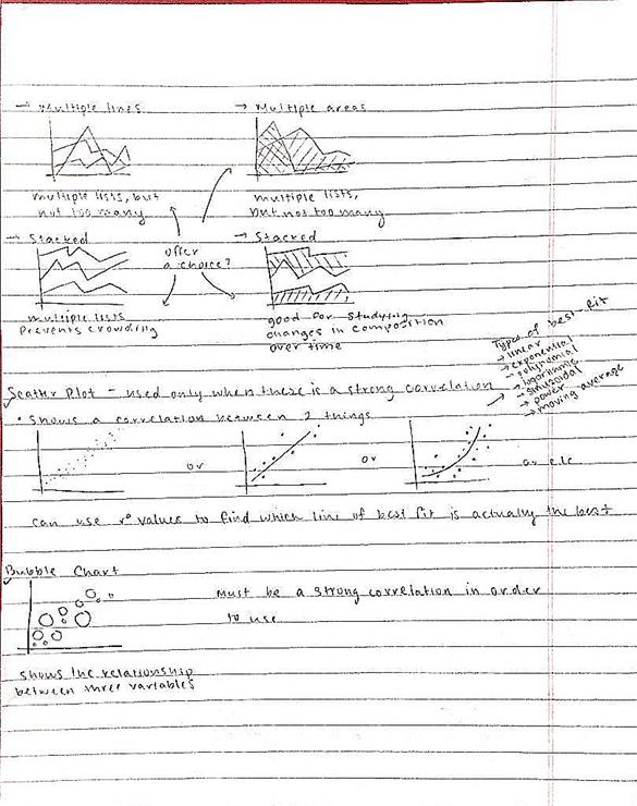
Line plots are also used for comparative purposes, but are either used as a comparison across time or to show a relationship between two variables. The data for line plots often comes in pairs. Since line plots sometimes deal with dates and times, the data was split into two variables, LinePlotExamples and TimeLinePlotExamples.
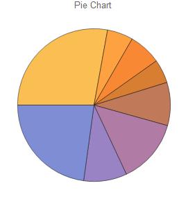
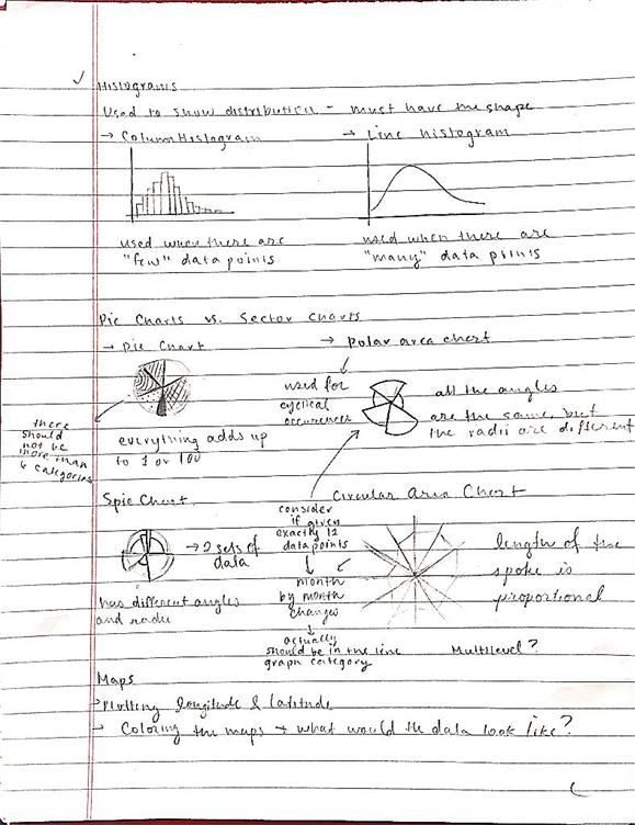
Pie charts are often used when dealing with percents or parts of a whole. Therefore, the sum of the data used in pie charts usually either sums to 1 or 100.
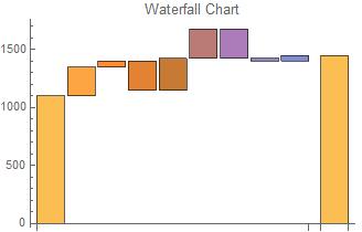
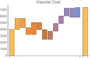
Waterfall charts are often used by businesses to show change in respect to a previous event. The first bar represents the initial value. Each bar from that point shows either a rise or a drop in value. The last bar represents the final value after the series of rises and drops. Due to the nature of the chart, the data for waterfall charts often includes alternation between positive and negative numbers.
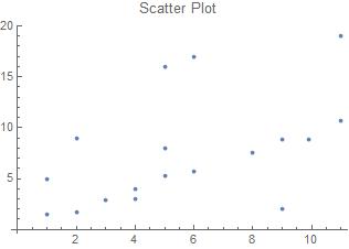
Scatter plots are often used to show correlation between two variables. Unlike line plots, scatter plots can still be created when the data is out of order.
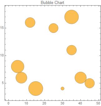
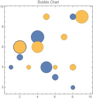
Bubble charts are similar to scatter plots except that they show correlation across three variables. One variable is represented by position on the x-axis, another by position on the y-axis, and the last by the radius of the bubble. The data for bubble charts always comes in triplets.
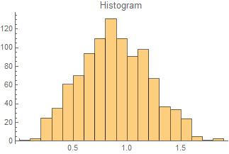
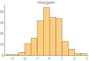
Histograms are used to show distribution and often have a bell shape to them.
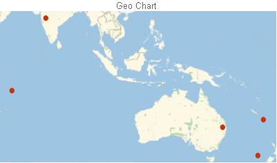
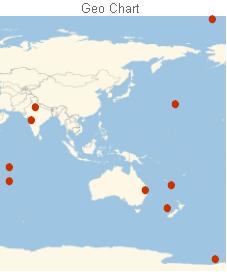
Finally, geo charts are used for the purpose of pointing out different parts of the world. As a result, the data for geo charts resembles longitude and latitude coordinates.
After all the training data had been determined, the function DataClassify[] was created by using the built-in function Classify[].
DataClassify = Classify[Flatten[{barChartexamples, waterfallExamples, pieChartExamples, LinePlotExamples, TimeLinePlotExamples, BubbleChartExamples, HistogramExamples, ScatterPlotExamples, GeoExamples }]]
The function DataClassify[] identifies which type of chart would be most appropriate.
Next, the function Visualize[] was created. This function graphs the data in the format specified by DataClassify[].
Visualize[x_List] := ToExpression[DataClassify[ToString[x]]][x]
Finally, a microsite was created to display the function.
URLShorten[CloudDeploy[FormPage["data" -> <| "Interpreter" -> "Expression", "Label" :> "Enter the data as a list" |>, CloudEvaluate[Visualize[#data]] &]]]
The microsite can be found at https://wolfr.am/w5hrqZM8.
Code
All the code is included below.
DataClassify = Classify[Flatten[{barChartexamples, waterfallExamples, pieChartExamples, LinePlotExamples, TimeLinePlotExamples, BubbleChartExamples, HistogramExamples, ScatterPlotExamples, GeoExamples }]]

Visualize[x_List] := ToExpression[DataClassify[ToString[x]]][x]

URLShorten[CloudDeploy[FormPage["data" -> <| "Interpreter" -> "Expression", "Label" :> "Enter the data as a list" |>, CloudEvaluate[Visualize[#data]] &]]]
Examples
Some examples of the function Visualize[] at work are below.
Visualize /@ {
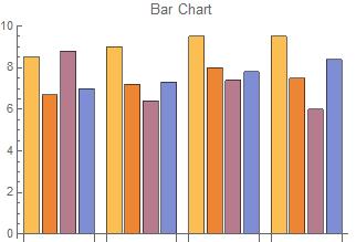
{{8.5, 6.7, 8.8, 7}, {9, 7.2, 6.4, 7.3}, {9.5, 8, 7.4, 7.8}, {9.5, 7.5, 6, 8.4}},
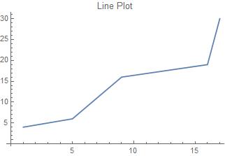
{{1, 4}, {5, 6}, {9, 16}, {16, 19}, {17, 30}},
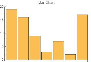
{1100, 250, 50, -250, 275, 250, -250, -25, 50},
{{"1970", 20}, {"1975", 50}, {"1980", 90}, {"1985", 110}, {"1990", 280}},
{.61, .12, .15, .11, .2, .3, .2, .5}, {{40, 6, 541}, {35, 11, 390}, {15, 4, 825}, {7, 6, 503}, {12, 16, 403}, {45, 5, 375}, {5, 8, 657}, {35, 17, 787}, {30, 4, 44}, {25, 15, 354}},
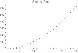
RandomVariate[WeibullDistribution[3, 1], 1000],
{{-40.30294, 167.57691}, {-27.99694, 152.31741}, {-12.00480, 60.45049}, {-24.75070, 169.87108}, {19.59415, 75.12872}},
{{1, 5}, {5, 8}, {2, 9}, {9, 2}, {11, 19}, {5, 16}, {4, 3}, {6, 17}, {1, 1.5}, {3, 2.9}, {2, 1.7}, {5, 5.3}, {11, 10.69}, {4, 3.94}, {9, 8.80}, {6, 5.7}, {8, 7.6}, {9.9, 8.8}}
}
{, , , , , , , , }
Improvements
While the project did accomplish all of its goals, improvements can still be made. One way to improve this project is to continue to feed it more training data. The data for this project was gathered by finding as many of that type of chart as possible and decoding the chart into the data. As can be imagined, this approach is limited, and the training data is limited. A better approach would be to funnel multitudes of sorted data into the training sets.
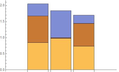
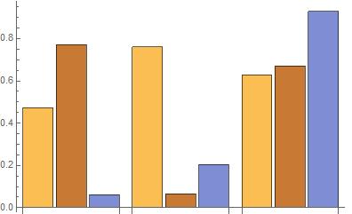
This project could further be improved by distinguishing variations in each type of graphic. For example, when dealing with a bar chart of multiple categories, either a stacked bar chart or a grouped one can be used. The two charts below both show the same data in different formats.
Table[BarChart[RandomReal[1, {3, 3}], ChartLayout -> l], {l, {"Stacked", "Grouped"}}]
 ,
, 
Similarly, with scatter plots, the decision of whether or not to include a line of best fit could be considered. In the two examples below, a line of best fit would be more appropriate for the chart on the right as opposed to the one on the left.
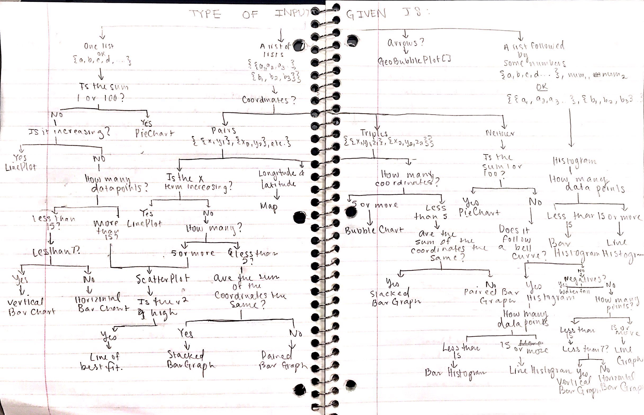
The initial planning for this project did include more detailed options, which can be seen in the flowchart below. Expanding on the initial flowchart could improve this project.
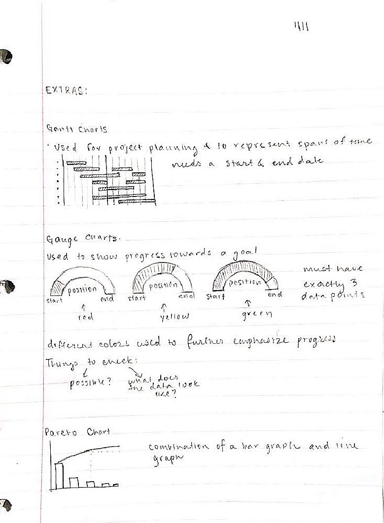
Further improvements for this project would be including more types of graphics. Additional graphics that could be included are Gantt charts, gauge charts, Pareto Charts, area graphs, line histograms, polar area charts, Spie charts, and circular area charts.
For more information on these types of charts, the links in section labelled "Background Info Links/References" can be studied. The following pages of early planning notes may also be helpful.
Background Info Links/References
https://www.mymarketresearchmethods.com/types-of-charts-choose/
https://eazybi.com/blog/datavisualizationandcharttypes/
http://blog.visme.co/types-of-graphs/
Special thanks to Dariia Porechna and Katie Orenstein for their help.


