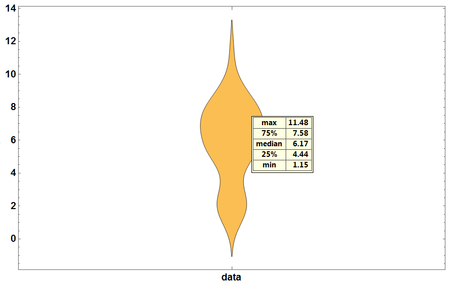
Message Boards Message Boards

[?] Understand Violin Plot maximum and minimum values?

Hi,

In the Violin plot, why ‘data’ showes negative values below zero? The maximum of ‘data’ is 11.48, why Violin plot exceeded 12 on the y-axis?

In[10]:= data = {8.58`, 1.85`, 4.95`, 1.36`, 1.58`, 2.06`, 5.46`, 
  11.48`, 8.86`, 9.6`, 2.37`, 5.32`, 5.71`, 5.74`, 5.34`, 5.33`, 
  5.22`, 8.13`, 8.02`, 7.58`, 7.33`, 7.98`, 6.76`, 6.29`, 7.01`, 
  5.78`, 4.12`, 2.44`, 1.97`, 3.06`, 8.46`, 7.25`, 7.38`, 6.72`, 
  7.88`, 6.61`, 2.59`, 6.76`, 6.17`, 1.15`, 5.39`, 4.44`, 6.97`, 
  7.94`, 9.3`, 7.44`}

In[13]:= {Max[data], Min[data]}

Out[13]= {11.48, 1.15}

enter image description here

POSTED BY: M.A. Ghorbani
4 Replies

DensityPlot is for plotting 2D-densities and does not has per se anything to do with statistics. Maybe this comparison helps:

Through[{Histogram, SmoothHistogram}[data, GridLines -> Automatic]]

enter image description here

As you see, the SmoothHistogram exceeds the MinMax values of the data, which is reasonable.

POSTED BY: Henrik Schachner

Thank you very much Henrik.

POSTED BY: M.A. Ghorbani

This is because here a "smoothed out" distribution is shown. If you do not like this, you can change the option ChartElementFunction, e.g.:

DistributionChart[data, ChartElementFunction -> #, 
   GridLines -> {None, Automatic}] & /@ {Automatic, "Quantile", 
  "DensityQuantile", "FadingQuantile", "GlassQuantile", "Density", 
  "HistogramDensity", "LineDensity", "PointDensity"}

enter image description here

POSTED BY: Henrik Schachner

Thank you very much Henrik.

So what is the main difference between Violin plot and Density plot.?

POSTED BY: M.A. Ghorbani
Reply to this discussion
Community posts can be styled and formatted using the Markdown syntax.
Reply Preview
Attachments
Remove
or Discard

Group Abstract Group Abstract