Data about the oldest humans that have lived allow a small data set to reveal larger patterns about human life expectancy and general quality of life. The data used in this brief analysis can be found at http://archive.is/4kwbk.The first step in my data analysis was to extract data and reformat it. First, I import the data and define the headers of the dataset.
orig = Import["http://archive.is/4kwbk", "Data"]
heads = {"#", "Birthplace", "Name", "Born", "Died", "Age", "Days",
  "Race", "Sex", "Deathplace"}
Next, I convert the data to the Dataset form.
dataSimplified =
 Dataset[Association[Thread[heads -> #[[;; 10]]]] & /@
   Take[orig[[2, 1, 1]], {8, 72}]]
The data is relatively disorganized and complex, so many substitutions were necessary so that the Interpreter function was able to understand the data.
dataCorrected =
 dataSimplified[
  All, {"Birthplace" ->
    StringReplace[{"U.S." ~~ ___ -> "USA", ___ ~~ "(UK)" -> "UK",
      "Czechoslovakia" -> "Czech Republic",
      "Germany (now Poland)" ~~ ___ -> "Poland",
      "Canada (Que)" -> "Canada",
      "Cape Verde (Portugal) [8]" -> "Portugal", ___ ~~ "Jamaica)" ->
       "Jamaica"}], "Born" -> StringReplace[{"[1]" -> ""}]}]
The last line of the data is offset as Kane Tanaka is the current oldest person alive.
In[ ] = Normal[dataCorrected1[65, All]]
Out[ ] = <|"#" -> 65, "Birthplace" -> "Japan", "Name" -> "Kane Tanaka",
 "Born" -> "Jan. 2, 1903", "Died" -> "115*", "Age" -> "214*",
 "Days" -> "EA", "Race" -> "F", "Sex" -> "Japan (Fukuoka)",
 "Deathplace" -> "2018-"|>
We'll have to manually edit this data.
row65 = Dataset[<|"#" -> 65, "Birthplace" -> "Japan",
   "Name" -> "Kane Tanaka", "Born" -> "Jan. 2, 1903", "Died" -> "n/a",
    "Age" -> "n/a", "Days" -> "n/a", "Race" -> "EA", "Sex" -> "F"|>]
dataCorrected2 = Append[Drop[dataCorrected1, -1], row65]
Using the Interpreter function, I was able to convert birthplaces to a format that is easily computable.
dataInterpreted =
 dataCorrected2[
  All, {"Birthplace" -> Interpreter["Country"],
   "Born" -> Interpreter["Date"], "Died" -> Interpreter["Date"]}]
I then used the GeoHistogram command to create the following figure.
GeoHistogram[
 Normal[dataInterpreted[All, "Birthplace"]], {"Rectangle", 15},
 PlotTheme -> "Scientific"]
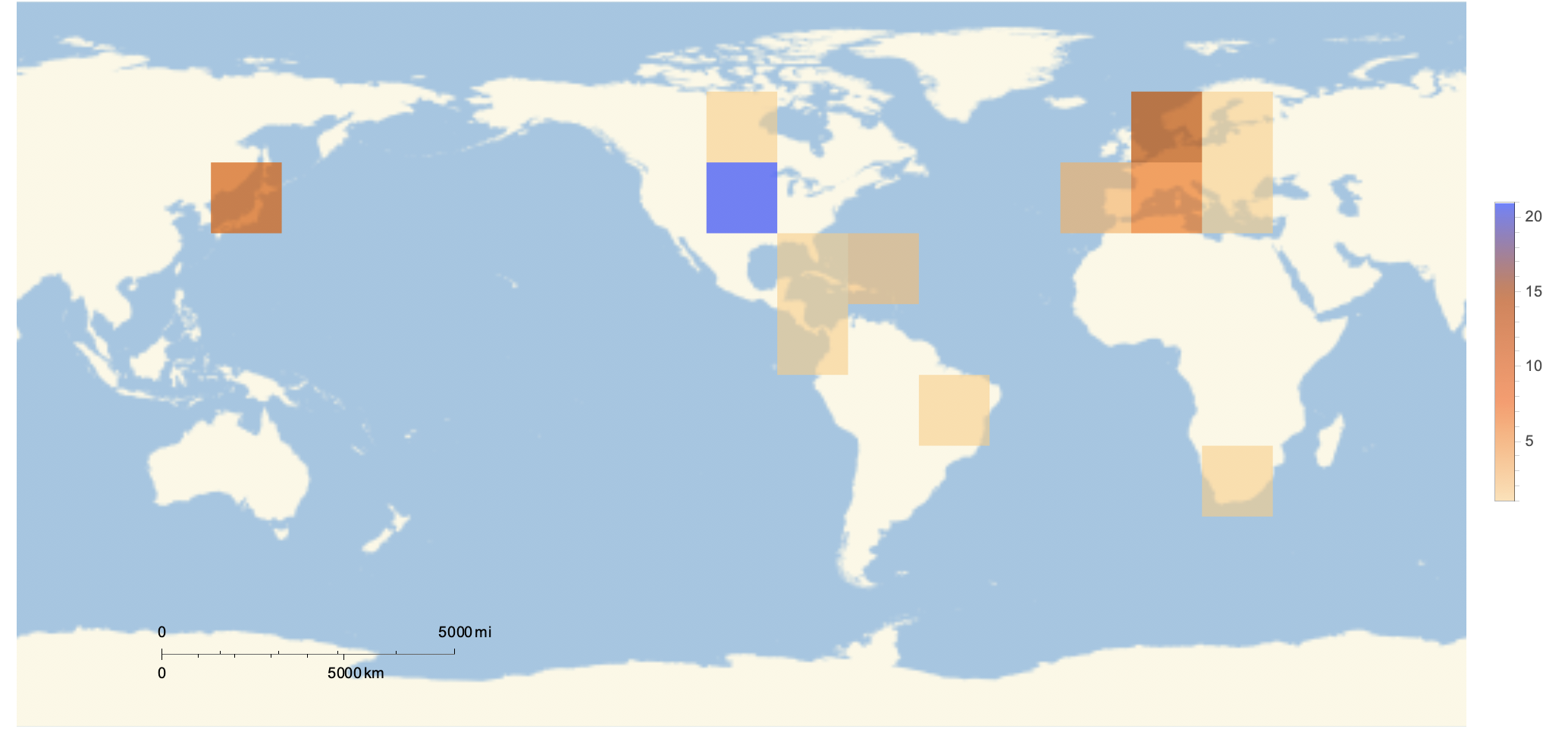
The figure displays the density of the worlds oldest people in different regions. Analysis: This figure supports the hypothesis of the Global South. This controversial hypothesis that is often said to overgeneralize suggests that individuals living South of the equator are more likely to have a lower quality of life than those living North of the equator. This figure supports the hypothesis as better quality of life is associated with longer life expectancy, and the figure suggests that those who reign as the oldest humans are more likely to be found North of the equator.
We can also observe similar disparities across races. The following figure was generated using the PieChart function.
racecounts = Counts[Normal[dataInterpreted[All, "Race"]]]
PieChart[Values[racecounts],
 ChartLabels -> {"White", "Japanese", "Black", "Hispanic",
   "East Asian", "Multiracial"}]
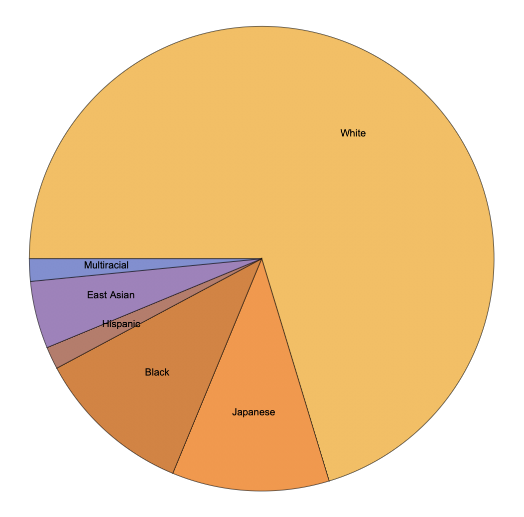 This figure displays the proportion of those who have reigned as the oldest human on earth by race. Note Japanese is separated as a different race in accordance with the original data. Analysis: This figure displays that a large majority of those who have reigned as oldest person are white. This data is reflective of general, global racial inequity.
Finally, we can look at some statistics of this elite group. The distribution of their ages can be generated using the Histogram function.
lifeLengthData =
 Drop[Quantity[Normal[dataInterpreted[All, "Age"]], "Years"] +
   Quantity[Normal[dataInterpreted[All, "Days"]], "Days"], -1]
Histogram[lifeLengthData, {600}, Frame -> True,
 FrameLabel -> {"Age (days)", "Frequency"}]
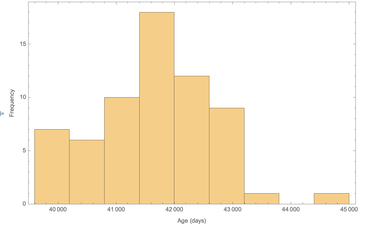 Note the last value in the is dropped as Kane Tanaka is still living. Analysis: What is particularly interesting about this data is the relative symmetry it exhibits. Using the
 Skewness function, I found that the skewness of this distribution is only .174, relatively low.
N@Skewness[lifeLengthData]
This is unexpected as age distributions typically have strong positive skew. If we interpret this data as a sample from a theoretical distribution, we can conduct inference tests. The inference test of interest would be the Mardia skewness test for normality. This test allows us to assess whether the skewness observed is significantly different than the skewness measurements produced by random sampling of the normal distribution. The Wolfram Language is able to run this test with the MardiaSkewnessTest. Testing the data returns a p-value of .569, above almost all significance thresholds.
MardiaSkewnessTest[N@lifeLengthData]
Running the function DistributionFitTest on the data returns the following table.
DistributionFitTest[
 N@lifeLengthData, Automatic, {"TestDataTable", All}]
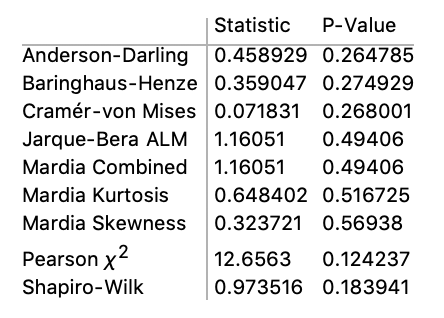
For all tests appropriate for the data, none flagged the data as significantly different than variates of the normal distribution. Again, this is unexpected because of the typical strong positive skew of age distributions.


