Introduction
Cities all over the world grow over time at different classes and rates. It is beneficial for citizens, companies, governments, ...etc to get an estimate of these rates and the direction of the development. In this study we explore several ways to collect and process data (manual and through an API), and try to find suitable way to predict the development a city using satellite images.
Data
Satellite data images are becoming more available than ever across the globe. They offer images with different information layers that highlight points (areas) of interest accompanied with numeric and nominal data. There are several ways to obtain this kind of datasets such as purchasing them from a provider, but there are some other methods to obtain datasets for free such as for example downloading images through Google Earth Pro application, which allows user to explore images of certain position through time in a simple way and it switches between images from different satellites while the user changes parameters like zoom level and time. Another way to get free satellite images is by using an API from data provider which is more time efficient and can provide pre-highlighted areas of interest in the given images.
Manual collection of satellite images
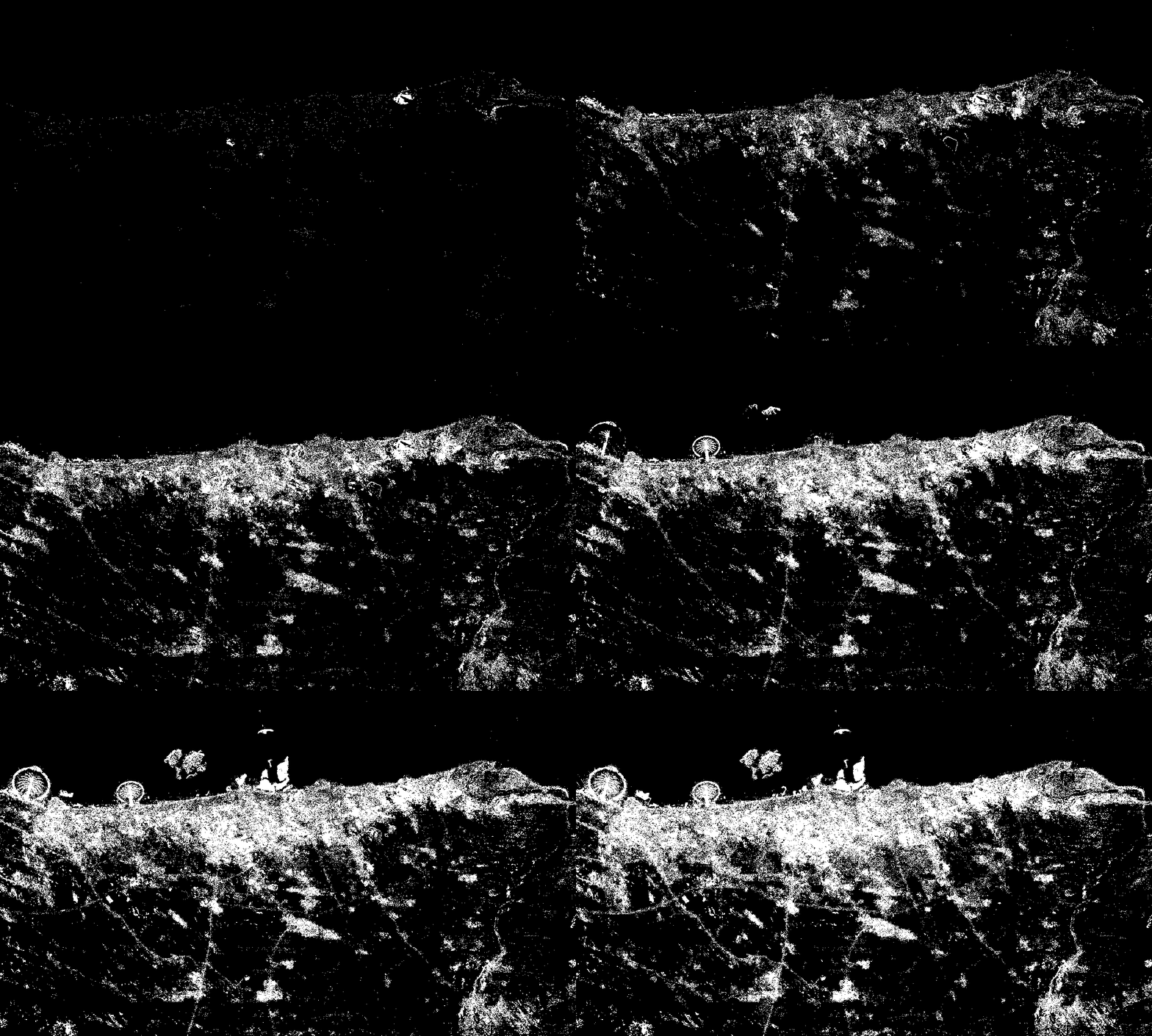
The following animation is a timelapse of the development of Dubai and its surrounding area through the time interval 1984 - 2016 made by images we collected manually from Google Earth Pro and stored them as a gif file. 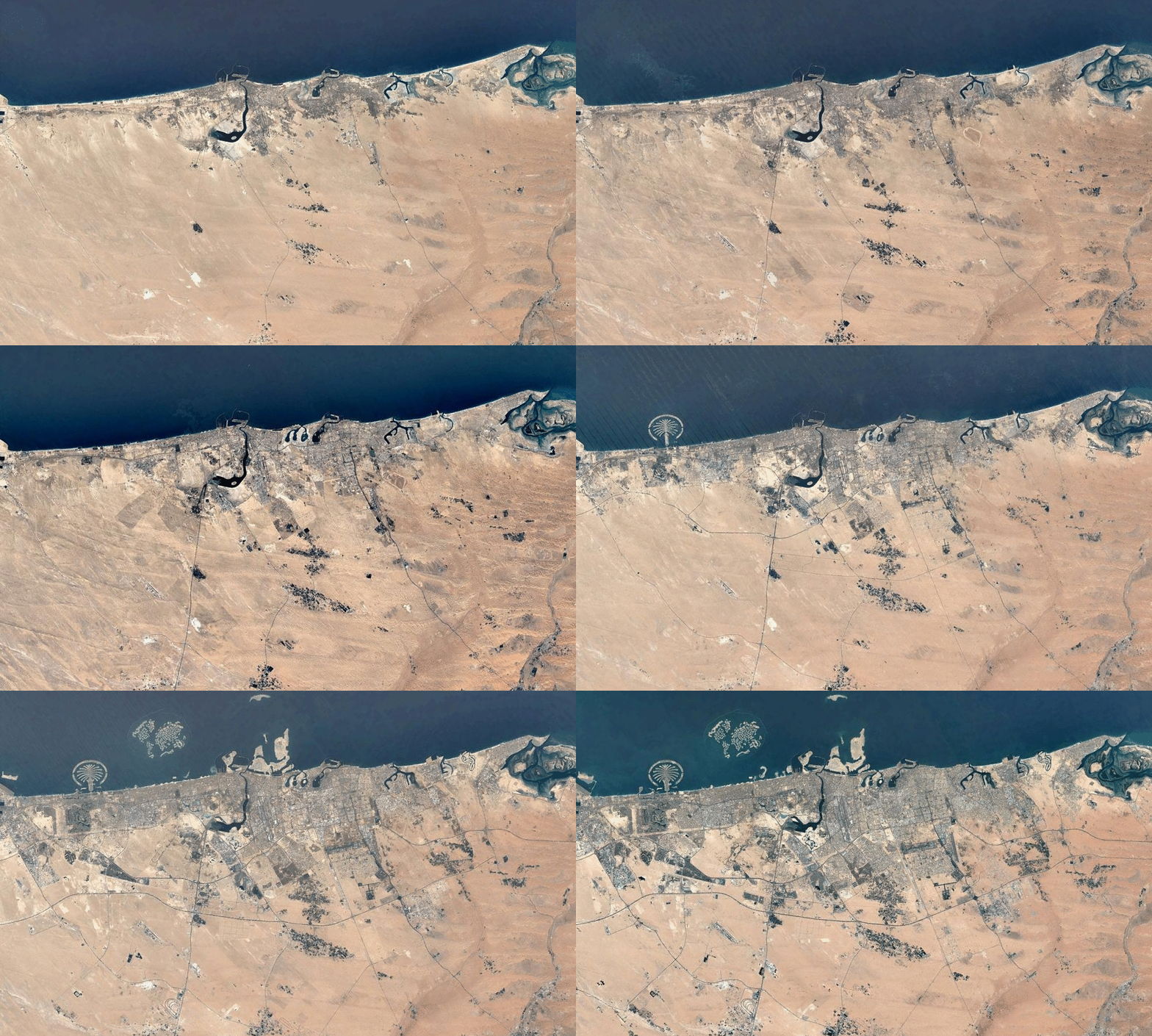 Using such dataset specially if it contains sand covered areas, allows limited control of choosing specific class to study. For example if the desired class to study is urban change, then separating urban developed areas from sand areas based on color classification may produce in accurate data even with high resolution images. If the desired study is for overall development of the city including all the classes, then this dataset can be used by binarize the image differences over time.
imgList = Import["your list of collected images.jpg"];
diffList = Differences[imgList];
ImageMeasurements[Binarize[#, .1], "Total"] & /@ diffList // ListLinePlot
and to monitor the change rate between images over time we plotted the sum of data values in the binarized image differences.
diffdata = ImageMeasurements[Binarize[#, .1], "Total"] & /@ diffList;

diffdata // ListLinePlot
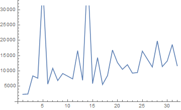
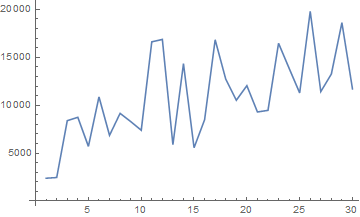
The spicks here are due to some anomalies in the images, in that specific data case the spicks are due to wind or sand storms that changed the surface structure of some sand covered areas, these changes appeared in two of the image differences. In order to remove these anomalies we removed the outliers from the list of total data in the binarized image differences.
q = Quartiles[diffdata];
maxq = q[[3]] + 1.5 (q[[3]] - q[[1]]);
minq = q[[1]] - 1.5 (q[[3]] - q[[1]]);

newimgList =
  Delete[imgList, Position[diffdata, _?(minq > # || # > maxq &)]];

newdiffList = Differences[newimgList];

newdiffdata =
  ImageMeasurements[Binarize[#, .1], "Total"] & /@ newdiffList;

newdiffdata // ListLinePlot
ListAnimate[Accumulate[Binarize[#, .1] & /@ newdiffList],
 ImageSize -> Large]
 In order to compare the change rate for multiple areas (with the same parameters values) we calculated the average of change rate over time.
Mean@newdiffdata
10852.4
API utilization for collecting Satellite images
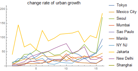
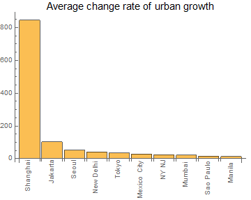
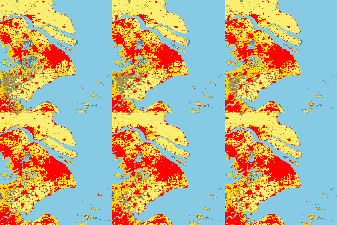
We were able to connect to the API of NASA's website and get images with acceptable resolution and many classes. We first got the classes color code then we started to receive images of the metropolitan area of Shanghai since it is the city with the highest change rate over time among the most populated ones in the world.
rawLegend =
  Import["https://gibs.earthdata.nasa.gov/colormaps/v1.3/MODIS_\
Combined_IGBP_Land_Cover_Type_Annual.xml"];

legend = Association@
   Cases[rawLegend,
    XMLElement[
      "LegendEntry", {"rgb" -> color_, "tooltip" -> name_,
       "id" -> _}, {}] :>
     RGBColor[ToExpression /@ StringSplit[color, ","]/255] -> name,
    Infinity];

legendReverse = AssociationMap[Reverse, legend]
topcities =
 EntityList[
  EntityClass["MetropolitanArea", "Population" -> TakeLargest[10]]]
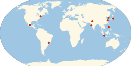
Which get the list of Tokyo, Mexico City, Seoul, Mumbai, Sao Paulo, Manila, New York-Northern New Jersey-Long Island, NY-NJ-PA, Jakarta, New Delhi, Shanghai.
GeoListPlot[
 EntityClass["MetropolitanArea", "Population" -> TakeLargest[10]][
  "Position"], GeoRange -> "World", GeoProjection -> "Robinson"]
cityImgs10 =
  Function[p,
    GeoImage[GeoDisk[p, Quantity[70, "Miles"]], GeoZoomLevel -> 8,
       GeoServer -> \
{"https://gibs.earthdata.nasa.gov/wmts/epsg3857/best/MODIS_Combined_\
L3_IGBP_Land_Cover_Type_Annual/default/" <>
          DateString[#, {"Year", "-", "Month", "-", "Day"}] <>
          "/GoogleMapsCompatible_Level8/`1`/`3`/`2`.png",
         "ZoomRange" -> {1, 8}}, Background -> Black] & /@
     DateRange[DateObject[{2001, 1, 1}], DateObject[{2017, 1, 1}],
      "Year"]] /@
   EntityClass["MetropolitanArea", "Population" -> TakeLargest[10]][
    "Position"];
binaryMaps =
  Map[Binarize[
     ColorDetect[#, legendReverse["Urban and Built-up Lands"]],
     0.9999] &, cityImgs10, {2}];

newdiffList10 = Differences[#] & /@ binaryMaps;

newdiffdata10 = ImageMeasurements[#, "Total"] & /@ newdiffList10;
ListLinePlot[newdiffdata10,
 PlotLegends ->
  ReplacePart[EntityValue[topcities, "Name"], 7 -> "NY NJ"],
 PlotLabel -> Style["change rate of urban growth", Black, 15]]
With[{data =
   ReverseSort@
    AssociationThread[
     ReplacePart[EntityValue[topcities, "Name"], 7 -> "NY NJ"],
     Mean /@ newdiffdata10]},
 BarChart[data, ChartLabels -> (Rotate[#, Pi/2] & /@ Keys[data]),
  PlotLabel ->
   Style["Average change rate of urban growth", Black, 15]]]
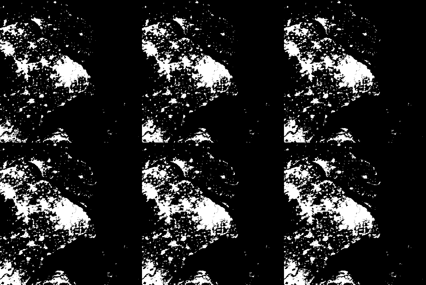
{ListAnimate[cityImgs10[[10]]], ListAnimate[binaryMaps[[10]]]}
Prediction of future urban development
To predict the next urban development in a certain area, we need historical data which we already obtained in the previous section. Since Wolfram language provide several methods for prediction we decided to look for a suitable method for our study. In case of classified images, only 17 years available in historical data that are available to be obtained via API (2001 - 2017), which is not enough to train Neural Network for prediction, so we decided to simulate a convolution layer and use it among a statistical model. First we use the binarized classified images, by that we only limit the study to the urban areas. Then we transform the image into binary vectors, a vector for each raw of pixels. A pixel place is one if this place is part of the urban area, and zero otherwise. Next we divide the training images into smaller parts, each part and its historical versions will be used to predict a corresponding pixel. We divided the training set into sets of five consecutive images with offset equal to one. each group of five is used such that the first four images lead to the fifth one in prediction, by that we increased the size of training data.
Methods
Decision trees is one of the suitable methods for these kind of predictions. We used the first sixteen images to predict the following 7 images.
binaryMapsShanghai = binaryMaps[[10]];

rules = Catenate[
   Function[maps,
     Module[{flatMatrices},
      flatMatrices =
       Catenate@
        Transpose[
         Partition[ImageData[#, "Bit"], {3, 3}, {1, 1}, 2, 0] & /@
          Most[maps], {3, 1, 2, 4, 5}];
      Thread[flatMatrices -> Catenate@ImageData[Last[maps], "Bit"]]
      ]] /@ Partition[binaryMapsShanghai[[;; -2]], 5, 1]
   ];

pf = Predict[rules, Method -> "DecisionTree"]
predictimg[pf_] := Module[{output, predimg},
   output =
    Map[pf, Transpose[
      Partition[ImageData[#, "Bit"], {3, 3}, {1, 1}, 2, 0] & /@
       binaryMaps[[-4 ;; -1]], {3, 1, 2, 4, 5}], {2}];
   predimg = Binarize[Image@output, 0.1];
   AppendTo[binaryMaps, predimg];
   ];

predictimg[pf];
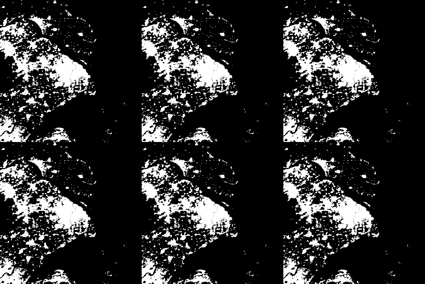
Every time the function predictimg is being called, it generates a new predicted binary image and add it to the list of binary images of the area in study. Here is an example of seven images generated by this function.
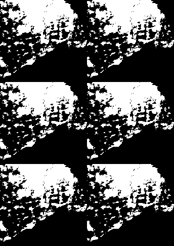
A closer look.
In order to see how good the model is, we fitted a linear regression ,model on the change rate of urban development for Shanghai and then compared the expected results with the ones we got from our model.
rateChange =
 LinearModelFit[Transpose[{Range[16], newdiffdata10[[10]]}], x, x]
ListPlot[Transpose[{(rateChange[#] & /@ Range[17, 22]), {271.`, 152.`,
     88.`, 57.`, 34.`, 15.`}}], Filling -> Axis,
 PlotLabel ->
  Style["Relation between expexted and generated change rate", Black,
   15]]
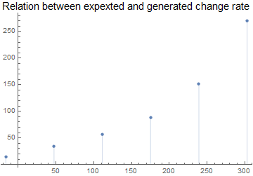
The model was quite cautious in deciding the next spread parts but we believe with some tweaks of the inputs we can get better results in the future versions of that model. We tried other statistical methods, for example Linear regression and Random Forest, but they did not show any change in the predicted images. We also tried the Nearest Neighbor method, which need much more time to produce an output and due to time limitations, we couldn't produce an output using this method.
Future plan
The model is in its early stage. More investigation in available methods. We still do not know how the Nearest Neighbor method will behave. Also there may be other API's that allow more data to be imported which may give better results. Tweaking the inputs may also affect the outputs and with some optimizations we may make better use of data at hand.