Intro
Most people live in cities nowadays. Cities provide the environment for collaboration and scientific discoveries. They drive the global economy. There are around 2 dozens urban areas with populations exceeding 10 million people, but we still fail to quantify the influence of various aspects of urban design on the quality of life. We have analysed 200 cities with a combined GDP of at least $13'528'044'528'286 per year. It accounts for at least 17% of global economy.
Brief overview of results
I didn't find direct correlations between the sentiment of related Twitter posts and the position of the city in the ranking. There is no obvious trend on the chart below, even though cities are sorted in the ascending order of quality of life. 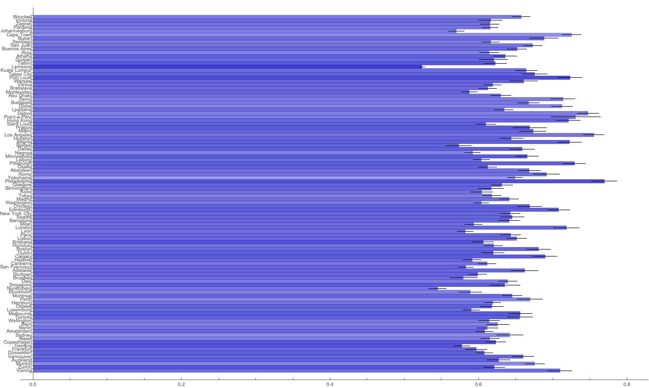
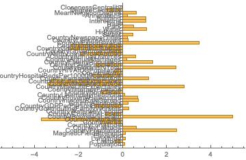
I didn't find direct correlations between the economic and geographical features of the city and the position of the city in the ranking. That data was available in the Wolfram knowledge base.
I didn't find direct correlations between the topology of the transportation network and the position of the city in the ranking. To analyze it I had to pull OpenStreetMaps data, reconstruct the road network of the city and run graph analytics on it to determine features like "betweenness centrality".
I didn't find direct correlations between the distribution of land by designation and the position of the city in the ranking. To analyse it, I had to pull satellite images from Google servers, rasterise & quantise the colour scheme. After that it's just a simple pixels counting task.
I only saw a positive trend when training CNN to analyse the hidden features of the city, as opposed to manually extracting them and feeding them into machine learning models. But those approaches require a lot more data. One of the more exciting ideas was trying to repurpose a CNN trained for a similar task. The closest one available in the Wolfram repository was probably the ResNet-101 trained to predict locations of different sights by their images, but carving out the right parts of the network and fine-tuning it afterwards was extremely problematic from both analytical and computational perspective.
Good cities vs Bad cities
Even though the advanced tools for analytics required far more data than what we had at our disposal (and could efficiently analyse in-RAM), some of the difference is much easier to see with the naked eye.
Take a look at the following chart. Those are the mean normalised values of cities from the Top 100 ranking by Mercer. The brightness of the bar is higher if the value is higher among good cities than among bad cities. 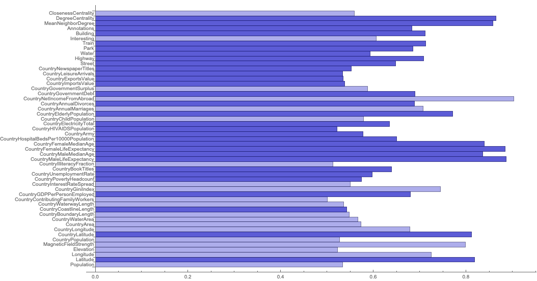
And below are the mean values for other large cities from all over the globe. The brightness of the bar is higher if the value is higher among bad cities than among good cities. 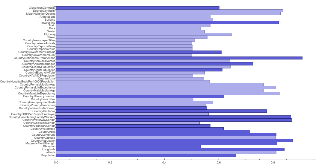
Future
This project proved to be very difficult and requires larger volume of data to train an accurate deep neural regression model. I will later continue this line of research with larger dataset and other tools. I invite everybody to join me!
Links


