1st note for Gompertz curve
Intending a differential equation model of COVID-19, for Italy and Spain to estimate the trend including the future. In the previous report, Logistic equation can model the event, however, expecting termination state such as in the case of Italy and Spain, is slightly differing from the Logistic curves, That difference introduce the unstable forecasting. So, the expecting model was changed to Gompertz curve model.
Where death number become y for the moment t, differential equation for y becomes, dy/dt= A y^Exp(-Bt) . A solution becomes as, y(t)= y= n b^Exp[-c (t-start)] where n is the potential number of death. The result equation is so called Gompertz curve.
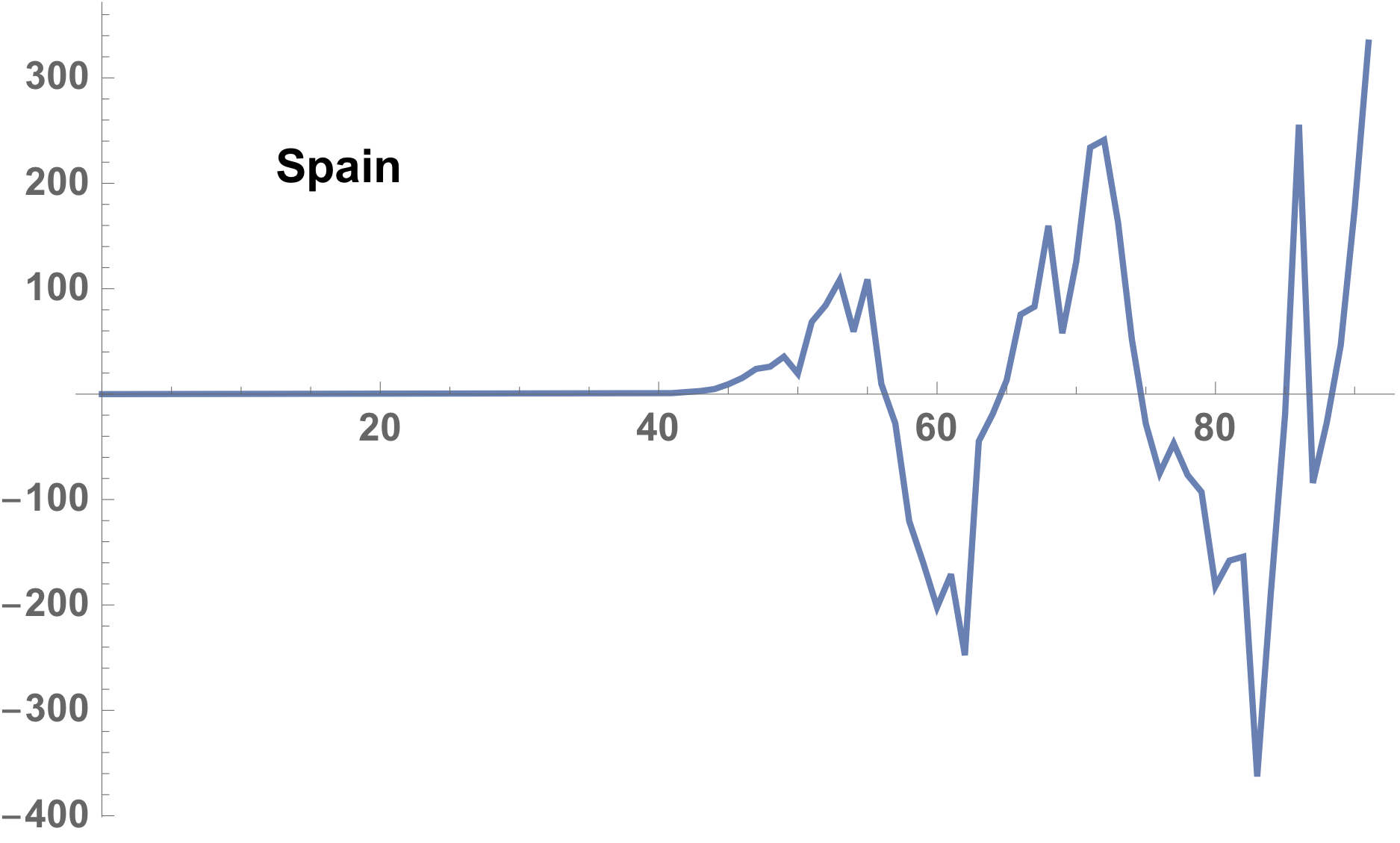
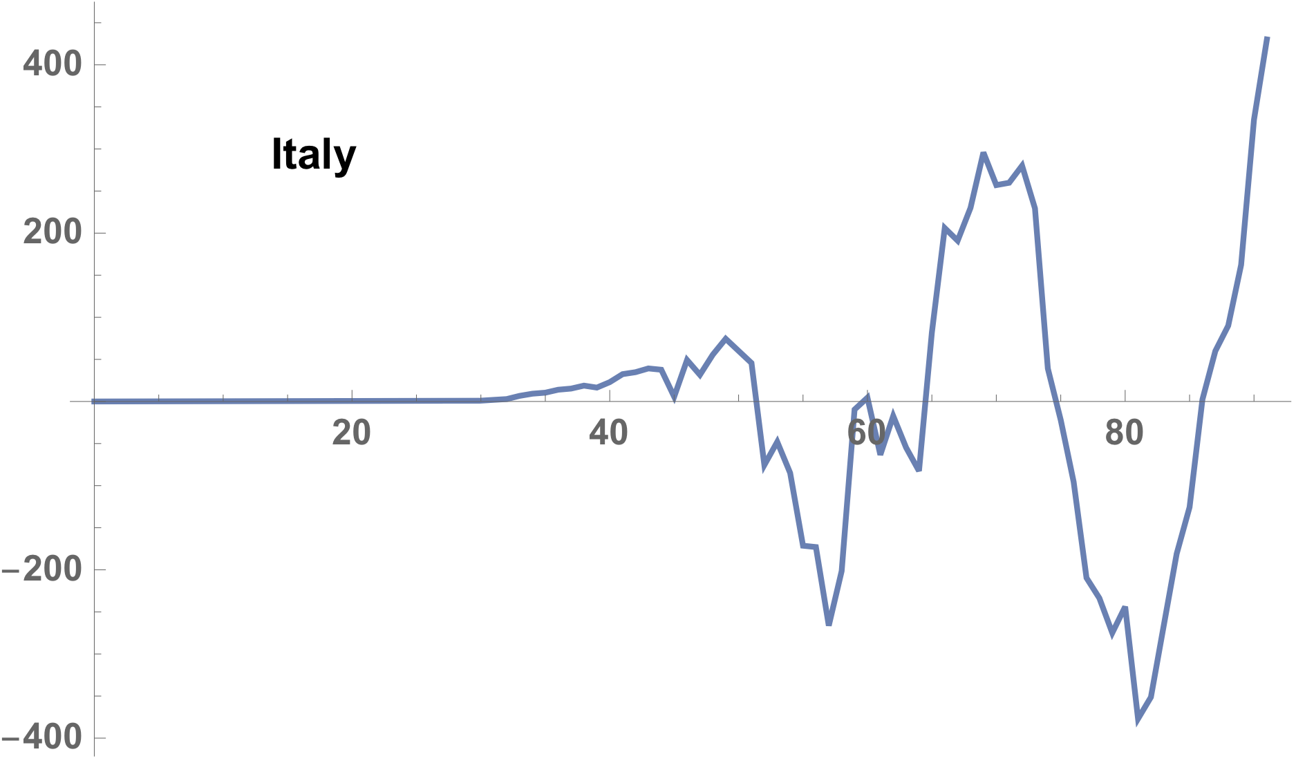
Very significant point is that the Gompertz model composed of exponential increasing part and exponential decreasing part which is defined by the constant coefficient. Closing up the fluctuations, you can see a characteristic periodic pattern on each case of Italy and Spain, and this periodic fluctuation is caused from the equation especially are shown in the termination-stages.
We can obtain world COVID status from such a pages.
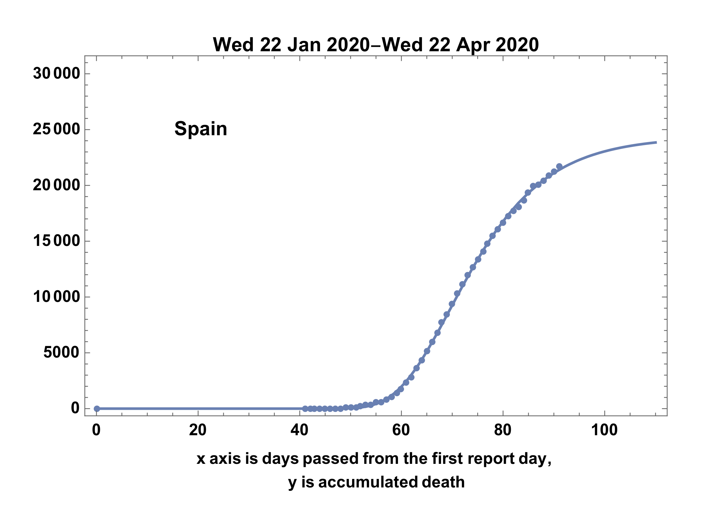
country = "Spain";
urlCovid19 = "https://pomber.github.io/covid19/timeseries.json"; data \
= Map[Association, Association[Import[urlCovid19]][country], {1}];
ddata = {DateObject[#["date"]], #["deaths"]} & /@ data;
firstday = ddata[[1, 1]];
Last[ddata]
Converting the data to the reported number separated.
i3 = Map[{QuantityMagnitude[#[[1]] - firstday], #[[2]]} &, ddata];
i4 = Map[First, Gather[i3, #1[[2]] == #2[[2]] &]];
ListPlot[i4]
Obtaining process of initial guess heuristically.
start = 55;
model = n b^Exp[-c ( t - start)];
initialguess = {n -> 25000, c -> 0.08, b -> 0.1};
Show[
 Plot[model /. initialguess, {t, 0, 1000},
  PlotRange -> {{0, 100}, {0, 50000}}],
 ListPlot[i4]
 ]
Fitting the death number to the model
ans = FindFit[i4, model, initialguess /. Rule -> List, t,
  MaxIterations -> 100]
Showing the result.
fdate = First[ddata][[1]];
ldate = Last[ddata][[1]];
upto = 110;

Show[
 ListPlot[i4,
  PlotLegends -> Placed[Text[Style[country, Bold]], {0.2, 0.8}]],
 Plot[model /. ans, {t, 0, upto}],
 PlotRange -> {{0, upto}, {0, 30000}},
 ImageMargins -> 20,
 Frame -> True,
 PlotLabel -> DateString[fdate] <> "-" <> DateString[ldate],
 FrameLabel ->
  "x axis is days passed from the first report day, \ny is \
accumulated death", LabelStyle -> {Black}]
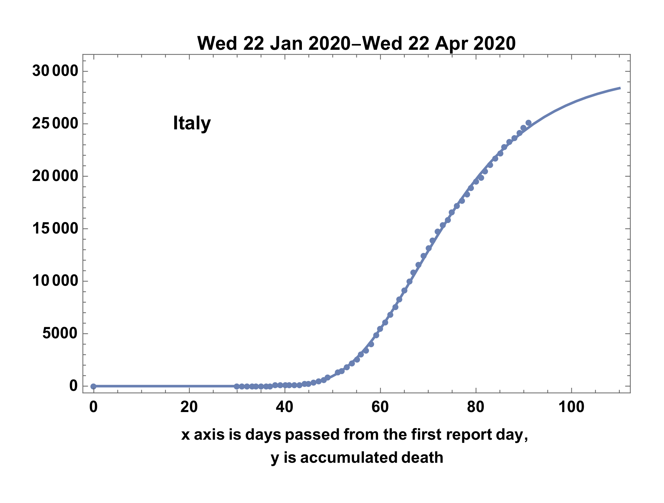
- Showing the result case of Italy
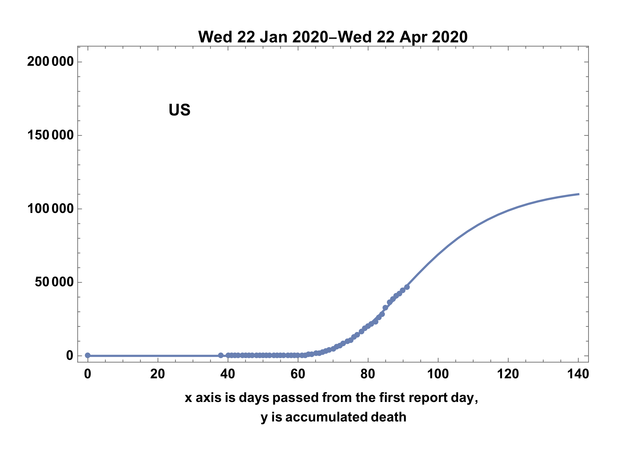
- Case of US still in extension-stage
Difference between reported and model estimated
Very interesting resembling is found between Italy and Spain.
pdays = First[Transpose[i4]];
death = Last[Transpose[i4]];
diff = Transpose@{pdays, death - (model /. ans /. t -> pdays)};
ListLinePlot[diff,
 PlotLegends -> Placed[Text[Style[country, Bold]], {0.2, 0.8}]]
The difference shown in the case of Italy, as follows,
case of the Spain is following.