Amir,
First, You should always post an example that actually runs and duplicates the problem.
You are mixing up the structure. You are sending company data to plot but trying to label the data with sector names
I took your code and made a running example so you can see the issue.
i = 0; stocks =
Table[Table[i += 5;
Table[{n, RandomReal[{i, i + 1}]}, {n, 25, 1000, 1}], {company,
companyNames[sec]}], {sec, sectorNames}];
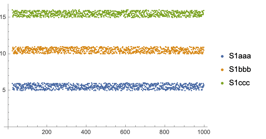
s = 1; ListPlot[stocks[[s]],
PlotLegends -> companyNames[sectorNames[[s]]]]
s = 2; ListPlot[stocks[[s]],
PlotLegends -> companyNames[sectorNames[[s]]]]
which gives a plot like this:
 If you intended to plot sectors and not companies, how do you take the data for, say 3 companies, and plot that as one sector? Is it three separate curves with the same color? three curves different colors?
Maybe this?
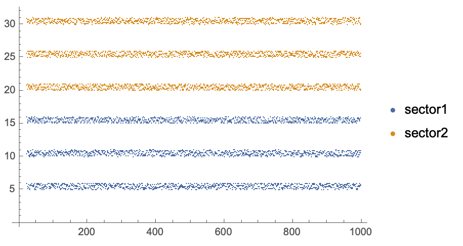
ListPlot[Map[Flatten[#, 1] &, stocks],
 PlotLegends -> sectorNames]
My recommendation is for you to look at using Dataset] for your stocks [(documentation here). Then you can make queries like get all the stocks is a certain sector. Your plotting commands will become less cryptic.
Regards,
Neil


