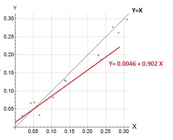
Hi,
How do I add the red line (the fitted model) to a chart like the below chart?
data = {{0.066551724`, 0.03344673290848732`}, {0.042857143`,
    0.06619860231876373`}, {0.104193548`,
    0.0819694995880127`}, {0.139`,
    0.1276416927576065`}, {0.236774194`,
    0.1868351548910141`}, {0.285333333`,
    0.260822594165802`}, {0.308064516`,
    0.2974480986595154`}, {0.268709677`,
    0.27652934193611145`}, {0.228928571`,
    0.1987084001302719`}, {0.135806452`,
    0.13015994429588318`}, {0.052666667`,
    0.06885196268558502`}, {0.019354839`, 0.03142540901899338`}};

sc = ListPlot[data, Mesh -> All, ImageSize -> 500,
   AspectRatio -> Automatic, TicksStyle -> Directive[Black, 12],
   AxesStyle -> Directive[Black, 12], Ticks -> Automatic,
   GridLines -> Automatic, Axes -> True, AxesLabel -> {"\!\(\*
StyleBox[\"X\",\nFontSize->16]\)", "Y" },
   Epilog -> Line[{{0, 0}, {1, 1}}]];

line = Fit[data, {1, x}, x]

Show[{Plot[line, {x, 0, 0.5}], sc}]