Thanks so much Rohit, The following was my thinking -- I have my list of sector stocks, AdvertisingAgencies, filtered for the nyse & nasdaq & 2021. A list of 25 stocks from a list of 133.
secNN01y = {"NASDAQ:ADV", "NASDAQ:BOMN", "NASDAQ:CMPR", "NASDAQ:CNET", \
"NASDAQ:CRTO", "NASDAQ:FLNT", "NASDAQ:ICLK", "NASDAQ:ISIG", \
"NASDAQ:MCHX", "NASDAQ:MGNI", "NASDAQ:NCMI", "NASDAQ:QNST", \
"NASDAQ:SRAX", "NASDAQ:WIMI", "NASDAQ:XNET", "NYSE:CCO", "NYSE:DLX", \
"NYSE:DMS", "NYSE:EEX", "NYSE:INUV", "NYSE:IPG", "NYSE:OMC", \
"NYSE:QUOT", "NYSE:TSQ", "NYSE:WPP"}
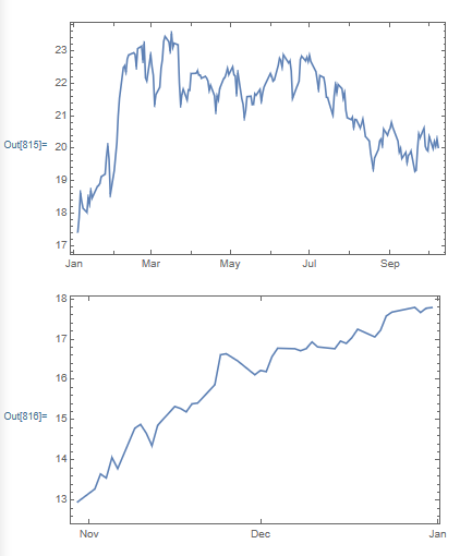
My question -- did advertiser's stock fall during the slow summer months and then rise towards Christmas?? I took the mean of the 25 stocks and plotted them, but was stymied by missing data.
o1 = DateListPlot[Mean[FinancialData[secNN01y, {2021}] ] ]
o2 = DateListPlot[Mean[FinancialData[secNN01y, {{2020}, {2020}}] ] ]

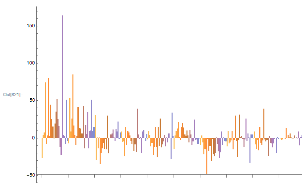
I used "Return" and reordered the data monthly and plotted it
m1 = FinancialData[secNN01y, "Return", {{2021}, {2021}, "Month"}];
m1T = Table[m1[[j, 2, 1, 1, i]], {i, 10}, {j, 25}];
BarChart[m1T]

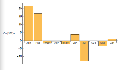
Interesting, January and February did well and the summer months showed more negative returns, but I needed to look at, at least ten years of data. I must first simplify the data before I learned how to wrap the years. I took the mean of the reordered data, which I now believe was a mistake as mean averages columns not rows.
m1Tm = Table[Mean[m1T[[i]] ], {i, 10}]
BarChart[m1Tm,
 ChartLabels -> {"Jan", "Feb", "Mar", "Apr", "May", "Jun", "Jul",
   "Aug", "Sep", "Oct"}]

January did not seem right and found a penny stock that had a 164% gain, which was skewing the data and decided to use "Price" instead.
p1 = FinancialData[secNN01y, "Price", {{2021}, {2021}, "Month"}];
p1T = Table[p1[[j, 2, 1, 1, i]], {i, 10}, {j, 25}];
p1TMP = p1[[All, 2, 1, 1, All]] // Normal // Mean // Mean
p1Tm = Table[Mean[p1T[[i]] /p1TMP - 1], {i, 10}]
BarChart[p1Tm,
 ChartLabels -> {"Jan", "Feb", "Mar", "Apr", "May", "Jun", "Jul",
   "Aug", "Sep", "Oct"}]
BarChart[m1Tm,
 ChartLabels -> {"Jan", "Feb", "Mar", "Apr", "May", "Jun", "Jul",
   "Aug", "Sep", "Oct"}]

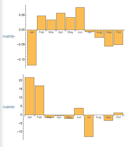
Same data but the charts look quite different. The top BarChart is based on the percent difference between the mean of the 25 stocks for each of the ten months in 2021 against the mean price of all the stocks over ten months. Whereas the bottom BarChart is the mean of the average "Return" for each stock for each month. One of the problems is that I used mean on the reordered data which remains and still needs to be investigated. And I did not know what Nov to Dec looked like, so I had to look at 2020. I tried the same template as I had used for 2021, but I was hampered by missing data
p20 = FinancialData[secNN01y, "Price", {{2020}, {2020}, "Month"}];
p20T = Table[p20[[j, 2, 1, 1, i]], {i, 12}, {j, 25}];
p20TMP = p20[[All, 2, 1, 1, All]] // Normal // Mean // Mean ;
p20Tm = Table[Mean[p20T[[i]] /p20TMP - 1], {i, 12}];
BarChart[p20Tm,
 ChartLabels -> {"Jan", "Feb", "Mar", "Apr", "May", "Jun", "Jul",
   "Aug", "Sep", "Oct", "Nov", "Dec"}]
if Table[] did not work maybe Pick[] might, I tried
Table[Pick[p20[[j, 2, 1, 1, k]]  ,
  DateWithinQ[DateObject[{2020, i}],
   DateObject[p20[[j, 2, 2, 1, 1, k]]]] ], {i, 12}, {j, 25}, {k, 4}]
Pick[] worked up to k = 3 , but failed at k = 4 because of the missing data in stock ADV. What I was hoping for was a BarChart similar to the first one posted in this dialogue, with each bar representing one month's average difference ( ("montlyAverageStocksPrice" - "yearlyAverageStocksPrice") / "yearlyAverageStocksPrice" ) for each of the last ten years and plotting the 12 months in one chart. So the first ten bars would be January's averagePriceDifference for the years 2011 to 2021 and the next ten bars would be February's averagePriceDifference for the years 2011 to 2021. With this information I could determined if the advertising dollar changed throughout the year that influenced stock price. But the same problem remains, missing data kills functions......