Hello,
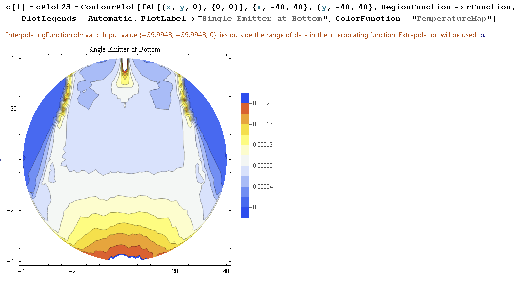
The data is way too big to post. I'm hoping someone has a simple answer for this. I'm plotting contour plots of a large data set from Interpolation functions. I use the "TemperatureMap" for which the top should be red, but in some I get a wrap around, with the top level painted in blue, which is really at the bottom. You can actually see it at the very bottom where orange transitions to blue instead of red.
It's driving me nuts!