Message Boards Message Boards

0
|
1991 Views
|
2 Replies
|
2 Total Likes
View groups...
Share
Share this post:

How to make a density plot with a color axis

Posted 1 year ago

How to add all snapshots of the circle to a single density/region plot with different colors depending on varying a and show a as a color axis.

POSTED BY: John Wick
2 Replies

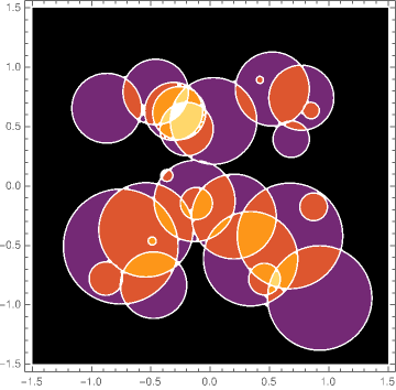
I can only guess on what is meant by "color axis". And probably instead of circles you have disks in mind. If so, then maybe this is a way:

(* define disk function with center {cx,cy} and radius r: *)
diskFunc[{cx_, cy_}, r_][x_, y_] := 
  Piecewise[{{1, EuclideanDistance[{x, y}, {cx, cy}] <= r}}];
(* just some parameters for 25 disks: *)
diskParameters = Table[{{RandomReal[{-1, 1}], RandomReal[{-1, 1}]}, RandomReal[.5]}, 25];
(* function representing all disks: *)
func = Total[diskFunc[#1, #2][x, y] & @@@ diskParameters];
DensityPlot[func, {x, -1.5, 1.5}, {y, -1.5, 1.5}, ColorFunction -> "SunsetColors", PlotRange -> All, PlotPoints -> 40]

enter image description here

POSTED BY: Henrik Schachner

The second example in the documentation for DensityPlot may be similar to what you have in mind:

DensityPlot[Sin[x] Sin[y], {x, -4, 4}, {y, -3, 3}, 
 ColorFunction -> "SunsetColors", PlotLegends -> Automatic]
POSTED BY: Gianluca Gorni
Reply to this discussion
Community posts can be styled and formatted using the Markdown syntax.
Reply Preview
Attachments
Remove
or Discard

Group Abstract Group Abstract