Group Abstract Group Abstract

Message Boards Message Boards

0
|
36 Views
|
4 Replies
|
3 Total Likes
View groups...
Share
Share this post:

How to draw a frequency distribution histogram?

Posted 16 hours ago

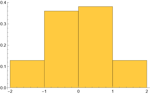
In general, plotting a frequency distribution histogram requires access to the original dataset. The example code below demonstrates how to generate the histogram using the raw data (data).

data = RandomVariate[NormalDistribution[0, 1], 200];
Histogram[data, {-2, 2, 1}, "PDF"]

enter image description here

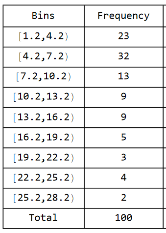
The actual situation is as follows: the raw data (data) is unknown. Only the grouping intervals, bin widths, and the frequency (count) of data points in each group are available. How can I plot a frequency distribution histogram under these conditions?

The grouping is structured as follows: starting from the left endpoint of the first group at 1.2 to the right endpoint of the last group at 28.2, with a bin width of 3 and a total of 9 groups. The corresponding frequencies for each group are provided in the table below.

How can I plot a frequency distribution histogram based on these given conditions?

enter image description here

POSTED BY: Jim Clinton
4 Replies
Posted 10 hours ago

Another approach with DiscretePlot

POSTED BY: Hans Milton
Posted 13 hours ago

Maybe something like this:

Histogram[WeightedData[Range[1.2, 25.2, 3], newdata], {1.2, 28.2, 3}]

enter image description here

POSTED BY: Eric Rimbey
Posted 13 hours ago

Thank you! This is exactly the effect I wanted. What does the data in "newdata" look like?

POSTED BY: Jim Clinton
Posted 12 hours ago

Oh, sorry. Forgot to copy-paste that bit. It was just the values in the table you provided:

newdata = {23, 32, 13, 9, 9, 5, 3, 4, 2}
POSTED BY: Eric Rimbey
Reply to this discussion
Community posts can be styled and formatted using the Markdown syntax.
Reply Preview
Attachments
Remove
or Discard