Check my logic please,
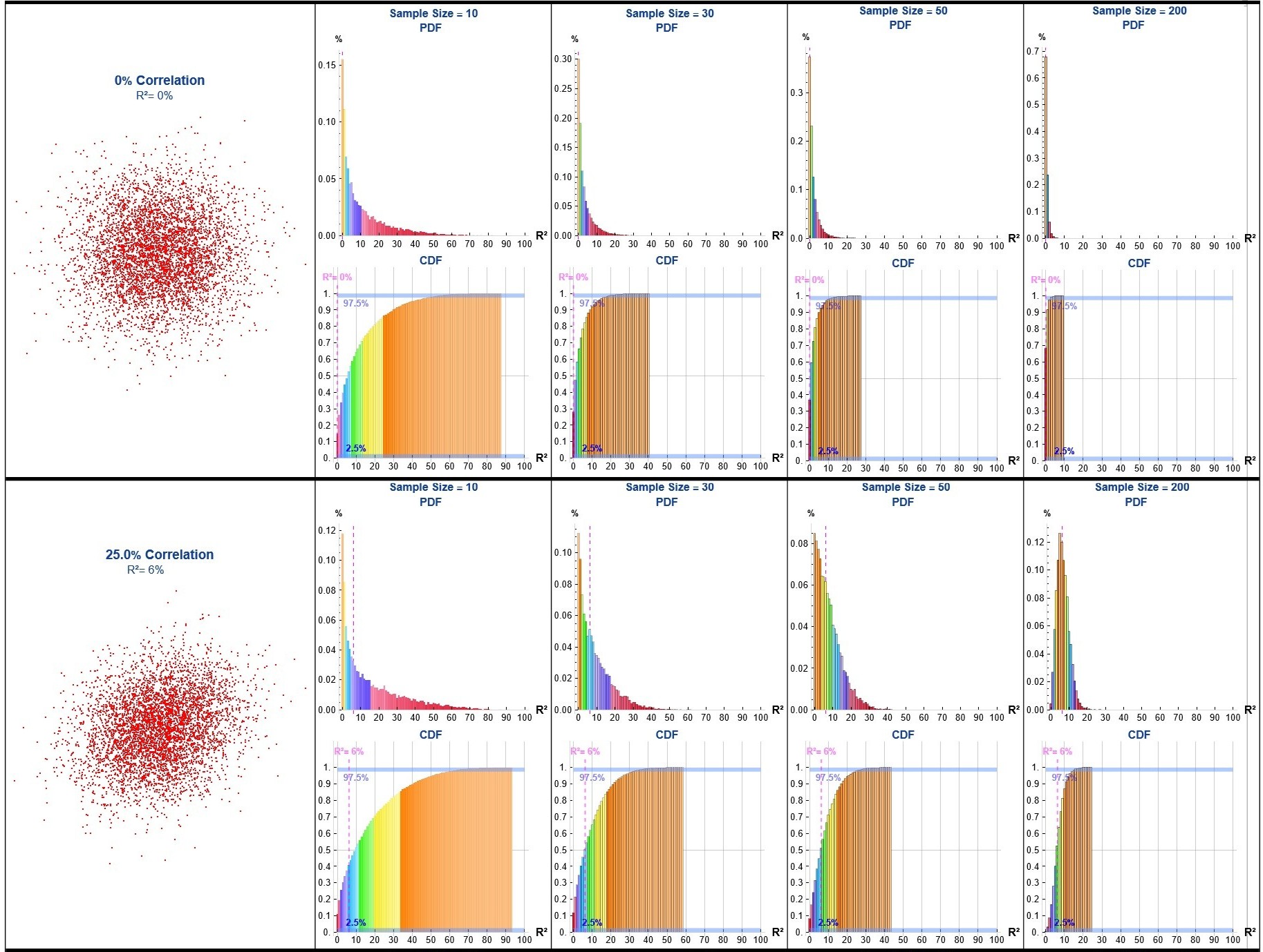
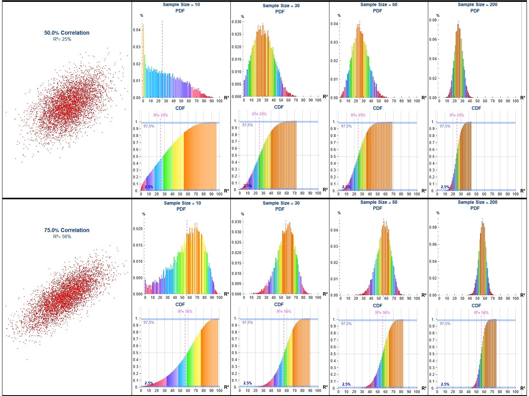
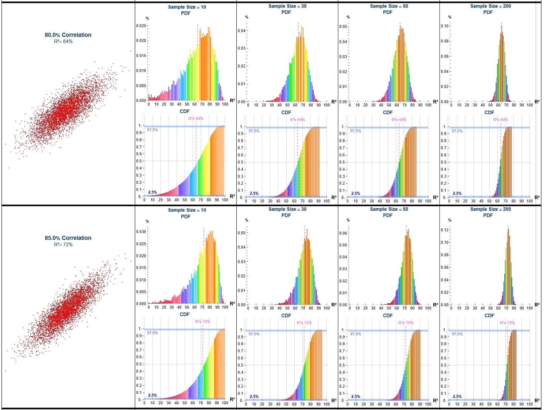
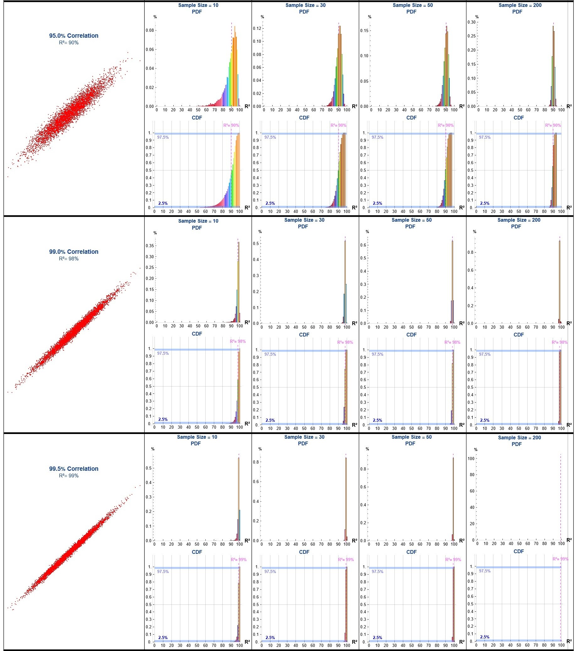
In engineering applications, it is common to encounter analyses where engineers draw a small sample (e.g., n ≈ 10) from a process, perform a linear regression, and cite the coefficient of determination (R²) as evidence of a meaningful relationship.
To demonstrate the limitations of this approach I developed a Monte Carlo simulation generating binormal data across a range of correlations (ρ), repeatedly sampling (n = 10, 30, 50 & 200), computing the sample R² for each iteration, and aggregating the results to estimate the probability density function (PDF) and cumulative distribution function (CDF) of R² for each ρ value and sample size.
corrValues = {0, 0.25, 0.5, 0.75, 0.8, 0.85, 0.95, 0.99,
   0.995}; (* Correlation Values to use in the Monte Carlo runs *)
sampleSizes = {10, 30, 50,
   200};  (* Sample sizes to use in the Monte Carlo runs *)
runs = 10000; (* Number of Monte Carlo runs *)

(* Generate data for each correlation graph *)
datatest1 = BlockRandom[SeedRandom[123];
   Table[
    RandomVariate[BinormalDistribution[{0, 0}, {1, 1}, i1],
     5000], {i1, corrValues}]];

(* Create grid layout for each correlation value *)
Grid[
 Table[
  Prepend[
   ParallelTable[
    Column[{
      Show[
Histogram[
Table[
With[{sample = RandomVariate[
BinormalDistribution[{0, 0}, {1, 1},
Part[corrValues, j]], samp]},
          model = LinearModelFit[sample, x, x]; rSquared = Round[
            model["RSquared"] 100]], runs], 101, "PDF",
        PlotRange -> {{0, 100}, All}, ImageSize -> 250,
        AspectRatio -> 1, AxesStyle -> LightGray, TicksStyle -> Black,
         Ticks -> {
Range[0, 100, 10], Automatic},
        GridLines -> {{Part[corrValues, j]^2 100}, None},
        GridLinesStyle -> Directive[Magenta, Dashed], AxesLabel -> {
Style["R²", Black, Bold, 12],
Style["%", Black, Bold]}, LabelStyle -> Black,
        ChartLayout -> {"Column", 4}, ColorFunction -> "BrightBands",
        PlotLabel -> Column[{
Style["Sample Size = " <> ToString[
NumberForm[samp, {2, 0}]], 12, Bold, DarkBlue],
Style["          PDF", 12, Bold, DarkBlue]}]]],
      Show[
       Histogram[
        Table[
         With[
          {sample =
            RandomVariate[
             BinormalDistribution[{0, 0}, {1, 1}, corrValues[[j]]],
             samp]},
          model = LinearModelFit[sample, x, x];
          rSquared = Round[model["RSquared"]*100]
          ],
         runs
         ],
        101,(* Number of bars in the histogram *)
        "CDF",
        Sequence[
        PlotRange -> {{0, 100}, {0, 1.1}}, ImageSize -> 250,
         AspectRatio -> 1, AxesStyle -> LightGray,
         TicksStyle -> Black, Ticks -> {
Range[0, 100, 10],
Range[0, 1, 0.1]}, GridLines -> {
Range[0, 100, 10], {0.5}}, AxesLabel -> {
Style["R²", Black, Bold, 12], None}, LabelStyle -> Black,
         ChartLayout -> {"Column", 4}, ColorFunction -> "BrightBands",
          PlotLabel -> Style["CDF", 12, Bold, DarkBlue], Epilog -> {
Text[
Style["2.5%", 10, Bold, Blue], {10, 0.06}],
Directive[StandardBlue,
Opacity[0.5]],
Polygon[{{0, 0}, {0, 0.025}, {100, 0.025}, {100, 0}}],
Text[
Style["97.5%", 10, Bold, Blue], {10, 0.94}],
Directive[StandardBlue,
Opacity[0.5]],
Polygon[{{0, 0.975}, {0, 1}, {100, 1}, {100, 0.975}}], Magenta,
           Dashed,
Thickness[0.007],
Line[{{Part[corrValues, j]^2 100, 0}, {Part[corrValues, j]^2 100,
              1.05}}],
Text[
Style["R²= " <> ToString[
PercentForm[Part[corrValues, j]^2, {2, 0}]], 10, Bold,
             Magenta], {Part[corrValues, j]^2 100, 1.1}]}]
        ]
       ]
      }]
    , {samp, sampleSizes}
    ],

   ListPlot[
    datatest1[[j]],
    Sequence[PlotStyle -> Directive[
PointSize[Small], Red], PlotInteractivity -> False, ImageSize -> 330,
     AspectRatio -> 1, FrameTicks -> None, Frame -> False,
     Axes -> None, PlotLabel -> Column[{
Style[ToString[
PercentForm[
Part[corrValues, j], {3, 1}]] <> " Correlation", 14, Bold, DarkBlue],

Style["       R²= " <> ToString[
PercentForm[Part[corrValues, j]^2, {2, 0}]], 12, DarkBlue]}]]
    ]
   ],
  {j, Length[datatest1]}
  ], Dividers -> {{{True}}, {{Thickness[4]}}}
 ]
 Attachments:


