Clustering decomposition is a data-mining and data processing technique for large datasets grouping into simple representative objects. Although clustering is less known approach than other grouping methods (factor analysis in particular), it comes particularly handy when we face large sets of data and trying to identify patterns and features common to each cluster. We demonstrate the case on the financial data where we analyse a large multi-asset portfolio with unique financial returns. We compare decomposition methods and provide cluster characteristics using statistical and probabilistic analysis including risk.
Cluster analysis - brief introduction
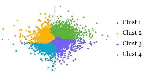
Cluster analysis is a data-mining and data processing approach for determining grouping patterns in the data structure.
It is less known than other exploratory techniques, but still powerful and valid method for large dataset classification, pattern recognition, information retrieval and image analysis.
It is generally referred as is an unsupervised learning technique used for classification of data where individual elements are partitioned into groups called clusters that represent proximate collections of data elements based on a distance or dissimilarity function. Identical element pairs have zero distance or dissimilarity, and all others have positive distance or dissimilarity.
What is special about clusters? It is a method for determining how cases rather than variables group together. Structural features are handled though the distance function. Elements with similar proximity are grouped into clusters with consistent distance characteristics.
Clusters in financial data analysis
Clusters are ideal method for classifying large sets of data into meaningful groups that can be further analysed using standard exploratory techniques.
Clusters can be effectively used to reduce the dimensionality of data to be analysed. Each cluster can be effectively used as a combined variable with its own grouped characteristic.
Clustering is closely linked to statistical distributions and represents multi-objective optimisation problems that naturally arise in finance.
Clustering of financial returns
We look at clustering application on financial returns and consider the following case:
We have collected large multi-asset portfolios with computed financial returns. Our objective is to divide the total portfolio into groups with similar characteristics and obtain meaningful statistics of each group.
Simulation of financial returns
portA = RandomVariate[NormalDistribution[-0.01, 0.008], {1600, 2}];
portB = RandomVariate[LogisticDistribution[0.007, 0.01], {1200, 2}];
portC = RandomVariate[StudentTDistribution[0.015, 0.01, 4], {1200, 2}];
portD = RandomVariate[LaplaceDistribution[-0.007, 0.01], {1000, 2}];
Creating combined portfolio
portret = Join[portA, portB, portC, portD];
Total size of combined portfolio:
Total[Length /@ portret]
10000
With distributional patterns showing skewed distribution of combined portfolio returns
Histogram[Flatten[portret], 40, ChartStyle -> "Rainbow"]
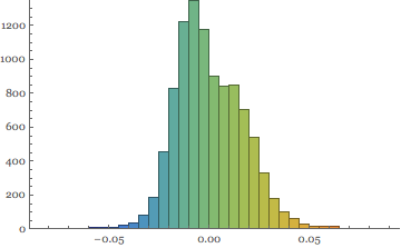
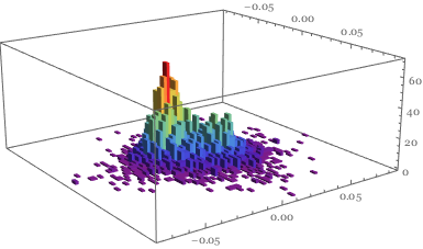
This is confirmed in the 3D image
Histogram3D[portret, 50, ColorFunction -> "Rainbow"]
Defining clustering of financial returns:
Clusters are built on the notion of similarity / proximity amongst individual returns. Mathematica 10 offers several measures to choose from - we test four of them:
Euclidean distance:
Sqrt[\[Sum](u-v)^2]
Squared Euclidean distance:
\[Sum](u-v)^2
Manhattan distance:
\[Sum]\[LeftBracketingBar]u-v\[RightBracketingBar]
Canberra distance:
\[Sum]\[LeftBracketingBar]u-v\[RightBracketingBar]/(\[LeftBracketingBar]u\[RightBracketingBar]+\[LeftBracketingBar]v\[RightBracketingBar])
.
    iSize = 250;
    {ListPlot[
      FindClusters[portret, 4, DistanceFunction -> EuclideanDistance],
      PlotLabel -> "Eucld Dist", ImageSize -> iSize],
     ListPlot[FindClusters[portret, 4,
       DistanceFunction -> SquaredEuclideanDistance],
      PlotLabel -> "Sq Eucld Dist", ImageSize -> iSize],
     ListPlot[FindClusters[portret, 4,
       DistanceFunction -> ManhattanDistance], PlotLabel -> "Manht Dist",
      ImageSize -> iSize],
     ListPlot[FindClusters[portret, 4,
       DistanceFunction -> CanberraDistance],
      PlotLabel -> "Canberra Dist", ImageSize -> iSize]}

We can see that each distance function partitions clusters in a distinct way.
Working with clusters
Selecting the cluster
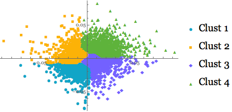
Let's select the Manhattan distance method for clustering of our mega-portfolio:
mclust = FindClusters[portret, 4,
   DistanceFunction -> ManhattanDistance];
ListPlot[mclust, PlotMarkers -> Automatic,
 PlotLegends -> {"Clust 1", "Clust 2", "Clust 3", "Clust 4"}]
Analysing each cluster profile
Clusters size:
BarChart[Map[Length, mclust], PlotLabel -> Style["Clusters size", 16],
  ChartStyle -> "DarkRainbow", BarOrigin -> Left,
 LabelingFunction -> After]
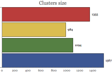
We can observe unequal distribution of cluster sizes => cluster 1 is just half of the cluster 4. This is due to the distancing distribution of clusters specification.
Cluster Norm
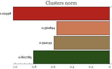
Cluster norm provides valuable information about the distance function inside each cluster.
BarChart[Map[Norm, mclust], PlotLabel -> Style["Clusters norm", 16],
 ChartStyle -> "RoseColors", BarOrigin -> Right,
 LabelingFunction -> Before]
Statistical analysis of clusters
Clusters are treated as 'objects' and we can perform any statistical analysis on them. For example - we can compute descriptive statistics to identify moments of each cluster.
Location and dispersion measures
size = Length[mclust];
legnd = {"Cluster 1", "Cluster 2", "Cluster 3", "Cluster 4"};
clmean = Table[Mean[Flatten[mclust[[i]]]], {i, size}];
clvol = Table[StandardDeviation[Flatten[mclust[[i]]]], {i, size}];
{BarChart[clmean, ChartStyle -> "Pastel",
  PlotLabel -> "Clusters means", LabelingFunction -> Above,
  ImageSize -> 320, ChartLegends -> legnd],
 BarChart[clvol, ChartStyle -> "FallColors",
  PlotLabel -> "Clusters vols", LabelingFunction -> Above,
  ImageSize -> 320, ChartLegends -> legnd]}

First two clusters reside in the negative return territory, but are less volatile than the ones which show positive returns.
We can get further insight into each cluster dispersion by looking at quartile deviation and inter quartile range:
clqdev = Table[QuartileDeviation[Flatten[mclust[[i]]]], {i, size}];
cliqrng = Table[InterquartileRange[Flatten[mclust[[i]]]], {i, size}];
{BarChart[clqdev, ChartStyle -> "LakeColors",
  PlotLabel -> Style["Clusters Quartile Deviation", 16],
  LabelingFunction -> Above, ImageSize -> 320, ChartLegends -> legnd],
  BarChart[cliqrng, ChartStyle -> "SunsetColors",
  PlotLabel -> Style["Clusters vols", 16], LabelingFunction -> Above,
  ImageSize -> 320, ChartLegends -> legnd]}

The above dispersion statistics is confirmed also in the quartile domain - quartile deviation is the lowest for negative returns clusters, but higher for the positive one. This indicates higher risk in the positive return segments.
Clusters shape measures
cskew = Table[Skewness[Flatten[mclust[[i]]]], {i, size}];
ckurt = Table[Kurtosis[Flatten[mclust[[i]]]], {i, size}];
{BarChart[cskew, ChartStyle -> "MintColors",
  PlotLabel -> Style["Clusters skewness", 16],
  LabelingFunction -> Above, ImageSize -> 320, ChartLegends -> legnd],
  BarChart[ckurt, ChartStyle -> "LakeColors",
  PlotLabel -> Style["Clusters kurtosis", 16],
  LabelingFunction -> Above, ImageSize -> 320, ChartLegends -> legnd]}
 Moments statistics reveal non-normality pattern in all clustered data.
Probabilistic analysis of clustered returns
Extension to the probabilistic calculations on the clusters is trivial: For example - we may want to determine each cluster probability of financial return < 0
Table[Probability[x < 0, x \[Distributed] Flatten[mclust[[i]]]], {i,
    size}] // N;
BarChart[%, PlotLabel -> Style["Clusters return probability < 0", 16],
  ChartStyle -> "Rainbow", LabelingFunction -> Above]
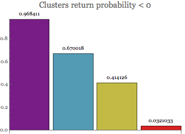 Being in the negative return domain, the first two clusters show the highest probability of negative returns.
Clusters risk measure
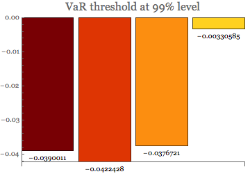
We can easily calculate Value at Risk threshold for each cluster:
varT = Table[Quantile[Flatten[mclust[[i]]], 0.01], {i, size}];
BarChart[varT, ChartStyle -> "SolarColors",
 PlotLabel -> Style["VaR threshold at 99% level", 16],
 LabelingFunction -> Below]
and then using the above measure to obtain the Tail VaR statistics:
tVaR = Table[
   NExpectation[x \[Conditioned] x < varT[[i]],
    x \[Distributed] Flatten[mclust[[i]]]], {i, size}];
BarChart[tVaR, ChartStyle -> "TemperatureMap",
 PlotLabel -> Style["Tail VaR threshold at 99% level", 16],
 LabelingFunction -> Below]
![enter image description here][13]
Tail VaR (Expected shortfall) reveals the same risk as the VaR above. The first cluster is the most riskiest whilst the last one in the least riskiest cluster.
Cluster distributions
Creating clusters objects allow us to visualise and work with cluster distributions
Table[Histogram[Flatten[mclust[[i]]], 25,
  ColorFunction -> Function[{height}, ColorData["Rainbow"][height]],
  ImageSize -> 225], {i, size}]
 Clusters one and four generate highly skewed profiles - cluster 1 negative and cluster 4 positive. Clusters two are three are more symmetrical.
The distribution patterns can also be analysed in the 3D format as they provide richer insight into the distributions in higher dimensions. As we can see below, the low-frequency outliers are still present in each cluster and add to the risk of each group.
clr = {"Pastel", "LightTemperatureMap", "RedBlueTones",
   "AvocadoColors"};
Table[Evaluate@
   Histogram3D[mclust[[i]], 50, "PDF", ImageSize -> 250,
    ColorFunction -> clr[[i]]], {i, size}] // Quiet

Summary
Why clusters?
- Ideal tool for knowledge discovery and pattern recognition in datasets.
- Great technique for automatic data classification and numerical taxonomy.
- Well-suited tool for financial data analysis:
- Patterns detection
- Drivers recognition
- Characteristics extraction
Great technique for automatic data classification and numerical taxonomy
 Attachments: