There is a fantastic resource online - The GDELT Project http://gdeltproject.org/. On its front page it describes itself like this: "The GDELT Project is the largest, most comprehensive, and highest resolution open database of human society ever created". Since 2015 it has about 3/4 of a trillion emotional snapshots and more than 1.5 billion location references. It is free and open. There is a very convenient way to download all raw data files. The possibilities are endless and I guess that some version or subset of it would be a fantastic addition to the Wolfram Data Repository. The data is free to use and apparently can be redistributed.
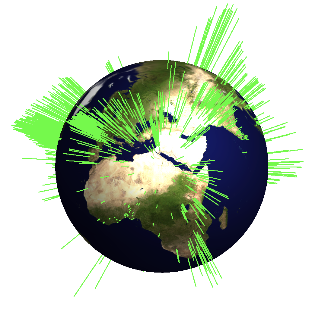
I will show some basic analysis of the data and will produce graphics such as this one.
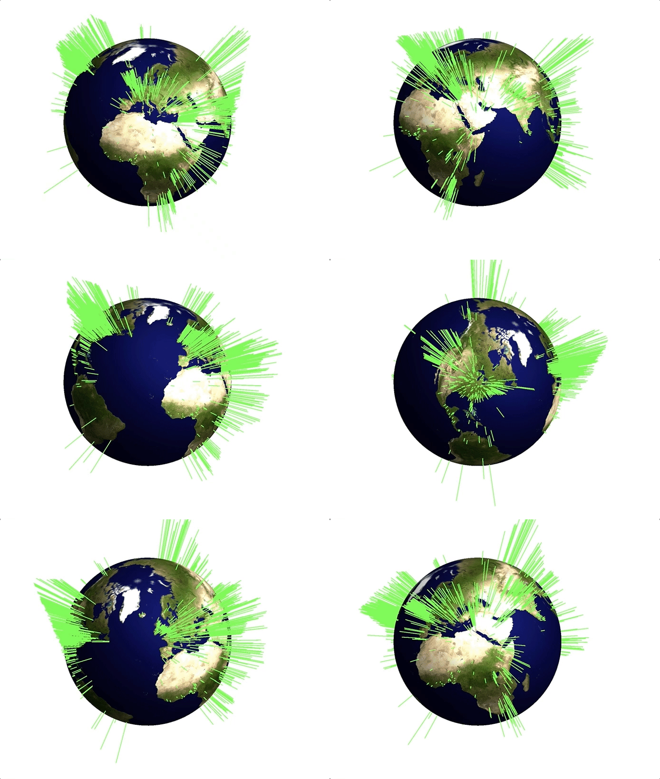
We will also "calculate how positive different countries are/see the world". This post serves only as a brief introduction to the dataset. Much more is possible and I hope to explore more in future posts.
Downloading the data
First, I make a little script to download the data. The database is updated on a daily basis. So it is convenient to have a script to updates ones database. I create a Folder (on my Desktop) and then run this script. If you download the data for the first time this will take a while. You might want to only download parts of the database at once.
previousDownloads =
  FileNameTake /@ FileNames["*", "~/Desktop/WorldEvents/"];
 downloadList = Select[Import["http://data.gdeltproject.org/events/index.html", "Hyperlinks"], StringContainsQ[#, ".zip"] && ! StringContainsQ[#, "MASTERREDUCED"] && ! StringContainsQ[#, previousDownloads] &];
URLDownload[#, StringJoin["~/Desktop/WorldEvents/", FileNameTake[#]]] & /@ downloadList;
The good thing about this is that the download is incremental. If you execute these lines only new files will be downloaded and you can keep your database up to date. We should set the working directory like this:
SetDirectory[FileNameJoin[{NotebookDirectory[], "WorldEvents"}]]
I have downloaded a large set of files, the names of which I can read like this:
files = FileNames["*"];
At the time of writing these lines I have
files // Length
1596 files. That are
Total[FileByteCount /@ files]
(*23626922639*)
about 22.5 GB worth of data. This is a size where it might be useful to use the Wolfram Language's ability to interface with mySQL, but I will try to run some exploratory analysis purely in Mathematica. I will start with just one of the files:
dataworldevents = Import[files[[-2]], {Import[files[[-2]]], "TSV"}];
The first line of the data looks like this:
dataworldevents[[1]]

To make sense of this we download the header for the files
labels = Import["http://gdeltproject.org/data/lookups/CSV.header.dailyupdates.txt","TSV"][[1]]

and display one entry like this
TableForm[Transpose@{Range[Length[labels]], labels, dataworldevents[[33]]}]
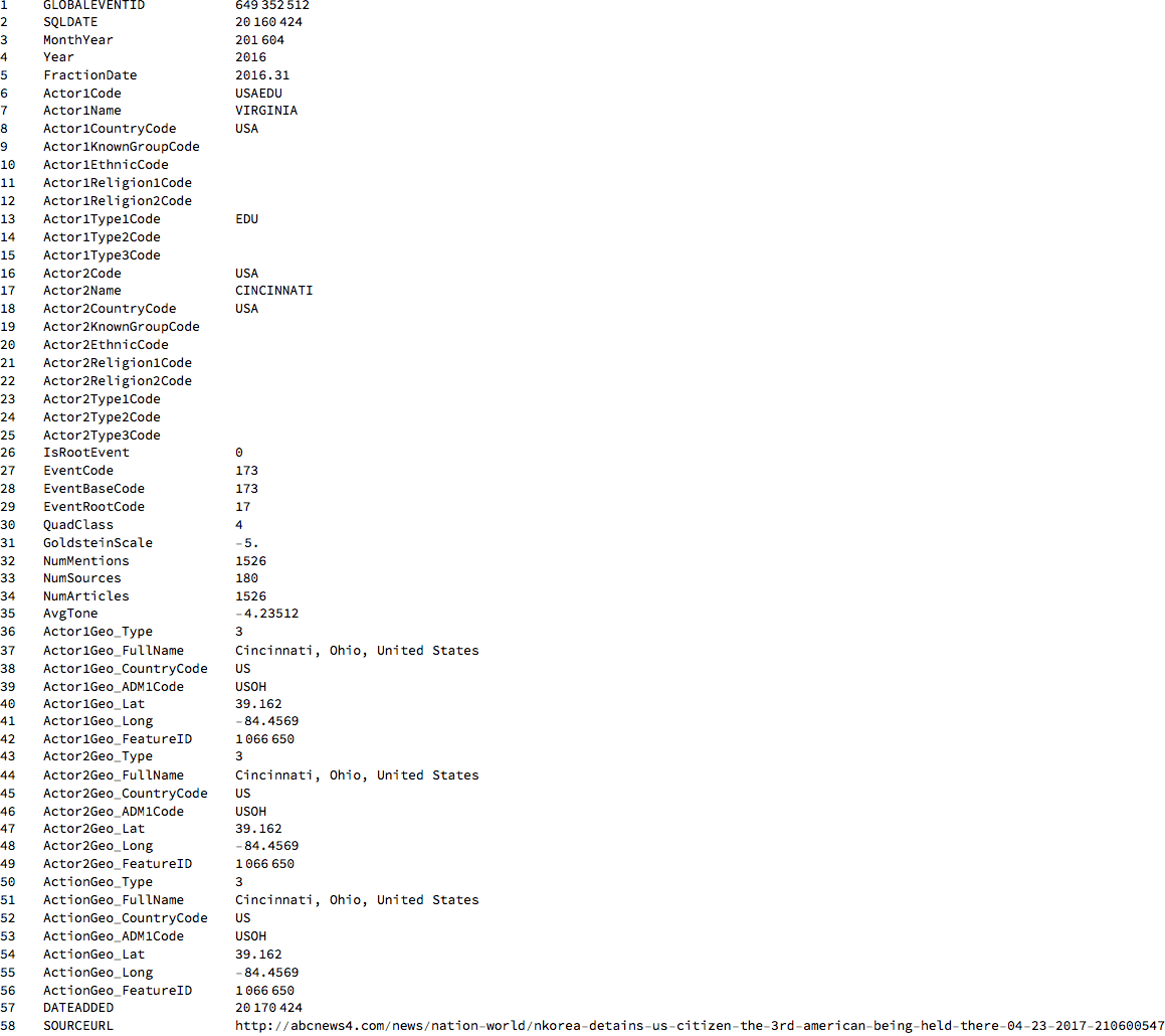
There's is an incredible amount of information in these lines. Line one is an event id. Lines 2-5 provide information about the time the event took place; lines 6-15 provide information about the actor in the article, here it is Virgina in the US. 15-25 provide information about the second actor, here Cincinnati in the US. Line 26 gives information of whether this is a root event. Lines 27-29 give information about what happened. Here is a list of all the event codes:
eventcodes = Import["http://gdeltproject.org/data/lookups/CAMEO.eventcodes.txt", "TSV"];
To get a feeling for the codes I only want to display a random choice of event codes here:
TableForm[SortBy[RandomChoice[eventcodes, 10], First]]
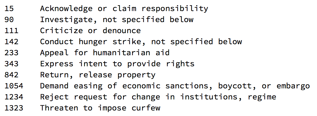
Because I need this later, I will generate a list of rules, that links the event codes to the description of the events.
eventcoderules = Rule @@@ eventcodes[[2 ;;]];
The next important line of the data entry is line 31, which is the GoldsteinScale of the event. Each event code has a certain impact: positive or negative. The GoldsteinScale attaches an importance to the event.
goldsteinscale = Import["http://gdeltproject.org/data/lookups/CAMEO.goldsteinscale.txt", "TSV"];
Here is a table to explain what the Goldstein scale does:
Grid[Prepend[{#[[1]], #[[1]] /. eventcoderules, #[[2]]} & /@ RandomChoice[goldsteinscale, 10], {"Event code",
"Event description", "Goldstein value"}], Frame -> All, Alignment -> {{"Center", "Left", "Center"}}]

It becomes clear that negative numbers like -10. correspond to "bad" events - like "kill by physical assault" and positive numbers correspond to "positive" events like "offer diplomatic cooperation". Lines 32-34 provide information on how often this event is cited. Line 35 is on the average tone of the news. Lines 36-55 give the information on the geolocation of the actors and the event. Line 57 is when the event was added and line 58 is a link to the actual article. Note that sometimes the source articles get deleted after a while.
Average tone of the articles
We can first look at the average tone of an article. The average tone is in column 35:
labels[[35]]
(*AvgTone*)
A histogram of this is readily calculated:
Histogram[dataworldevents[[All, 35]], 80, PlotTheme -> "Marketing", ImageSize -> Large, LabelStyle -> Directive[Bold, 16],
FrameLabel -> {"Average tone", "Number of reports"}]
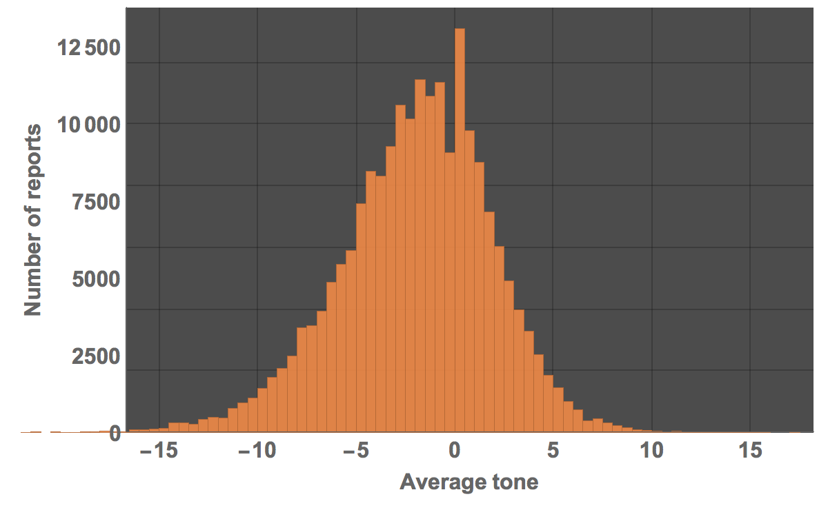
The mean and median of the average tone are both negative:
Mean[dataworldevents[[All, 35]]]
(*-1.96202*)

Median[dataworldevents[[All, 35]]]
(*-1.69492*)
We can also fit a distribution to that:
dist = SmoothKernelDistribution[dataworldevents[[All, 35]]]
and plot it
Show[Histogram[dataworldevents[[All, 35]], 80, "PDF", PlotTheme -> "Marketing", ImageSize -> Large,
LabelStyle -> Directive[Bold, 16], FrameLabel -> {"Average tone", "Number of reports"}],
Plot[PDF[dist, x], {x, -20, 15}, PlotStyle -> Directive[Yellow, Thickness[0.01]]]]
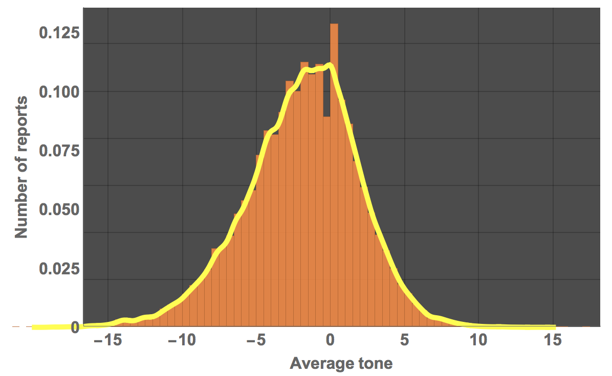
Let's see what type of distribution this could be:
FindDistribution[RandomChoice[dataworldevents, 20000][[All, 35]]]
(*MixtureDistribution[{0.497244, 0.502756}, {LogisticDistribution[-3.67395, 2.14875], NormalDistribution[-0.3071, 2.5434]}]*)
In this particular case a mixture of a Logistic and Normal Distribution does appear to do the trick. We will later look at the average tone in different countries.
Geo-distribution of the articles/news
Let's look at where the news happens:
worldeventlocs = DeleteCases[dataworldevents[[All, {40, 41}]],List["",""]];
I will use a special GeoHistogram that I programmed for another post.
toCoordinates[coords_] :=
 FromSphericalCoordinates[{#[[1]], Pi/2 - #[[2]], Mod[Pi + #[[3]], 2 Pi, -Pi]}] & /@ (Flatten[{1., #/360.*2 Pi}] & /@ coords)
lengths[inputdata_] := 2.*(inputdata/Max[inputdata])
myGeoHistogram[data_, radius_] :=
 Show[SphericalPlot3D[radius, {u, 0, Pi}, {v, 0, 2 Pi}, Mesh -> None, TextureCoordinateFunction -> ({#5, 1 - #4} &),
PlotStyle -> Directive[Specularity[White, 10], Texture[Import["~/Desktop/backgroundimage.gif"]]], Lighting -> "Neutral", Axes -> False, RotationAction -> "Clip", Boxed -> False, PlotPoints -> 100, PlotRange -> {{-3, 3}, {-3, 3}, {-3, 3}}, ImageSize -> Full], Graphics3D[Flatten[{Green, Thickness[0.00275],
Line[{#[[1]], (radius + #[[2]])*#[[1]]}] & /@ Transpose[{toCoordinates[#[[All, 1]]], lengths[#[[All, 2]]]} &@(data /. "" -> 1.)]}]]]
The background image is attached to the post. One more data cleaning step:
worldeventlocsplace = DeleteCases[dataworldevents[[All, {54, 55}]],List["",""]];
This is the resulting graph:
myGeoHistogram[Transpose@{worldeventlocsplace[[1 ;; 10000]], ConstantArray[1, 10000]}, 3.]
Searching the database
Once the data is imported we can also look for particular key words and actors, such as former president Obama.
Select[dataworldevents[[All, {7, 17}]], MemberQ[#, "OBAMA"] &] // Length
There are 955 entries for that day. Here is a selection of the entries.
Select[dataworldevents[[All]], MemberQ[#, "OBAMA"] &][[1 ;; 5]] // TableForm

Because they are too rich to display properly we can look at the urls that are linked to get an idea of the content.
Select[dataworldevents[[All]], MemberQ[#, "OBAMA"] &][[1 ;; 5]][[All, -1]] // TableForm

We can see that all of them contain the name Obama. Interestingly, president Trump does not come up if we search like this.
Select[dataworldevents[[All]], MemberQ[#, "TRUM"] &] // Length
(*0*)
We can, however, go directly to the urls and find his name:
Select[dataworldevents, StringContainsQ[#[[-1]], "TRUMP", IgnoreCase -> True] &] // Length
(*11250*)
And here are the corresponding urls:
Select[dataworldevents, StringContainsQ[#[[-1]], "TRUMP", IgnoreCase -> True] &][[1 ;; 5]][[All, -1]] // TableForm

We can also search for particular types of events, such as event number 1823
Select[dataworldevents, #[[27]] == 1823 &] // Length
107 entries in the database. Many of which are repeated events.
Latest events
We can also look at some of the latest events. It turns out that there is a file with the images corresponding to the latest events. Here is an example of how to use that feature.
tmpfile = URLDownload[StringSplit[Import["http://data.gdeltproject.org/gdeltv2_cloudvision/lastupdate.txt"], " "][[-1]], NotebookDirectory[]];
imgdata = Import[tmpfile[[1]], "TSV"]; DeleteFile[tmpfile[[1]]];
We can look at some of these images. Also, all of them are labelled by a machine learning algorithm. This is what we get:
Grid[Table[{Import[imgdata[[k, 3]]], TableForm[(StringSplit[#, "<FIELD>"] & /@ StringSplit[imgdata[[k, 4]], "<RECORD>"])[[All, {1, 2}]]]}, {k,101, 108}], Frame -> All]

All images also contain information about where we find what. Here is one of the images:
imgperson = ImageResize[Import[imgdata[[114, 3]]], 200]

We can extract data from the annotation:
StringSplit[StringTake[StringSplit[imgdata[[114, 12]], "\"faceAnnotations\":"][[2]], 200], { "\"vertices\": [", ", \"fdBoundingPoly\""} ][[2]]

HighlightImage[imgperson, Polygon[{#[[1]] - ImageDimensions[imgperson][[1]], #[[2]]} & /@ {{ 89, 3}, { 413, 3 }, {413, 380 }, {89, 380 }}]]
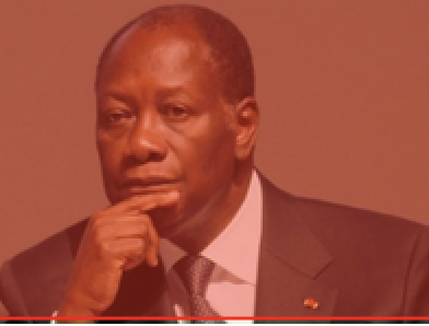
Which in this case is the entire frame.
"Positivity-index"
We have two columns which give us information about how positive/negative a reported event is. Column 31 ("GoldsteinScale") and column 35 ("Average Tone"). We will also use the geo-coordinates.
labels[[{54, 55, 31, 35}]]

The following graphic shows the average tone of a news article (40000 or so of them):
GeoRegionValuePlot[GeoPosition[#[[1]]] -> #[[2, 2]] & /@ (DeleteDuplicatesBy[Select[Partition[#, 2] & /@
Cases[dataworldevents[[1 ;; 40000, {54, 55, 31, 35}]], {_?NumberQ, _?NumberQ, _?NumberQ, _?NumberQ}], ! (#[[1]] == {"", ""}) &], First]),
GeoBackground -> "Satellite", ImageSize -> Full, ColorFunctionScaling -> True, ColorFunction -> ColorData["TemperatureMap"],
PlotStyle -> Directive[Opacity[1.]]]
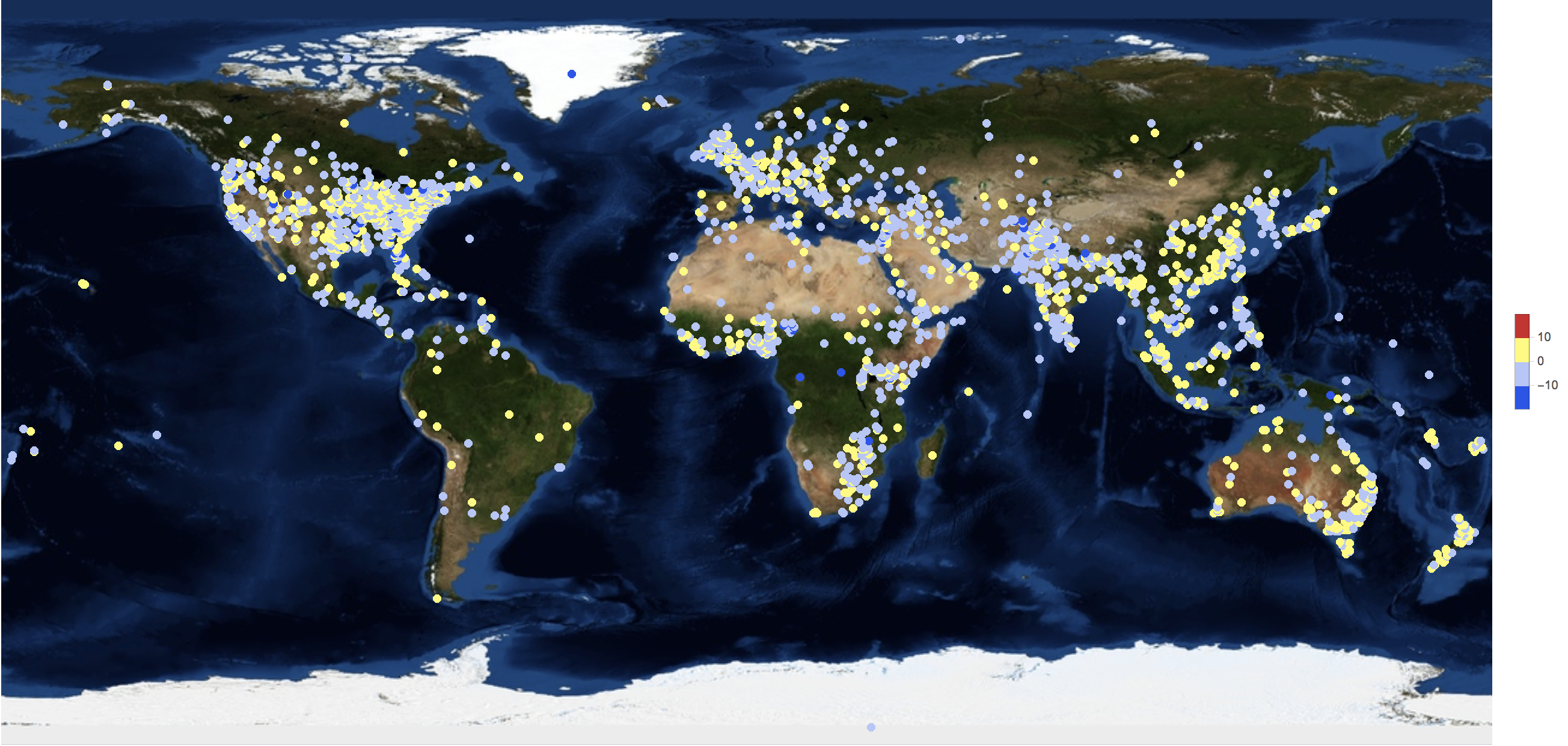
There are relatively few very positive reports but a number of very negative ones. Again, remember that the average tone is negative:
Histogram[Select[Partition[#, 2] & /@ dataworldevents[[1 ;; 40000, {54, 55, 31, 35}]], ! (#[[1]] == {"", ""}) &][[All, 2, 2]], 60, PlotTheme -> "Marketing", ImageSize -> Large, LabelStyle -> Directive[Bold, 16], FrameLabel -> {"Average tone", "Number of reports"}]
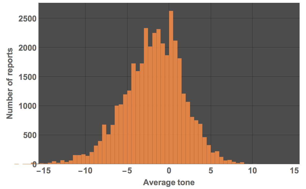
We can calculate how many negative pieces of news there are:
Select[Select[Partition[#, 2] & /@ dataworldevents[[1 ;; 40000, {54, 55, 31, 35}]], ! (#[[1]] == {"", ""}) &][[All, 2, 2]], # < 0 &] // Length
(*26093*)
and how many positive ones:
Select[Select[Partition[#, 2] & /@ dataworldevents[[1 ;; 40000, {54, 55, 31, 35}]], ! (#[[1]] == {"", ""}) &][[All, 2, 2]], # > 0 &] // Length
(*11965*)
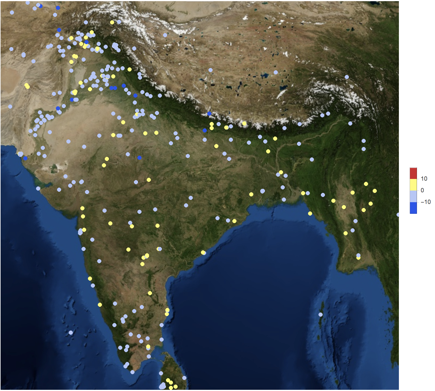
You see that there more than twice as many negative reports than positive ones. We can also focus on individual countries:
GeoRegionValuePlot[
 GeoPosition[#[[1]]] -> #[[2, 2]] & /@ DeleteDuplicatesBy[Select[Partition[#, 2] & /@ Cases[dataworldevents[[1 ;; 40000, {54, 55, 31, 35}]], {_?NumberQ, _?NumberQ, _?NumberQ, _?NumberQ}], ! (#[[1]] == {"", ""}) &], First], GeoBackground -> "Satellite", ImageSize -> Full, ColorFunctionScaling -> True,
 ColorFunction -> ColorData["TemperatureMap"], PlotStyle -> Directive[Opacity[1.]], GeoRange -> Entity["Country", "India"]]
Column 52 shows the country code of an event. These are all the countries:
DeleteDuplicates[dataworldevents[[All, 52]]]

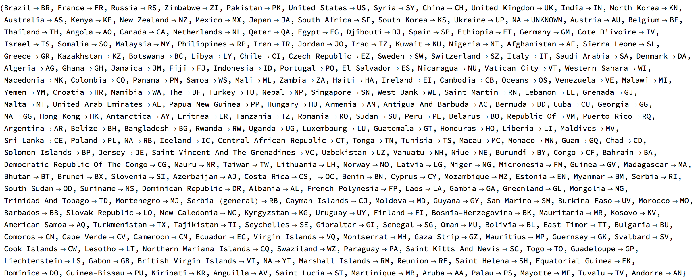
Let's build a look-up table for country names and codes:
Quiet[countryCodes =
   SortBy[DeleteDuplicates[Rule @@@ Transpose[{StringTrim[StringSplit[dataworldevents[[All, 51]], ","][[All, -1]]] /. {} -> {"NA"},
   dataworldevents[[All, 52]] /. "" -> "UNKNOWN"}]], First][[2 ;;]]];
countryCodes[[1 ;; 10]]

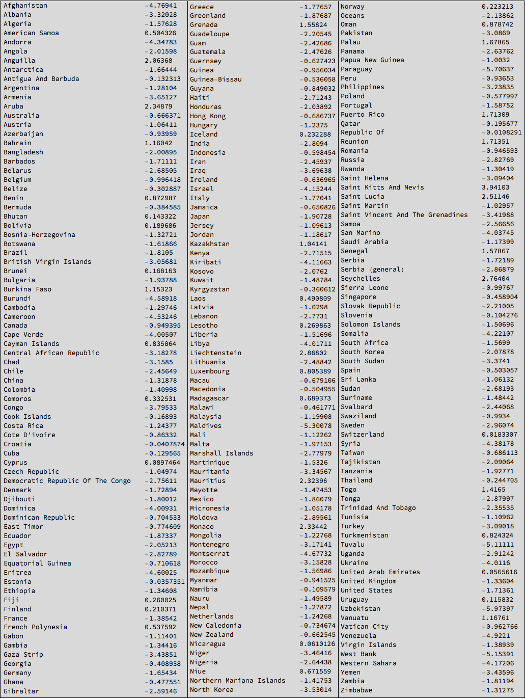
Using this table we can calculate the mean happiness in each country:
Monitor[countryHappiness =
   SortBy[Table[{StringTrim[countryCodes[[i, 1]]], Mean[Select[dataworldevents[[All, {54, 55, 31, 35, 52}]], #[[-1]] == countryCodes[[i, 2]] &][[All, 4]]]}, {i, 1, Length[countryCodes]}], Last];, i]
This is the resulting table:
Grid[{TableForm /@ Partition[SortBy[#, First] &@Select[countryHappiness, ! (#[[1]] == "NA" || #[[1]] == "" || #[[1]] == "The") &], 76]}, Frame -> All,
Background -> LightGray]
Next we can try to make this into a geo-movie. We should first use the interpreter function to convert the country names into entities:
countryEntity = Interpreter["Country"][Select[countryHappiness, ! (#[[1]] == "NA" || #[[1]] == "" || #[[1]] == "The") &][[All, 1]]];
Not all of them will have worked, but the large ones are usually fine. So now we can create a lookup table again:
countryrules =
  Rule @@@ Select[Transpose[{Select[countryHappiness, ! (#[[1]] == "NA" || #[[1]] == "" || #[[1]] == "The") &][[All, 1]], countryEntity}],
  Head[#[[2]]] == Entity &];
With this we can plot a map:
GeoRegionValuePlot[Rule @@@ (countryHappiness /. countryrules), ColorFunction -> Function[{x}, ColorData["Temperature"][x]](*,ColorFunction-> "Rainbow"*), ImageSize -> Full, PlotRange -> {-3, 1}(*,PlotLegends\[Rule]Histogram*)]
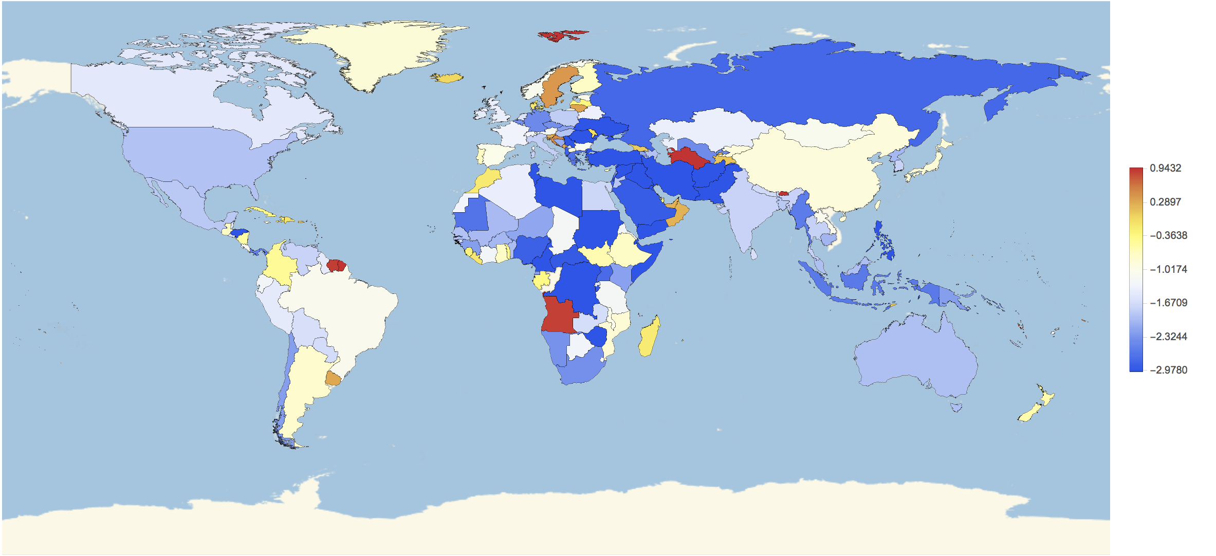
For some countries we have no data; but we will change that now. First of all we will load all data:
dataworldeventsmult = Import[#, {Import[#], "TSV"}] & /@ files[[-3 ;; -2]];
We will calculate the country codes again:
countryCodes =
 DeleteDuplicates[Rule @@@ Transpose[{StringTrim[StringSplit[dataworldevents[[All, 51]], ","][[All, -1]]] /. {} -> {"NA"},
 dataworldevents[[All, 52]] /. "" -> "UNKNOWN"}]]
We can then generate all the happiness data for all times and countries:
countryHappinessmult = {}; Monitor[Table[dataworldeventsmult = Import[files[[Length[files] - j - 1]], {Import[files[[Length[files] - j - 1]]],"TSV"}];
AppendTo[countryHappinessmult, {#[[1, -1]] /. (Reverse /@ countryCodes), Mean[#[[All, 2]]]} & /@ GatherBy[dataworldeventsmult[[All, {31, 35, 52}]], Last]];, {j, 1,1000}], j]
This takes quite a while so we should better export the data:
Export["~/Desktop/countryhappinessresult.mx", countryHappinessmult];
With that we can calculate the mean happiness per country and rank them according to happiness:
meanhappinessmult = {#[[1, 1]], Mean[Select[#[[All, 2]], NumberQ]]} & /@ GatherBy[Flatten[countryHappinessmult[[1 ;; 700]], 1], First];
Grid[{TableForm /@ Partition[Reverse[SortBy[Select[meanhappinessmult, ! (#[[1]] == "NA" || #[[1]] == "" || #[[1]] == "The" || ! NumberQ[#[[2]]]) &], Last]], UpTo[87]]}, Frame -> All, Background -> LightGray]
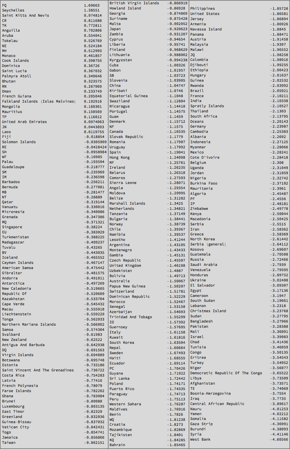
So the West Bank, Syria, and the Gaza Strip have rather negative news and the Seychelles have rather good news. We can plot this for some countries:
DateListPlot[{Transpose[{Table[
     DatePlus[DateObject[{2017, 2, 2}], 1 - i], {i, 1, 700}],
    Table[Select[
        countryHappinessmult[[k]], #[[1]] == "United States" &][[
       1]], {k, 1, Length[countryHappinessmult]}][[1 ;; 700, 2]]}],
  Transpose[{Table[
     DatePlus[DateObject[{2017, 2, 2}], 1 - i], {i, 1, 700}],
    Table[Select[
        countryHappinessmult[[k]], #[[1]] == "United Kingdom" &][[
       1]], {k, 1, Length[countryHappinessmult]}][[1 ;; 700, 2]]}],
  Transpose[{Table[
     DatePlus[DateObject[{2017, 2, 2}], 1 - i], {i, 1, 700}],
    Table[Select[countryHappinessmult[[k]], #[[1]] == "Germany" &][[
       1]], {k, 1, Length[countryHappinessmult]}][[1 ;; 700, 2]]}]},
 PlotRange -> All, ImageSize -> Full,
 PlotLegends -> {"United States", "United Kingdom", "Germany"},
 LabelStyle -> Directive[Bold, 16]]
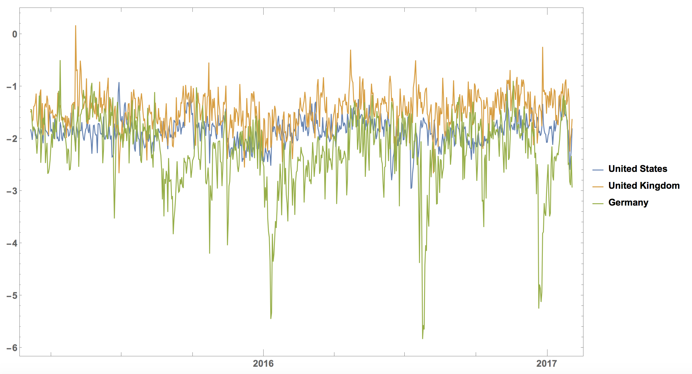
It is interesting that the curve for Germany has the strongest "dips". There is a clear dip in June (Brexit) and another one at the end of the year. The United Kingdom is the happiest of the three (with large positive spikes), the US is somewhat in the middle, and Germany is usually lowest with extremely low points. Does this reflect how people think? Do the negative articles make people more negative?
It is straight forward to make a little animation of the happiness over time geographically in the world.
Monitor[frames = Table[GeoRegionValuePlot[Rule @@@ ((Select[countryHappinessmult[[k]], ! (#[[1]] == "NA" || #[[1]] == "" || #[[1]] == "The" || ! NumberQ[#[[2]]]) &]) /. countryrules), ColorFunction -> Function[{x}, ColorData["Temperature"][x]](*,ColorFunction\[Rule]"Rainbow"*), ImageSize -> Full,
PlotRange -> {-3, 1}(*,PlotLegends\[Rule]Histogram*), Epilog -> {Black, Text[Style[DateString[DatePlus[DateObject[{2017, 2, 2}], 1 - k]], 22], {-120., -65.}]}, PlotLegends -> False, GeoCenter -> GeoPosition[{0., 0.}]], {k, 1, Length[countryHappinessmult]}];, k]
The movie can then be exported like so:
Monitor[Do[Export["~/Desktop/Worldeventsmovie/frame" <> ToString[1000 + k] <> ".jpg", frames[[k]], ImageResolution -> 100], {k, 1, Length[frames], 2}], k]
Here is a snapshot
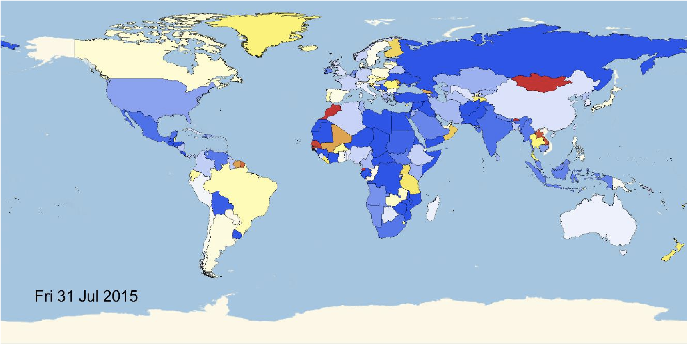
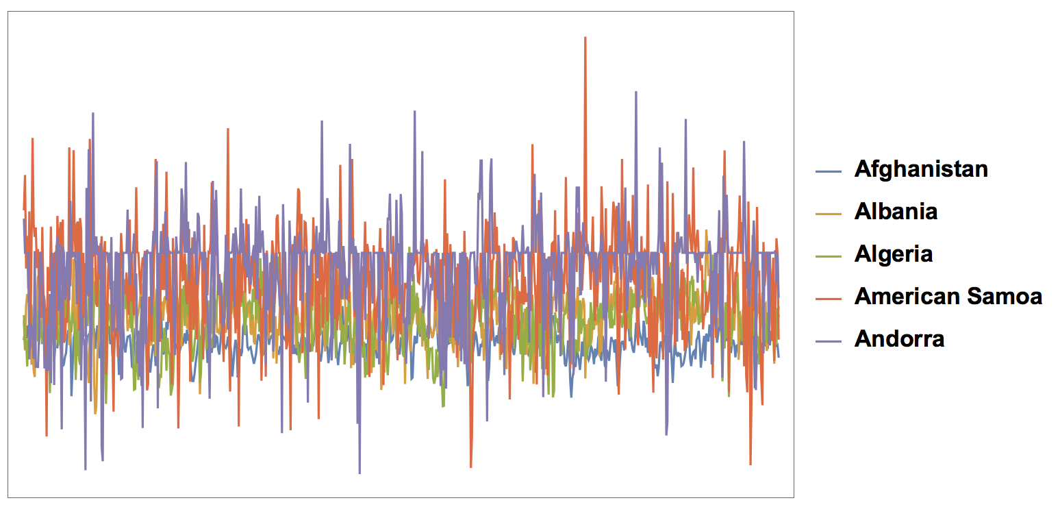
The video is uploaded to Youtube. We can also do this a little bit more systematically by building time series:
countries = Select[Sort[DeleteDuplicates[Flatten[countryHappinessmult[[All, All, 1]]]]], StringLength[#] > 2 &];

Monitor[timeseries =
   Table[(Reverse@Transpose[{Table[DatePlus[DateObject[{2017, 2, 2}], 1 - i], {i, 1, 700}], Table[Select[countryHappinessmult[[k]], #[[1]] == countries[[m]] &][[1]], {k, 1, Length[countryHappinessmult]}][[1 ;; 700, 2]]}]), {m, 1, Length[countries]}];, m]
Now we can conveniently plot that:
DateListPlot[timeseries[[1 ;; 5]], PlotLegends -> countries[[1 ;; 5]],ImageSize -> Large, LabelStyle -> Directive[Bold, 17]]
Or we can show random countries:
choice = RandomChoice[Range[Length[countries]], 5];
DateListPlot[timeseries[[choice]], PlotLegends -> countries[[choice]],ImageSize -> Large, LabelStyle -> Directive[Bold, 17]]
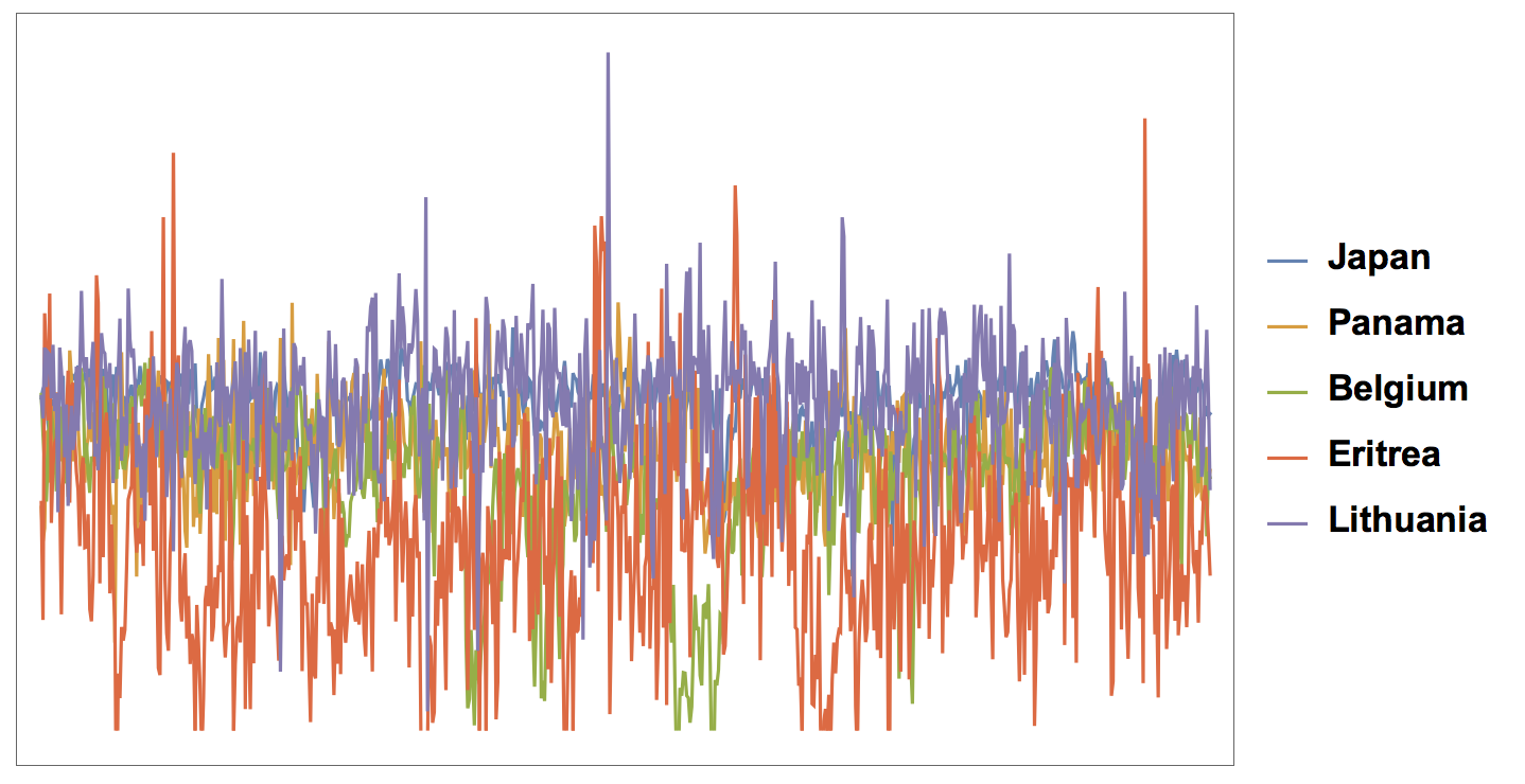
Having converted everything into times series would allow us to use all the powerful tools that the Wolfram Language offers to work with time series.
Events in time
I have not taken great care in this post to find optimal ways of cleaning the data; I have not defined nice functions. All of that can be achieved quite easily. Here I define some functions that allow us to download data "on the fly". The first one transforms a DateObject into a string which part of the respective file name.
dateString[date_DateObject] :=
FromDigits[Join[{2, 0}, Flatten[PadLeft[#, 2, 0] & /@ IntegerDigits /@ Drop[DateList[date], -1]], {0, 0}]]
The next one helps to import the respective file.
eventsImport[date_DateObject] := Import["http://data.gdeltproject.org/gdeltv2/" <> ToString[dateString[date]] <> ".export.CSV.zip", {{"*"}, "TSV"}][[1]]
This allows us to import the data for a particular date:
events = eventsImport[DateObject[{2017, 2, 2, 21, 30}]];

TableForm[Join[{labels}, events[[-10 ;;]]]]

The first couple of events will have an earlier date, because they predate the time when the article was added to the database.
Graphs and all that
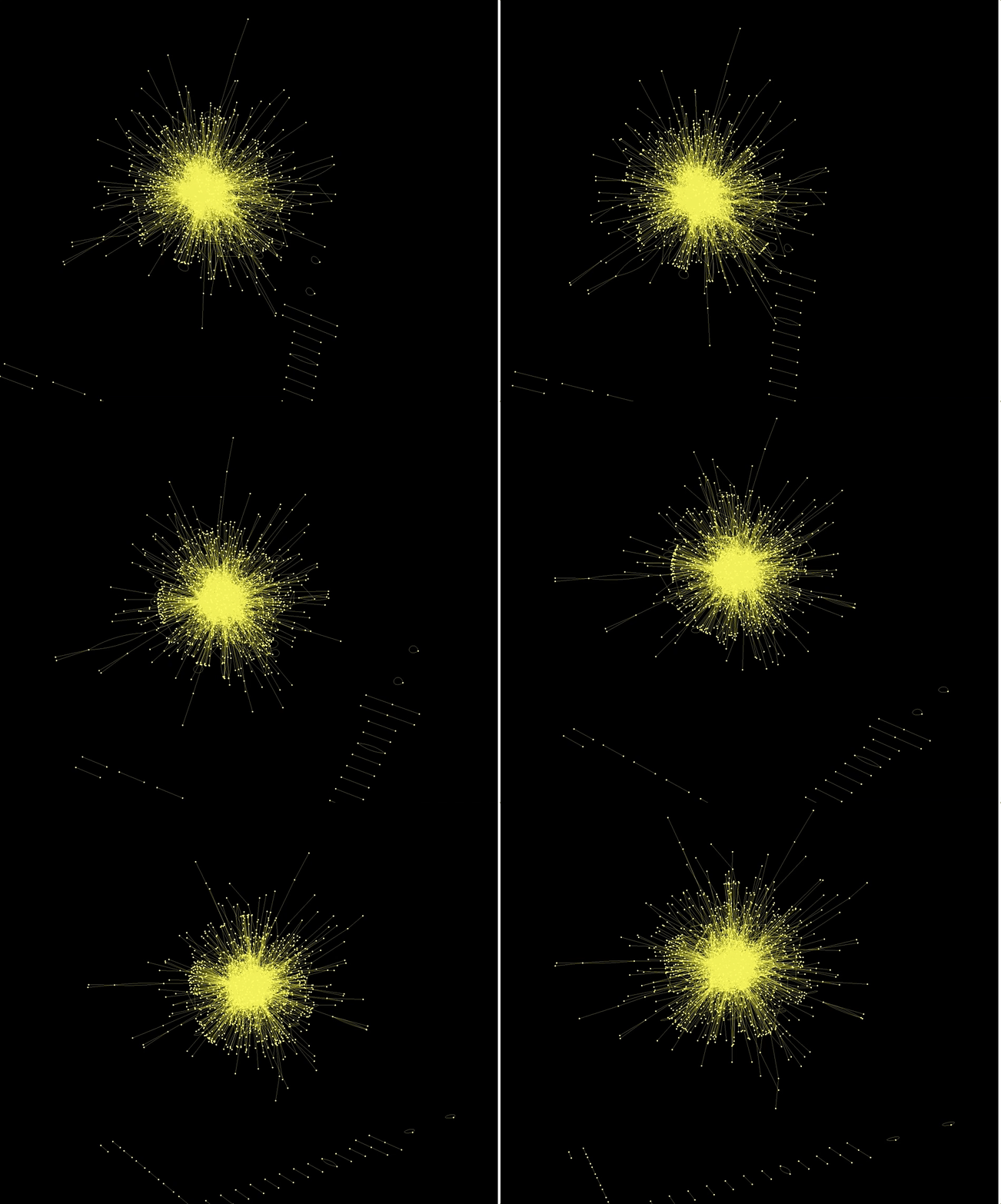
With the Wolfram Language it is incredibly easy to make Graphs using the data. This here for example is a network of "actors".
Graph3D[RandomChoice[Rule @@@ Select[dataworldevents[[All, {7, 17}]], ! MemberQ[#, ""] &], 5000],
ImageSize -> Full, VertexStyle -> Yellow, EdgeStyle -> Yellow, Background -> Black]
Also the country codes of the actors and actions are networked in an interesting way:
CommunityGraphPlot[RandomChoice[Rule @@@ Select[dataworldevents[[All, {38, 45}]], (! MemberQ[#, "" && #[[1]] != #[[2]]]) &], 1000]]
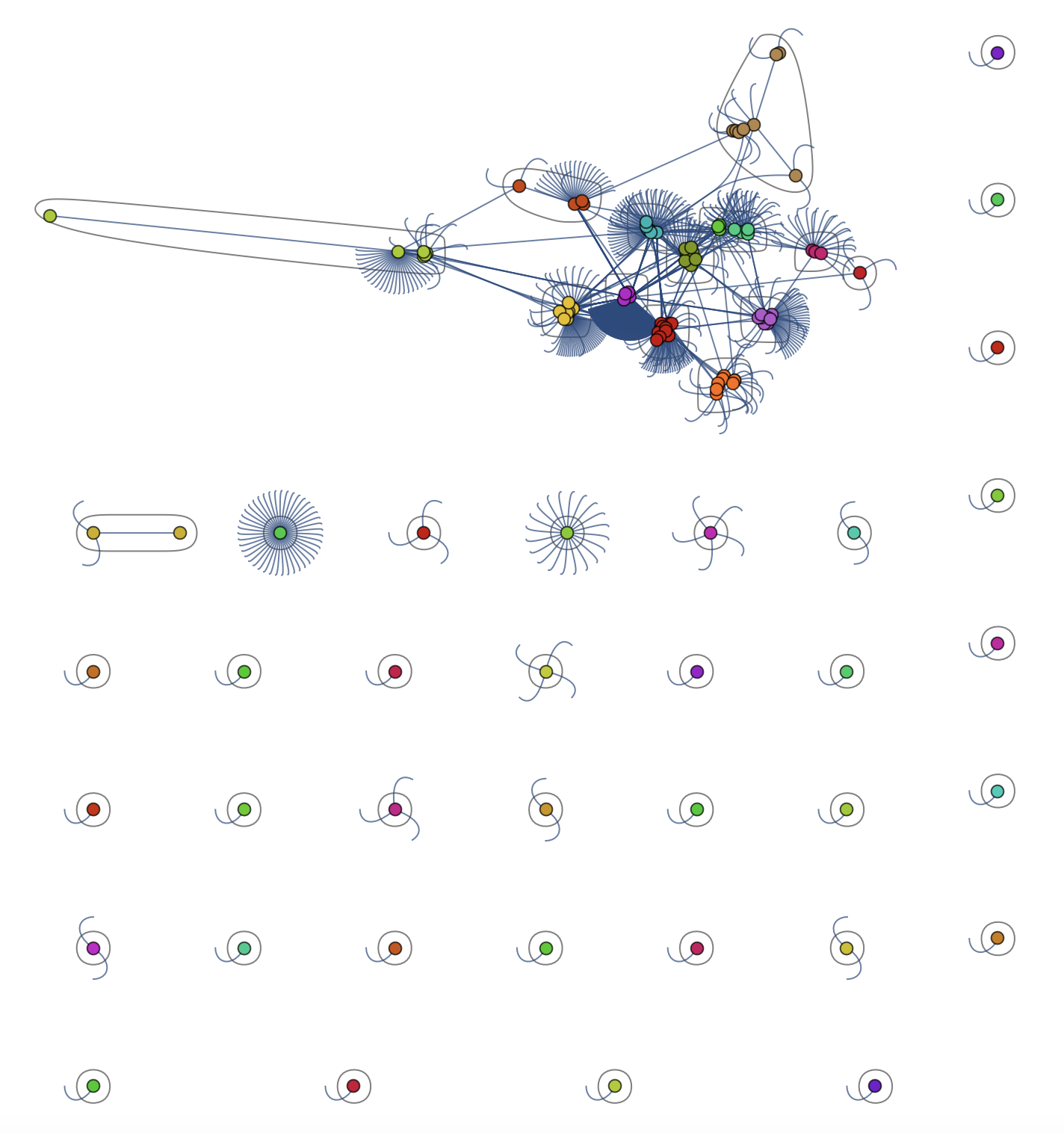
This is the largest component of the graph above
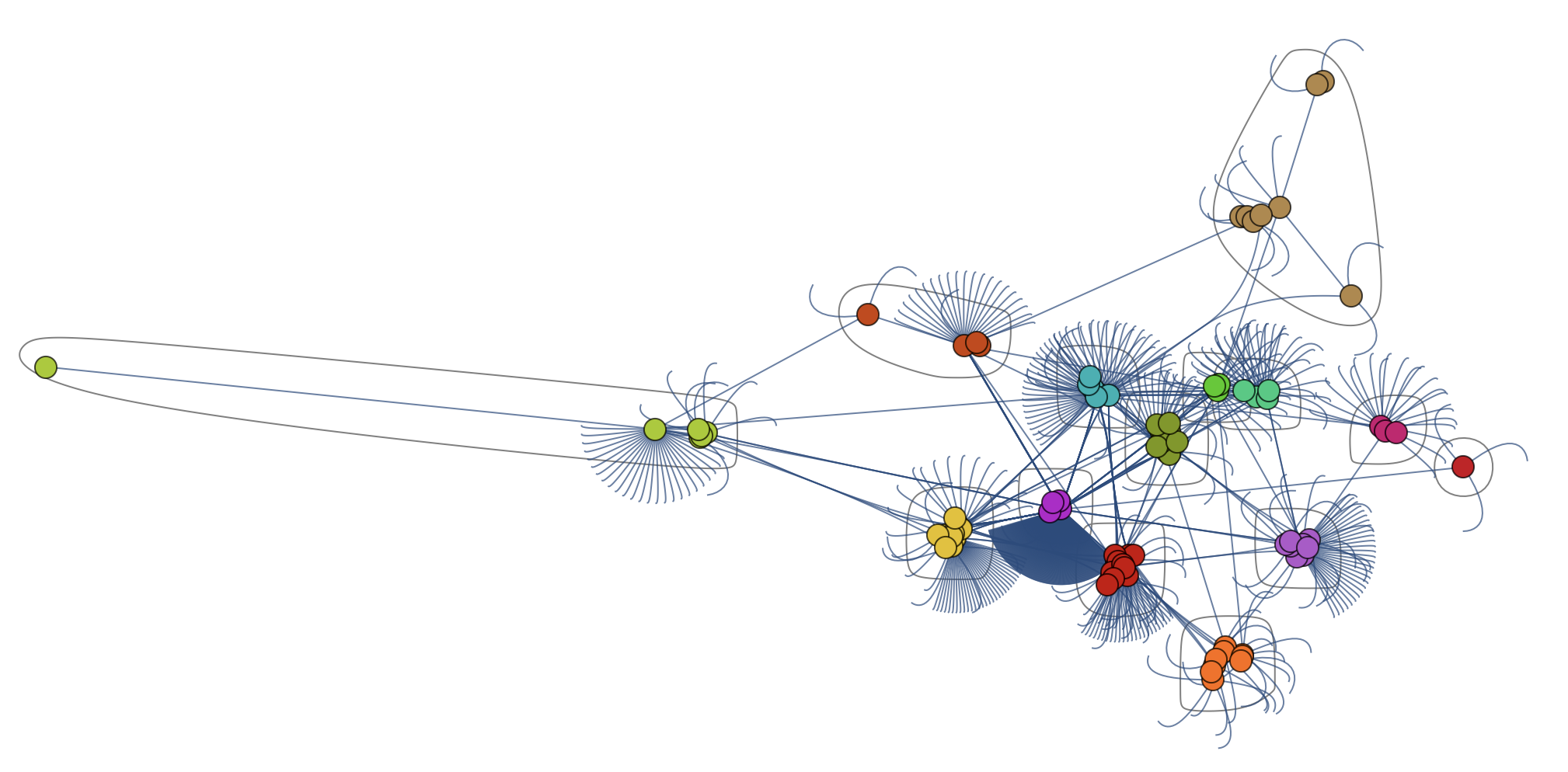
I suppose that all of this only gets truly interesting when we get to levels 6 or 7 of Stephen Wolfram's data preparation scheme; only then can we use the full information from the Wolfram language.
Conclusions
There is an awful lot to explore in this dataset. On the website of the GDELT project they show very nice representations, which can easily be reproduced with the Wolfram Language. Can you find any interesting links between events? Can you use the annotated images to train a useful neural network in Mathematica?
Because of the fact that this data set is freely available and that the terms of use are very permitting, I believe that this could be a brilliant addition to the Wolfram Data Repository. I think that one of the driving forces behind the WDR is @Alan Joyce. Wouldn't it be nice to demonstrate the process to prepare data for the repository that Stephen Wolfram describes in his latest Blog Post on this data set?
Cheers,
Marco
 Attachments: