Thank you for the excellent responses. I could not figure out how to use all the plot formatting I wanted with Graphics (in particular log scale and grid lines within the plot). However, for the record, I did end up figuring out something that worked for me:
Here's a small sample of my data (the first 10 list elements of 14,869 elements), with the entire data list attached:
{{5, 198.047} -> 366, {6, 198.047} -> 392, {7, 198.047} ->
  388, {7, 208.471} -> 734, {8, 198.047} -> 351, {8, 208.471} ->
  744, {9, 198.047} -> 315, {9, 208.471} -> 768, {9, 218.894} ->
  1003, {10, 198.047} -> 272}
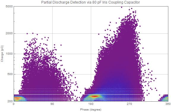
First, I defined a plotting function that generates a list of plotting directives for a common point size and individual point color, and then uses this list to plot all the points:
pdPlot[list_, string_, pointSize_] := Module[{directives},

  directives =
   Directive[PointSize[pointSize], #] & /@
    Map[cf, #2 & @@@ list/Max[#2 & @@@ list]];

  ListPlot[{#1} & @@@ list, ScalingFunctions -> "Log",
   ImageSize -> Large, Frame -> True,
   PlotRange -> {{0, 360}, {200, 5000}},
   FrameTicks -> {{Automatic, None}, {{0, 90, 180, 270, 360}, None}},
   GridLines -> {{0, 90, 180, 270, 360}, Automatic},
   PlotLabel -> "Partial Discharge Detection via " <> string,
   FrameLabel -> {"Phase (degree)", "Charge (pC)"},
   PlotStyle -> directives]

  ]
Where:
cf = ColorData["Rainbow"]
I then call the function with my data list, title string, and a point size I found to work well:
pdPlot[couplerData, "80 pF Iris Coupling Capacitor", 0.0075]
Which yields the following plot:
Next, I am working on the appropriate plot legend to show the color scale.
 Attachments:


