Hi,
you can use something like
ListLinePlot[CorrelationFunction[TemporalData[{Transpose[{x, y}]}, Automatic], {-200, 200}]["Values"][[;; , 1, 2]], PlotRange -> {All, {-1, 1}}]
I guess. It does something slightly different from your low level implementation.
You can get yours to work (fix standard deviations and normalisations etc) like this:
ClearAll["Global`*"]
Nx = 10000;
x = RandomVariate[NormalDistribution[], Nx];
y = RandomVariate[NormalDistribution[], Nx];
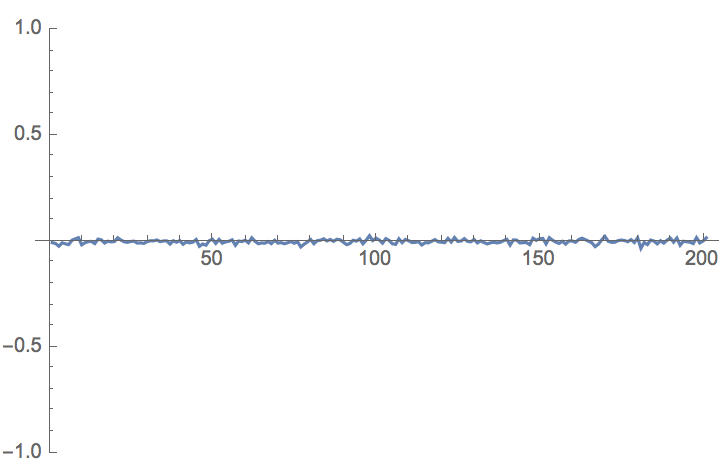
Rxy[n_] := 1/(Nx-n) Sum[x[[m]]*y[[m + n]], {m, 1, Nx - n}]
ListLinePlot[Table[Rxy[z], {z, 0, 200, 1}], PlotRange -> {All, {-1, 1}}]
It is somewhat more elegant to do it like this:
xcorr[m_] := Mean[Drop[x, -m]*Drop[y, m]]
ListLinePlot[ Table[xcorr[m], {m, 1, 200}], PlotRange -> {All, {-1, 1}}]
which gives the same image as above. Don't forget that for the correlation you need to divide the expected value by the standard deviations of the respective time series and before that subtract the mean. You can do that my hand, but there are functions for that:
xcorr[m_] := Mean[Drop[Standardize[x], -m]*Drop[Standardize[y], m]]
ListLinePlot[Table[xcorr[m], {m, 1, 200}], PlotRange -> {All, {-1, 1}}]
This doesn't make much of a difference for the time series I have chosen above, but is a bit more general. There are more things to say, but that's the basic idea. Also this is numerically probably not the most efficient way.
Cheers,
Marco


