Sport plays an important part of my life. As the Wolfram Language offers powerful tools for visualizing and statistical analyzing data, let's start with some basic statistics followed by graphics/graphs computed from recorded activity data.
Data Import and First Insights
Regarding statistical analysis, a spreadsheet of data with basic information about activities was downloaded. Regarding visualization, the same activities containing greater detail like longitude/latitude information were imported individually.
spreadsheet =
 Import["projects/WSS2018/fit2Mathematica/Activities.csv", {"Dataset",
    All, Range[7]}, "HeaderLines" -> 1, "Numeric" -> True]
This gives the following table :
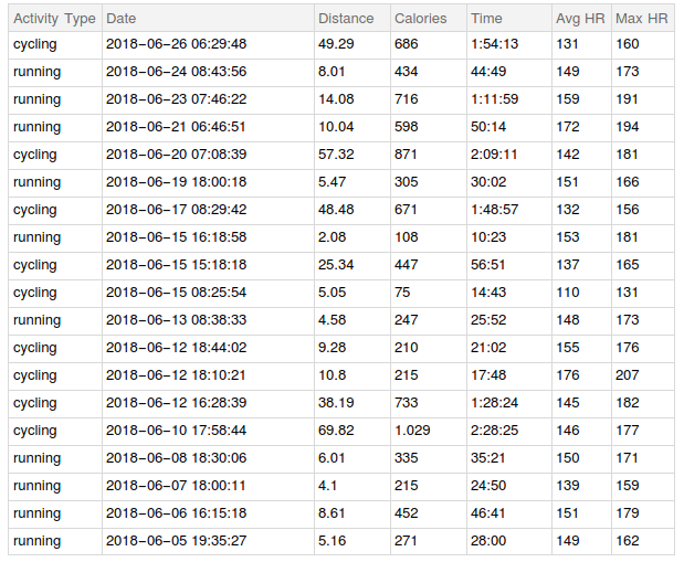
When inspecting the imported spreadsheet, it looks as both activity types, cycling and running, are distributed equally. Observing the different activity attributes, someone can see that the heart rate is higher for running whereas the covered distance is much less compared to cycling.
"Calories" seems to be correlated to "Distance" and to "Time" when focusing on one activity type. As the Wolfram Language offers the needed tools to do statistical analysis, let's proof the assumptions made.
Statistical Analysis
A BarChart is used to underline the first assumption and shows that both activities are practiced somehow equally.
hist = Tally[spreadsheet[[All, "Activity Type"]]];
label = hist[[All, 1]] // Normal;
BarChart[hist[[All, 2]], ChartStyle -> "Pastel", ChartLabels -> label]
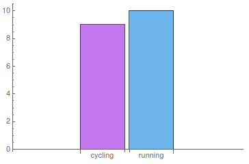
To see if the other assumptions are correct too, we do further statistical analysis. Looking at the overall average heart rate (147.12) and comparing it to the average heart rate of both activity types (141.56 for cycling, 152.10 for running), strengthen again the assumptions made. Considering the data is correct and does not include any outliers, one can say that the average heart rate for running is slightly higher than for cycling.
Tracking your heart rate tells you precisely how hard or easy your heart is working. One would say that for an athletic person the average heart rate is quite high in the before shown case and would, therefore, suggest that the training is too intense. Thus, let's do some more analysis of heart rate.
Regarding experts' opinion, someone should always work out in specific heart zones, which are calculated based on your maximum heart rate (MHR). The equation which is the most common one is:
220 - age = MHR.
This means that my MHR would equal 193. As most of the training should fall in Zone 1 and 2 meaning 60 to 80% of the MHR, the heart rate should be between 115 and 155 most of the time. Regarding running activities, that would mean that the above tracked training is in the upper region of Zone 2 most of the time. Thus, let's look at the maximum heart rate of the tracked activities and see if the MHR is higher than the above calculated one.
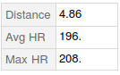
Looking at the table above and calculating the maximum of all "Max HR" values (207.00) shows that my MHR is above the estimated MHR. Of course that could be an outlier. Calculating the mean of the "Max HR" column results in 172.84, which is pretty high too, considering that the data does not include any competition activities.
Nowadays, many experts agree that the formula above is inaccurate for most people and that it is better to monitor the heart rate based on something known as heart rate reserve (HRR), which is more accurate and can be calculated by taking the MHR of a 5-K race (there someone will likely be able to sustain about 97% of their max heart rate ), getting your resting heart rate (RHR), which can be retrieved by monitoring your heart rate as soon as you wake up by counting your pulse for 60 seconds and repeat this for a few days and in the end subtracting the latter from the MHR.
Regarding this purpose we will import some information about a 5-K run I did last year calculate the MHR from this specific run:
The "achieved" MHR regarding the 5-K is 208 and as I know my RHR, which is about 45, someone can easily calculate the RHR:
Solve[208 == 0.97*MHR , MHR];
MHR - 45 /. %
which gives MHR=169.43.
To find out which numbers to target on which runs, we have to multiply the HRR by the zone percentage you want to run in and add back your RHR. Thus, running somewhere in Zone 1 and 2 (let's say 65%) would give the following heart rate:
%*0.65 + 45 = 155.13
This result looks way better as it is totally in line with the average running heart rate calculated above. Enough investigations done on heart rate, so let's go back to basic statistical analysis and focus on covered distance.
Calculating the mean of covered distance gives on overall level 20.09, as grouped by activity type regarding running 6.81 and cycling 34.84. Again the made assumption seems to be correct and absolutely makes sense, as in general, more distance is covered by cycling than by running if someone is not into ultra running, which I am definitely not.
Finally, we calculate the correlation of "Distance" and "Calories" .
Correlation[spreadsheet[[All, "Distance"]] // Normal,
 spreadsheet[[All, "Calories"]] // Normal]
which gives 0.40. This is not that high but a weak relationship can be seen.
As a lot statistics can be done with the Wolfram Language, more are shown in the next section.
More Statistics
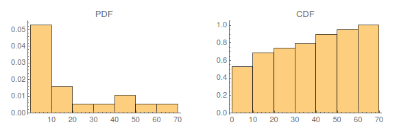
Visualizing the distribution of the covered distance by plotting histograms for the PDF and CDF:
GraphicsRow[{histplotpdf,
   histplotcdf} = {Histogram[spreadsheet[[All, "Distance"]], 10,
    "PDF", PlotLabel -> "PDF"],
   Histogram[spreadsheet[[All, "Distance"]], 10, "CDF",
    PlotLabel -> "CDF"]}, ImageSize -> Large]
As the Wolfram Language also offers tools to find the underlying distribution of data, let us try to fit the visualized data above using FindDistribution. First, we calculate the underlying distribution of the data
 Subscript[\[ScriptCapitalD], p] =
 FindDistribution[spreadsheet[[All, "Distance"]]]
and see how good it fits:
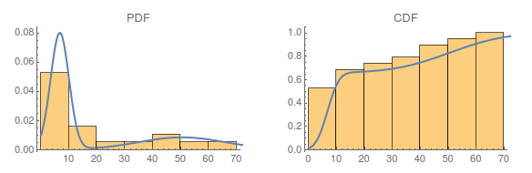
This looks very reasonable as someone can see two "peaks" regarding the PDF, one regarding running and one regarding cycling activities.
Since having found an underlying distribution, let's calculate how likely covering a distance of more than twelve kilometers is:
Probability[x > 12.0,
x \[Distributed] Subscript[\[ScriptCapitalD], p]]
This results in 0.37 which is low but again reasonable as most of the time the running distance is between five and ten kilometers. Moreover, some short cycling tours were done too.
For now enough statistical analysis was done, so let's focus on visualization in the second part.
Visualization of Activity Data
As the Wolfram Language offers many tools for data visualization, a few will be shown in this section below. The second part of imported data files is used and an overview of routes done in the last month is plotted:
AllLatLong = Map[Reverse, #[[All, {3, 2}]] &] /@ AllCsv;
GraphicsGrid[Partition[Graphics[Polygon[#]] & /@ AllLatLong, 6]]

These are the routes of running and cycling activities done in the last month. Someone can easily differentiate between the running and cycling routes as the latter cover bigger areas. Not obvious but at least I know, the last graphic of the grid shows the route of the cycling tour done in Waltham, Massachusetts. Let's do some analysis on this tour and show some nice visualization tools.
Therefore, the CSV file of the cycling activity gets imported and visualized in a few nice ways:
latLong=inFit[[All,{3,2}]];
latLongAlt=inFit[[All,{3,2,6}]];
latLongSpeed=inFit[[All,{3,2,8}]];
altplot=ListPointPlot3D[latLongAlt,Filling->None,BoxRatios->{Automatic,Automatic,.04},
       ColorFunction->(ColorData["Rainbow",2.5 (#3-0.6)]&),AxesLabel->{"latitude","longitude","altitude"},ImageSize->Large];
speedplot=ListPointPlot3D[latLongSpeed,Filling->Bottom,BoxRatios->{Automatic,Automatic,.04},
       ColorFunction->(ColorData[{"SunsetColors","Reverse"}][#3]&),AxesLabel->{"latitude","longitude","speed"},ImageSize->Large];
Show[altplot,speedplot]
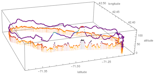
This plot visualizes that if the altitude gets lower when the speed is getting higher. As no one except me knows the route direction and going up or down depends on this hidden information the next graphic will create clarity.
Manipulate[
       GeoGraphics[GeoPath[Take[inFit[[All,{2,3}]],UpTo[Floor[pointsToShow]]]],
       GeoRange->{{42.3793710465543,42.53642104798928},{-71.38013072591275,-71.1983386958018}}
       ],{{pointsToShow,Length[latLong],"Cycling distance"},0,Length[latLong],
    AnimationRate->inFit[[All,8]][[pointsToShow]],AnimationDirection->Forward},SaveDefinitions->True]
An interactive map is plotted by using Manipulate: 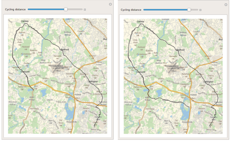
Looking at the results and figures above, someone can see that the Wolfram Language offers many useful tools when it comes to analyzing data, both for statistics and for visualization purpose.
Further Explorations
Analyzing greater amount of activity data from history, moreover, getting data from other athletes too would be great to do even more statistical analysis.


