NOTE: Package source can be found at: https://gitlab.com/SumNeuron/UpSetChart
Visualization of Sets
As most already know, Mathematica provides a wide range of visualizations with great presets for viewing one's data. However, its excellence does not preclude it from putative improvement.
Anyone who has wanted to make even a simple Venn-Diagram in Mathematica has probably sought out one of the following resources:
and even then, these solutions are more hot-fixes for such a fundamental chart type.
Furthermore, even if Venn-Diagram's were implemented in Mathematica they scale poorly. With $2^n$ comparisons needed to be shown, they can get out of hand fast. Just consider this Venn-Digram published in Nature that shows the relationship between the bananas genome and the genome of five other species:
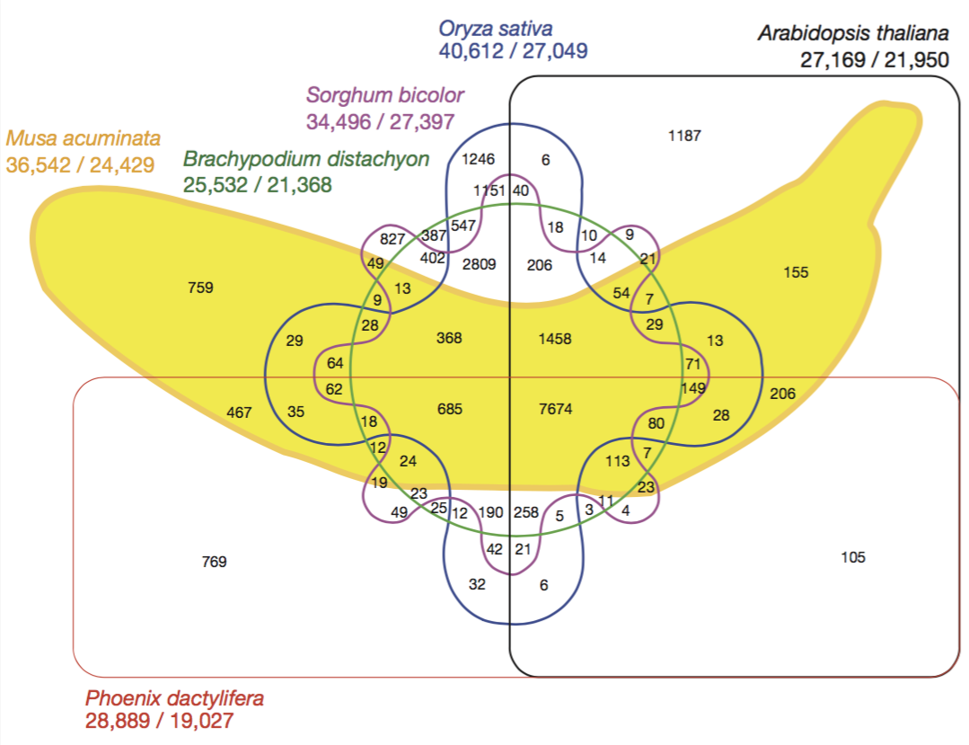
Notice, that is hard to identify which comparison belongs to what region and the size of these regions have no relationship to cardinality of the subset represented there.
UpSetChart
The UpSetChart is a new twist on visualizing comparisons between sets:
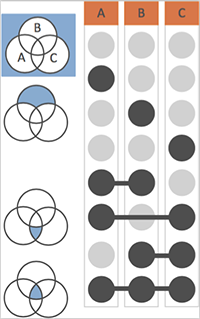
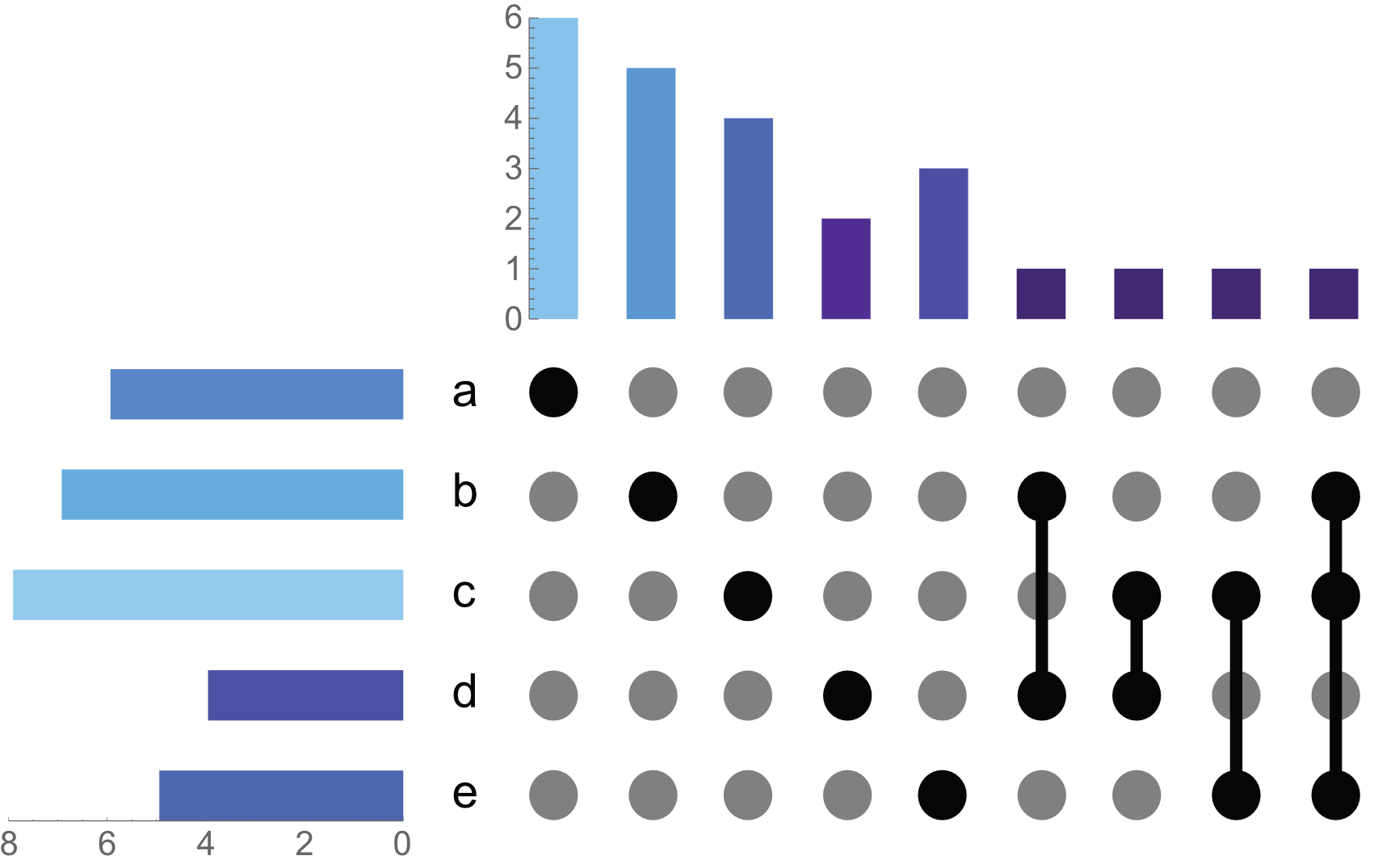
Here, each region of the Venn-Diagram is given it's own row in this "indicator grid", where each column represents a set.
In combination with two bar charts - one for set cardinalities and the other for comparison cardinality - it becomes clear how elements of sets are related to one another:
sets = <|
  "a" -> {7, 77, 53, 95, 42, 41},
  "b" -> {51, 88, 87, 67, 90, 37, 96},
  "c" -> {15, 87, 99, 6, 20, 87, 98, 68},
  "d" -> {46, 85, 6, 90},
  "e" -> {72, 97, 15, 55, 87}
|>;


UpSetChart[sets, "DropEmpty" -> False, "ComparisonSortBy" -> "Name", "SetSortBy" -> "Name", Axes->{True, True}]
*Note: I refer to comparisons rather than intersections as the bars which are aligned to parts of a Venn-Diagram are not true intersections; rather, they are only the elements which are unique to that comparison (e.g. intersection of those sets minus the union of all other sets). Otherwise, for example, if we look at the indicator grid for just set of B. B intersect B is all of . Yet as shown in the side-by-side image of the Venn-Diagrams and corresponding indicator grid, the dot for just B, means elements which are unique to the B part of the Venn-Digram (not an intersection).
While this is nice (and in the Notebook has useful tooltips), we already are starting to see that this is going to scale poorly.
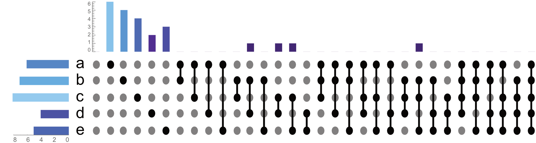
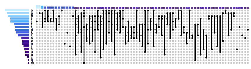
Image if we had $20$ sets! For $20$ sets there are $1,048,576$ comparisons that would have to be visualized. Dropping empty sets, and sorting by cardinality allows for a clear overview of how these sets are related:
randomSets = RandomData[20];
UpSetChart[randomSets, "DropEmpty" -> True,
  "SetSortBy" ->  "Cardinality",
  "ComparisonSortBy" -> "Cardinality"
]
By removing the empty comparisons, we are still left with a lot of comparisons to look at. Although this is better than a traditional Venn-Diagram we can make our data even more accessible. If we group our comparisons by the number of sets being used to make the comparison, the chart becomes far more manageable:
UpSetChart[
  RandomData[20],
  "DropEmpty" -> True,
  "SetSortBy" -> "Cardinality",
  "ComparisonSortBy" -> "Cardinality",
  "TabbedByComparisonsDegreeQ" -> True,
  "ImageSize" -> {Automatic, 250}
]
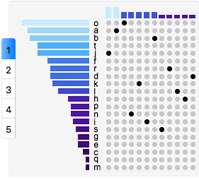
in gif form:
While this is by no means a perfect solution, it is a step in the right direction.
The UpSetChart package can be found here. There are several styling options. However, milage may vary as the axes are sort of hacked in there.


