Introduction
Looking on data and immediately understanding the underlying data, finding relationships and getting the information searched is not always easy. Visualization tools can help to reduce the time it takes to understand. Therefore, the goal was to design heuristic rules to automatically visualize various types of data and combine statistical analysis, unsupervised/clustering methods along with the wide variety of visualization techniques Wolfram Language has to offer.
Getting started
Based on empirical knowledge humans see/understand quite easy the form/structure of data and thus, they are able to apply the appropriate visualization tools to the data. As this should be now automatically done, the first step was to detect data as well as different variable types. Before showing the code let's see which data/variable types exists:
data types 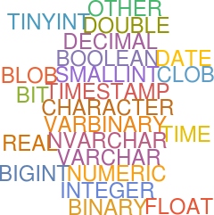 variable types:
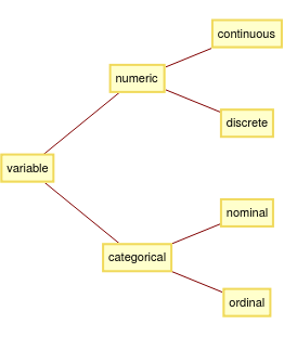
Now, we know about possible kinds of data and variable types. The most important ones in our case are time, numeric and character regarding data types and categorical regarding variable types, as the plot type/the main functions will depend exactly on these.
After some data pre-processing/data cleaning we apply the following function to our data to get the data forms:
suggestedColumns[d0_, int_Integer: 10] := Module[{info, meta, data},
  info = MachineLearning`ToMLDataset@RandomSample[d0, int];
     meta = info[[1, 2, "Input"]];
  data = Association@Apply[
     #1 -> Append[#2, "Name" -> #1] &,
     Transpose[{Keys[meta], Values[info[[2, 1]]]}],
     {1}
     ];
  Query[{#Type, #Name, #Values} &] /@ Values[data]
  ]
Which gives for a certain data set the following output:

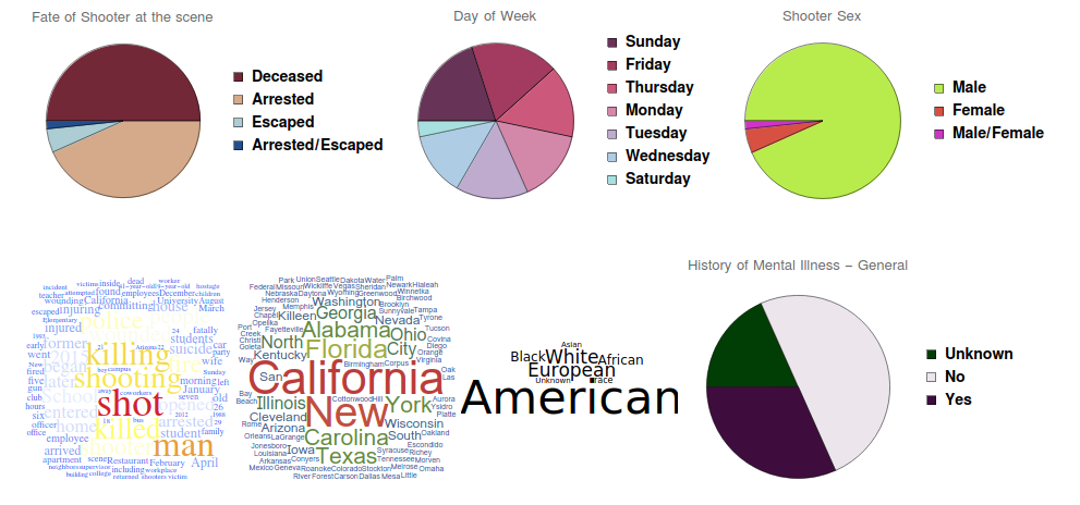
As the data types are achieved, next the appropriate plots have to be created. Starting with nominal/text data, depending on attributes as word count size, appearance (e.g uniqueness) and construction (e.g association), plots as Wordcloud, PieChart and Histogram are used:
Which[ (*using which to avoid different kind of errors*)

 AllTrue[AssociationQ[#] & /@ pV, TrueQ],
 FeatureSpacePlot[Keys[pV]], (*use featurespaceplot for associations*)

  AllTrue[((StringContainsQ[ToString[Head[#]], "Entity"]) & /@ pV),
  TrueQ], Labeled[WordCloud[pV], Text[l0[[pW[[i]], 2]]], Top],
 If[AllTrue[NumericQ /@ pV, TrueQ], True, pV = DeleteCases[pV, ""];
  Max[WordCount@pV] <= 3],
 (*if data is good test if wordcloud or histogram/pie plot should be \
applied*)
 Which[
  DuplicateFreeQ@pV, Nothing,
  CountDistinct[pV] < 2, Nothing,
  CountDistinct[pV] <= 20,
    hist = Tally@pV;
    label = hist[[All, 1]] // Normal;
    If[method == "Bar",
    BarChart[hist[[All, 2]],
    ChartStyle -> RandomChoice[ColorData["Gradients"]],
    ChartElementFunction -> "GlassRectangle", ChartLegends -> label,
    PlotLabel -> l0[[pW[[i]], 2]]],
    PieChart[hist[[All, 2]],
    ChartStyle -> RandomChoice[ColorData["Gradients"]],
    ChartLegends -> label, PlotLabel -> l0[[pW[[i]], 2]]]
    ],
  True, Labeled[
   WordCloud[pV, WordSelectionFunction -> (StringLength[#] > 1 &),
    FontFamily -> RandomChoice[$FontFamilies],
    ColorFunction -> RandomChoice[{"AvocadoColors", "DarkRainbow"}],
    WordOrientation -> {{0, \[Pi]/3}}], Text[l0[[pW[[i]], 2]]], Top]
  ],
 True,
 Labeled[WordCloud[TextWords@DeleteStopwords@pV,
   WordSelectionFunction -> (StringLength[#] > 1 &),
   FontFamily -> RandomChoice[$FontFamilies],
   ColorFunction ->
    RandomChoice[{"DarkRainbow", "TemperatureMap",
      "VisibleSpectrum"}]], Text[l0[[pW[[i]], 2]]], Top]
 ]
Note, that only the code extract is given without function header, data cleaning and function ending. Applying this to a data object from the Wolfram Data Repository gives us different kinds of plots:
Regarding numerical data, plots based on data dependency and date existence were generated.
If[(Variance[v1] > 0 && Variance[v2] > 0),
   pValue = IndependenceTest[N@v1, N@v2];
   Lab = "Dependence of " <> ToString[l0[[pS[[i]]]][[2]][[2]]] <>
     " and " <> ToString[l0[[pS[[i]]]][[1]][[2]]];
   If[
    pValue < 0.05,
    ListPlot[Transpose[{Normalize[v1], Normalize[v2]}],
     PlotLegends -> Automatic,
     PlotStyle ->
      Directive[PointSize[Medium],
       RandomChoice[{Pink, Purple, Black, Green}]],
     AxesLabel -> {l0[[pS[[i]]]][[1]][[2]], l0[[pS[[i]]]][[2]][[2]]},
     PlotTheme -> "Monochrome"],
    StackedListPlot[{Normalize[v2], Normalize[v1]},
     AxesLabel -> {l0[[pS[[i]]]][[1]][[2]], l0[[pS[[i]]]][[2]][[2]]},
     PlotStyle -> PointSize[Medium]]]],
  {i, 1, Length[pS]}
  ],
 True,
 If[method == "H",
  Histogram[pV[[pN]], PlotLabel -> First@l0[[pN, 2]],
   ChartElementFunction ->
    ChartElementDataFunction["SegmentScaleRectangle", "Segments" -> 3,
      "ColorScheme" -> "SolarColors"]],
  StackedListPlot[pV[[pN]], PlotLabel -> First@l0[[pN, 2]],
   PlotTheme -> "Scientific"]
  ]]
and
Table[
 t = GroupBy[
   Cases[Thread[l0[[xy[[i]], 3]]], x_ /; FreeQ[x, _Missing]],
   First -> Last, Total];
  ts = TimeSeries[t,
    MissingDataMethod -> {"Constant", Mean[Values[t]]}]
  ];
 DateListPlot[ts["Path"], Joined -> True, Filling -> Axis,
  PlotRange -> All, PlotLabel -> l0[[xy[[i]], 2]][[2]]],
 {i, 1, Length[xy]}
 ]
Again only an extract of the code is shown and the following output is obtained:

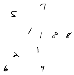
Functions like these where also written for images, geo locations, audios and entities.
geoPlot[l0_] := Module[{pL},
  If[MemberQ[l0[[All, 1]], "Location"],
   pL = Pick[l0, StringMatchQ[l0[[All, 1]], "Location"]];
   Table[
    GeoHistogram[pL[[i, 3]]]
    , {i, 1, Length[pL]}]
   ]
  ]

audioPlot[l0_] := Module[{pA, entry},
  If[MemberQ[l0[[All, 1]], "Audio"],
   pA = Pick[l0, StringMatchQ[l0[[All, 1]], "Audio"]];
   Table[
    entry = RandomChoice[pA[[i, 3]]];
    Periodogram[entry, 1000, PlotLabel -> l0[[pA[[i]]]][[2]]],
    {i, 1, Length[pA]}]
   ]
  ]


imagePlot[l0_, int_Integer: 10] := Module[{pI, rI},
  If[MemberQ[l0[[All, 1]], "Image"],
   pI = Pick[l0, StringMatchQ[l0[[All, 1]], "Image"]];
   Table[
    rI = RandomSample[pI[[i, 3]]];
    FeatureSpacePlot[rI, Min[int, Length[rI]]],
    {i, 1, Length[pI]}
    ]
   ]
  ]
Regarding these functions, plots as GeoHistogram, FeatureSpacePlot and Periodogram were used to visualize the data and the following outputs were retrieved:
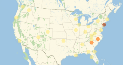
For entities in data objects which do not have "Entity" as their content type, I decided to randomly extract properties from these and generate new data sets to which again the above defined functions can be applied.
getEntTable[pE_, int_Integer: 10] :=
 Module[{entities, PropEnt, nE, nP, rP, d, finalD},
  Table[
   entities = RandomSample[pE[[i]], Min[10, Length[pE[[i]]]]];
   nE = EntityTypeName /@ entities;
   If[AllTrue[nE, MemberQ[EntityValue[], #] &],
    nP = Entity[First@nE]["Properties"];
    rP = RandomSample[nP, Min[int, Length[nP]]];
    PropEnt = EntityValue[entities, rP];
    d = Dataset[
      Association[Thread[Prepend[CommonName[rP], First@nE] -> #]] & /@
        Transpose[Join[{CommonName[entities]}, Transpose@PropEnt]]];
    finalD =
     d[{Identity,
        Merge[Identity] /*
         Select[Count[#, _Missing]/Length[#] > 0.01 &] /* Keys} /*
       Apply[KeyDrop]];
    suggestedColumns[finalD, 10]
    ], {i, 1, Length[pE]}]
  ]
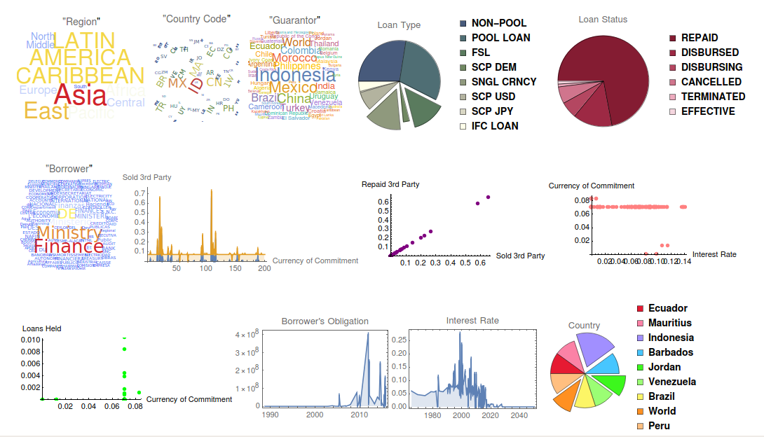
The job of the main function is now to call all these pre-defined functions and put all plots together. The result of the input data is shown in the next image:
Summary
'A picture is worth a thousand words' - While trying to obtain information from large volumes of data, it is useful to visualize it in a meaningful way. However, the greatest challenge is to find the appropriate tool to visualize the underlying data. In this project, we have explored the various kinds of data visualization tools the Wolfram Language offers, and have come up with automatic rules to infer the data type and decide automatically the exact plot type to use for the data. As the Wolfram WordCloud Data Repository offers a large amount of curated data, we used examples from there.
Future work
As large volumes of data imply a high number of visualization methods, there are way more informative visualization techniques that can be explored further. Also the way to plot entity information has to be revised as here based on random property selection maybe useless information which is not associated to the original data object gets visualized.
Contact Information
sabrina.kuhrn@gmx.at
GitHub Link
https://github.com/Eunike91/Summer2018Starter/blob/master/StudentDeliverables