Introduction
The goal of this project was to analyze how users on social media, in this case Twitter, use emojis in relation to their tweets contents to map an overarching sentiment to each emoji. Using ServiceConnect in the Wolfram Language, tweets can be pulled with a specific search term.
I first had to link my twitter account to ServiceConnect
twitter = ServiceConnect["Twitter", "New"]
Using ServiceConnect, I then was able to pull tweets using the following function:
GetTweetData[terms_, n_] := Module[
  {sentimentList},
  sentimentList =
   Classify["Sentiment", #] & /@
      Normal[twitter["TweetSearch", "Query" -> #, MaxItems -> n][All,
        "Text"]] & /@ terms;
  sentimentList =
   Delete[sentimentList, Position[sentimentList, Indeterminate]];
  Return[sentimentList]
  ]
Using this function GetTweetData, multiple terms in the form of a list can be passed in as arguments as well as the total number of tweets per term to be pulled. The function then returns a list of lists of sentiments: "Positive", "Neutral", or "Negative", back so that the data can be manipulated. In some case scenarios, the built in sentiment classifier in the Wolfram Language would consider the sentiment of a tweet to be "Indeterminate". In this case, the data point that was Indeterminate is removed to avoid issues with compiling the data.
Data is able to be visualized in many different ways, those of which include: Pie charts, bar charts, and as a dataset.
Bar Chart
TwitterBarChart[data_, sortedTerms_] := Module[
     {assocMap = {"Positive" -> 1, "Negative" -> -1, "Neutral" -> 0}},
     BarChart[Sort[Total /@ ReplaceAll[data, assocMap]],
      ChartLabels -> Placed[sortedTerms, Above]]
     ]
TwitterBarChart[rawData, emojis[[Ordering[emojis]]]]
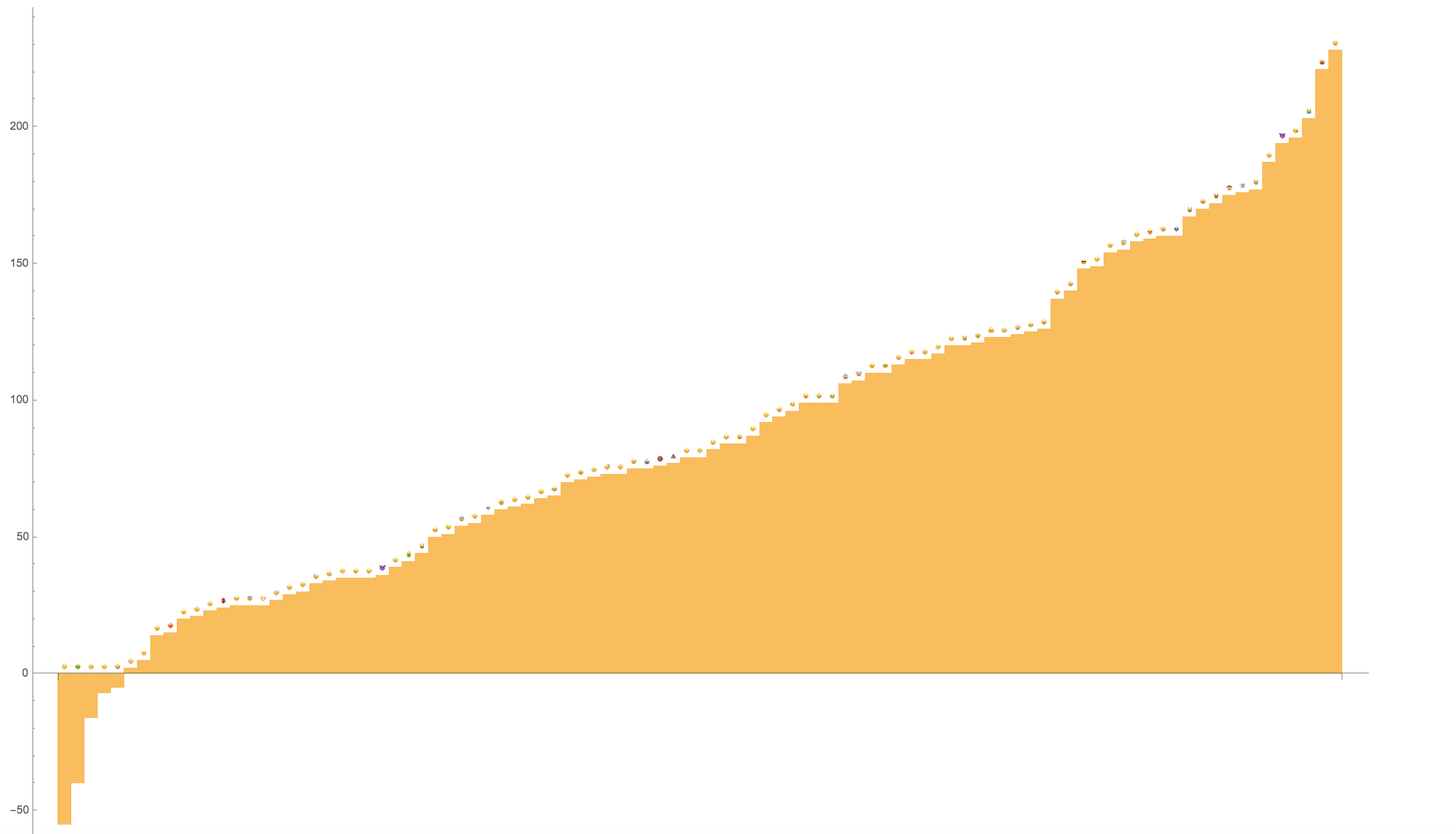
This function is beneficial for seeing a nice display of most negative to most positive emojis. It gives a nice representation of the overall data for each emoji by finding a sort of "net sentiment score", where positive = 1, negative = -1, and neutral = 0. These graphs were made using those methods.
However, to achieve the goal of moving from most negative to most positive, a the data has to be sorted. Using a function called SortEmojis and the Wolfram Language function Ordering[], the function returns a list of rasterized emojis that are in the order that the sorted data will be in so that data and images match up with each other.
SortEmojis[data_, emojis_] := Module[
  {termsList , dataOrdering,
   assocMap = {"Positive" -> 1, "Negative" -> -1, "Neutral" -> 0}},
  dataOrdering = Ordering[Total /@ ReplaceAll[data, assocMap]];
  termsList = emojis[[dataOrdering]];
  Return[termsList]
  ]
The counts of the data are found to find the "net sentiment score" as aforementioned, so that the data is sorted in the way it is intended to be.
After running the function TwitteBarChart, you end up with an output that looks like this: 
So this sentiment data is good for representing the overall sentiments, and gives a nice visual of what is positive and negative. However sometimes there is more to be seen.
Pie Charts
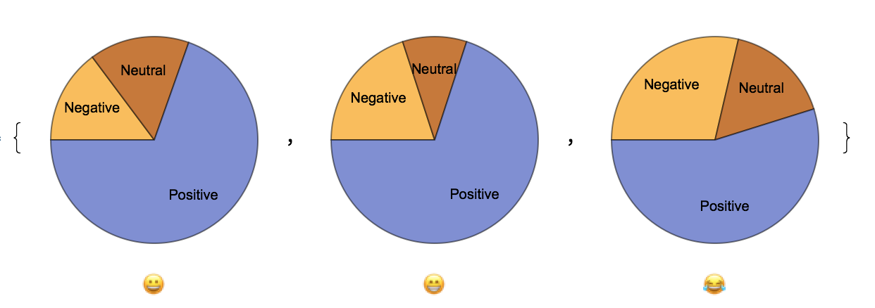
An effective way to look more at the details of one of the emojis is to analyze a PieChart (or a few) of the emojis sentiments.
There is a function I also created called TwitterPieCharts which takes a list of sentiments and labels in order to properly display a list of pie charts all with labels being their respective emojis
TwitterPieCharts[data_, terms_] := Module[
 {counts = KeySort /@ Counts /@ data},
  Thread[Labeled[
   PieChart[#, ChartLabels -> {"Negative", "Neutral", "Positive"}] & /@ counts, terms]]
      ]
To allow for the static labels "Negative" , "Neutral", and "Positive" the counts of the counts of the data is ran through KeySort to allow for correct labeling of pie chart sectors. Then the pie charts are ran through the function Thread[] in order to assign a name to each one.
TwitterPieCharts[Take[rawData, 3], Take[emojis, 3]]
This code snippet right here is just an example to display the functionality. I am taking the first three emojis and their corresponding emojis to produce an output of three pie charts which look like the following. 
These pie charts allow a more detailed view of specific emoji data without getting into the numbers. In some case scenarios, emojis on the bar chart may have lots of both positive and negative which counteract in the calculating of the "net sentiment score" of which I mentioned earlier and that is used to calculate the data for the bar chart.
Dataset
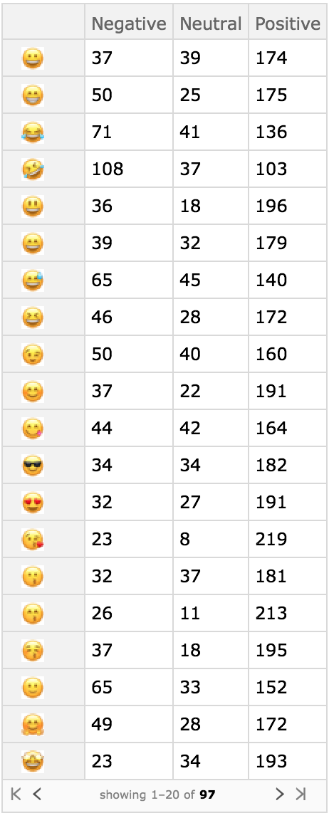
If actual raw data, as in the original counts of the sentiment data wish to be seen, the Wolfram Language has a very easy function built directly in designed to represent data in a cell style chart.
TwitterDataSet[data_, terms_ := Module[
  {counts = KeySort /@ Counts /@ data},
  Dataset[Association[MapThread[Rule, {terms, counts}]]]
  ]
This function creates a key map of emojis with the sentiment counts they represent, and then key sorts them in order to effectively display the data inside a dataset with a consistent structure that is very easy to read.
TwitterDataSet[data, emojis]
This code snippet here, with the list of raw sentiment data and emojis produces this output in the dataset 
Conclusion
Overall the conclusion that I was able to draw about the use of emojis on twitter is that it goes against general expectation. Many emojis such as "ð¤" were were negative overall, which was odd considering the emoji seems to have a pretty neutral "flavor" to it. For each emoji, 250 tweets were pulled for each, resulting in a total of 24250 tweets. Among these 24250 tweets however, I noticed as I was taking a glance at them after being pulled, that a few tweets were duplicated. I found the answer for this to lie within the fact that retweets are considered actual new tweets. In some case scenarios, I might see the same tweet 10-15 times in a row if the tweet was popular and retweeted by many. This gives more popular tweets more "weight" so to speak in this type of data analysis, but the question is if that "weight" in actuality, accurately represents the connotation of those emojis accurately, despite one thinking it is simply garbage data from the beginning. In other words, even though the tweets are retweets, do retweets accurately represent the thoughts and emotions of others on twitter, meaning that duplicate retweets still provide accurate data? That is hard to say, however it is easy to determine that twitter users, in general, for certain types of messages, use certain types of emojis that not many would expect.
 Attachments: