Message Boards Message Boards

0
|
4784 Views
|
1 Reply
|
0 Total Likes
View groups...
Share
Share this post:

Control horizontal scale for CandlestickChart?

Posted 5 years ago

The documentation for CandlestickChart says: "The dates are considered an ordered sequence of events, and are not shown on an absolute time scale." However, I don't understand why there should be such a difference between the following:

CandlestickChart[{{{2017, 1, 1}, {90, 94, 80, 85}}, {{2018, 1, 2}, {81, 125, 70, 120}}}]
CandlestickChart[{{{2018, 1, 1}, {90, 94, 80, 85}}, {{2018, 1, 2}, {81, 125, 70, 120}}}]

The only difference is the year in the first element. The resultant charts are: Why the SCRUNCH?

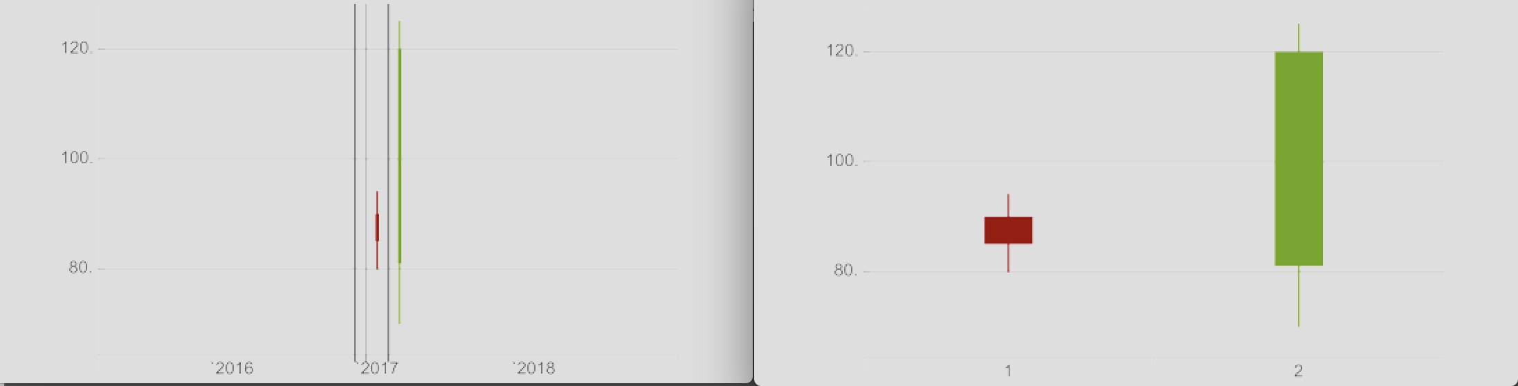
I did try removing the month and day from the 2017/2018 code, but the chart was still SCRUNCHED.
If that is resolved, how can I eliminate the grey "discontinuity" bars in the first (2017,2018) chart?

Using Mathematica 11.3.0

POSTED BY: Fly Guy

The gray bars are showing year separation. Look at the output of the following:

CandlestickChart[{{{2017, 1, 1}, {90, 94, 80, 85}}, {{2017, 12, 
    31}, {81, 125, 70, 120}}}] 
CandlestickChart[{{{2017, 1, 30}, {90, 94, 80, 85}}, {{2017, 12, 
    1}, {81, 125, 70, 120}}}] 

Edited to add images

enter image description here

POSTED BY: Ed Forrester
Reply to this discussion
Community posts can be styled and formatted using the Markdown syntax.
Reply Preview
Attachments
Remove
or Discard

Group Abstract Group Abstract