I've been experimenting with data from the WMAP mission. It occurred to me to map the temperature data as audio to see what kinds of sounds might be generated. I was expecting static, and indeed that's what I got: 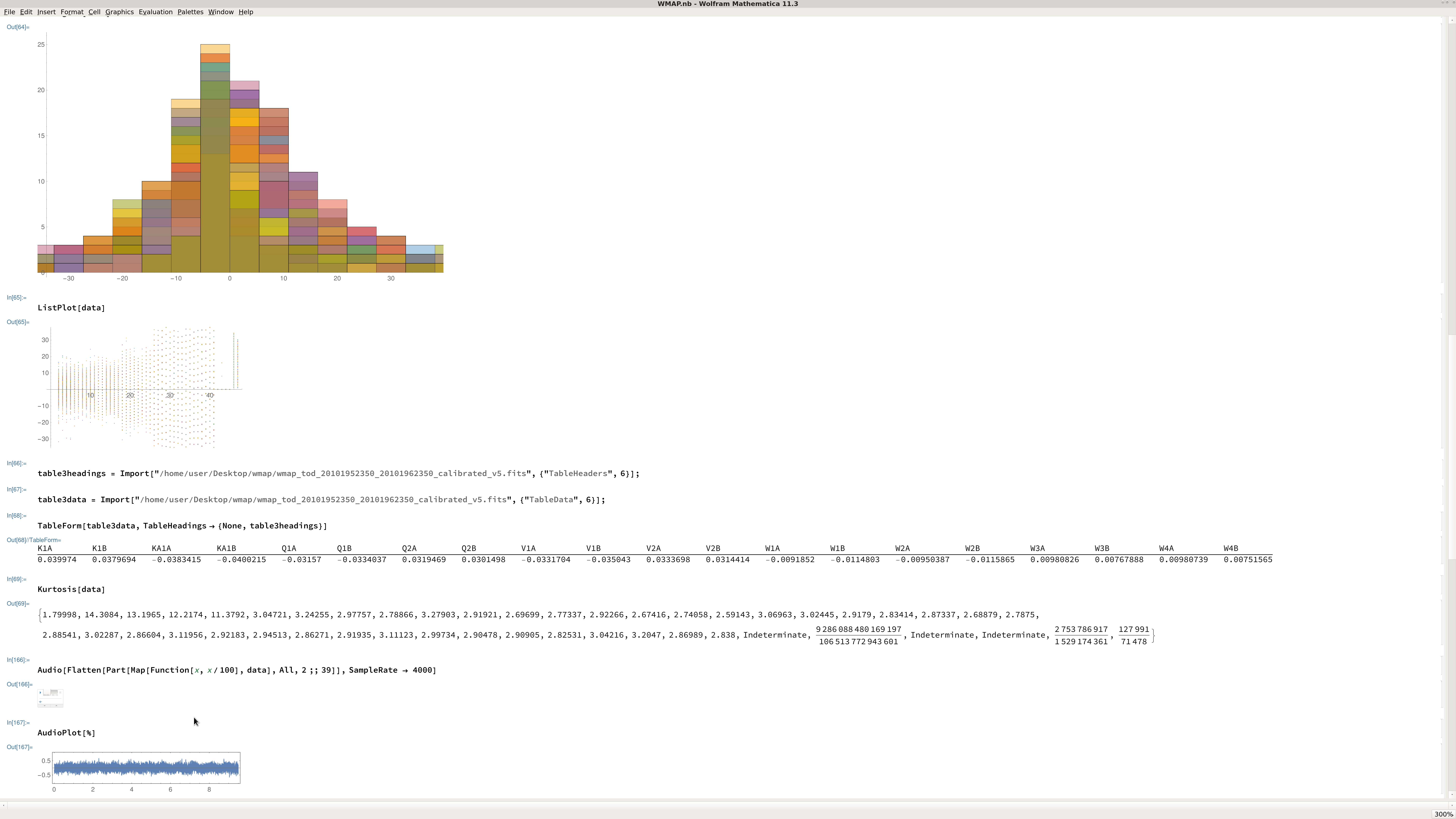 There are 40+ columns in the data, including time markers in column 1 and science markers in columns 40-41, so here I simply discarded these irrelevant data and flattened the table. With the first 1000 rows and a sample rate of 4000 you get a few seconds of simulated audio. Over the entire table there are tens of thousands of rows, so that is next. I also want to separate the different frequency bands so that the audio is divisible into distinct channels that make sense, instead of one monotone stream with all of the columns in it. I wanted to document this because in reading the various papers about statistical analysis of the WMAP data, I don't see an analysis or simulation of audio. I provide my work in progress notebook. Comments welcome.
 Attachments:


