Introduction
In the stock market, the returns (% change in price of the stock between days) of any particular stock create a fingerprint unique to that stock. For example, the returns of Tesla and Johnson & Johnson are very different, since they are shaped by variable factors such as industry, size, and volatility. In this project, I used machine learning to analyze the "return fingerprint" of stocks in the S&P 500. Would the computer tell me that Facebook and Twitter are similar, if I gave it no context? To isolate the return fingerprint from the rest of the variable factors, I trained the computer on pure Date List Plots. I could analyze the impact of the variable factors, how people can use what they know about particular stocks to get a better overview of the market, and the accuracy and precision of computer results. I aimed to correctly group stocks by fingerprint (within the time frame of a year), and analyze the correlation within the subgroups.
Importing Data
The Wolfram databases store a wide range of financial data, so I was able to import all of my data directly and without parsing. I imported the returns of all stocks in the S&P 500 and created a list of DateListPlots to store the graphs.
moreReturns =
     AssociationMap[FinancialData[#, "Return", "Jan. 1 2019"] &,
      EntityList[ EntityClass["Financial", "SP500"]]]

stockReturnsPlot =
 DateListPlot[#, FrameTicks -> None] &  /@ DeleteMissing[moreReturns]
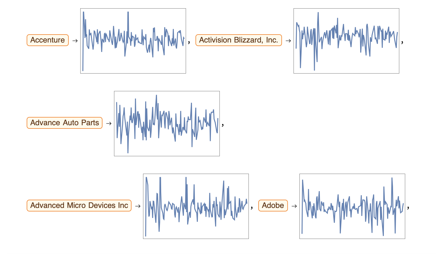 All of these plots are from January 1 2019 to July 1 2019, and the plot range is -10 to 10. As one can see, there is no context behind the graphs.
Grouping by Industry ------------------------------------------------------------------------
snpSectorsAll =
AssociationMap[EntityValue[#, "Sector"] &, Keys[moreReturns]];
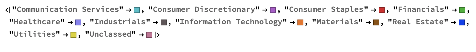
plotSectors = Values[snpSectorsAll] // Union
stockSectorsAll = GroupBy[Normal[snpSectorsAll], Last -> First]
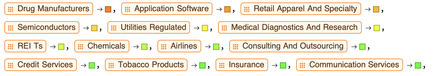
![][2] Here is a small section of the association map. It maps the industry to all of the stocks within that industry. I also mapped the industries to various colors.
Static Prototype
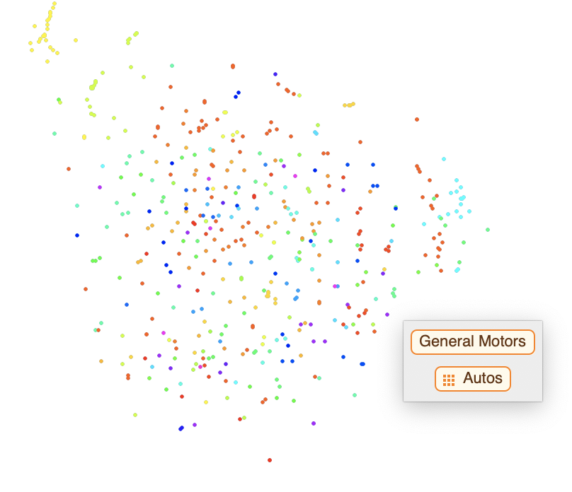
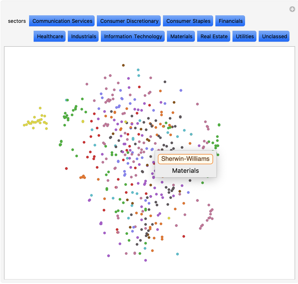
Once I had the stocks mapped to the sectors and the sectors mapped to the colors, I wrote a function to map the stocks to the colors. I then feature space plotted the DateListPlots, and I got the following results. The results were a blast of not-so-random confetti data points. In this plot, datapoints of similar colors cluster together in groups ranging from two to 12 points. This shows that the machine classifies the stocks by sector. The user can hover over a datapoint to view the stock and industry.
confetti =
FeatureSpacePlot[(Tooltip[Style[#2, stockColorFunction[#1]],
Column[{#1, snpSectorsAll[#1] /. _Missing -> "Uncategorized"},
Center]]) & @@@ Normal[stockReturnsPlot],
LabelingFunction -> None]
Putting It All Together...
Once I had my dynamic stock color manipulator, I was able to put everything together and create an interactive stock sector visualizer.
Manipulate[
FeatureSpacePlot[(Tooltip[ Style[#2, If[MemberQ[stylizer, stockColorFunction[#]],
stockColorFunction[#], White]], If[MemberQ[stylizer, stockColorFunction[#]],
Column[{#1, snpSectorsAll[#1] /. _Missing -> "Uncategorized"}, Center],
LabelingFunction -> None]]) & @@@  Normal[stockReturnsPlot],
LabelingFunction -> None], {stylizer, Reverse /@ Normal[sectorsMapped],
ControlType -> TogglerBar, Appearance -> "Row"}]
Final Results-New and Improved
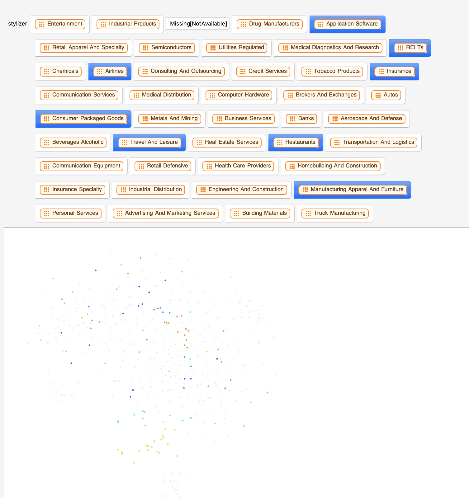
Although I achieved the results I wanted, the interactive plot was not very user friendly. Some industries, such as Banks and Insurance, were completely different colors, despite being in the same industry. In addition, forty three toggler buttons was too much. After remapping the industries to sectors, I created an association to assign the sectors to 12 colors. The final plot is a lot more user friendly, and it is easier to read the data.
alright =
Manipulate[FeatureSpacePlot[(Tooltip[ Style[#2,   If[MemberQ[sectors,
stockColorFunction2[#]], stockColorFunction2[#], White]],
If[MemberQ[sectors, stockColorFunction2[#]], Column[{#1,
snpSectorsAll2[#1] /. _Missing -> "Uncategorized"}, Center]]])
& @@@ Normal[stockReturnsPlot], LabelingFunction -> None,
PlotStyle -> PointSize[Medium]], {sectors,
Reverse /@ Normal[condensedSectorsMapped],
ControlType -> TogglerBar, Appearance -> "Row"}]
Analysis
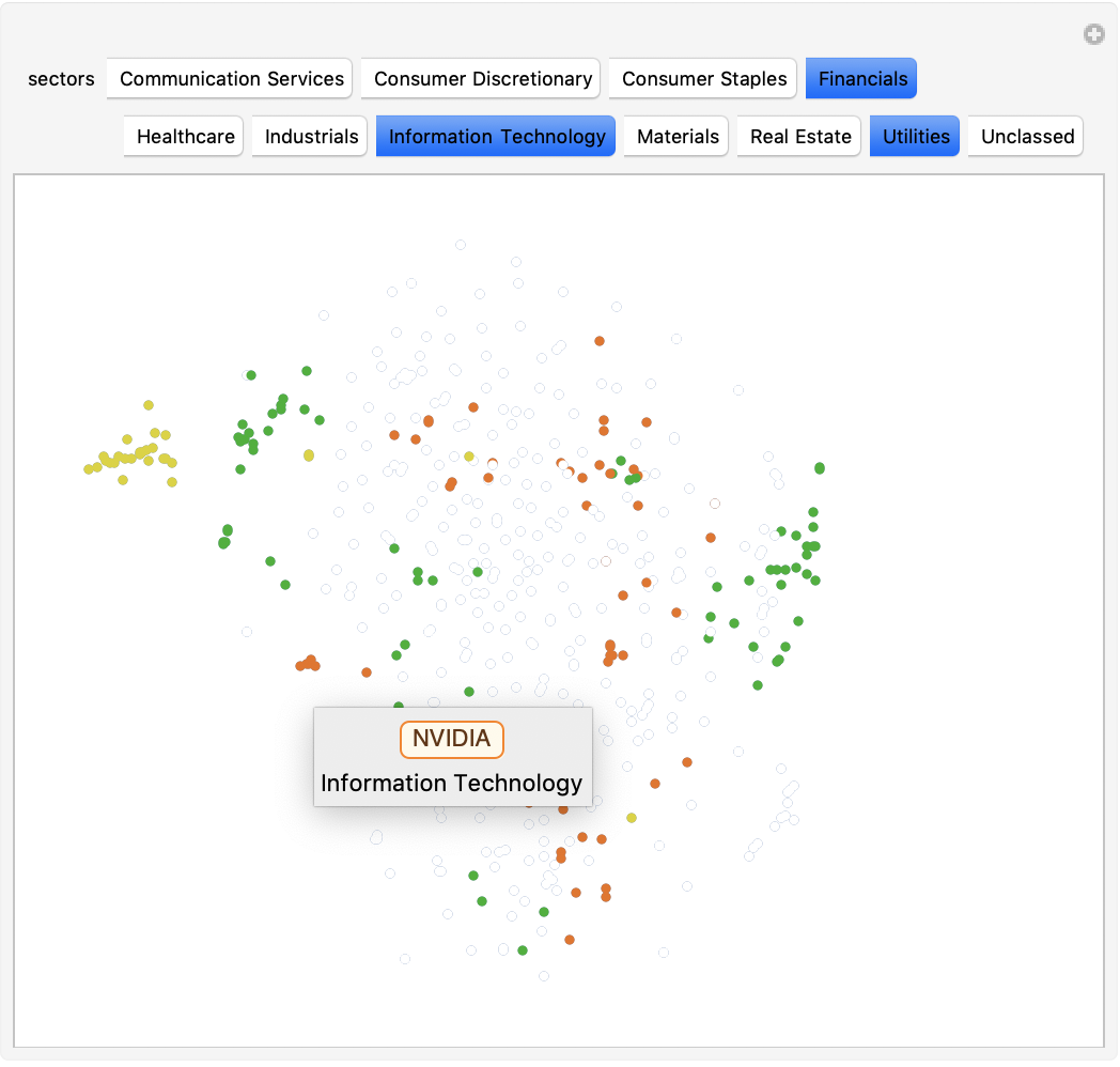 This plot shows all of the stocks in the S&P 500. It appear like a burst of confetti at first glance, but a closer look reveals moderate correlation between the stocks. Dots of the same color cluster together into smaller subgroups, confirming that industry has a big influence on the similarity between stocks. While not all stocks in a sector clustered in one big group, most tended to cluster near at least two others of the same sector. For example, Norwegian Cruise Line Holdings, Carnival, and Royal Caribbean (cruise businesses) form a mini cluster. In addition to this, dots of different colors sometimes cluster together. Upon further investigation, I found that these stocks almost always have something in common. For example, there is a cluster in the top right with both financial and IT stocks. Among these are VISA (financials) and Microsoft(IT), two big companies with low volatility that deal with online operations. This correlation is much easier to identify through visualization. In the second plot, I have selected the Financials, Information Technology, and Utilities sectors. Again, one can see the correlation between sectors of various stocks. All of the yellow Utility stocks cluster in the left, while the Financial and IT sectors cluster in smaller subgroups all around the plot.
Extensions
I focused on the visualization of stocks by sector for a fixed time frame, but there are many ways to expand the scope and give more comprehensive results. One such extension is adjusting the size of the dots to indicate market capitalization. This would show additional correlation, as one would expect larger stocks to cluster together. Another extension is to create an adjustable timeframe to see the market change over a period of time. This would be great to visualize the dynamic market, as well as to predict where the market is headed.
Thank you!
Big thanks to Philip Maymin for being an awesome mentor.


