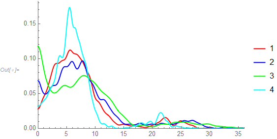
I'm sure it can be done with MapIndexed and lots of other ways. Here's one of those ways given that you've provided the 4 lists as S1, S2, S3, and S4:
data = {S1, S2, S3, S4};
alldata = Transpose[{data, {"1", "2", "3", "4"}}];

h = Histogram[#[[1]], {20}, "PDF", PlotRange -> {{0, 1300}, {0, 0.016}}, PlotLabel -> #[[2]]] & /@ alldata;
GraphicsRow[h, ImageSize -> 1000]

I've given all of the histogram the same PlotRange values to allow a comparison. However, because these are histograms and because of most of the data being mashed up near 0, comparisons are at best difficult. One approach is to overlay nonparametric densities and use a transformation of the data such as a square root transformation.
k = 0.5;
skd = SmoothKernelDistribution[#[[1]]^k, Automatic, {"Bounded", {0, \[Infinity]}, "Gaussian"}] & /@ alldata;
Plot[Evaluate[PDF[#, x] & /@ skd], {x, 0, 1300^k}, PlotRange -> {{0, 1300^k}, {0, Automatic}},
 PlotStyle -> {Red, Blue, Green, Cyan}, PlotLegends -> {1, 2, 3, 4}]

This makes it easier to see the similarities and differences among the distributions of the 4 datasets.