Message Boards Message Boards

1
|
4277 Views
|
3 Replies
|
6 Total Likes
View groups...
Share
Share this post:

[?] Plot histogram with especial bin width value?

Hi,

How do I plot the histogram for each list with bin width equal 20 in the enclosed notebook?

I appreciate your help.

Regards,

enter image description here

Attachments:
POSTED BY: M.A. Ghorbani
3 Replies
Posted 5 years ago

I could not get the second line in your code to combine the data columns so I'm using just the data in the first column.

To get a bin width of 20, use {20} in the Histogram command:

Histogram[data, {20}, "PDF", PlotRange -> {{0, 500}, {0, 0.016}}]

Histogram with binwidth of 20

I've used the "PDF" option so that your histograms from datasets with differing numbers of observations can be compared.

With large datasets such as yours there is no reason to display a histogram. Try a more modern nonparametric density estimate.

skd = SmoothKernelDistribution[data, Automatic, {"Bounded", {0, \[Infinity]}, "Gaussian"}];
Plot[PDF[skd, x], {x, 0, 500}, PlotRange -> {{0, 500}, {0, 0.016}}]

Nonparametric density estimate

One of the many advantages is the ability to superimpose several nonparametric density estimates and clearly see differences and similarities of different datasets. If you overlay histograms, you get a mess.

POSTED BY: Jim Baldwin

Thank you Jim for the useful explain.

I included the data in Mathematica. I would like to plot four histograms for four lists with a bin width of 20 using MapIndex command.Is it possible?

Attachments:
POSTED BY: M.A. Ghorbani
Posted 5 years ago

I'm sure it can be done with MapIndexed and lots of other ways. Here's one of those ways given that you've provided the 4 lists as S1, S2, S3, and S4:

data = {S1, S2, S3, S4};
alldata = Transpose[{data, {"1", "2", "3", "4"}}];

h = Histogram[#[[1]], {20}, "PDF", PlotRange -> {{0, 1300}, {0, 0.016}}, PlotLabel -> #[[2]]] & /@ alldata;
GraphicsRow[h, ImageSize -> 1000]

4 histograms

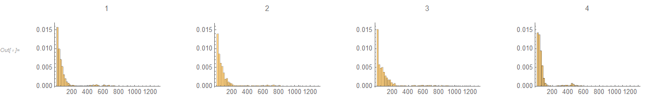
I've given all of the histogram the same PlotRange values to allow a comparison. However, because these are histograms and because of most of the data being mashed up near 0, comparisons are at best difficult. One approach is to overlay nonparametric densities and use a transformation of the data such as a square root transformation.

k = 0.5;
skd = SmoothKernelDistribution[#[[1]]^k, Automatic, {"Bounded", {0, \[Infinity]}, "Gaussian"}] & /@ alldata;
Plot[Evaluate[PDF[#, x] & /@ skd], {x, 0, 1300^k}, PlotRange -> {{0, 1300^k}, {0, Automatic}}, 
 PlotStyle -> {Red, Blue, Green, Cyan}, PlotLegends -> {1, 2, 3, 4}]

4 smooth histograms with square root transformation

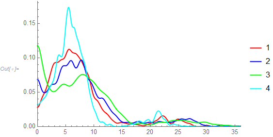
This makes it easier to see the similarities and differences among the distributions of the 4 datasets.

POSTED BY: Jim Baldwin
Reply to this discussion
Community posts can be styled and formatted using the Markdown syntax.
Reply Preview
Attachments
Remove
or Discard

Group Abstract Group Abstract