MODERATOR NOTE: coronavirus resources & updates: https://wolfr.am/coronavirus

I've found the NY Times plots here to be pretty useful:
https://www.nytimes.com/interactive/2020/03/21/upshot/coronavirus-deaths-by-country.html
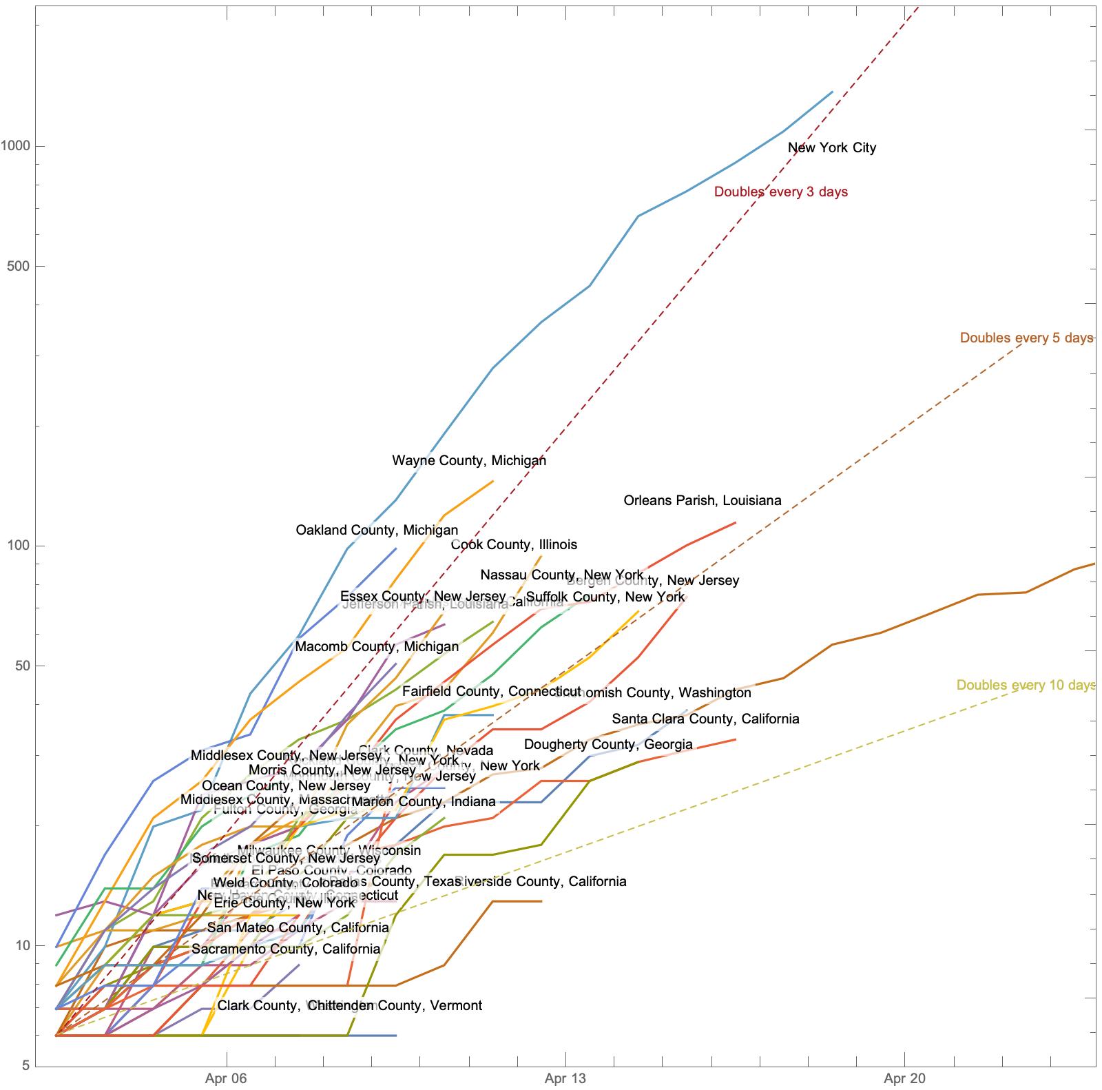
But I wanted to be able to tinker with them. I already created ResourceFunction["NYTimesCOVID19Data"] (link) for retrieving the NY Times data. Now, I made the following notebook to create timeline plots, like the ones on the NY Times website. That website has plots for Countries and US States, but not for US Counties, so that is the first plot I made.
A side affect of this work was two new resource functions "TimeSeriesAlign" and "TimeSeriesSelect", which were published the function repository today.
At the end of the notebook, I show how to create this web form. I will not be keeping that up-to-date, but you can create and deploy your own copy and make improvements.
I hope some other people find this useful too. Stay safe out there folks.