MODERATOR NOTE: coronavirus resources & updates: https://wolfr.am/coronavirus
I added some more analysis here based on the suggestion of a friend. He asked about looking at what percentage of deaths were likely caused by covid-19. Thus, I took the average annual death rate per county, multiplied it by 7/365 to get average weekly death rate. I took this number and added the number of deaths from covid-19 over the last week to get an estimate of how many total people died. I then divided the number of covid-19 deaths by this number to get the rough percentage of people that died from the virus.
As you can see below, there are some counties in which up to 75% of deaths were from covid-19. New York State (even outside of NYC) seems to have been hit the hardest.
I had made some maps like this to look at crime statistics in the past but decided to adopt them to use The NY Times' covid-19 data. They turned out pretty nice so I thought I'd share them. The plots are all normalized by population since I would think healthcare capacity would scale roughly linearly with population. Excuse the crude hacks you'll find throughout.
Update the local git repository with the NY Times data on GitHub.
SetDirectory[NotebookDirectory[] <> "./covid-19-data"];
Run["!git pull -f"];
SetDirectory[NotebookDirectory[]];
Get a list of all the states in the continental United States.
allStates =
  EntityList[EntityClass["AdministrativeDivision", "ContinentalUSStates"]];
Extract the boundary polygon(s) for each state.
stateBoundaries =
  Map[{-#[[1]], #[[2]], -0.1} &,
   EntityValue[allStates, {"Polygon"}] /. {GeoPosition -> Identity,
     Quantity[x_, _] -> x}, {5}];
Get entities for the counties in each state. This takes an array of state names so we can narrow the analysis down to whatever set of states we'd like.
counties[states_] :=
 Flatten[Function[x,
    Join @@ EntityValue[{Entity[
        "AdministrativeDivision", {x, "UnitedStates"}]},
      EntityProperty["AdministrativeDivision", "Subdivisions"]]] /@ states]
Get the population, annual deaths, and FIPS code for each county in the list of states provided.
properties[states_] :=
 Flatten[(EntityValue[{counties[states]},
      EntityProperty[
       "AdministrativeDivision", #1]] &) /@ {"Population", "FIPSCode",
     "AnnualDeaths"}, 1]
Extract the strings of the county names from the entities.
countynames[state_] := EntityValue[counties[state], "CanonicalName"]
Cut the full county names (e.g. "CentreCounty, Pennsylvania, UnitedStates") down to just the name of of the county (e.g. "Centre"). Cut the full state names down.
stringLength[state_] := StringLength["County, " <> state <> ", UnitedStates"]
countyShortNames[states_] :=
 Flatten[Function[x,
    Table[StringDrop[
      StringDrop[ToString[countynames[{x}][[i]]], -stringLength[x] - 1],
      1], {i, 1, Length[counties[{x}]]}]] /@ states]
allStateNames = EntityValue[allStates, "CanonicalName"];
allStateShortNames =
  Table[StringDrop[StringDrop[ToString[allStateNames[[i]]], -15], 1], {i, 1,
    Length[allStateNames]}];
Get the central location of each county and state so I can display tooltips if desired.
loc[states_] := EntityValue[counties[states], "Position"]
locStates := EntityValue[allStates, "Position"][[All, 1]]
Get the postal abbreviations for each state and make an array mapping short names to postal abbreviations.
stateAbbreviations = (#1["StateAbbreviation"] &) /@ allStates;
stateAbbreviationsShortNames =
  Transpose[{stateAbbreviations, allStateShortNames}];
Grab the data from the CDC stored in a local database and group by either state or county. I took the data from March and April of 2018 and calculated deaths per day.
Needs["DatabaseLink`"]
conn = OpenSQLConnection[
   JDBC["mysql", "localhost:3306/cdc"],
   "Username" -> "user", "Password" -> "password"];
statesFluPneuRaw =
 SQLExecute[conn,
  "SELECT `State`, `Week`, `Influenza`, `Pneumonia`, `Total` FROM \
`State_flu_data` WHERE `Season` like '2018-19'"]; \
heartDiseaseDeathsPerDayByCountyRaw =
 SQLExecute[conn,
  "SELECT `County`, `County_code`, sum(`Deaths`)/61 FROM \
`Heart_disease_deaths_by_county` WHERE `Month_code` like '2018/03' or \
`Month_code` like '2018/04' group by `County`"];
heartDiseaseDeathsPerDayByStateRaw =
  SQLExecute[conn,
   "SELECT substring(`County`,-2), `Month_code`, sum(`Deaths`)/61 FROM \
`Heart_disease_deaths_by_county` WHERE `Month_code` like '2018/03' or \
`Month_code` like '2018/04' group by SUBSTRING(`County`,-2)"];
cancerDeathsPerDayByCountyRaw =
  SQLExecute[conn,
   "SELECT `County`, `County_code`, sum(`Deaths`)/61 FROM \
`Cancer_deaths_by_county` WHERE `Month_code` like '2018/03' or `Month_code` \
like '2018/04' group by `County`"];
cancerDeathsPerDayByStateRaw =
  SQLExecute[conn,
   "SELECT substring(`County`,-2), `Month_code`, sum(`Deaths`)/61 FROM \
`Cancer_deaths_by_county` WHERE `Month_code` like '2018/03' or `Month_code` \
like '2018/04' group by SUBSTRING(`County`,-2)"];
circulatoryDeathsPerDayByCountyRaw =
  SQLExecute[conn,
   "SELECT `County`, `County_code`, sum(`Deaths`)/61 FROM \
`Circulatory_deaths_by_county` WHERE `Month_code` like '2018/03' or \
`Month_code` like '2018/04' group by `County`"];
circulatoryDeathsPerDayByStateRaw =
  SQLExecute[conn,
   "SELECT substring(`County`,-2), `Month_code`, sum(`Deaths`)/61 FROM \
`Circulatory_deaths_by_county` WHERE `Month_code` like '2018/03' or \
`Month_code` like '2018/04' group by SUBSTRING(`County`,-2)"];
respiratoryDeathsPerDayByCountyRaw =
  SQLExecute[conn,
   "SELECT `County`, `County_code`, sum(`Deaths`)/61 FROM \
`Respiratory_deaths_by_county` WHERE `Month_code` like '2018/03' or \
`Month_code` like '2018/04' group by `County`"];
respiratoryDeathsPerDayByStateRaw =
  SQLExecute[conn,
   "SELECT substring(`County`,-2), `Month_code`, sum(`Deaths`)/61 FROM \
`Respiratory_deaths_by_county` WHERE `Month_code` like '2018/03' or \
`Month_code` like '2018/04' group by SUBSTRING(`County`,-2)"];
Clean up the raw states influenza and pneumonia deaths for use here.
statesFluPneuData = ({StringReplace[#1[[1]], " " -> ""],
      If[ToExpression[#1[[2]]] >= 40, ToExpression[#1[[2]]] - 39,
       ToExpression[#1[[2]]] + 52 - 39],
      ToExpression[#1[[3]]] + ToExpression[#1[[4]]],
      ToExpression[StringReplace[#1[[5]], "," -> ""]]} &) /@ statesFluPneuRaw;
Week 24 seemed to be the worst week for influenza and pneumonia deaths so I used that. Get rid of the data for Alaska, Hawaii, D.C., and NYC.
worstFluPneuWeek =
  DeleteCases[Select[statesFluPneuData, #1[[2]] == 24 &],
   a_ /; MemberQ[{"Alaska", "Hawaii", "DistrictofColumbia", "NewYorkCity"},
     a[[1]]]];
Clean up the raw cause of death data and removed Alaska, Hawaii, and D.C. Need to resort since the raw data is alphabetized by postal abbreviation.
heartDiseaseDeathsPerDayStates =
  Sort[Function[
     x, {Select[stateAbbreviationsShortNames, #1[[1]] == x[[1]] &][[1, 2]],
      x[[3]]}] /@
    Select[heartDiseaseDeathsPerDayByStateRaw, #1[[1]] != "AK" && #1[[1]] !=
        "HI" && #1[[1]] != "DC" &]];
respiratoryDeathsPerDayByState =
  Sort[Function[
     x, {Select[stateAbbreviationsShortNames, #1[[1]] == x[[1]] &][[1, 2]],
      x[[3]]}] /@
    Select[respiratoryDeathsPerDayByStateRaw, #1[[1]] != "AK" && #1[[1]] !=
        "HI" && #1[[1]] != "DC" &]];
circulatoryDeathsPerDayByState =
  Sort[Function[
     x, {Select[stateAbbreviationsShortNames, #1[[1]] == x[[1]] &][[1, 2]],
      x[[3]]}] /@
    Select[circulatoryDeathsPerDayByStateRaw, #1[[1]] != "AK" && #1[[1]] !=
        "HI" && #1[[1]] != "DC" &]];
cancerDeathsPerDayByState =
  Sort[Function[
     x, {Select[stateAbbreviationsShortNames, #1[[1]] == x[[1]] &][[1, 2]],
      x[[3]]}] /@
    Select[cancerDeathsPerDayByStateRaw, #1[[1]] != "AK" && #1[[1]] !=
        "HI" && #1[[1]] != "DC" &]];
Extract the numerical values of the population, annual deaths, and FIPS code for each county in the list of states. Make a dictionary of populations using the FIPS codes as keys and massage things for NYC.
population[states_] :=
 N /@ QuantityMagnitude /@ properties[states][[1]]
FIPSCodes[states_] := ToExpression[properties[states][[2]]]
deathsPerDay[states_] :=
 N[(QuantityMagnitude /@ properties[states][[3]])/365]
FIPSPopulationDeaths[states_] :=
 Module[{x, nyc},
  x = AssociationThread[
    FIPSCodes[states] ->
     Transpose[{population[states], deathsPerDay[states]}]];
  If[ContainsAny[states, {"NewYork"}],
   nyc = Total[x /@ {36005, 36061, 36047, 36081, 36085}];
   Do[x[code] = nyc, {code, {36005, 36061, 36047, 36081, 36085}}]]; x]
Import the raw data from "us-counties.csv" and do some manipulations to get the NYC data into the form used for other counties. A couple other metropolitan areas have the data recorded en masse but I have not adjusted for those.
rawData = Import[NotebookDirectory[] <> "./covid-19-data/us-counties.csv",
   "EmptyField" -> "0"];
nycData = Select[rawData, #1[[2]] == "New York City" &];
newData = DeleteCases[rawData,
   a_ /; a[[2]] == "New York City" || a[[2]] == "Bronx" || a[[2]] == "Kings" ||
      a[[2]] == "Queens" || a[[2]] == "Richmond"];
Do[newData =
  Join[newData, (ReplacePart[#1, 4 -> fips] &) /@ nycData], {fips, {36005,
   36061, 36047, 36081, 36085}}]
Import the raw data from "us-states.csv".
rawStatesData =
  Import[NotebookDirectory[] <> "./covid-19-data/us-states.csv",
   "EmptyField" -> "0"];
This function takes a list of states and whether you want to extract "Infected" or "Dead" from the data, and normalizes it by the population of the county. I multiply by 1,000,000 so the results is infected/dead per million people.
normalizedData[states_, type_ : "Infected"] :=
 Module[{field}, If[type == "Infected", field = 5, field = 6];
  KeyValueMap[
   Function[{x,
     y}, ({QuantityMagnitude[DateObject[] - DateObject[#1[[1]]]], (
        10^6 #1[[field]])/y[[1]], (10^6 y[[2]])/y[[1]], x} &) /@
     Select[newData, x == #1[[4]] &]], FIPSPopulationDeaths[states]]]
This function takes the type ("Infected" or "Dead") from the C-19 data and the death rates from other diseases, and normalizes it by the population of the state. I multiply by 1,000,000 so the results are per million people.
normalizedDataStates[type_ : "Infected"] :=
 Module[{field}, If[type == "Infected", field = 4, field = 5];
  KeyValueMap[
   Function[{x,
     y}, ({QuantityMagnitude[DateObject[] - DateObject[#1[[1]]]], #1[[field]],
         N[(10^6 #1[[field]])/y[[1]]], (10^6 y[[2]])/y[[1]],
        N[(10^6 y[[3]])/(7 y[[1]])], N[(10^6 y[[4]])/y[[1]]],
        N[(10^6 y[[5]])/y[[1]]], N[(10^6 y[[6]])/y[[1]]],
        N[(10^6 y[[7]])/y[[1]]], x} &) /@
     Select[rawStatesData, x == #1[[3]] &]], FIPSPopulationDeathsStates]]
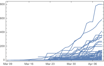
Check to see if things are working correctly by looking at a rough graph of dead per million for counties in Louisiana.
Show[(DateListPlot[#1] &) /@
  normalizedData[{"Louisiana"}, "Dead"][[All, All, 1 ;; 2]], PlotRange -> All]
Since not all counties of the same number of days since the first infected/death I figure out when the first incident occurred for all the states in the list. I then pad the data with zeroes so that all counties have the same length of history. There's an optional parameter in case I'm not interested in looking at the entire history, but only a certain number of days back.
maxHistory[states_, type_: "Infected"] :=
 Max[Length[#] & /@ normalizedData[states, type]]
paddedNormalizedData[states_, padLength_: All,
  type_: "Infected"] := (maxH =
   If[padLength === All, maxHistory[states, type], padLength];
  normData = normalizedData[states, type];
  PadLeft[#, maxH, {{0, 0, 0, 0}}] & /@ normData)
Do the same for the data by state.
maxHistoryStates[type_: "Infected"] :=
 Max[Length[#] & /@ normalizedDataStates[type]]
paddedNormalizedDataStates[padLength_: All, type_: "Infected"] :=
 Module[{normData,
   maxH}, (maxH = If[padLength === All, maxHistoryStates[type], padLength];
   normData = normalizedDataStates[type];
   PadLeft[#, maxH, {{0, 0, 1/365., 0}}] & /@ normData)]
Get the data for all counties in the list of states or all the states for a day before the latest date.
historicalNormalizedData[states_, daysAgo_Integer, padLength_: All,
  type_: "Infected"] :=
 paddedNormalizedData[states, padLength, type][[All, -daysAgo]]
historicalNormalizedDataStates[daysAgo_Integer, padLength_: All,
  type_: "Infected"] :=
 paddedNormalizedDataStates[padLength, type][[All, -daysAgo]]
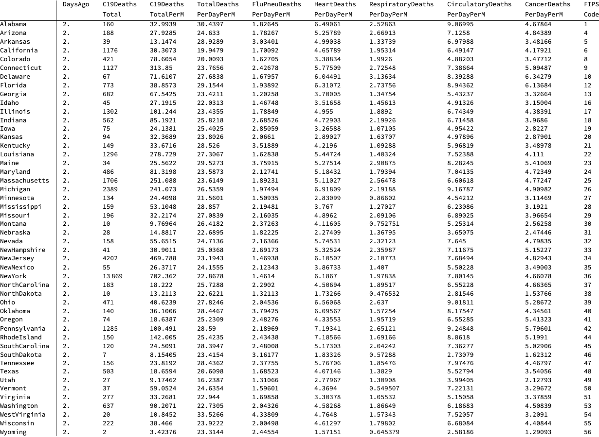
Take a look at the death data for each state to make sure things seem reasonable after all the conversions.
TableForm[historicalNormalizedDataStates[1, 1, "Dead"],
 TableHeadings -> {allStateShortNames, {"DaysAgo", "C19Deaths\nTotal",
    "C19Deaths\nTotalPerM", "TotalDeaths\nPerDayPerM",
    "FluPneuDeaths\nPerDayPerM", "HeartDeaths\nPerDayPerM",
    "RespiratoryDeaths\nPerDayPerM", "CirculatoryDeaths\nPerDayPerM",
    "CancerDeaths\nPerDayPerM", "FIPS\nCode"}}]
A helper function to find the total C-19 deaths in each state from a given day to another day.
totalDeaths[fromDay_, toDay_] :=
 Total[paddedNormalizedData[allStateShortNames, fromDay, "Dead"][[All, -toDay,
    2]]]
Find the maximum and minimum number cases for whatever states you provide. Ultimately I simply normalized with 1000 infected per million people and 100 for dead per million, so this is really just a check to see if things are working correctly.
{minCasesPerM, maxCasesPerM} =
 MinMax[historicalNormalizedDataStates[1, 1, "Infected"][[All, 3]]]
{minCasesPerM, maxCasesPerM} = {0, 1000}
{minCasesPerMStates, maxCasesPerMStates} = {0, 10000}
{minCasesChangePerM, maxCasesChangePerM} = {0, 100}
{423.025, 12296.9}
These functions takes a list of states (for the case using counties), the number of days ago to analyze and the data for infected or dead and generates all the information needed to make a 2D plot of counties in the state list colored by the rate of infected or dead. I added some higher values to the scale since the NYC numbers swamped out everything else (and I didn't want to have to explain log plots to people on Facebook).
historicalCasesPerMillionMap[states_, daysAgo_Integer, type_: "Infected"] :=
 Module[{xx},
  ParallelMap[
   Function[{x, y, z},
      x -> {(xx =
          Max[0, maxCasesPerM/(2 (maxCasesPerM - minCasesPerM)) - y/(
            2 (maxCasesPerM - minCasesPerM))];
         Which[y >= 10000, Darker[Purple], y >= 5000, Purple, y >= 2000,
          Lighter[Purple], True, Hue[xx]]), y, z}] @@ # &, {counties[states],
     historicalNormalizedData[states, daysAgo, daysAgo, type][[All, 3]],
     countyShortNames[states]} // Transpose]]

historicalCasesPerMillionMapStates[daysAgo_Integer, type_: "Infected"] :=
 Module[{xx},
  ParallelMap[
   Function[{x, y, z},
      x -> {(xx =
          Max[0, maxCasesPerMStates/(
            2 (maxCasesPerMStates - minCasesPerMStates)) - y/(
            2 (maxCasesPerMStates - minCasesPerMStates))]; Hue[xx]), y,
        z}] @@ # &, {allStates,
     historicalNormalizedDataStates[daysAgo, daysAgo, type][[All, 3]],
     allStateShortNames} // Transpose]]
This function takes a list of states, the number of days ago to determine the change from the previous day. I again added some higher values to the scale since the NYC numbers swamped out everything else.
historicalChangeInCasesPerMillionMap[states_, daysAgo_Integer,
  type_: "Infected"] :=
 Module[{xx},
  ParallelMap[
   Function[{x, y, z},
      x -> {(xx =
          Max[0, maxCasesPerM/(2 (maxCasesPerM - minCasesPerM)) - y/(
            2 (maxCasesPerM - minCasesPerM))];
         Which[y >= 1000, Darker[Purple], y >= 500, Purple, y >= 200,
          Lighter[Purple], True, Hue[xx]]), y, z}] @@ # &, {counties[states],
     historicalNormalizedData[states, daysAgo, daysAgo, type][[All, 2]] -
      historicalNormalizedData[states, daysAgo + 1, daysAgo + 1, type][[All,
       2]], countyShortNames[states]} // Transpose]]
Generate data to create a map of the rough percentage of deaths caused by covid-19 for each of the provided states over a period from X days ago to X+Y days ago.
historicalPercentageDeathsMap[states_, daysAgo_Integer,
  averagedOver_Integer] :=
 Module[{xx, latest, oneDayPrior, change, total, data},
  ParallelMap[
   Function[{x, y, z}, x -> {Hue[(1 - 2 y)/2], y, z}] @@ #1 &,
   Transpose[{counties[states],
     data = paddedNormalizedData[states, daysAgo + 7, "Dead"];
     change =
      1/averagedOver (data[[All, -daysAgo, 2]] -
         data[[All, -daysAgo - averagedOver, 2]]);
     total = change + data[[All, -1, 3]];
     total = ReplacePart[total, Position[total, 0.0] -> 0.5/365];
     change/total, countyShortNames[states]}]]]
Since the change from one day to the next seemed to be kind of noisy as I don't think they got data from each county for each day, I made this function to smooth things over three days.
historicalAveragedChangeInCasesPerMillionMap[states_, daysAgo_Integer,
  type_: "Infected"] :=
 Module[{xx},
  ParallelMap[
   Function[{x, y, z},
      x -> {(xx =
          Max[0, maxCasesPerM/(2 (maxCasesPerM - minCasesPerM)) - y/(
            2 (maxCasesPerM - minCasesPerM))];
         Which[y >= 1000, Darker[Purple], y >= 500, Purple, y >= 200,
          Lighter[Purple], True, Hue[xx]]), y, z}] @@ # &, {counties[states],
     latest = historicalNormalizedData[states, daysAgo, daysAgo, type][[All,
       2]]; oneDayPrior =
      historicalNormalizedData[states, daysAgo + 1, daysAgo + 1, type][[All,
       2]]; twoDaysPrior =
      historicalNormalizedData[states, daysAgo + 2, daysAgo + 2, type][[All,
       2]]; (2 latest - oneDayPrior - twoDaysPrior)/2,
     countyShortNames[states]} // Transpose]]
This function creates a 2D map of the population normalized data for the list of states provided. I was putting the actual values in each county but when showing the entire country it got too crowded so I commented it out.
map[states_,
daysAgo_Integer] := (all =
historicalCasesPerMillionMap[states, daysAgo, "Infected"];
Legended[GeoGraphics[{EdgeForm[{Thickness[0.0001], Black}], FaceForm[Green],
Apply[{Opacity[0.5], GeoStyling[#2[[1]]],
Tooltip[Polygon[#1], #2[[3]]]} &, all, {1}](*,Table[Text[Style[If[
all\[LeftDoubleBracket]j,2,2\[RightDoubleBracket]>maxCasesPerM,Round[
all\[LeftDoubleBracket]j,2,2\[RightDoubleBracket],1],""],
TextAlignment\[Rule]Center,Black,FontSize\[Rule]12],loc[
states]\[LeftDoubleBracket]j\[RightDoubleBracket]],{j,1,Length[all]}]*)},
GeoBackground -> None, ImageSize -> 2000],
Placed[SwatchLegend[
Table[Hue[ii], {ii, 1/2, 0, -(1/16)}]~
Join~{Lighter[Purple], Purple, Darker[Purple]},
Table[Round[ii, 1], {ii, minCasesPerM, maxCasesPerM, (
maxCasesPerM - minCasesPerM)/8}]~Join~{2000, 5000, 10000},
LegendLayout -> "Row", LegendMarkerSize -> 30,
LabelStyle -> {FontSize -> 36}], Below]])
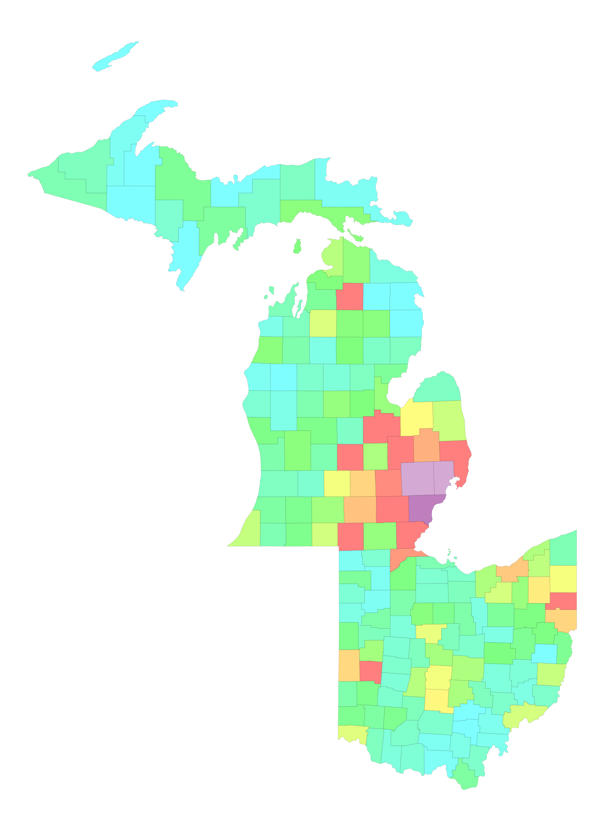
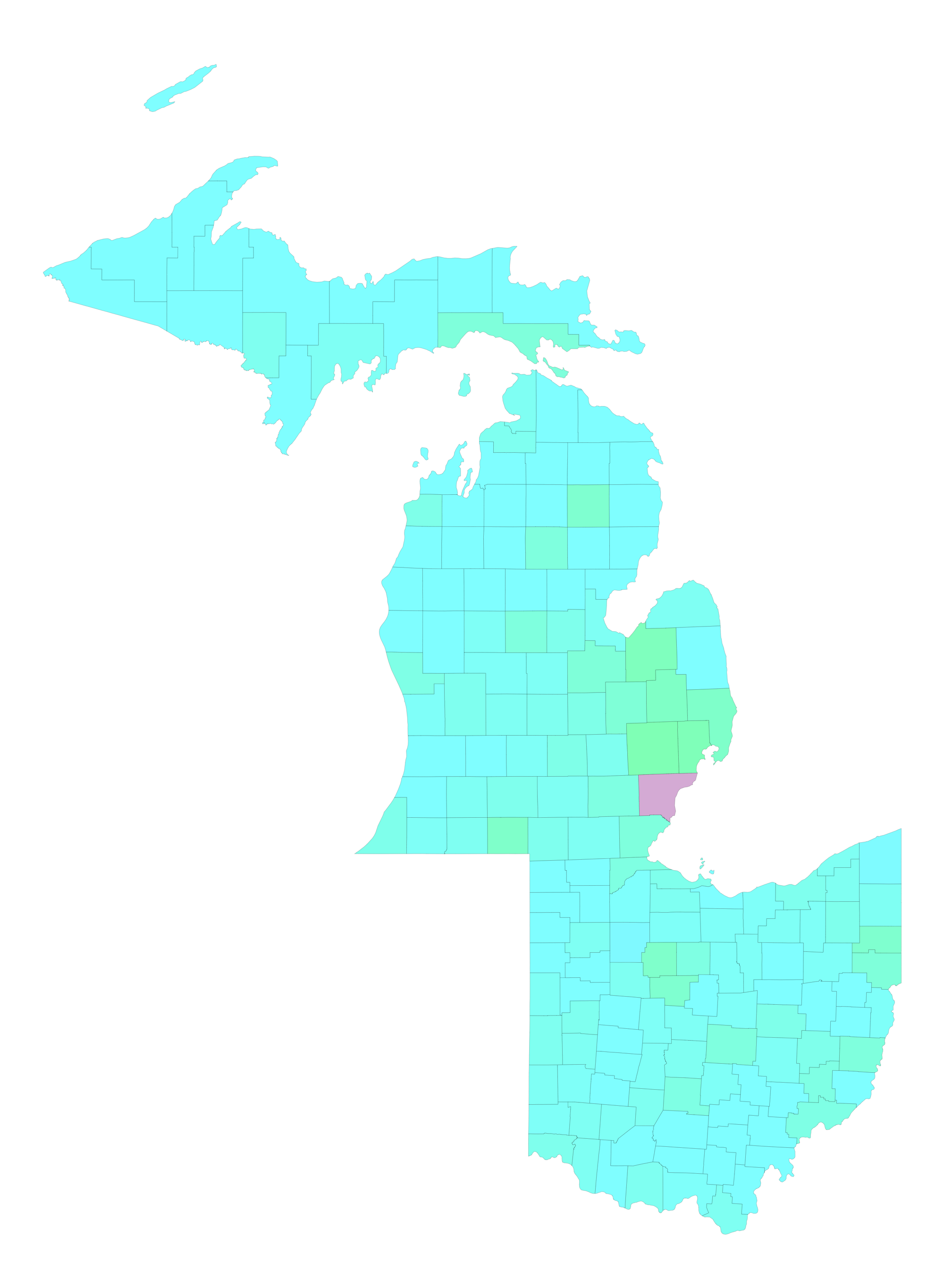
map[{"Michigan", "Ohio"}, 1]
This function creates a 2D map of the population normalized change from the previous day for the list of states provided. I was putting the actual values in each county but when showing the entire country it got too crowded so I commented it out.
mapChange[states_,
daysAgo_Integer] := (all =
historicalChangeInCasesPerMillionMap[states, daysAgo, "Infected"];
Legended[GeoGraphics[{EdgeForm[{Thickness[0.0001], Black}], FaceForm[Green],
Apply[{Opacity[0.5], GeoStyling[#2[[1]]],
Tooltip[Polygon[#1], #2[[3]]]} &, all, {1}],
Table[Text[
Style[If[all[[j, 2, 2]] >= 10^10, Round[all[[j, 2, 2]], 1], ""],
TextAlignment -> Center, Black, FontSize -> 12],
loc[states][[j]]], {j, 1, Length[all]}]}, GeoBackground -> None,
ImageSize -> 2000],
Placed[SwatchLegend[
Table[Hue[ii], {ii, 1/2, 0, -(1/16)}]~
Join~{Lighter[Purple], Purple, Darker[Purple]},
Table[Round[ii, 1], {ii, minCasesChangePerM, maxCasesChangePerM, (
maxCasesChangePerM - minCasesChangePerM)/8}]~Join~{200, 500, 1000},
LegendLayout -> "Row", LegendMarkerSize -> 30,
LabelStyle -> {FontSize -> 36}], Below]])
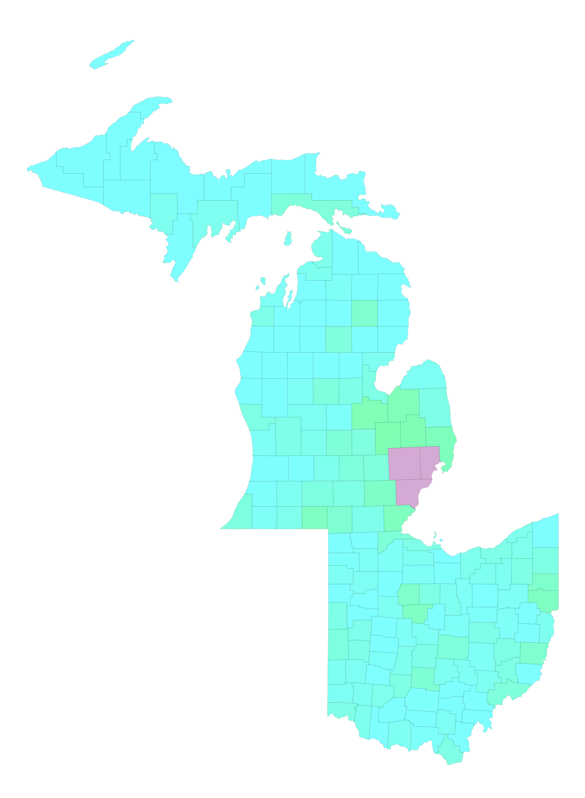
mapChange[{"Michigan", "Ohio"}, 1]
This function creates a 2D map of the smoothed change in population normalized data from the day prior to the one provide to the given day for the list of states provided.
mapAveragedChange[states_,
  daysAgo_Integer] := (all =
   historicalAveragedChangeInCasesPerMillionMap[states, daysAgo, "Infected"];
  Legended[GeoGraphics[{EdgeForm[{Thickness[0.0001], Black}], FaceForm[Green],
      Apply[{Opacity[0.5], GeoStyling[#2[[1]]],
        Tooltip[Polygon[#1], #2[[3]]]} &, all, {1}],
     Table[Text[
       Style[If[all[[j, 2, 2]] >= 10^10, Round[all[[j, 2, 2]], 1], ""],
        TextAlignment -> Center, Black, FontSize -> 12],
       loc[states][[j]]], {j, 1, Length[all]}]}, GeoBackground -> None,
    ImageSize -> 2000],
   Placed[SwatchLegend[
     Table[Hue[ii], {ii, 1/2, 0, -(1/16)}]~
      Join~{Lighter[Purple], Purple, Darker[Purple]},
     Table[Round[ii, 1], {ii, minCasesChangePerM, maxCasesChangePerM, (
        maxCasesChangePerM - minCasesChangePerM)/8}]~Join~{200, 500, 1000},
     LegendLayout -> "Row", LegendMarkerSize -> 30,
     LabelStyle -> {FontSize -> 36}], Below]])

mapAveragedChange[{"Michigan", "Ohio"}, 1]
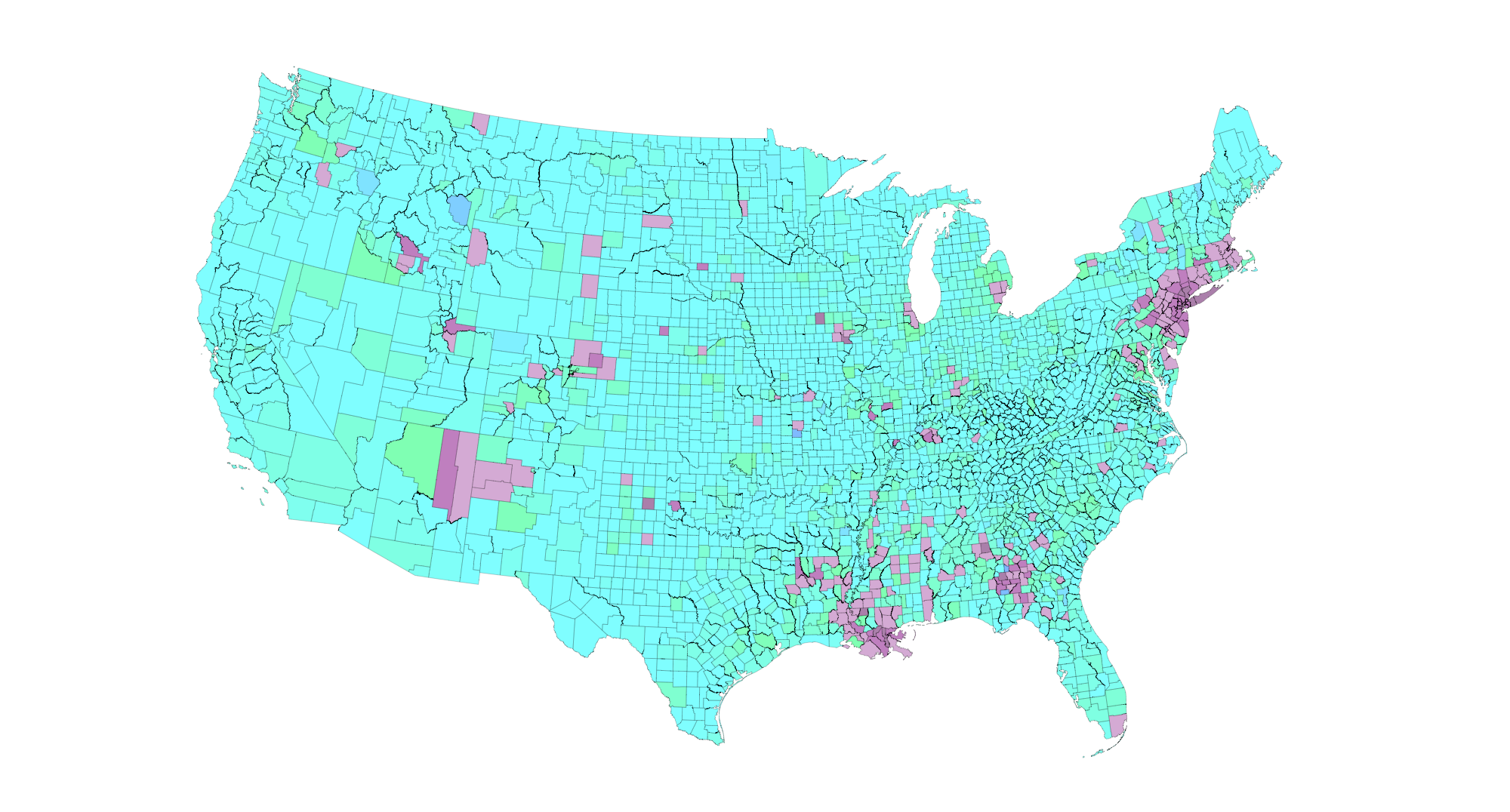
mapAveragedChange[allStateShortNames, 1]
mapPercentDeaths[states_, daysAgo_Integer,
  averagedOver_Integer] := (all =
   historicalPercentageDeathsMap[states, daysAgo, averagedOver];
  Legended[GeoGraphics[{EdgeForm[{Thickness[0.0001], Black}],
     FaceForm[Green],
     Apply[{Opacity[0.5], GeoStyling[#2[[1]]],
        Tooltip[Polygon[#1], #2[[3]]]} &, all, {1}]},
    GeoBackground -> None, ImageSize -> 2000],
   Placed[SwatchLegend[Table[Hue[ii], {ii, 1/2, -1/4, -(1/16)}],
     Table[Round[ii, 1], {ii, 0, 300/4, 50/8}], LegendLayout -> "Row",
      LegendMarkerSize -> 30, LabelStyle -> {FontSize -> 36}],
    Below]])
Percentage of deaths caused by covid-19 over the last week.
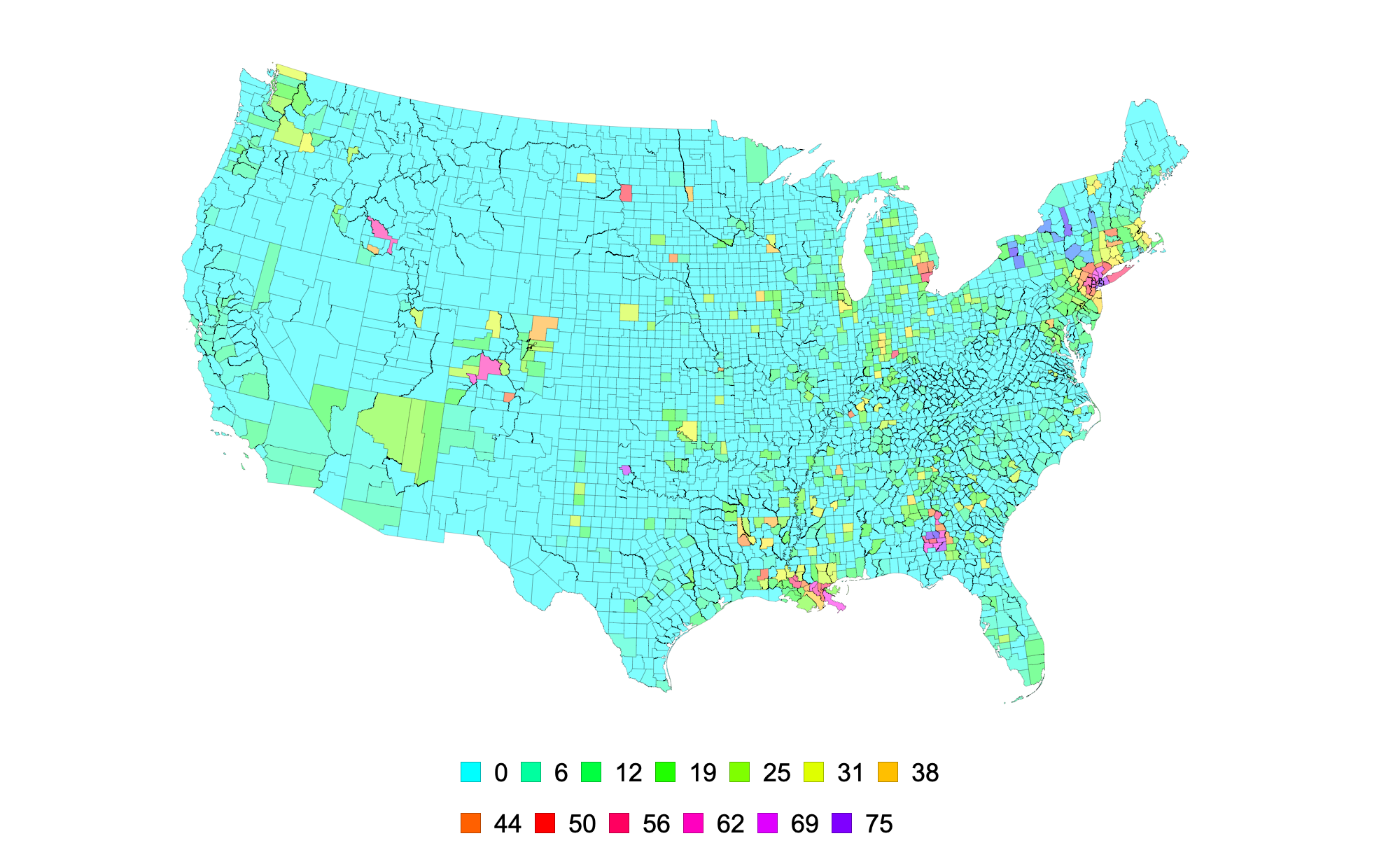
mapPercentDeaths[allStateShortNames, 1, 7]
These are some awesome helper function someone posted on the Mathematica StackExchange by "halmir" by allow you to extrude geographic boundaries. I modified them so we can stack data. (https://mathematica.stackexchange.com/questions/57872/map-of-united-states-as-a-3d-histogram/57886#57886)
FindContourBreaks[pts_List] :=
  Module[{i, lines, breaks = {}},
   lines = ({pts[[#1[[1]]]], pts[[#1[[2]]]]} &) /@
     Partition[RotateLeft[Flatten[({#1, #1} &) /@ Range[Length[pts]], 1]], 2];
    Flatten[Position[lines,
     Alternatives @@ (Transpose[{lines[[All, 2]],
          lines[[All, 1]]}] \[Intersection] lines)]]];
FindContourBreak[pts_List] :=
  Module[{breaks, ranges}, breaks = FindContourBreaks[pts];
   ranges = Partition[
     RotateLeft[Join[{1, 1}, Flatten[({#1, #1 + 1} &) /@ breaks]]], 2];
   ranges = Drop[ranges, -1];
   DeleteCases[Apply[Range, ranges, {1}], x_ /; Length[x] < 3]];
SideComplex[pts_List, length_] :=
  Module[{topPts, botPts, sideRects, sidePts, sideNormals}, topPts = pts;
   botPts = (2 length + 1 - #1 &) /@ topPts;
   sideRects =
    Partition[RotateLeft[Flatten[({#1, #1} &) /@ Range[Length[topPts]], 1]],
     2]; sidePts = ({topPts[[#1[[1]]]], botPts[[#1[[1]]]], botPts[[#1[[2]]]],
        topPts[[#1[[2]]]]} &) /@ sideRects; Polygon[sidePts]];
To3DComplex[Polygon[list_], offset_: 0, depth_: 10] :=
 To3DComplex[list, offset, depth]
To3DComplex[list_List, offset_: 0, depth_: 10] /; Depth[list] == 3 :=
 Module[{topPts, botPts, length, contours, sidePolys},
  topPts = ({#1[[1]], #1[[2]], depth} &) /@ list;
  botPts = Reverse[({#1[[1]], #1[[2]], offset} &) /@ topPts];
  length = Length[list]; contours = FindContourBreak[list];
  sidePolys = (SideComplex[#1, length] &) /@ contours;
  GraphicsComplex[
   Join[topPts, botPts], {Polygon[Range[length]],
    Polygon[Reverse[Range[length + 1, 2 length]]], EdgeForm[], sidePolys}]]
To3DComplex[list_List, offset_: 0,
  depth_: 10] := (To3DComplex[#1, offset, depth] &) /@ list
Get the polygons for each county in the list of states using a Mercator mapping.
polygons[states_] := (EntityValue[counties[states], {"Polygon"}] /.
      GeoPosition[x_] :> GeoGridPosition[GeoPosition[x], "Mercator"]) /.
    GeoGridPosition[x_, "Mercator"] :> x /. Quantity[x_, _] :> x;
Get the polygons for each state using a Mercator mapping.
polygonsStates = (EntityValue[allStates, {"Polygon"}] /.
      GeoPosition[x_] :> GeoGridPosition[GeoPosition[x], "Mercator"]) /.
    GeoGridPosition[x_, "Mercator"] :> x /. Quantity[x_, _] :> x;
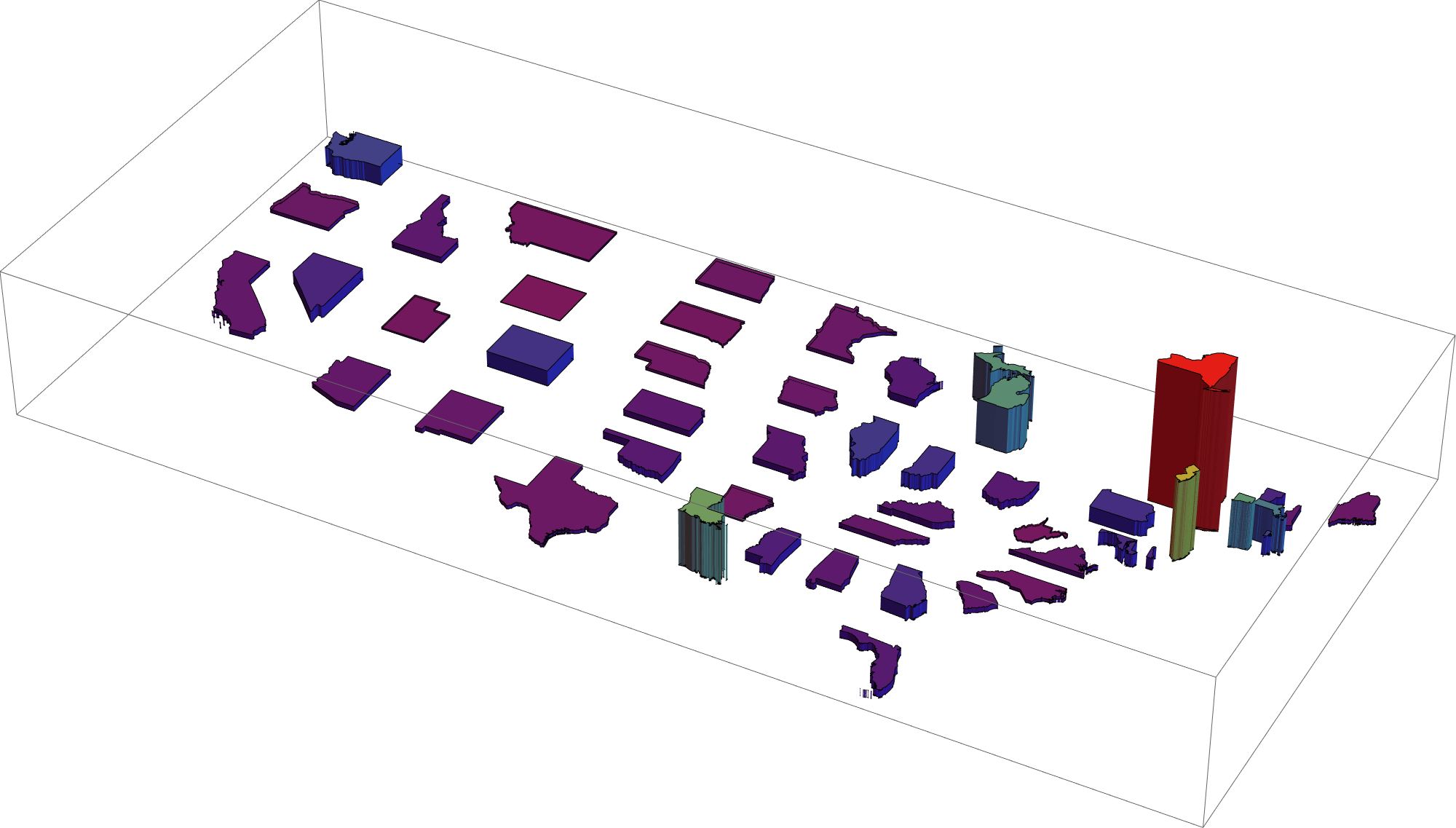
Since things were getting hard to visualize with all the state adjacent to one another, this "explodes" the map to separate the states.
polygonsStatesExpanded =
  Table[Polygon[
    Flatten[Function[x,
       Map[{#1[[1]] + 96 + 1.25 (x[[2]] + 96), #1[[2]] - 43 +
            1.25 (x[[1]] - 43)} &, polygonsStates[[All, 1]][[All, 1]], {3}][[
        ii]]] /@ {locStates[[ii]]}, 1]], {ii, 48}];
Created the extruded counties with the height proportional the normalized data. I did some rescaling here to make the plots look nicer.
polygons3D[states_, daysAgo_, padLength_ : All, type_ : "Infected"] :=
  Apply[{ColorData["Rainbow"][2 #1], To3DComplex[#2, 0, 2 #1]} &,
   Transpose[{paddedNormalizedData[states, padLength, type][[All, -daysAgo]][[
      All, 3]]/If[type == "Infected", 10000, 1000],
     polygons[states][[All, 1]]}], {1}];
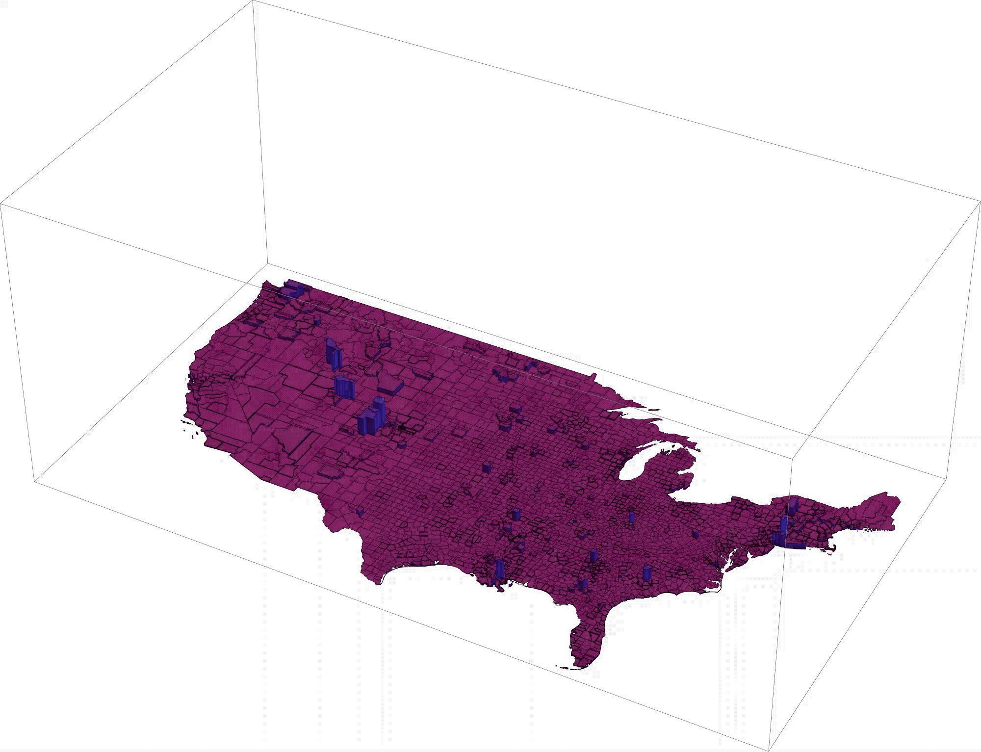
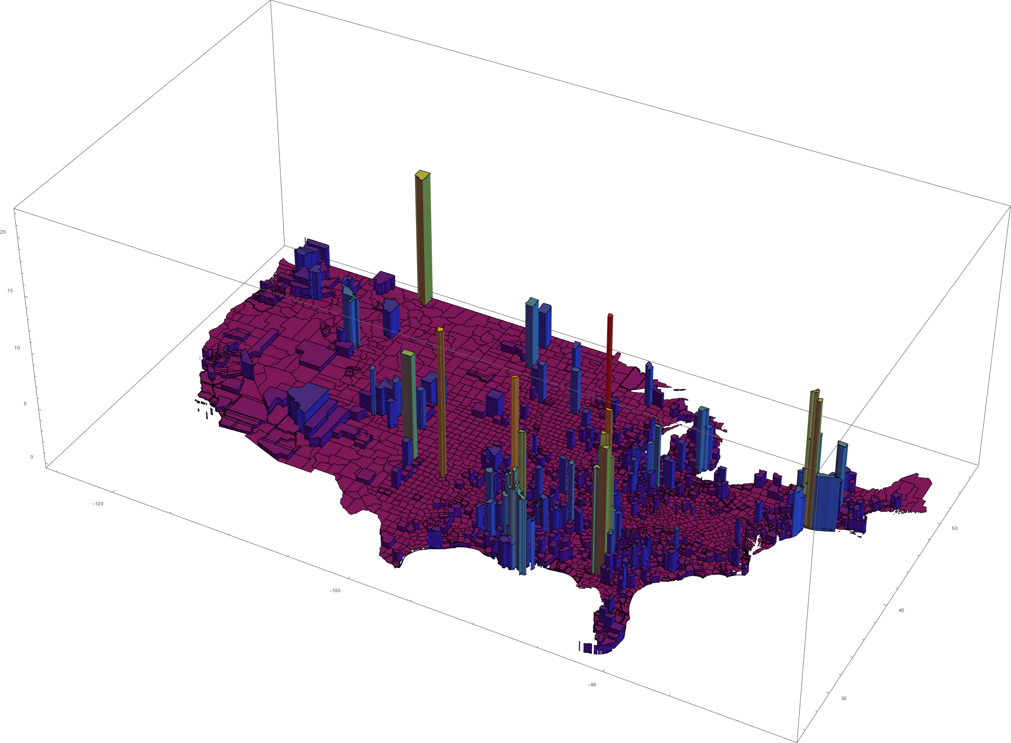
Create a graphic showing the number of people that have died from Covid-19 per capita for each county in the continental U.S. These can take quite some time to generate on older computers (like mine).
countyBarPlot =
 Graphics3D[polygons3D[allStateShortNames, 1, 1, "Dead"],
  ImageSize -> 2000, Boxed -> True, Axes -> True]
A loop to generate the graphic for each of the prior 21 days and export them. I then stitch them together outside of Mathematica to make movies. For some reason Mathematica takes forever to create movies from a sequence of images.
Do[countyBarPlot =
  Graphics3D[polygons3D[allStateShortNames, ii, ii], ImageSize -> 2000,
   Boxed -> True, PlotRange -> {Automatic, Automatic, {0, 25}}];
 Export[NotebookDirectory[] <> "./covid-19-data/USTwoWeekHistoryDead3D" <>
   ToString[ii] <> ".png", countyBarPlot], {ii, 1, 21}]
Here is an example animation of the number of infected per million over the last two weeks. The scale ranges from 0 to 1 in 50 people infected.
Created the extruded states with the height proportional the normalized C-19 data. The 'offset' parameter is used when I want to stack data.
polygons3DStates[daysAgo_, offset_: 0, type_: "Infected"] :=
  Apply[{ColorData["Rainbow"][2 #1],
     To3DComplex[#2, offset, 20 #1 + 10 #1]} &,
   Transpose[{paddedNormalizedDataStates[daysAgo, type][[
       All, -daysAgo]][[All, 3]]/If[type == "Infected", 10000, 1000],
     polygonsStatesExpanded[[All, 1]]}], {1}];

Graphics3D[polygons3DStates[6, 0, "Dead"], ImageSize -> 2000,
 Boxed -> True, Axes -> False, BoxRatios -> Automatic]
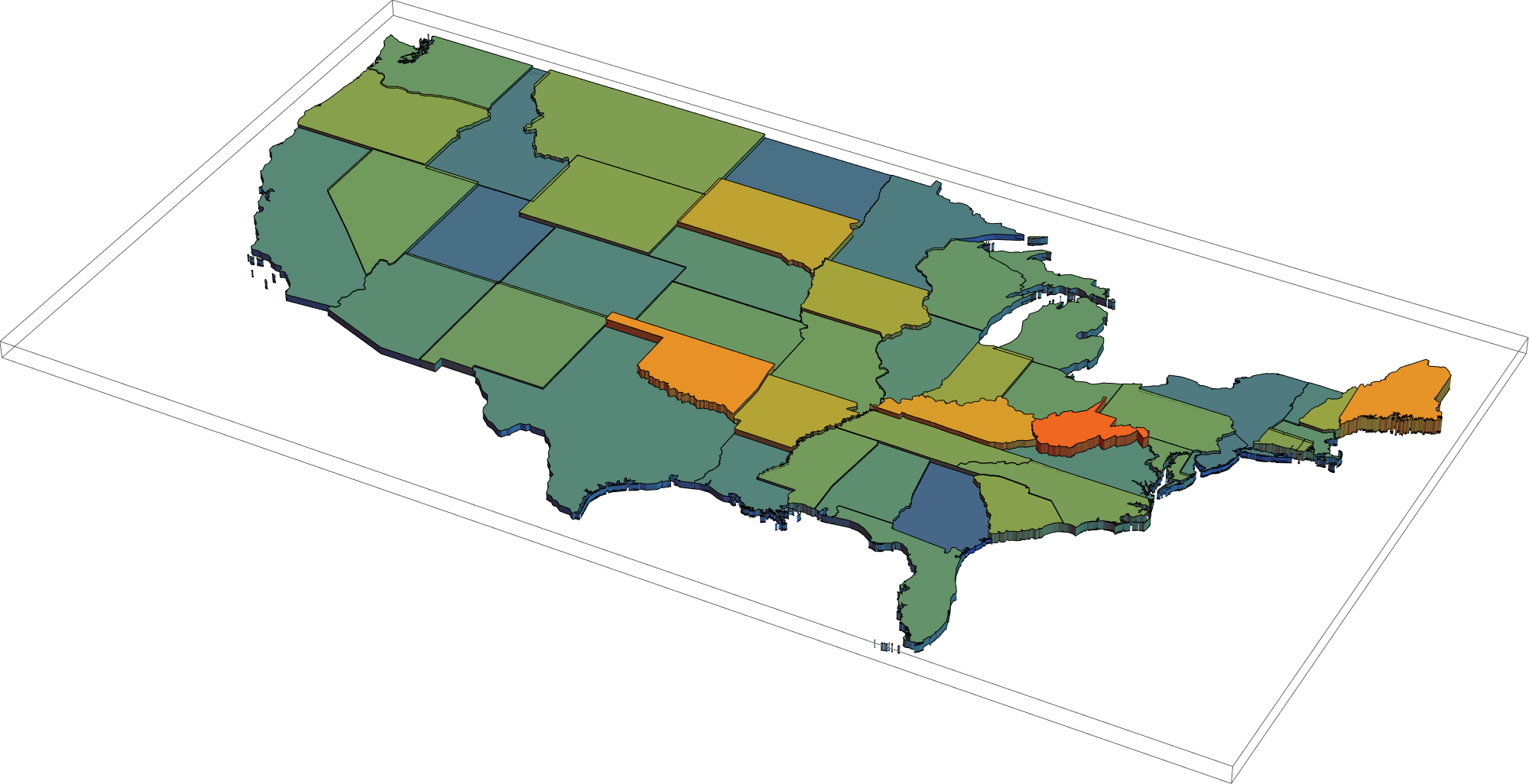
Created the extruded states with the height proportional to the normalized influenza/pneumonia data.
polygons3DStatesFluPneu[daysAgo_, offset_: 0, type_: "Infected"] :=
  Apply[{ColorData["Rainbow"][200 #1], To3DComplex[#2, offset, 200 #1]} &,
   Transpose[{paddedNormalizedDataStates[daysAgo, type][[All, -daysAgo]][[All,
       5]]/If[type == "Infected", 10000, 1000],
     polygonsStates[[All, 1]]}], {1}];

Graphics3D[polygons3DStatesFluPneu[6, 0, "Dead"], ImageSize -> 2000,
 Boxed -> True, Axes -> False, BoxRatios -> Automatic]
Created the extruded states with the height comparing the normalized C-19 data over the last seven days with various other death estimates.
polygons3DStatesLastWeek[comparison_, offset_: 0, padLength_:,
  type_ : "Infected"] :=
 Module[{x},
  x = ({#1[[All, 5]][[1]], #1[[All, 3]][[-1]] - #1[[All, 3]][[1]]} &) /@
  paddedNormalizedDataStates[7, type];
  Apply[{Opacity[1], Yellow, To3DComplex[#3, 0, 50 (#2)], Opacity[0.8],
     ColorData["Rainbow"][5 #1], To3DComplex[#3, 50 #2, 50 (#1 + #2)]} &,
   Transpose[{x[[All, 2]]/If[type == "Infected", 10000, 500], (
     7 paddedNormalizedDataStates[padLength, type][[All, -1]][[All,
       comparison]])/If[type == "Infected", 10000, 500],
     polygonsStatesExpanded[[All, 1]]}], {1}]]
A graphic showing the deaths from C-19 per capita over the last week on top of the estimated deaths from heart disease over the same time period.
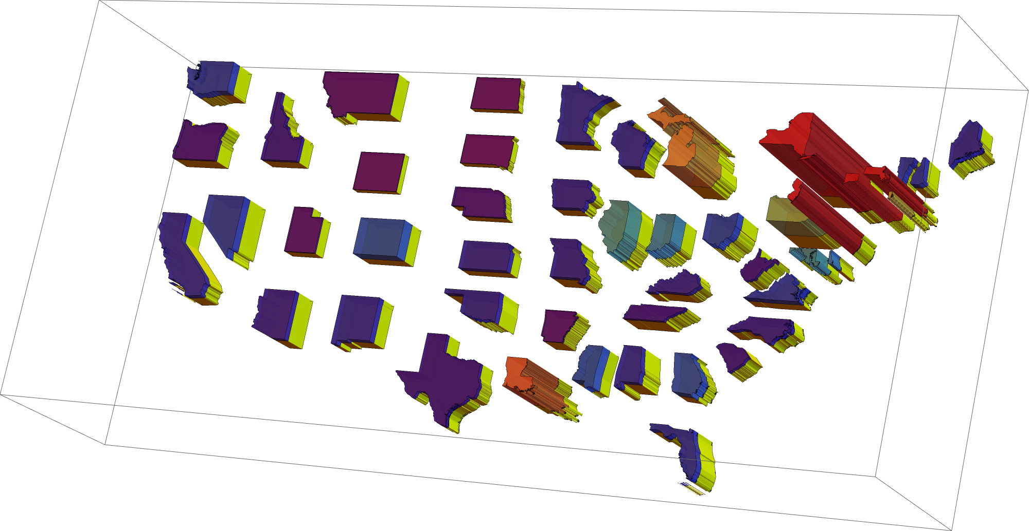
As you can see, over the last week of data, covid-19 is the leading cause of death in many states.


