Hi Alex,
Looks like SmoothDensityHistogram does not support Method -> {"DistributionAxes" -> "SmoothHistogram"}. You have to use "Histogram", or generate a SmoothHistogram separately and add it to the plot as shown in the first link I mentioned.
I want the points to be displayed like a circle when I use
DensityHistogram.
Add ChartElementFunction -> "Bubble". The bubbles are oval because the range of x and y values is different. You can work around that by providing a binning specification that is in the ratio of the range of x and y which is 10/8. e.g. Using {{2.5}, {2}}
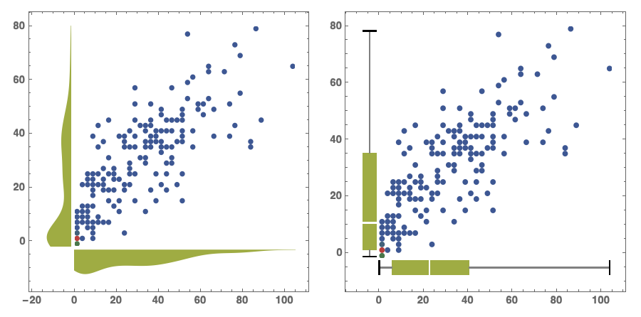
GraphicsRow[Table[DensityHistogram[data, {{2.5}, {2}},
   ColorFunction -> "DarkRainbow",
   Method -> {"DistributionAxes" -> p},
   ImageSize -> 500,
   BaseStyle -> {FontFamily -> "Helvetica"},
   LabelStyle -> Bold,
   ChartElementFunction -> "Bubble"],
  {p, {"SmoothHistogram", "BoxWhisker"}}]]