Group Abstract Group Abstract

Message Boards Message Boards

0
|
9.2K Views
|
8 Replies
|
4 Total Likes
View groups...
Share
Share this post:

Represent a correlation matrix via a graph

Posted 4 years ago

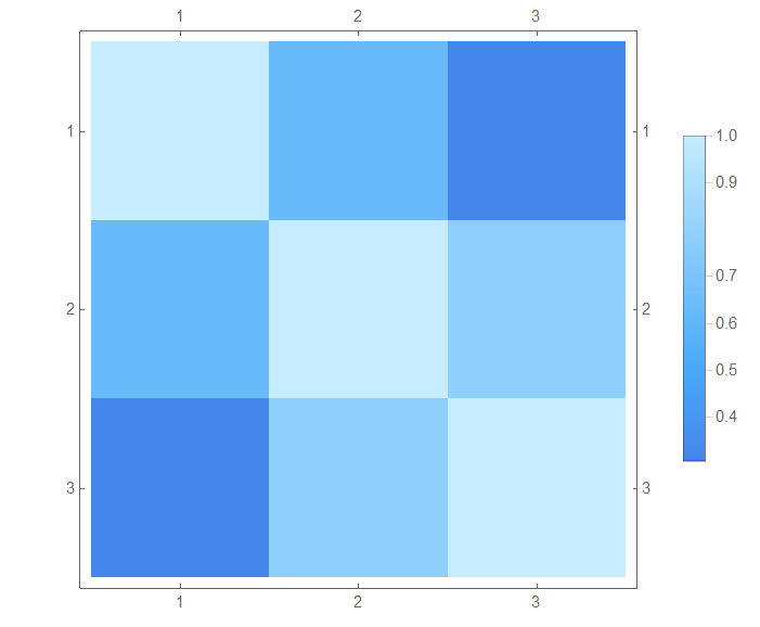
I have a simple (maybe mistake!) question. Is it possible to present a correlation matrix via a graph? For example:

data1 = {11.22, 12.29, 12.97, 14.15, 17.33, 17.60, 16.62, 14.43, 
   13.62, 11.01};
data2 = {12.29, 12.97, 14.15, 17.33, 17.60, 16.625`, 14.43, 13.62, 
   11.01, 9.25};
data3 = {12.97, 14.15, 17.33, 17.60, 16.625`, 14.43, 13.62, 11.016, 
   9.25, 9.48};

Apply[Correlation, 
  Tuples[{data1, data2, data3}, 2] // Partition[#, 3, 3] &, {2}] // 
 MatrixPlot[#, ColorFunction -> "DeepSeaColors", 
   PlotLegends -> Automatic] &

enter image description here

Thank you for your help.

POSTED BY: Alex Teymouri
8 Replies
POSTED BY: Sam Carrettie
POSTED BY: EDITORIAL BOARD
Posted 4 years ago

If you allow for edges to have custom weights, then I'm pretty sure that yes you can represent a correlation matrix with a directed graph. However, if you just label the edges with their weights, it may be challenging to visualize. It would be easy to include/omit edges if the correlation matrix was binary. Changing the thickness or opacity of the edges with their weights would be the best way to visualize a correlation matrix as a graph in my opinion.

POSTED BY: Joseph Stocke
Posted 4 years ago

Along the lines that Joseph suggested

corr = Apply[Correlation, Tuples[{data1, data2, data3}, 2] // Partition[#, 3, 3] &, {2}]

WeightedAdjacencyGraph[corr,
 DirectedEdges -> True,
 EdgeStyle -> {DirectedEdge[i_, j_] :> AbsoluteThickness[corr[[i, j]]]},
 PlotTheme -> "Scientific"]

enter image description here

POSTED BY: Rohit Namjoshi
Posted 4 years ago

Wow!

Thank you so much, man.

For more understanding, is it possible to show correlation values on the figure?

POSTED BY: Alex Teymouri
Posted 4 years ago

As Sam said, this can be easily found in the documentation.

rounded = Round[corr, .01]

WeightedAdjacencyGraph[rounded,
 DirectedEdges -> True,
 EdgeStyle -> {DirectedEdge[i_, j_] :> AbsoluteThickness[rounded[[i, j]]]},
 EdgeLabels -> "EdgeWeight",
 PlotTheme -> "Scientific"]

enter image description here

POSTED BY: Rohit Namjoshi

Hi Rohit,

That is great.

I noticed that recently in the scientific papers, researchers show the correlation between some lists through a graph like the following figure. I thought it may be interesting for you. enter image description here

Best Regards

Mohammad

POSTED BY: M.A. Ghorbani
Posted 4 years ago

Thank you, Joseph.

May I ask you to do for the example data? Is the result understandable?

POSTED BY: Alex Teymouri
Reply to this discussion
Community posts can be styled and formatted using the Markdown syntax.
Reply Preview
Attachments
Remove
or Discard