Hi everyone, I am trying to evaluate commercial viability of wind turbines in varying weather conditions. Using the following code, I was able to get daily mean wind speeds of a coastal city in Australia for the past 10 years.
wsData = WeatherData[{"Portland", "Australia"},
   "MeanWindSpeed", {{2010, 1, 1}, {2020, 1, 1}, "Day"}];
DateListPlot[wsData, AspectRatio -> 1/5, Joined -> True,
 ImageSize -> 1000, PlotStyle -> Directive[Opacity[.8], Thickness[0]]]
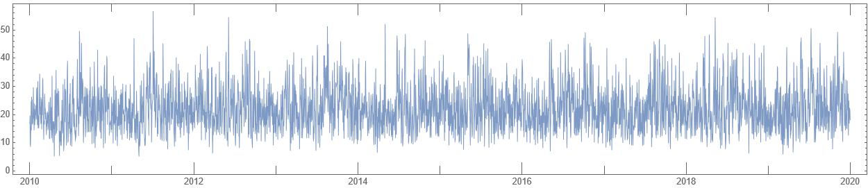
Now, what I would like to analyse is the underlying trend in this wind data. I would like to isolate the plot of the driving function and that of the noise in separate graphs as shown in the example I found in a text:
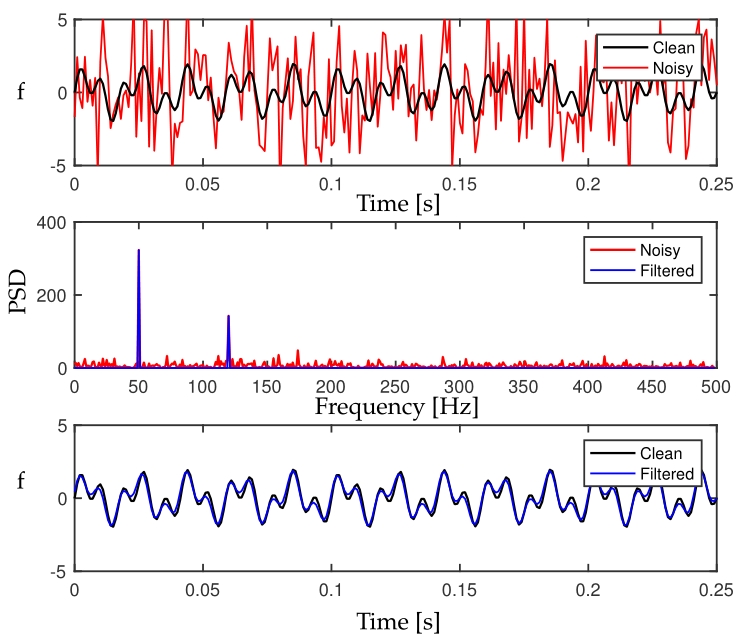
However, I am finding it difficult to use Fourier Transform functions with TimeSeries data, and any pointers/tips would be much appreciated.