Message Boards Message Boards

Labeling, scaling and computing a correlation between two datasets

Posted 2 years ago

I want to compare the Dow Jones Index to the price of the Ethereum cryptocurrency. Although I can get the data and plot them individually, I can't get a sensible graph of the two sets of data. I would also like to plot a correlation coefficient between them. I'm not really fussed about the exact definition of correlation in this sense, so anything in Mathematica would do.

I think the attached Notebook shows this better than I could easily explain here.

POSTED BY: David Kirkby
8 Replies
Posted 2 years ago

3) There is a Correlation Function (http://reference.wolfram.com/language/ref/Correlation.html). You'll need to get your data into the correct "shape". You can extract different properties from the TimeSeries data you get from FinancialData. For example, you can do this:

finDataDJI = FinancialData["DJI", {{2021, 1, 8}, {2021, 12, 31}, "Day"}]

finDataDJI["Values"]

You can do that for each series and then apply Correlation. However, you'll need to carefully align the data.

There may be other correlation functions that you prefer. Check them out here http://reference.wolfram.com/language/guide/DescriptiveStatistics.html.

POSTED BY: Eric Rimbey
Posted 2 years ago

Thank you. Yes, I see the problem. The Dow Jones data is 248 points, against the Ethereum which is 348 values. Obviously the Dow Jones does not get updated at weekends or holidays, whereas cryptocurrencies would be every day. I assume there's a reasonable chance that the dates of Dow Jones index could be extracted, then the ethereum data extracted only on those dates, so the lengths of the datasets are the same. That would be pushing my Mathematica skills to the limit, but I expect that's the way to approach the problem, unless you have any better ideas.

Any suggestions for the other problem of getting sensible y-axes if plotting data with significantly different values?

POSTED BY: David Kirkby
Posted 2 years ago

Hi David,

Here is one way

date = "1/1/2021";
dji = FinancialData["^DJI", date];
eth = FinancialData["ETH/USD", date];

(* Extract date/value pairs *)
djiData = dji["DatePath"];
ethData = eth["DatePath"];

(* Identify dates common to both *)
commonDates = Intersection[djiData[[All, 1]], ethData[[All, 1]]];

(* Filter to common dates *)
djiFiltered = Select[djiData, MemberQ[commonDates, First@#] &];
ethFiltered = Select[ethData, MemberQ[commonDates, First@#] &];

(* Use the resource function CombinePlots to generate a 2 axis plot *)
ResourceFunction["CombinePlots"][
 DateListPlot[djiFiltered,
  PlotStyle -> ColorData[97][1],
  PlotLegends -> LineLegend[{ColorData[97][1]}, {"DJI"}]],
 DateListPlot[ethFiltered,
  PlotStyle -> ColorData[97][2],
  PlotLegends -> LineLegend[{ColorData[97][2]}, {"ETH"}]],
 "AxesSides" -> "TwoY"]

enter image description here

(* Compute correlation *)
Correlation[djiFiltered[[All, 2]], ethFiltered[[All, 2]]]
(* 0.814973 *)
POSTED BY: Rohit Namjoshi
Posted 2 years ago

Thank you very much for that! That must have been quite a bit of work to put that together.

I was quite surprised, that when I changed the from ETH to BTC (bitcoin), the correlation coefficient was much lower (0.268759). It seems fairly regularly stated that

  1. Bitcoin follows the stock market
  2. Other cryptocurrencies follow bitcoin.

I'm guessing this is a complex topic for economists, but just a cursory glance at the correlation coefficient showed a difference I was not expecting.

Thank you once again.

POSTED BY: David Kirkby
Posted 2 years ago

Hi David,

Once you get proficient with the Wolfram Language you will find that it takes very little effort to manipulate date and generate simple visualizations for exploratory data analysis. It took me ~ 5 min to write that code. To generalize it a bit we can define a function that takes two symbols, a start date and end date, and generates a plot of the price with the correlation as the plot label.

ClearAll@compareFinancialData;
compareFinancialData[symbol1_String, symbol2_String, startDate_, endDate_] := Module[
  {data1, data2, commonDates, filtered1, filtered2},

  data1 = FinancialData[symbol1, {startDate, endDate}]["DatePath"];
  data2 = FinancialData[symbol2, {startDate, endDate}]["DatePath"];

  commonDates = Intersection[data1[[All, 1]], data2[[All, 1]]];

  filtered1 = Select[data1, MemberQ[commonDates, First@#] &];
  filtered2 = Select[data2, MemberQ[commonDates, First@#] &];

  ResourceFunction["CombinePlots"][
   DateListPlot[filtered1,
    PlotStyle -> ColorData[97][1],
    PlotLegends -> LineLegend[{ColorData[97][2]}, {symbol1}],
    PlotLabel -> 
     "Correlation: " <> 
      ToString@Round[Correlation[filtered1[[All, 2]], filtered2[[All, 2]]], .001],
    ImageSize -> 500],
   DateListPlot[filtered2,
    PlotStyle -> ColorData[97][2],
    PlotLegends -> LineLegend[{ColorData[97][2]}, {symbol2}],
    FrameStyle -> ColorData[97][2]],
   "AxesSides" -> "TwoY"]
  ]

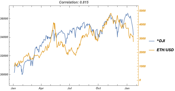
To reproduce the previous result

compareFinancialData["^DJI", "ETH/USD", "2021-01-01", Today]

enter image description here

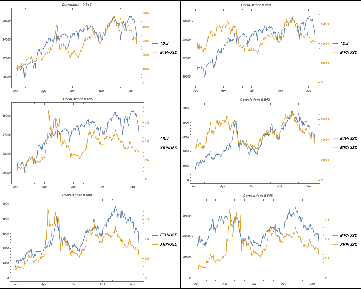
To compare a set of symbols

symbols = {"^DJI", "ETH/USD", "BTC/USD", "XRP/USD"};

Subsets[symbols, {2}] // 
 Map[compareFinancialData[First@#, Last@#, "2021-01-01", Today] &] //
 Partition[#, UpTo[2]] & // 
 Grid[#, Frame -> All, Spacings -> {1, 1}] &

enter image description here

The date string format "1/1/2021" is ambiguous, is it M/D/Y or D/M/Y? Use an unambiguous format such as "YYYY-MM-DD".

FinancialData has data on a small set of cryptocurrencies. If you are interested in cryptocurrency data analysis, take a look at this resource function by @Anton Antonov. I believe he has submitted it for inclusion in the function repository, but it is not yet available there.

POSTED BY: Rohit Namjoshi
Posted 2 years ago

Hi Rohit Thank you for that. I assume the fact that you refer to this as the "Wolfram Language" means you probably work for Wolfram Research, as almost everyone else would call it Mathematica. You are obviously very skilled at this. For us who use the software occasionally, it is not so easy. Of the computer languages I know, Mathematica is the most difficult to understand. But to be fair, it is the most powerful.

It would be good if there was a much wider range of cryptocurrencies supported.

I think it would be good if https://reference.wolfram.com/language/ref/FinancialData.html was updated to show dates in a way that's less ambiguous, by having days beyond 12, so we know its the day and not the month.

I would have thought that CoinMarketCap https://coinmarketcap.com/ was the best source of data on some aspects of cryptocurrency, such as the circulating supply, as it would appear that the cryptocurrency exchanges use data from CoinMarketCap, not Yahoo. There is an API https://coinmarketcap.com/api/ too. But for my purposes, which was only out of interest sake, the Yahoo data is fine.

POSTED BY: David Kirkby
Posted 2 years ago

1) Use the PlotLegends option

POSTED BY: Eric Rimbey
Posted 2 years ago

Thank you

DateListPlot[{FinancialData["^DJI", date], 
  FinancialData["ETH/USD", date]}, 
 PlotLabel -> "Dow Jones Index and etherumm", 
 PlotLegends -> {"Dow Jones Index", "Ethereum"}]

worked well.

POSTED BY: David Kirkby
Reply to this discussion
Community posts can be styled and formatted using the Markdown syntax.
Reply Preview
Attachments
Remove
or Discard

Group Abstract Group Abstract