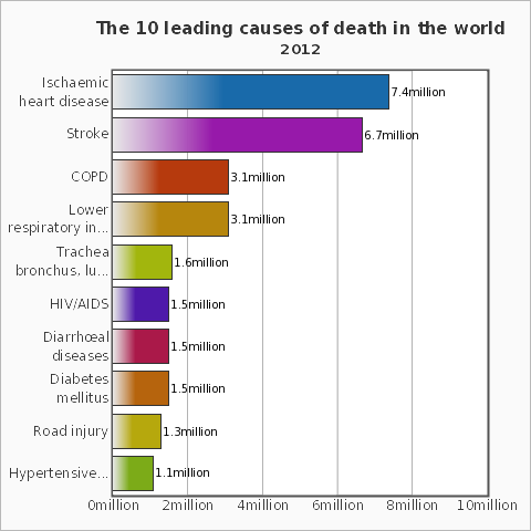
The WHO lists ischaemic heart diseases as the leading cause of death in the world. Let's use Mathematica to help to prevent that! The program can in principle also be developed further to monitor the heart beat of a newborn, to help prevent cot death (sudden infant death syndrome).
In this post I will use a simple green light diode and a photoreceptor to record heart beats and perform a simple analysis, which can suggest an increased risk of certain heart problems. I will use the following two components:
- Arduino Uno
- Sparkfun's Pulse Sensor (about $25)
Here is a photo of the sensor.
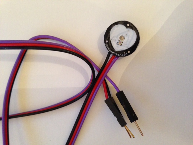
The setup is very simple but, as it turns out quite effective. The sensor has three pins: Black is ground, red goes to 5V, and purple is the analogue signal which connects to A0 of the Arduino. That is the entire hardware setup. The measurement principle is simple. The sensor contains a green light, which is positioned close to the skin, e.g. on a finger or the earlobe. The green light is absorbed by the blood flowing through the tissue. A little photoreceptive sensor detects the reflected light, which allows us to measure how much blood is going through the tissue. For this project I have made marginal modifications to the Arduino sketches that are provided with the sensor; there is also a free analysis sketch which I will replace by a more powerful Mathematica program. The two sketches that I use for the first bit of the data acquisition - HeartRateECG.ino and Interrupt.ino - can be downloaded from here. Both files need to be in the same folder and HeartRateEDC needs to be uploaded to the Arduino. I use the SerialIO package (this will be much, much easier in Mathematica 10!) to connect to the serial port. A simple instruction of how to install the package can be found on the website of William Turkel. Once this is done I use
<< SerialIO`
to load the package. Then I connect the Arduino to Mathematica:
myArduino = SerialOpen[Quiet[FileNames["tty.usb*", {"/dev"}, Infinity]][[1]]]
and set some parameters for the link
SerialSetOptions[myArduino, "BaudRate" -> 115200]
I define a simple read function
serialout := Module[{dummy}, dummy = SerialRead[myArduino]]
and then measure the heart beats and plot the results.
results = {}; Dynamic[Refresh[AppendTo[results, serialout]; ListLinePlot[(Flatten[StringSplit[results, ","]] // ToExpression)[[-500 ;;]], PlotRange -> {All, {0, 1200}}], UpdateInterval -> 0.002]]
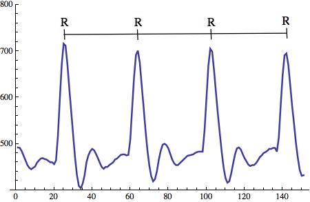
The resulting graph looks like this:
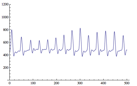
The level of detail is rather surprising. The structure of each heartbeat is clearly visible. The typical P,Q,R,S,T structure is clearly visible.
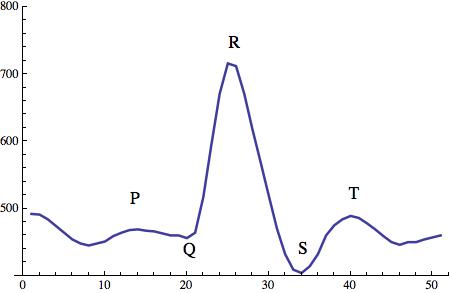
In what follows we will be mostly interested in the distance between consecutive R peak, and the resulting RR intervals.
To measure the RR intervals a slightly modified Arduino sketch will be used. It can be downloaded from here. Then I use Mathematica to record the RR intervals. Note that the Arduino sketch is used to detect each heart-beat, so Mathematica does not need to do that!
As before I first load the SerialIO library:
<< SerialIO`
and then connect to the Arduino.
myArduino = SerialOpen[Quiet[FileNames["tty.usb*", {"/dev"}, Infinity]][[1]]]
Again I set the parameters:
SerialSetOptions[myArduino, "BaudRate" -> 115200]
and define the "read-in function"
serialout := Module[{dummy}, dummy = SerialRead[myArduino]]
The next command records the data:
results = {}; Dynamic[Refresh[AppendTo[results, serialout];, UpdateInterval -> 0.002]]
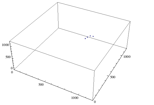
Alternatively, this line records and plots a scatter plot of the data:
results = {}; serialout; serialout; serialout; Dynamic[Refresh[AppendTo[results, serialout]; listdata = Flatten[StringSplit[results, ","]] // ToExpression;ListPointPlot3D[Table[{listdata[[i]], listdata[[i + 1]], listdata[[i + 2]]}, {i, 1,Length[listdata] - 2}], PlotRange -> {{0, 1200}, {0, 1200}, {0, 1200}}],UpdateInterval -> 0.1]]
The resulting plot illustrates the data acquisition:
The data can be saved like this:
Export["~/Desktop/RRbeats_raw.csv", results]
Finally the serial link can be closed.
SerialClose[myArduino]
It turns out that the way the points scatter around the diagonal tells us a lot about the state of the heart. If they are too regular, i.e. too close to the main diagonal that suggests that there are serious problems with the heart. If they are too irregular that is a bad sign, too. This presentation explains a bit the main ideas. These two references might also be interesting in this context:
A new approach to detect congestive heart failure using Teager energy nonlinear scatter plot of RR interval series
and
Scatterplots of RR and RT interval variability bring evidence for diverse non-linear dynamics of heart rate and ventricular repolarization duration in coronary heart disease
We will now perform a rudimentary analysis of the data. I use a new notebook and first load the raw data we generated above.
data = Import["~/Desktop/RRbeats_raw.csv", "Data"];
We then clean the data:
list = Table[data[[i, 1]], {i, 1, Length[data]}];listclean = N[DeleteCases[list //. {a___, b_, c_, d___} :> {a, ToExpression[StringJoin[Map[ToString[#] &, {b, c}]]], d} /; (b < 100 && c < 100), x_ /; x < 500]];
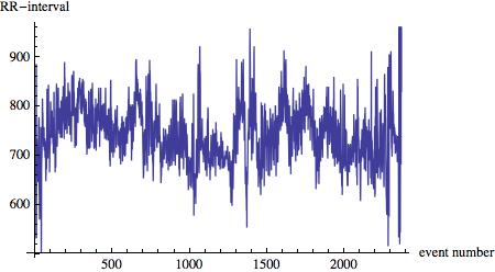
The main idea is that sometimes, due to the data transfer, only one or two digits of the measured RR interval are read from the buffer. The measurements are in milliseconds to if a measurement is less than 100 ms we know that something went wrong. In that case we combine the digits of consecutive measurements. Also, if the resulting time series contains intervals that are shorter than 500ms , i.e. 0.5 seconds, something went wrong as well and we delete the data. The time series of the RR intervals
ListLinePlot[listclean, AxesLabel -> {"event number", "RR-interval"}]
looks like this:
This command plots a 3d scatterplot of the data:
Show[ListPointPlot3D[Table[{listclean[[i]], listclean[[i + 1]], listclean[[i + 2]]}, {i, 1, Length[listclean] - 2 - 20}], PlotRange -> {{0, 1200}, {0, 1200}, {0, 1200}}, AspectRatio -> 1], ParametricPlot3D[{u, u, u}, {u, 0, 1200}]]
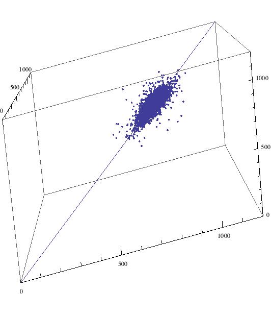
The data file to reproduce the plot is attached to this post. We can now also look at a histogram over a 2 dimensional scatter plot:
SmoothHistogram3D[Table[{listclean[[i]], listclean[[i + 1]]}, {i, 1, Length[listclean] - 2}], ColorFunction -> "Rainbow" , PlotRange -> {{550, 900}, {550, 900}}]
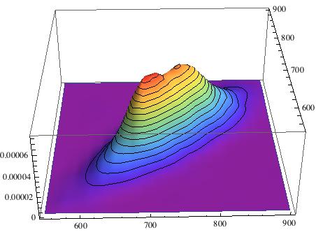
The important measure to assess the health of your heart is how narrow the distribution is about the diagonal. So we first estimate a KernelMixtureDistribution:
\[ScriptCapitalD] = KernelMixtureDistribution[Table[{listclean[[i]], listclean[[i + 1]]}, {i, 1, Length[listclean] - 2}]];
And then determine its covariance matrix:
Covariance[\[ScriptCapitalD]] // N // MatrixForm
To determine the "two main axes" of the distribution we determine the Eigensystem:
Covariance[\[ScriptCapitalD]] // N // Eigensystem
and plot everything in one image:
Show[SmoothDensityHistogram[Table[{listclean[[i]], listclean[[i + 1]]}, {i, 1, Length[listclean] - 2}], ColorFunction -> "Rainbow" , PlotRange -> {{550, 900}, {550, 900}}], Graphics[{{Thick, Arrow[{Mean[Table[{listclean[[i]], listclean[[i + 1]]}, {i, 1, Length[listclean] - 2}]], Mean[Table[{listclean[[i]], listclean[[i + 1]]}, {i, 1, Length[listclean] - 2}]] + (Covariance[\[ScriptCapitalD]] // N //Eigensystem)[[1, 1]]/50*(Covariance[\[ScriptCapitalD]] // N // Eigensystem)[[2,1]]}]}, {Thick, Arrow[{Mean[Table[{listclean[[i]], listclean[[i + 1]]}, {i, 1,Length[listclean] - 2}]], Mean[Table[{listclean[[i]], listclean[[i + 1]]}, {i, 1, Length[listclean] - 2}]] + (Covariance[\[ScriptCapitalD]] // N // Eigensystem)[[1, 2]]/50*(Covariance[\[ScriptCapitalD]] // N // Eigensystem)[[2,2]]}]}}]]
This is the resulting figure:
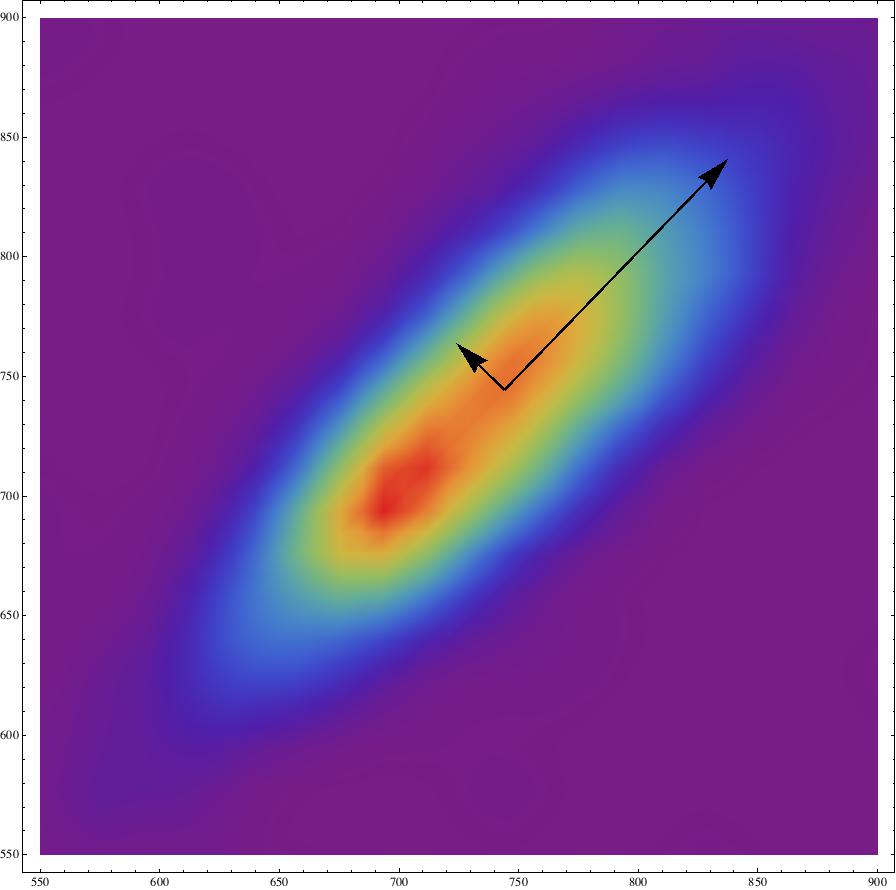
The ratio between the two eigenvalues is
(Covariance[\[ScriptCapitalD]] // N // Eigensystem)[[1,2]]/(Covariance[\[ScriptCapitalD]] // N // Eigensystem)[[1, 1]]
which for the data at hand is 0.208967, which according to the papers seems to be ok-ish.
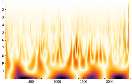
Mathematica now offers a whole bunch of algorithms to study the Heart Rate Variability, for example the entropy:
Entropy[(listclean - Mean[listclean])/Variance[listclean]] // N
which gives 4.74 for my time series,
WaveletScalogram[ContinuousWaveletTransform[((listclean - Mean[listclean])/Variance[listclean]) // N]]
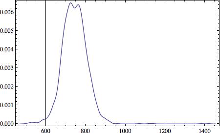
and many others such as the histogram of the RR interval durations:
SmoothHistogram[(listclean), Frame -> True]
Also, the setup can be used to monitor the heart of, e.g. a newborn. The upcoming WolframCloud should allow you to deploy the measurements directly into the cloud so that you can monitor the vital signs of the baby. It is straight forward to make Mathematica send out email warnings or "ring the alarm" if something goes wrong.
I attach the relevant notebooks to this post.
Marco
 Attachments:


