Hello!
Assume I have a 2D function Vel[x, z] (say, velocity distribution in the geological medium) and a set of points Xi = {x1, x1, ...}, Zi = {z1, z1, ...} with some scalar measurements Fi = {f[x1, z1], f[x2, z2], ...} for each of them. I would like to visualize the spatial distribution of the measurements as a scatter plot with the velocity model as a background. Unfortunately, there's no function like ScatterPlot in the WL, but I managed to do what I want and obtained the following plot: 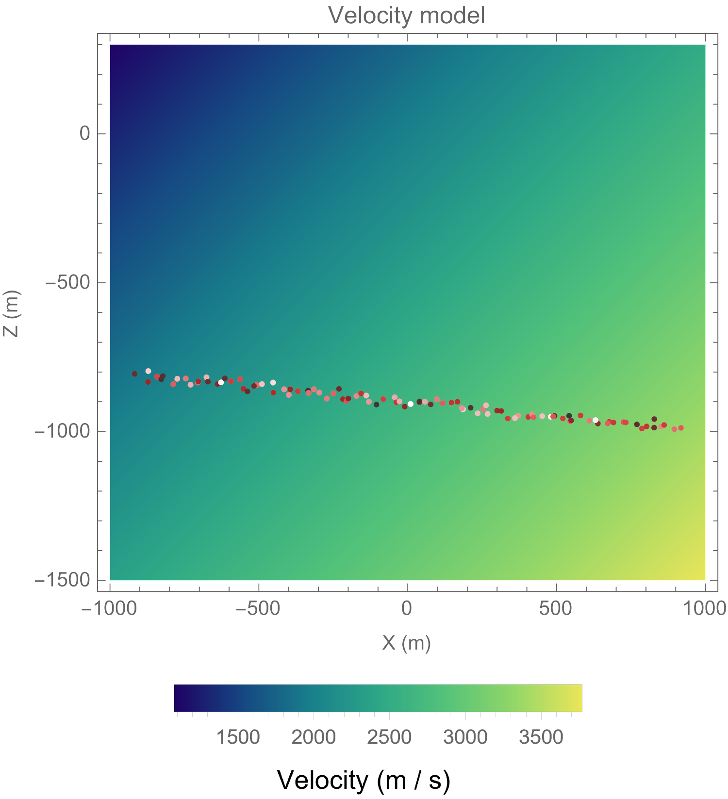
Here high values of Fi correspond to red points whereas low values correspond to white points.
My question is: how can I add an additional colorbar for the "white-red" colorscale? Thank you in advance!
UPD: a code sample generating the image above:


