Group Abstract Group Abstract

Message Boards Message Boards

How to make Linear Regression Graph with TimeSeries (obtained with WeatherData) data

Hi! I'm doing a university paper on global warming and so I decided to use the Wolfram Language as a research tool, so I built a command that, given a city and two dates, would graph the temperature of the city between the two points of the given dates. enter image description here As additional information, I decided to include a linear regression to the graph, so I investigated how to do it (I am relatively new in this language) and I tried to do it with easy data and it came out quite well, but when using it with the data obtained with WeatherData knowing that I am using days and years instead of numbers, I did not know how to make wolfram understand this as numbers to use the LinearModelFit function.

Before writing here I did my research here on a similar problem (https://community.wolfram.com/groups/-/m/t/4705759 ), but the data used are of much smaller magnitude.

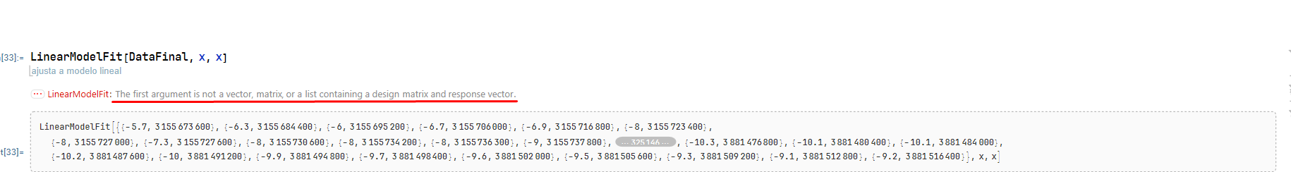
The things I have done so far is that I have isolated the temperature and the seconds in different lists, I have removed the unit from the temperature with QuantityMagnitude, then I have used Transpose to leave in format {x1,y2},{x2,y2}...

And, it doesn't work. I don't know why: the syntax seems to be the same as the base model of the Documentation Centre.

enter image description here enter image description here enter image description here

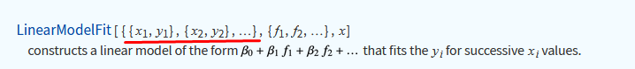
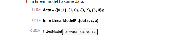
Does anyone know how to do this? Thanks in advance!

POSTED BY: Pablo Barrios
5 Replies

If you want to know why your version failed, it is almost certainly the replacement of QuantityMagnitude[Missing[_]] by Nothing: this will make some of your entries either an empty list or a one-element list instead of a two-element list, so you no longer have a clean two-column matrix (which is what the error message is telling you).

Note also that when you constructed DataFinal, you put x and y backwards: time should the x, temperature the y.

POSTED BY: Gareth Russell

Pablo,

maybe this approach might help (I choose a larger time interval to see the effect):

start = DateObject[{1975}, "Year"];
end = DateObject[{2022}, "Year"];
data0 = WeatherData[Entity["City", {"Nuuk", "Sermersooq", "Greenland"}], "Temperature", {start, end, "Day"}];
data1 = data0["Path"];
data2 = {#1, QuantityMagnitude[#2]} & @@@ data1;
lm = LinearModelFit[data2, t, t];
DateListPlot[data0, Epilog -> {Red, Line[{{start, lm[UnixTime@start]}, {end, lm[UnixTime@end]}}]}, GridLines -> Automatic, ImageSize -> Large]

enter image description here

POSTED BY: Henrik Schachner

That is the answer! Thank you very much!

POSTED BY: Pablo Barrios

Pablo,

I made a mistake in my answer, sorry! - The last line should read:

DateListPlot[data0, Epilog -> {Red, Line[{{start, lm[AbsoluteTime@start]}, {end, lm[AbsoluteTime@end]}}]}, GridLines -> Automatic, ImageSize -> Large]

So, one should use AbsoluteTime[] (and not UnixTime[]). (When one data point per year - and not per day - is used, this becomes obvious.) The result is now more plausible ...

enter image description here

POSTED BY: Henrik Schachner

Can't post the notebook, so here are some additional images: enter image description here enter image description here

POSTED BY: Pablo Barrios
Reply to this discussion
Community posts can be styled and formatted using the Markdown syntax.
Reply Preview
Attachments
Remove
or Discard