Message Boards Message Boards

0
|
1735 Views
|
6 Replies
|
3 Total Likes
View groups...
Share
Share this post:

How to remove noise in the plot generated from ListContourPlot?

Posted 9 months ago

I am trying to do ListContourPlot a list of three-dimensional data. The notebook file and the dependent file are attached here.

I think the portion marked in the red-colored box is noise generated from the Mathematica module. Is there any way to remove these gittery plots from the original plot?

Attachments:
6 Replies

Might just be a matter of restricting the plot x-y values. I base the selection predicate on values I see in the plot you show.

newpts = Map[Reverse, allres];
newpts2 = Select[newpts, (#[[2]] - 1) + (#[[1]] - 34)/11 <= 0 &];

Now plot it. I have the y coordinate start at 0.05 to remove some seeming badness at the bottom.

ListContourPlot[newpts2, GridLines -> Automatic, 
 ContourLabels -> True, ColorFunction -> "Rainbow", 
 ImageSize -> Large, PlotRange -> {{0, 45}, {.05, 1}}, 
 PlotLegends -> Automatic]

enter image description here

POSTED BY: Daniel Lichtblau

HYou can try this:

ListContourPlot[Select[phir4z0, 0.000098` < #[[2]] < 0.999945` &],
 GridLines -> Automatic, ContourLabels -> True, 
 ColorFunction -> "Rainbow",
 ImageSize -> Large, PlotRange -> {{0, 50}, {.05, .95}},
 PlotRangePadding -> None, AspectRatio -> 1/2]
POSTED BY: Gianluca Gorni

Thanks, Daniel Lichtblau!

I want a plot which should be the same as shown in the figure, which is generated from a different software. enter image description here

Is there any option in Mathematica to generate the contour plot cleanly.

Hi all, I basically think that ListContourPlot[], ListPlot3D[] and friends should simply not accept ambiguous data - like it is the case with Interpolation[]. Here comes immediately the warning "There are duplicated abscissa points in ...". Here is an example:

(* two sets of test data: *)
ds = Flatten[Table[{x, y, Sin[x + y^2]}, {x, -Pi, Pi, .1}, {y, -Pi, Pi, .1}], 1];
dc = Flatten[Table[{x, y, Cos[x^2 + y]}, {x, -Pi, Pi, .1}, {y, -Pi, Pi, .1}], 1];
(* creating a single ambiguous set: *)
da = Sort[Join[dc, ds]];
ListContourPlot[da]

enter image description here

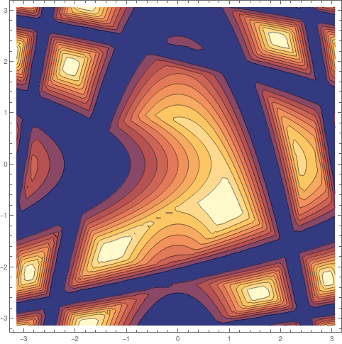
This in fact gives an interesting image - but it does not make any sense! And there is no warning whatsoever!

POSTED BY: Henrik Schachner

I don't know that they qualify as jittery, exactly. Try ListPlot3D[Map[Reverse, allres]] to see what I mean. They really show a precipitous change I would describe as a fold, with some jaggedness on one side.

Some trial and error indicates that smoothing the middle coordinates can make a difference to the outcome. I show this below. I use a (fairly long) triangle-type filter to convolve those values.

offset = 17;
ker0 = Join[Range[offset], Range[offset - 1, 1, -1]];
ker = ker0/Total[ker0];
newy = ListConvolve[ker, allres[[All, 2]]];
{newx, newz} = Transpose@allres[[offset ;; -offset, 3 ;; 1 ;; -2]];
newpts = Transpose[{newx, newy, newz}];

ListPlot3D[newpts]

enter image description here

Now the contour plot.

ListContourPlot[newpts, GridLines -> Automatic, ContourLabels -> True,
  ColorFunction -> "Rainbow", ImageSize -> Large]

enter image description here

Still a bit of weirdness at the lower right but much of the jaggedness is gone. One can experiment with the kernel size to get a trade-off between smoothness and fidelity to the original.

POSTED BY: Daniel Lichtblau

Your data has a lot of points that are stacked vertically. I would exclude them:

ListContourPlot[Select[phir4z0, 0.000098` < #[[2]] < 0.999945` &],
 GridLines -> Automatic, ContourLabels -> True,
 ColorFunction -> "Rainbow", ImageSize -> Large]
POSTED BY: Gianluca Gorni
Reply to this discussion
Community posts can be styled and formatted using the Markdown syntax.
Reply Preview
Attachments
Remove
or Discard

Group Abstract Group Abstract